The rule of thirds helps you create balanced, engaging interiors by strategically placing furniture, artwork, and accessories along imaginary grid lines or at intersections. Aligning key elements with these points draws the eye naturally and adds harmony to your space. You can also use this technique to manage natural light and reflectivity, making your room more inviting. Keep exploring how combining this principle with others can transform your interior for a stunning result.
Key Takeaways
- The rule of thirds divides space into a 3×3 grid to strategically position furniture, art, and decor for visual harmony.
- Aligning artwork and accessories with grid intersections creates focal points and enhances aesthetic interest.
- Furniture placement along grid lines ensures balanced distribution of visual weight and fosters a natural flow.
- Placing windows and mirrors at grid points optimizes natural light and reflects brightness into darker areas.
- Combining the rule of thirds with contrast, balance, and texture principles results in cohesive, inviting interior spaces.
Understanding the Fundamentals of the Rule of Thirds
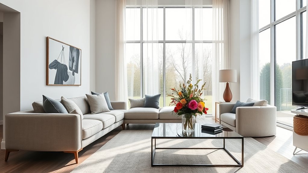
Have you ever wondered how some interiors instantly feel balanced and visually appealing? The key lies in understanding the fundamentals of the rule of thirds. This principle guides you to divide your space into a 3×3 grid, helping you position elements for maximum impact. When selecting color palettes, aim for harmony by balancing bold and neutral shades across these grid points. Material textures also play a vital role; combining smooth, rough, shiny, and matte finishes along the grid lines creates visual interest and depth. By thoughtfully placing furniture, artwork, and decor at these intersections, you’ll establish a natural flow that draws the eye and feels effortless. Additionally, understanding composition techniques can further enhance the visual balance in your interior design. Mastering these basics ensures your space feels cohesive, balanced, and inviting.
Applying the Rule to Wall Art and Gallery Displays
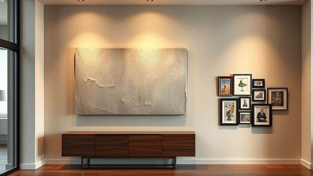
Once you’ve grasped the fundamentals of the rule of thirds, applying it to wall art and gallery displays becomes a powerful way to elevate your interior design. Position key pieces so their focal points align with the grid intersections, creating visual interest. Use scale contrast to balance large statement artworks with smaller pieces, ensuring the display feels cohesive yet dynamic. Color harmony is essential—choose artworks with complementary or analogous colors to unify the display and enhance flow. Avoid clutter by spacing pieces thoughtfully, allowing each to breathe within the grid zones. Incorporating design principles such as balance and rhythm can further enhance the overall aesthetic. This strategic placement draws the eye naturally, making your gallery wall engaging and balanced. By considering these elements, you craft a gallery display that’s both aesthetically pleasing and harmonious.
Using the Rule to Arrange Furniture for Visual Balance

Applying the rule of thirds to furniture arrangement helps create a balanced and inviting space. Position your main pieces, like sofas and tables, along imaginary grid lines or at their intersections to avoid symmetry that feels static. Use color coordination to tie furniture pieces together, ensuring the visual weight is evenly distributed across the room. Mix textures—such as a plush rug with sleek metal accents—to add depth and interest, guiding the eye naturally across the space. Keep larger furniture pieces aligned with the grid points for stability, while smaller items can be placed slightly off-center for a dynamic feel. This approach encourages harmony, making your room feel thoughtfully designed and comfortable. Proper furniture placement is essential for achieving visual balance and creating a cohesive look.
Incorporating the Rule in Accessory Placement
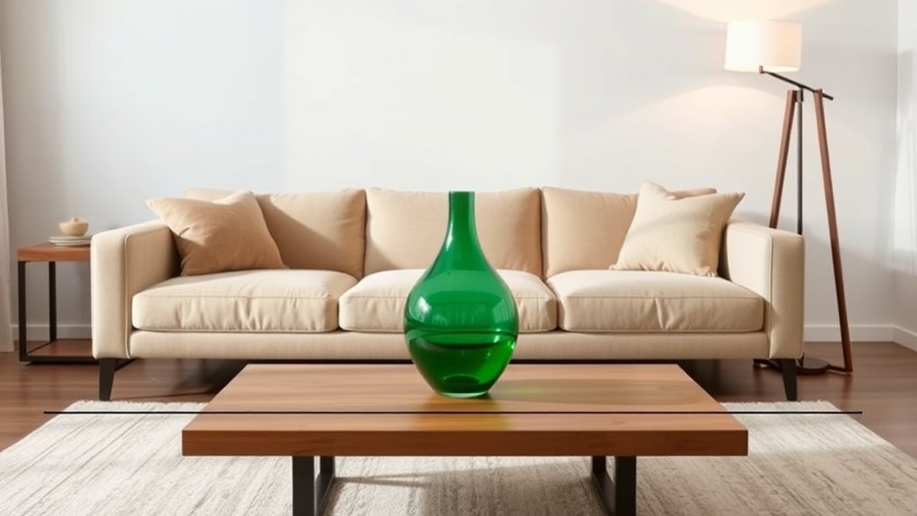
When placing accessories, use asymmetry to create visual interest while maintaining balance. Vary the sizes of your decor pieces to keep the eye moving naturally across the space. Grouping items thoughtfully can also enhance impact and reinforce the rule of thirds for a cohesive look. Incorporating diverse designs in your decor can further elevate the aesthetic appeal and add a layer of visual complexity.
Balance With Asymmetry
Have you ever wondered how to create visual interest with accessories while maintaining balance? Using asymmetry is a great way to do this, as it adds energy without overwhelming the space. To achieve this, focus on balancing visual weight rather than symmetry. Place a large or bold accessory as a focal point, then offset smaller, complementary pieces nearby. This creates a dynamic arrangement that draws the eye naturally. Keep in mind that uneven but thoughtfully placed accessories can feel more organic and inviting. The key is ensuring your focal points anchor the composition, while the surrounding items support without competing. Incorporating self watering plant pots can also add a touch of greenery that enhances the overall balance and vitality of your interior decor. This approach keeps your space balanced yet lively, encouraging the eye to move easily across your decor.
Varying Accessory Sizes
Varying accessory sizes is a powerful way to create visual interest and depth in your arrangements. When arranging flower arrangements or decorating a space, mix small, medium, and large accessories to draw the eye naturally across your setup. This variation aligns with the rule of thirds, helping you position larger pieces off-center for a balanced look. You can also incorporate color blocking by pairing accessories of different sizes in complementary or contrasting shades, making each element stand out. Larger accessories provide a focal point, while smaller ones fill gaps and add detail. By varying sizes intentionally, you create a dynamic visual flow that feels balanced and engaging without overwhelming the space. This technique guides the eye smoothly, making your interior styling feel cohesive yet lively.
Grouping for Impact
Grouping accessories thoughtfully can amplify their visual impact and reinforce the principles of the rule of thirds. When arranging items, aim for artistic balance by creating clusters that draw the eye naturally. Consider how colors interact; grouping accessories with complementary or harmonious hues enhances color harmony and makes the display more cohesive. Avoid scattering objects randomly—instead, place them in intentional groups that occupy specific thirds of the space. This not only highlights each grouping but also guides viewers’ attention smoothly across the room. Use varying heights and sizes within your groups to add visual interest without disrupting harmony. Incorporating visual balance techniques ensures a more polished and harmonious display. By carefully combining these elements, you create a polished, intentional look that emphasizes the rule of thirds and elevates your interior styling.
Enhancing Natural Light With the Rule of Thirds
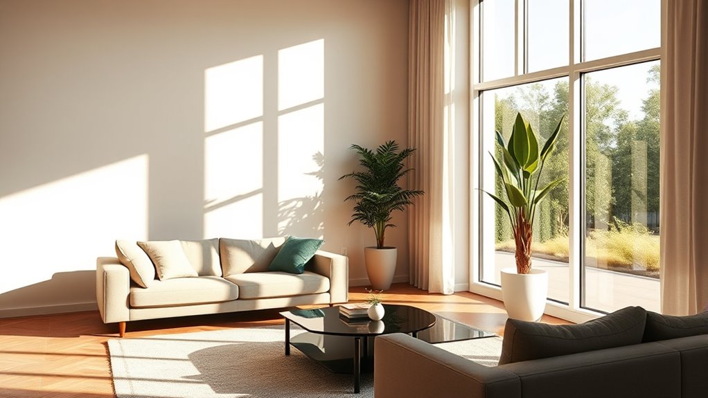
By thoughtfully placing windows, you can harness natural light to brighten your space effectively. Position mirrors strategically to reflect sunlight into darker corners, making the room feel more spacious. Incorporate light-reflecting decor to amplify the glow and create a balanced, inviting atmosphere. Being aware of the importance of local knowledge of resources can also help you optimize light placement and enhance your interior design strategy.
Strategic Placement of Windows
Have you ever noticed how the placement of windows can dramatically influence a room’s natural light? When you use the rule of thirds for window placement, you create a balanced flow of natural lighting. Position windows at one-third intervals of the wall to avoid harsh glare and shadows. This approach helps distribute light evenly, reducing dark corners and making the space feel more inviting. Consider the table below to visualize ideal window placement:
| Wall Section | Light Effect | Recommended Placement |
|---|---|---|
| Top Third | Soft, diffused natural lighting | Near ceiling, at one-third point |
| Middle Third | Bright, direct sunlight | Centered for even distribution |
| Bottom Third | Gentle ambient glow | Near floor for warmth |
Aligning window placement with these points maximizes natural lighting and enhances the room’s harmony. Proper window placement can also influence light control, further improving the overall ambiance of the space.
Mirror Positioning Techniques
Ever wondered how to make the most of your natural light without adding more windows? Mirror positioning is key. Place mirrors according to the rule of thirds, aligning them to reflect light toward darker areas. Positioning a mirror across from a window amplifies natural brightness, reducing the need for artificial lighting during the day. To enhance this effect, consider your color schemes; light, reflective colors boost the mirror’s impact by bouncing light around the room. Avoid clutter or heavy frames that distract from the reflection. Keep mirrors clean and well-placed to maximize their light-enhancing potential. This simple technique helps you create a brighter, more inviting space while minimizing energy use and complementing your overall interior style.
Light-Reflecting Decor
Using light-reflecting decor strategically can considerably boost natural illumination in your space. By placing objects with reflective surfaces according to the rule of thirds, you create balanced focal points that amplify light. Consider how color psychology influences the mood—shiny whites and soft pastels reflect more light, making rooms feel larger and brighter. Historical design elements, like antique mirrors or metallic accents, add depth and elegance while enhancing natural brightness. To visualize, see the table below:
| Object Type | Placement (Thirds) | Effect |
|---|---|---|
| Mirror | Wall intersections | Maximize light reflection |
| Metallic Vases | Corners or focal points | Add sparkle and bounce light |
| Glass Decor | Near windows | Disperse natural light |
| Light-colored Rugs | Floor thirds | Brighten and anchor space |
Using these tips, you’ll harness the power of reflective decor to create a luminous, stylish environment. Additionally, incorporating lighting design principles can further optimize the distribution of light within your interior.
Case Studies: Before and After Interior Styling
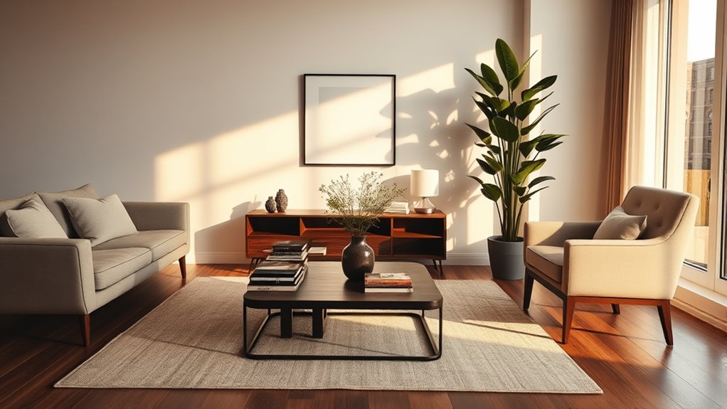
Seeing a space transformed through thoughtful interior styling can be truly inspiring. In these before-and-after case studies, you notice how carefully chosen color palettes breathe new life into rooms, creating harmony and visual interest. Material textures also play a crucial role, adding depth and tactile appeal. For example, a dull living room might become inviting with warm, earthy tones paired with textured throws and rugs. The rule of thirds guides the placement of key elements, ensuring balance and focus. You’ll see how simple adjustments—like shifting a sofa or adding a statement piece—can dramatically improve a space’s feel. These transformations highlight the power of strategic styling, showing that even small tweaks in color and texture, aligned with the rule of thirds, can make a space truly remarkable. Additionally, understanding how AI technology can assist in interior design through data-driven insights is opening new possibilities for creating harmonized environments.
Common Mistakes to Avoid When Using the Rule
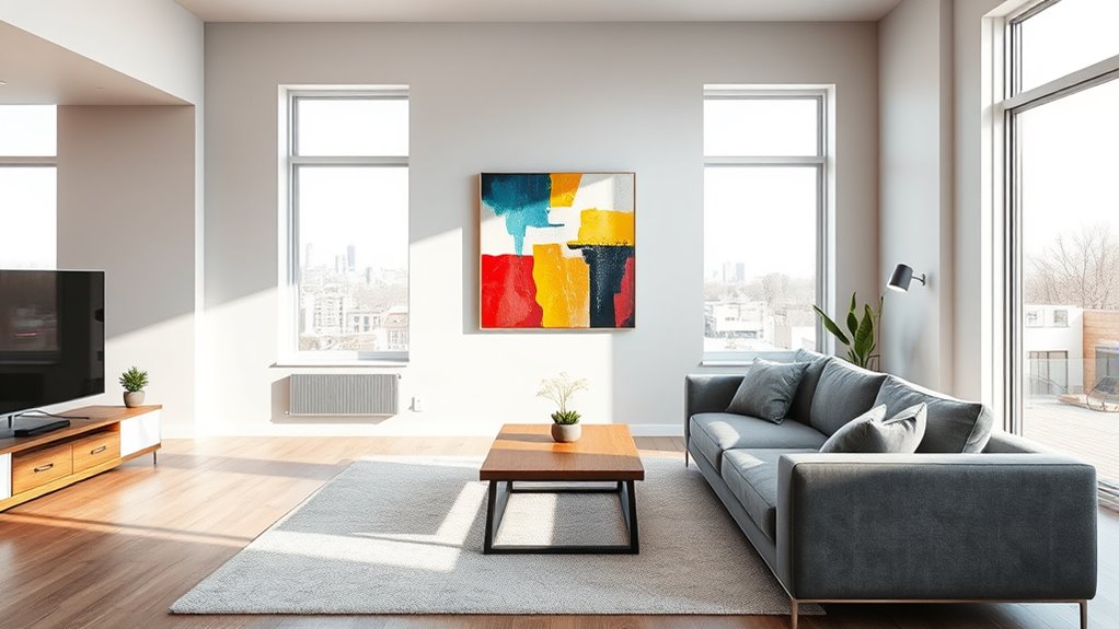
While the rule of thirds is a valuable guideline for creating balanced and visually appealing interiors, it’s easy to fall into common pitfalls that undermine its effectiveness. One mistake is overusing similar color coordination, which can make your space feel monotonous rather than dynamic. Avoid placing all elements with matching material textures, as this can create a flat look; instead, mix different textures to add depth and interest. Another error is misaligning focal points, causing imbalance and confusion. Don’t ignore scale—placing small items at intersections can diminish their impact. Ultimately, stay mindful of clutter, which can distract from the intended visual flow. By avoiding these mistakes, you ensure the rule of thirds enhances your interior’s harmony without compromising style.
Tips for Combining the Rule of Thirds With Other Design Principles

To create a truly balanced and engaging interior, it’s essential to combine the rule of thirds with other design principles like balance, contrast, and rhythm. Use color theory to select hues that complement or contrast effectively, guiding the eye across your space. For example, pairing warm tones with cool shades can create visual interest while maintaining harmony. Additionally, incorporate texture contrast—mix smooth and rough surfaces—to add depth and tactile appeal. When arranging elements according to the rule of thirds, ensure that your focal points highlight these contrasting textures and colors, creating a dynamic flow. This synergy between the rule of thirds and core design principles results in a cohesive, vibrant interior that feels intentional and visually compelling.
Frequently Asked Questions
How Does the Rule of Thirds Apply to Small Spaces?
In small spaces, you can create focal points that draw attention and enhance visual flow by applying the rule of thirds. Position key elements like artwork, lighting, or furniture along the grid lines to make the space feel balanced and intentional. This technique helps you avoid clutter, making the room appear larger and more inviting. Focus on strategic placement to maximize impact without overwhelming your cozy environment.
Can the Rule Be Adapted for Minimalist Interior Design Styles?
You can adapt the rule of thirds to minimalist interior design by emphasizing balance, harmony, and visual simplicity. Focus on arranging key elements along imaginary lines or points, creating a sense of order without clutter. Minimalist principles prioritize clean lines and open space, so apply the rule subtly, guiding the eye naturally while maintaining the serene, uncluttered feel. This approach enhances your space’s calm, cohesive aesthetic effortlessly.
Is There a Specific Way to Balance Asymmetrical Layouts Using the Rule?
To balance asymmetrical layouts, you should focus on creating visual balance by strategically placing focal points throughout your space. Use different sizes, colors, or textures to draw the eye evenly across the room, preventing one area from feeling too heavy. Think about how your eye moves naturally around the space, and adjust your arrangements so that each focal point complements the overall flow, achieving harmony without symmetry.
How Do Color Schemes Influence the Effectiveness of the Rule?
Ever wondered how color schemes impact your room’s balance? You can create stunning visual harmony by choosing colors that complement each other, emphasizing contrast dynamics to highlight focal points. Color harmony fosters unity, making your space feel cohesive, while contrasting tones add depth and interest. When you intentionally select your colors, you enhance the effectiveness of your layout, ensuring your design feels balanced and engaging, no matter the arrangement.
Can the Rule of Thirds Be Used in Outdoor or Garden Interior Design?
You can definitely apply the rule of thirds to outdoor or garden design. Just like in landscape photography, you position elements such as trees, pathways, or outdoor furniture placement along imaginary grid lines or at intersections. This creates visual balance and interest. Using the rule helps you craft a harmonious outdoor space, guiding the eye naturally through your garden and making the overall design more engaging and inviting.
Conclusion
Embrace the rule of thirds as your guiding compass, weaving balance and harmony into your space like a steady heartbeat. Let it be the thread that connects your vision, turning chaos into rhythm. With each placement, you craft a symphony of style—an artful dance of elements perfectly aligned. Trust this timeless principle to illuminate your path, transforming your home into a masterpiece where every detail sings in harmony.


