
To unlock the secrets of color psychology and transform any room, start by choosing colors that align with your desired emotions. Warm colors like red and orange can create excitement, while cool blues and greens promote calmness. Layering lighter hues can make a space feel larger, whereas darker shades add intimacy. Experiment with contrasting tones to direct attention and enhance visual interest. Pay attention to cultural meanings of colors, as they can shift perceptions significantly. Next, think about how color choices influence feelings within your space—there's so much more to explore to elevate your design!
Key Takeaways
- Choose warm colors like red and orange for energizing spaces, while cooler shades like blue and green promote relaxation and tranquility.
- Utilize lighter colors to create a sense of spaciousness, and darker hues for a more intimate atmosphere in the room.
- Balance contrasting colors to enhance visual interest and direct attention to focal points within the space.
- Consider cultural meanings of colors to ensure your choices resonate with the intended audience and context.
- Experiment with different color palettes and use A/B testing to discover combinations that evoke the desired emotional responses.
As an affiliate, we earn on qualifying purchases.
Color Psychology Fundamentals

Color psychology is an intriguing field that explores how colors impact your emotions and behaviors. Understanding this concept is crucial, especially if you're looking to transform a space. It examines how colors can evoke distinct feelings and influence human behavior, making it an essential tool in industries like advertising and interior design. Different colors can stimulate excitement or promote tranquility, depending on their warmth or coolness. Research indicates that color can affect mood and perception, showcasing its power in shaping environments. You'll find that the cultural context also plays a significant role; a color's meaning can shift dramatically across cultures. By grasping these fundamentals, you can create environments that resonate with your desired emotional responses, ultimately enhancing the experiences of those who inhabit the space.
Colors and Their Emotions

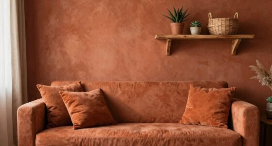
When transforming a space, understanding how different colors evoke specific emotions is essential. Warm colors like red, orange, and yellow can create a welcoming atmosphere but may also spark feelings of anger or anxiety. In contrast, cool colors such as blue and green often promote calmness and balance, making them ideal for relaxation areas. Research indicates that up to 90% of snap judgments can be based on color alone, highlighting the importance of thoughtful color choices in design. Bright, saturated colors grab attention and energize a room, while dull colors can lead to boredom. Additionally, the impact of colors can vary based on astrological compatibility, as different signs may respond uniquely to specific hues. Remember, the context matters too; a red room might feel different than a red accessory.
Designing Ambiance With Colors

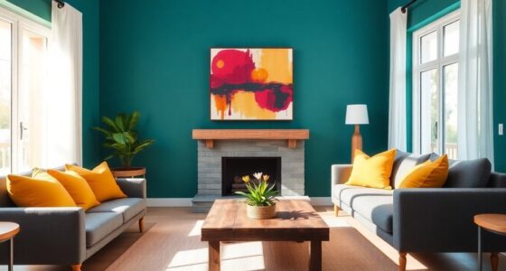
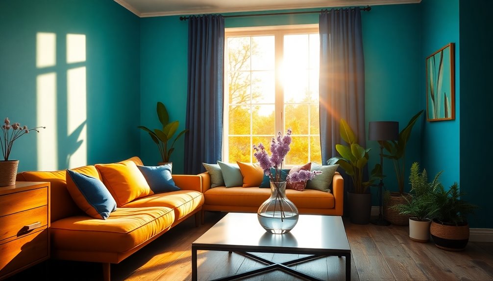
Selecting the right colors can significantly shape the ambiance of a room, influencing how you and your guests feel. Colors evoke emotions and can create a serene bedroom with soft blues or a lively dining room with warm reds. Consider your personal preferences and the space's purpose; calming hues promote relaxation, while vibrant shades inspire creativity. Additionally, thoughtful color use can create tranquility or energy, enhancing the overall atmosphere of the space.
Balance contrasting colors to enhance visual interest, pairing cool tones with warm accents for energy. Remember, lighter colors can make a room feel spacious, while darker hues add intimacy.
Perception and Space Manipulation

Understanding how colors influence perception can dramatically alter the way you experience a space. Warm colors like red and orange can make walls feel closer, creating an inviting atmosphere, while cool colors like blue and green give the illusion of more space. Farmhouses across regions often utilize traditional styles that reflect their historical significance, enhancing the overall ambiance of the space.
You can enhance the texture of a room by pairing light and dark colors, adding visual interest. Use contrasting hues to guide the eye to focal points, directing attention where you want it most.
Remember that the type and quality of light can also change how colors appear, affecting your emotional response. By thoughtfully choosing colors, you can manipulate your environment, making it feel larger, cozier, or more dynamic, based on your preferences. Additionally, the relationship between color and built environments is complex and can significantly influence how a space is perceived.
Practical Color Application Strategies

Applying practical color strategies can significantly enhance your space's overall vibe and functionality. Start by understanding color theory; familiarize yourself with the color wheel and the meanings behind colors to create appealing combinations.
Be mindful of cultural differences, as colors can convey varying messages. Experiment with different palettes, using A/B testing to find what resonates best.
Incorporate contrast to highlight key elements and ensure readability, especially for those with color vision deficiencies. Aim for color harmony by balancing combinations and avoiding overwhelming visuals.
Create a visual hierarchy to guide attention and enhance emotional connections. Effective contrast is crucial in establishing visual hierarchies, ensuring that important details are easily noticed. By thoughtfully applying these strategies, you'll transform your space and evoke the desired feelings in anyone who enters.
Frequently Asked Questions
How Do Cultural Differences Affect Color Interpretations?
Cultural differences significantly affect color interpretations. For instance, while red symbolizes luck in China, it conveys danger in the Middle East.
White represents purity in the US but mourning in East Asia. Similarly, blue denotes trust in North America yet signifies spirituality in Eastern cultures.
Understanding these variations helps you avoid miscommunication and ensures your message resonates positively across diverse audiences.
Being aware of these differences can enhance your cultural sensitivity and effectiveness.
Can Colors Influence Productivity in the Workplace?
Absolutely! Picture a serene blue that sharpens your focus, contrasted with an energizing yellow that sparks your creativity.
While green calms and reduces eye strain, too much red can overwhelm your senses.
You'll find that a balanced color scheme not only enhances concentration but also boosts morale.
What Are the Best Colors for Small Apartments?
When choosing colors for your small apartment, consider light and airy shades like soft whites and pale neutrals to make your space feel larger and brighter.
Monochromatic colors, such as various shades of blue or gray, can add depth without overwhelming the area.
Earthy tones like sage green and taupe create a calming atmosphere.
If you want a pop of energy, try using bold colors like teal or mint green strategically for vibrancy without cluttering the space.
How Often Should I Change My Room Colors?
Imagine your vibrant kitchen turning dull after just a year. You should consider changing your room colors based on factors like paint quality, humidity, and sunlight exposure.
Generally, high-traffic areas or rooms with moisture need repainting every 3-5 years, while less-used spaces can go longer.
Regular maintenance and cleaning can extend the life of your paint job, so keep an eye on wear and tear to maintain a fresh look in your space.
Are There Colors That Can Improve Sleep Quality?
Yes, certain colors can definitely improve your sleep quality.
Blue promotes calmness and helps lower your heart rate, while green provides a soothing, natural vibe that can alleviate anxiety.
Soft purples create a tranquil atmosphere, enhancing relaxation.
Interestingly, red light stimulates melatonin production, aiding your sleep cycle.
Avoid bright reds, though, as they can energize you instead.
Choose these colors wisely to create your ideal sleep environment!
Conclusion
By understanding color psychology, you can truly transform any room into a space that reflects your personality and evokes the right emotions. For instance, imagine a cozy reading nook painted in warm yellows and soft browns, encouraging relaxation and creativity. By choosing the right colors, you can create an environment that not only looks stunning but also feels inviting. So, go ahead—experiment with colors and watch your space come to life in ways you never thought possible!