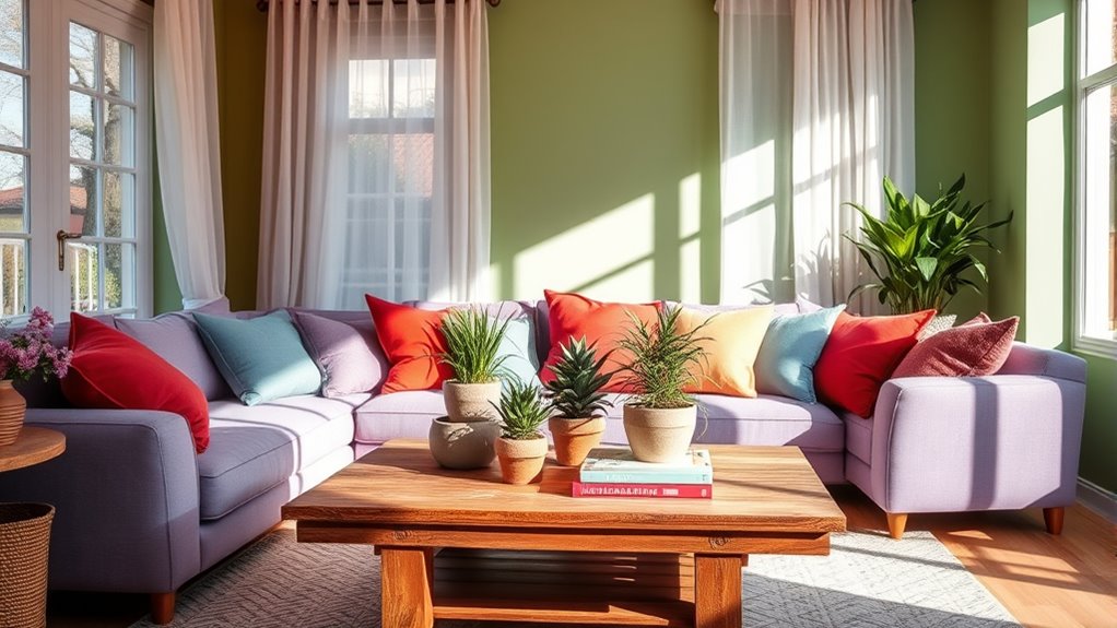

Using color psychology at home involves choosing shades that promote your emotional well-being and suit each room’s purpose. Calm blues and greens can help you relax, while energetic reds and yellows boost motivation. Coordinating colors thoughtfully creates a harmonious space that feels inviting. By selecting hues intentionally, you support your mood and mental health. If you want to learn how to balance and apply these principles, you’ll discover more tips to transform your home.
Key Takeaways
- Choose calming colors like blues and greens for bedrooms to promote relaxation and restful sleep.
- Use energizing shades such as yellows or reds in workspaces to boost focus and motivation.
- Coordinate wall colors with furniture and accents to create a harmonious, inviting atmosphere.
- Balance vibrant and muted tones to maintain positive emotional responses and prevent overwhelm.
- Incorporate a variety of shades to foster visual interest and support mental well-being throughout your home.
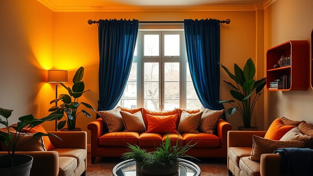
Color psychology can profoundly influence how you feel and behave in your home. The colors you choose for your walls, furniture, and accents don’t just serve aesthetic purposes—they shape the emotional impact of each space. When you select colors intentionally, you create an environment that supports your mood and well-being. For example, calming blues and greens can foster relaxation, while vibrant reds and yellows can energize and motivate you. To make the most of these effects, it’s essential to think about color coordination. When your colors harmonize well, they create a cohesive atmosphere that feels comfortable and balanced. If you pick contrasting or clashing shades without thought, the space might feel chaotic or unsettling, which diminishes the positive emotional impact you seek.
Effective color coordination involves understanding how different hues interact and influence your mood. For instance, pairing soft neutrals with pops of bold color can add interest without overwhelming your senses. You might opt for a neutral wall color, like beige or light gray, and add accent pillows or artwork in complementary shades. This approach ensures that the room feels inviting and well-designed, rather than chaotic or disjointed. Also, consider the room’s purpose when coordinating colors. In a bedroom, calming tones like lavender or pale blue can promote restful sleep, while a home office might benefit from energizing yellows or greens to boost focus. Additionally, understanding color contrast can help you create dynamic yet harmonious spaces that support your activities and emotional needs.
Another key aspect is understanding how color can influence your emotional response over time. Bright, lively colors may initially energize you but can become overwhelming if used excessively. Conversely, muted or softer tones tend to be more soothing but might make a space feel dull if overused. Striking a balance in your color palette helps maintain a positive emotional impact. Incorporate different shades thoughtfully to add depth and interest, avoiding monotony. For example, combining varying shades of blue in a living room can evoke tranquility while adding visual richness. Through intentional color coordination, you’re not just decorating—you’re designing an environment that nurtures your mental and emotional well-being.
calming blue green bedroom paint
As an affiliate, we earn on qualifying purchases.
As an affiliate, we earn on qualifying purchases.
Frequently Asked Questions
How Can I Incorporate Color Psychology Into Small Spaces Effectively?
To make small spaces feel larger and more inviting, use color accent walls to create focal points without overwhelming the room. Incorporate strategic lighting to enhance the mood and highlight your chosen colors. Light, cool hues like blues and greens can make a space feel more open, while warm shades add coziness. Balance these elements to evoke the desired emotions and make your small space feel thoughtfully designed and comfortable.
Which Colors Are Best for Creating a Calming Bedroom Environment?
You should choose soothing neutrals and soft pastels for a calming bedroom. Colors like gentle blues, muted greens, or soft pinks promote relaxation and help you unwind. Avoid bold, bright shades that can be stimulating. Keep the palette simple and cohesive to create a serene atmosphere. Incorporate these colors through wall paint, bedding, or decor to make your space feel peaceful and inviting, perfect for restful sleep.
How Do Cultural Differences Influence Color Perceptions at Home?
Think of color perceptions as a tapestry woven with cultural symbolism and regional preferences. You’ll find that in some cultures, red sparks energy and passion, while in others, it signifies luck and prosperity. Cultural differences shape how you interpret colors at home, influencing your choices and feelings. By understanding these nuances, you can create a space that resonates deeply, honoring your heritage and personal style with intentional color choices.
Can Color Psychology Help Improve Productivity in Home Offices?
Yes, color psychology can boost your productivity in a home office. By choosing colors with positive color associations, like blue for focus or green for balance, you can enhance your emotional impact and create an environment that fosters efficiency. Using calming or energizing hues strategically helps you stay motivated and reduce stress. Experiment with different shades to find what works best for your workflow and emotional well-being.
Are There Any Colors to Avoid in Children’s Play Areas?
Like a knight avoiding the dragon’s lair, steer clear of overly dark or aggressive colors in children’s play areas. Bright reds, blacks, and dull browns can hinder creativity and cause agitation. Instead, focus on colors with positive associations and symbolism, such as cheerful yellows or calming blues, which promote happiness and focus. These choices help children feel safe and inspired, fostering a healthy environment for play and learning.
Conclusion
By harnessing the power of color psychology at home, you can transform your space into an unstoppable fortress of calm, energy, and happiness. Imagine turning your living room into a sanctuary that works tirelessly to boost your mood, or your bedroom into a powerhouse of relaxation so intense, you’ll never want to leave. When you master this simple secret, you’ll open a world where your home doesn’t just exist—it becomes your ultimate happiness headquarters. Get ready for a life-changing color revolution!