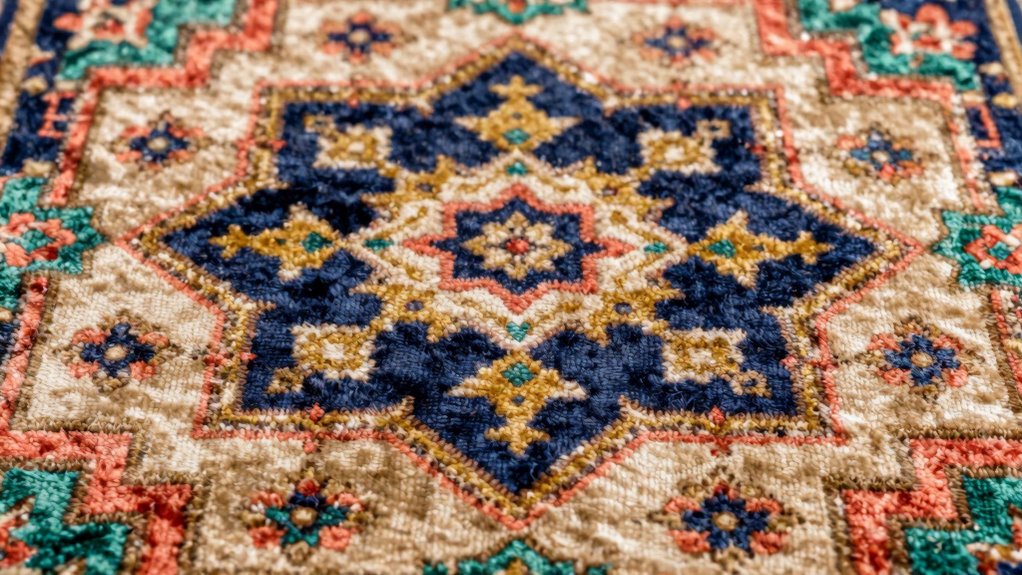

Start by examining your favorite rug and identifying its main colors. Use the color wheel to find hues that complement or contrast nicely with those shades, creating harmony or bold interest. Decide if you want a calming space with blues and greens or an energetic vibe with reds and yellows. Incorporate neutrals for balance, and experiment with different combinations until the scheme feels right. If you want to explore more ways to develop your palette, there’s plenty more to discover.
Key Takeaways
- Identify the dominant colors in your rug to establish a foundation for the palette.
- Use the color wheel to find complementary or analogous shades for harmony.
- Balance bold hues with neutral tones to create visual interest and calm.
- Consider the mood you want to evoke and select colors that align with that feeling.
- Experiment with contrasting or matching colors around the rug to enhance the overall room design.
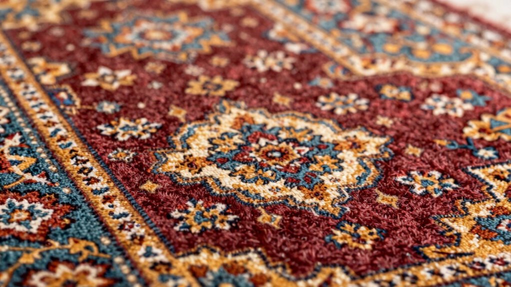
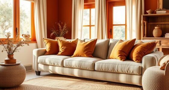
Have you ever wondered how to create a cohesive room design starting from a single rug? It might seem daunting at first, but the key lies in understanding color relationships and how they influence the overall vibe of your space. The color wheel theory is a valuable tool here—it helps you visualize how colors interact. By familiarizing yourself with this theory, you can identify harmonious combinations and daring contrasts that make your room pop. For example, if your rug features warm tones like reds and oranges, you can select wall colors or accessories that are either in the same warm family or in complementary shades. This approach creates balance and unity, making your room feel thoughtfully curated.
Start with your rug’s colors to create a balanced, harmonious, and thoughtfully curated room design.
If you’re feeling adventurous, contrasting color schemes can add energy and interest to your space. These involve pairing colors that sit opposite each other on the color wheel, such as blue and orange or purple and yellow. Using contrasting colors from your rug can help you create a vibrant, lively environment that captures attention. Start by choosing one dominant color from your rug, then pick its contrasting hue for larger surfaces like walls or furniture. To keep the look balanced, incorporate neutral tones—like beige, gray, or white—that act as visual rest points amidst the bold contrasts. This way, you avoid overwhelming the space while still making a dramatic statement.
When selecting your color palette, consider the mood you want to evoke. If your rug contains blues and greens, you might aim for a calming and serene atmosphere by choosing soft neutrals and cool shades. Conversely, if your rug boasts bright reds and yellows, a lively and energetic vibe can be achieved with warm, complementary hues. Keep in mind that the intensity of the colors matters—so if your rug has vibrant patterns, balance it with more subdued wall colors or furniture to prevent the room from feeling chaotic. Conversely, if your rug’s colors are more muted, you can afford to go bolder with your accent pieces. Understanding color relationships helps guide your choices effectively, ensuring a harmonious look.
Ultimately, your goal is to create harmony without monotony. Use the color wheel as your guide, experiment with contrasting schemes to add excitement, and always keep your personal taste at the forefront. When you start from a favorite rug, you already have a central piece that anchors your design. Building around it with thoughtful color choices turns that rug into the star of your room, making the entire space feel intentional and inviting. Additionally, exploring color schemes can inspire new ideas and help you develop a cohesive aesthetic that reflects your unique style. Recognizing the significance of color harmony can further elevate your room design, making it both visually appealing and balanced.
As an affiliate, we earn on qualifying purchases.
Frequently Asked Questions
Can I Use the Rug’s Colors for Every Room in My Home?
Yes, you can use your rug’s colors in every room, but consider color psychology to create the right mood. Bright hues may energize spaces, while softer shades promote relaxation. Use pattern coordination to guarantee the designs complement each other, avoiding visual clutter. Stick to a cohesive palette, and incorporate different shades and textures for balance. This approach helps your home feel harmonious while highlighting your favorite rug as a unifying element.
How Do I Balance Multiple Colors From the Rug in My Decor?
They say, “Too many cooks spoil the broth,” but with color, it’s about balance. To balance multiple colors from your rug, focus on color harmony by choosing a dominant hue and supporting shades. Use pattern repetition carefully to create cohesiveness without overwhelming the space. Incorporate neutral tones to anchor your decor, allowing the vibrant colors of your rug to shine without clashing. This approach keeps your design lively yet harmonious.
What Tools Can Help Identify the Exact Shades in a Rug?
To identify the exact shades in your rug, you can use color matching tools like digital color analyzers or mobile apps such as Adobe Color or Pantone’s Color Matcher. These tools assist with precise shade identification, making it easier to match paint, fabric, or accessories. For accurate shade identification, hold the device close to the rug or upload a photo, ensuring consistent lighting for the best results.
Should I Match Wall Colors to the Rug or Contrast?
Did you know that homes with well-matched color schemes are 50% more likely to feel harmonious? You should contrast wall colors with your rug to create vibrant color harmony and highlight pattern coordination. This approach makes your space lively without overwhelming. Use complementary shades or subtle contrasts to balance the rug’s design. Ultimately, contrasting walls with your rug adds visual interest and guarantees your room feels cohesive yet dynamic.
How Do I Choose a Neutral Background to Highlight the Rug?
To choose a neutral background that highlights your rug, focus on color harmony and background texture. Opt for soft, muted neutrals like warm beige, cool gray, or creamy tones that complement your rug’s colors without overpowering them. Consider textured backgrounds, such as subtle wallpaper or textured paint, to add depth. Keep the background simple and unobtrusive, allowing the rug’s pattern and colors to stand out beautifully.
Conclusion
By choosing a color palette from your favorite rug, you create a cohesive and personalized space that truly reflects your style. Did you know that homes with a well-coordinated color scheme can boost mood and comfort? So, take that rug as your inspiration, pick complementary hues, and watch your entire room come together effortlessly. It’s a simple yet powerful way to design with intention and make your space feel uniquely yours.