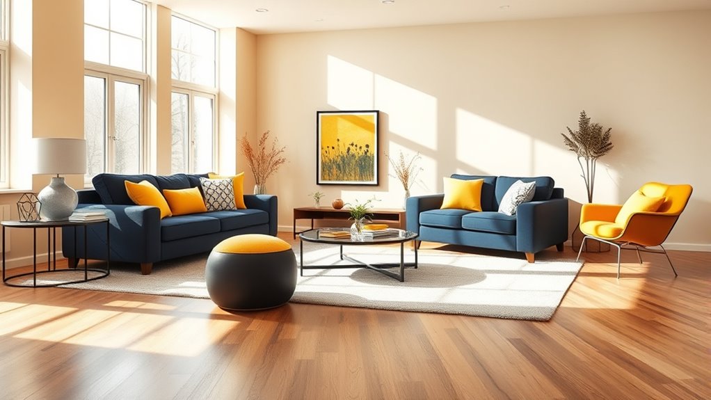

The 60‑30‑10 rule helps you create balanced, cohesive spaces by dividing colors and elements into proportions. You should use about 60% of a dominant color to set the main mood, 30% of a secondary hue to add depth and contrast, and 10% of an accent color to highlight specific features. This rule simplifies your design choices and keeps everything harmonious. If you want to master how to apply this in your space, there’s more to uncover below.
Key Takeaways
- The 60‑30‑10 Rule guides balanced interior design by dividing colors and elements into 60%, 30%, and 10% proportions.
- 60% of the space features the main color, establishing the room’s overall mood and tone.
- 30% includes secondary colors or textures that complement or contrast the main hue for depth.
- 10% is reserved for accent colors, adding pops of interest to highlight specific objects or areas.
- This rule simplifies design decisions, creating harmonious, balanced, and inviting environments.

Ever wondered how designers create visually balanced spaces? It all comes down to understanding how to distribute colors, textures, and elements harmoniously. The 60‑30‑10 rule is a simple yet powerful guideline that helps you achieve this balance effortlessly. At its core, it involves choosing a dominant color palette and then layering accent colors in a way that feels natural and pleasing to the eye. When you apply this rule, you’re fundamentally setting a foundation for design balance, making sure no single element overpowers the rest.
The primary step is to identify your main color, which should cover about 60% of your space. This dominant hue sets the overall mood and tone. Think of it as the backbone of your design, whether it’s a wall color, large furniture pieces, or major textiles. The key here is to select a color that resonates with the atmosphere you want to create. Once you’ve nailed down your primary color, you then choose your secondary color, taking up roughly 30%. This color acts as a complement or contrast to the main hue, adding depth and interest. It’s where you can incorporate different shades or textures to bring variety without disrupting the overall harmony.
Finally, the remaining 10% is dedicated to accent colors. These are the pops of color that highlight specific areas or objects — throw pillows, artwork, vases, or small decorative items. Because they represent a smaller proportion, they should stand out but not dominate. This balance ensures your space feels lively and dynamic without feeling chaotic. When you stick to this ratio, you’re intentionally guiding the eye across the room, creating a sense of flow and unity.
Using the 60‑30‑10 rule in your design process simplifies decision-making. It helps you develop a cohesive color palette that maintains visual harmony. Instead of second-guessing whether an element clashes or feels out of place, you can rely on these proportions to support your choices. This approach ensures you maintain design balance, making your space look well-thought-out and inviting. Whether you’re redecorating a single room or designing a complete interior, following this rule keeps everything in check and prevents your space from feeling overwhelming or uncoordinated. Ultimately, it’s a practical tool that empowers you to create beautifully balanced environments with ease. Understanding color ratios is essential for achieving visual harmony in any space.
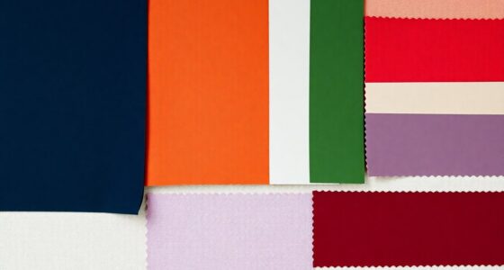
50/30/20 color palette wall paint
As an affiliate, we earn on qualifying purchases.
As an affiliate, we earn on qualifying purchases.
Frequently Asked Questions
How Does the 60‑30‑10 Rule Apply to Digital Marketing?
In digital marketing, the 60-30-10 rule guides your visual balance and content allocation. You should dedicate 60% of your space to engaging, relevant content that captures attention. Use 30% for supporting visuals or secondary messages to reinforce your main content. The remaining 10% is for branding or calls-to-action, ensuring your message stands out. This balance helps create a visually appealing, effective marketing campaign that resonates with your audience.
Can the 60‑30‑10 Rule Be Customized for Different Industries?
Yes, you can customize the 60‑30‑10 rule for different industries. To do this, you should focus on industry adaptation and develop customization strategies that align with your specific market, target audience, and goals. Adjust the percentage balance accordingly, emphasizing elements most relevant to your industry’s trends and customer behavior. This approach helps optimize resource allocation and enhances your marketing effectiveness across various sectors.
What Are Common Mistakes When Implementing the 60‑30‑10 Rule?
You might think following the 60‑30‑10 rule is foolproof, but watch out for color imbalance and oversimplification. A common mistake is rigidly sticking to the percentages without considering your brand’s unique needs, leading to an unbalanced palette. Overlooking this or ignoring the nuances of color psychology can make your design feel generic. Remember, flexibility and context matter more than strict adherence, so customize thoughtfully instead of mindlessly mimicking the rule.
How Does the Rule Influence Long-Term Brand Strategy?
You find that the 60‑30‑10 Rule shapes your long-term brand strategy by promoting brand consistency through balanced visual elements, ensuring your message stays clear and recognizable. This consistency helps build customer loyalty, as your audience knows what to expect and trusts your brand. By maintaining this visual harmony over time, you strengthen your brand’s identity, making it more memorable and fostering deeper connections with your customers.
Are There Tools to Help Visualize the 60‑30‑10 Distribution?
You can use visualization tools and data dashboards to easily see the 60‑30‑10 distribution. These tools help you create visual representations like pie charts or bar graphs that clearly show how your branding elements are allocated. By customizing dashboards, you get real-time insights and an interactive view of your brand’s balance, making it easier to adjust strategies and stay aligned with the ideal 60‑30‑10 proportions.
Conclusion
Remember, the 60‑30‑10 rule is all about balance. By balancing your resources wisely—whether it’s your budget, time, or efforts—you set yourself up for success. Keep in mind the saying, “A little goes a long way,” and don’t be afraid to adjust the proportions to fit your unique needs. When you master this rule, you’ll find harmony in your approach and greater results in everything you pursue.