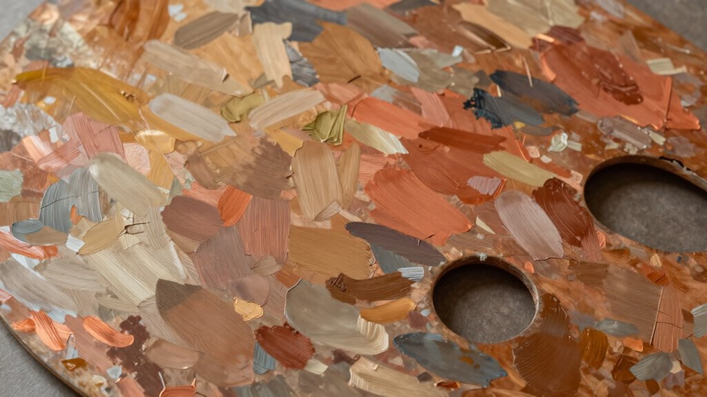

To build a classic palette that ages well, focus on selecting harmonious, timeless hues inspired by nature and history. Use neutral shades like soft gray, beige, or taupe as versatile bases, and add rich accents such as navy or emerald. Avoid trendy colors; instead, choose muted, subdued tones that develop character over time. Balance light and dark shades for visual interest, ensuring your palette remains elegant and relevant for years to come. If you keep exploring, you’ll discover how to perfect this enduring style.

Get furniture and decor delivered free with Prime
- Fast, free delivery on millions of items
- Prime Video, Amazon Music and more included
- Member-only deals all year
Key Takeaways
- Select neutral tones like beige, soft gray, and warm taupe as versatile, timeless bases.
- Incorporate muted, subdued hues inspired by nature and historical art for longevity.
- Use classic accent colors such as deep navy, rich emerald, or muted terracotta for enduring appeal.
- Prioritize harmonious combinations like analogous or complementary palettes to maintain visual balance.
- Avoid trendy, overly bright shades; focus on colors that age gracefully and adapt to changing lighting.
Have you ever wondered how to create a timeless color palette that elevates your design? Building a classic palette isn’t about following fleeting trends; it’s about choosing colors that work together effortlessly over time. To achieve this, focus on color harmony, which is the foundation of any lasting design. Color harmony involves selecting hues that complement each other, creating a balanced and cohesive look. When you understand how different colors relate—whether through analogous, complementary, or monochromatic schemes—you can craft combinations that feel natural and pleasing to the eye. These timeless combinations aren’t just aesthetically pleasing; they also guarantee your design remains relevant and elegant for years to come.
Creating a timeless palette relies on color harmony and enduring combinations that stay elegant over time.
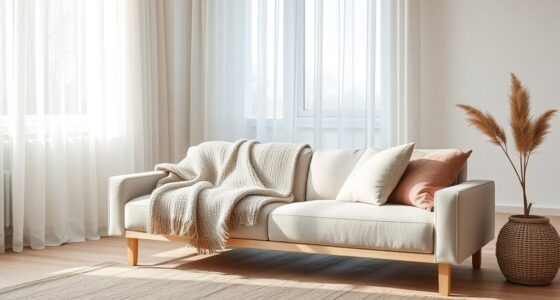
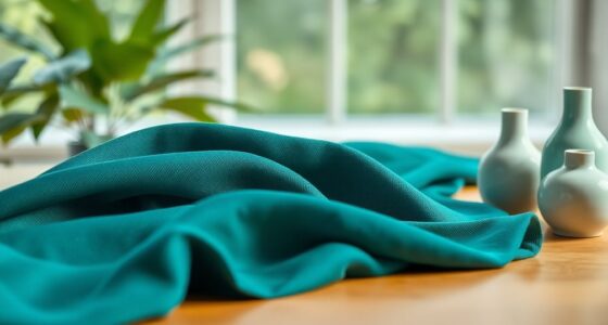
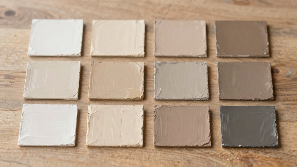
Start by choosing neutral tones as your base. Shades like beige, soft gray, or warm taupe serve as versatile anchors that pair beautifully with bancier accent colors. Neutral colors are inherently timeless because they don’t shout for attention; instead, they provide a calm backdrop that enhances other hues. From there, add in a few accent colors that evoke classic appeal—deep navy, rich emerald, or muted terracotta are excellent choices. These hues tend to age well and pair seamlessly with neutrals, establishing a balanced and sophisticated palette.
A key to maintaining timelessness is sticking to colors that have stood the test of time. Think of shades found in historical architecture or classic art—these tend to have staying power because they resonate universally. When selecting your palette, consider how the colors will age and how they’ll look in different lighting conditions. The goal is to avoid overly bright or trendy shades that may become dated quickly. Instead, opt for muted or subdued alternatives that add depth without overwhelming the senses. Additionally, understanding biodiversity can inspire you to select natural, enduring shades inspired by the environment, further enhancing the timeless quality of your palette. Incorporating color psychology into your choices can also help ensure your palette evokes the desired emotional response and remains relevant across different contexts.
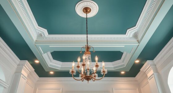
Incorporate contrast thoughtfully to add interest without disrupting harmony. A darker accent can anchor your overall color scheme, providing visual weight that balances lighter hues. Meanwhile, lighter tones can brighten spaces and give a sense of openness. This careful interplay not only creates a refined aesthetic but also ensures your palette remains versatile across various applications, from interior design to branding.
neutral color palette paint samples
As an affiliate, we earn on qualifying purchases.
As an affiliate, we earn on qualifying purchases.
Frequently Asked Questions
How Can I Incorporate Trends Without Compromising Timelessness?
You can incorporate trends without sacrificing timelessness by using seasonal color updates to refresh your palette subtly. Trend integration techniques, like adding a trendy accessory or a seasonal accent color, allow you to stay current without overwhelming your classic base. Stick to versatile, high-quality pieces that can be easily updated with small trend-focused elements. This approach keeps your style fresh while maintaining the enduring elegance of your classic palette.
What Fabrics Are Best for Maintaining a Classic Look?
You should choose fabrics like wool, cotton, silk, or linen for a classic look, as they offer excellent fabric durability and age beautifully over time. These materials also blend well with other fabrics, making color coordination easier. Opt for neutral or muted tones that remain timeless, and avoid overly trendy patterns. By selecting quality fabrics, you’ll maintain a sophisticated, enduring style that withstands changing fashion trends.
How Do I Choose Accessories That Complement a Classic Palette?
To choose accessories that complement a classic palette, focus on accessory color coordination by sticking to neutral or matching tones for versatility. Opt for timeless statement jewelry choices like pearl earrings or simple gold necklaces to add elegance without overpowering your look. Keep it balanced—if your outfit is subdued, add a pop with a bold piece, but always guarantee your accessories enhance rather than clash with your classic color scheme.
Can a Classic Palette Work in Both Casual and Formal Settings?
A classic palette works seamlessly in both casual and formal settings because of its timeless color harmony. You can easily mix and match pieces for different occasions, keeping your wardrobe organized around versatile, neutral tones. By investing in quality, adaptable items, you make your wardrobe more functional and stylish. This approach guarantees your wardrobe remains cohesive, flexible, and well-curated, no matter the event or dress code.
How Often Should I Update My Wardrobe to Keep It Fresh?
Think of your wardrobe like a vintage radio—timeless, but needing periodic tuning. You should update it seasonally with color updates that reflect current trends and your evolving style. Aim for strategic wardrobe capsule planning, revitalizing key pieces every six months to keep things new without overhauling everything. This approach guarantees your classic palette remains relevant, versatile, and effortlessly stylish over the years.
Conclusion
Building a classic palette is like planting a sturdy oak—once established, it stands the test of time. Stick to timeless shades and versatile combinations, and you’ll create a foundation that ages gracefully, much like a fine wine. Don’t rush the process; patience and thoughtful choices will make your palette bloom beautifully for years to come. Embrace the journey, and watch your carefully curated colors become a treasured part of your style, growing richer with age.
Halloween Picks
halloween
As an affiliate, we earn on qualifying purchases.