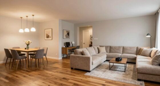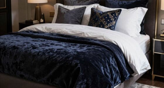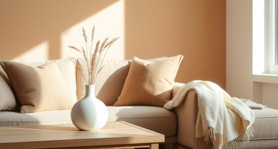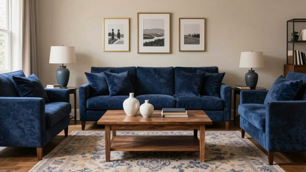

To tie rooms together with color repetition, choose a limited color palette and repeat key hues in accessories, artwork, or accent walls throughout your home. Focus on strategic placement to create visual flow and harmony, such as using the same color throw pillows or rugs in different spaces. Pay attention to color psychology to evoke the desired mood, and remember, consistency is key to achieving a balanced, cohesive look. Keep exploring to learn more about making these connections effortless.

Get furniture and decor delivered free with Prime
- Fast, free delivery on millions of items
- Prime Video, Amazon Music and more included
- Member-only deals all year
Key Takeaways
- Use consistent colors in accessories, artwork, or accent walls across rooms to create visual harmony.
- Carry repeated hues through throw pillows, rugs, or curtains to establish a cohesive flow.
- Plan a limited, unified color palette to ensure seamless transitions between spaces.
- Strategically place repeated colors in key areas to reinforce design and mood.
- Incorporate color psychology to choose hues that evoke desired emotions and maintain harmony.
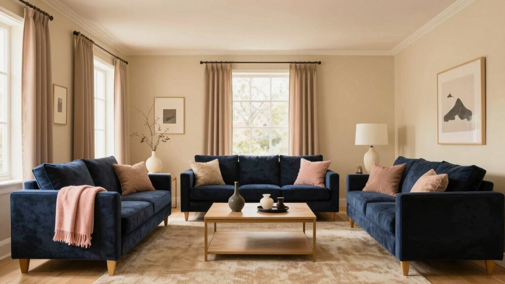
Creating a cohesive look throughout your home can be challenging, but one effective strategy is using color repetition. When you repeat specific colors across different rooms, you create a sense of unity that guides the eye smoothly from one space to another. This technique helps your home feel more intentional and put together, even if each room has its own distinct personality. To make this work, understanding color psychology is key; the emotions and moods associated with particular hues influence how you perceive the overall flow. For example, calming blues can evoke tranquility, while energetic reds add vibrancy. Choosing colors with the right psychological impact guarantees your home feels both harmonious and welcoming.
Repeating colors across rooms creates unity, enhancing flow and making your home feel intentional and harmonious.
Color repetition isn’t just about selecting the same shade everywhere—it’s about creating visual harmony through strategic placement. You might introduce a particular color in subtle ways, such as through accessories, artwork, or accent walls, and then carry that hue into other rooms via throw pillows, rugs, or curtains. This consistency subtly links the spaces without overwhelming the senses. This approach is especially effective when you consider the visual flow between rooms, ensuring each space feels connected and cohesive. The placement of repeated colors can also influence the perception of space, making rooms appear larger or more intimate depending on how you use them. The goal is to establish a visual thread that ties rooms together naturally, preventing each space from feeling isolated or disjointed. When you do this thoughtfully, your home transforms into a unified whole that feels balanced and cohesive. Additionally, color consistency can enhance the overall flow and make your decorating efforts feel more intentional. Paying attention to the color palette you choose helps maintain harmony and makes the repeated hues more impactful.
Understanding the psychology of color can help you select hues that not only look good but also evoke the desired emotional response in each room, reinforcing the overall harmony. You also want to take into account the intensity and tone of your chosen colors. Repeating a soft, muted shade creates a gentle flow that’s easy on the eyes, while bold, saturated hues can energize a space but might become overwhelming if overused. Play with shades of the same color to add depth and variation, which keeps the look interesting without sacrificing harmony. Keep in mind that the placement of repeated colors matters; strategic repetition in key areas—like trim, accessories, or furniture—can anchor your design and reinforce your intended mood. Incorporating color psychology into your choices can help you select hues that evoke the desired atmosphere in each area of your home. When you understand and leverage these principles, your home will feel more thoughtfully designed and visually appealing.
Finally, think about your overall color palette before you start. Using a limited palette makes it easier to maintain visual harmony and prevents your home from feeling chaotic. When you repeat colors thoughtfully throughout your rooms, you craft a seamless transition that enhances your home’s aesthetic appeal. This approach doesn’t require you to be a professional designer; with a little planning, you can create a space that feels cohesive, inviting, and full of personality. By understanding the principles of color psychology and applying repetition strategically, you’ll achieve a beautifully unified home that resonates with your style and personality.
As an affiliate, we earn on qualifying purchases.
Frequently Asked Questions
Can Color Repetition Work in Small Spaces Effectively?
Yes, color repetition works well in small spaces. It creates a sense of cohesion and makes the room feel more expansive. Use color contrast to highlight focal points, and coordinate textures to add depth without overwhelming. Repeating a color in accessories, furniture, or accents ties the space together seamlessly. Just keep the palette simple and balanced to avoid clutter, ensuring your small room feels both connected and inviting.
How Many Colors Should I Repeat for a Cohesive Look?
You should repeat three to four colors from your chosen color palette to achieve a cohesive look. This balance guarantees visual harmony without overwhelming the space. Focus on key elements like accent pieces, textiles, or furniture to reinforce these colors throughout each room. Repeating these colors consistently helps connect different areas, creating a unified, harmonious environment that feels thoughtfully designed and visually appealing.
Is It Better to Use Bold or Subtle Colors for Repetition?
Using subtle colors for repetition creates a harmonious and elegant flow, preventing the space from feeling overwhelming. Bold colors, on the other hand, act like a lightning bolt—adding excitement and contrast. It’s best to balance them with contrast techniques, pairing bold hues with understated tones for visual interest. This approach maintains color harmony while highlighting key elements, ensuring your rooms feel unified without overwhelming the senses.
Can Color Repetition Help With Room Flow in Open-Concept Homes?
Yes, color repetition can improve room flow in open-concept homes. By using consistent colors, you create visual harmony, guiding your eye smoothly across spaces. This taps into color psychology, fostering a sense of calm and unity. Repeating subtle or bold hues strategically links areas, making the entire space feel cohesive and inviting. It’s a simple yet effective way to enhance the overall flow and harmony of your open-plan layout.
How Do I Incorporate Color Repetition Without Overwhelming the Space?
To incorporate color repetition without overwhelming your space, choose a balanced color palette with a few key hues. Use these colors consistently across different rooms in subtle ways—like throw pillows, artwork, or rugs—to create visual consistency. Avoid overusing bold shades; instead, opt for softer tones or accents that complement the main colors. This approach adds cohesion while keeping the space feeling harmonious and inviting.
Conclusion
By repeating colors thoughtfully, you create a seamless flow that makes your home feel naturally connected. It’s like a gentle whisper guiding your eye from one space to the next, creating a cozy, cohesive vibe. When you notice that same shade popping up unexpectedly—maybe in a pillow or a piece of artwork—it’s no coincidence. That subtle touch ties everything together, making your rooms feel like parts of a beautifully curated story, effortlessly linked by color.
Halloween Picks
halloween
As an affiliate, we earn on qualifying purchases.