
To make a color feel expensive at home, choose deep, muted tones like navy or emerald paired with luxurious textures such as matte finishes or velvety surfaces. Incorporate metallic accents sparingly to catch the light and add a subtle glow. Use soft, warm lighting to enhance color depth and highlight undertones, creating an inviting, refined atmosphere. Mastering how colors, textures, and lighting work together will effortlessly elevate your space—if you want to discover more, keep exploring.
Key Takeaways
- Deep, muted tones like navy, charcoal, and emerald evoke sophistication and timeless elegance.
- Incorporating metallic accents such as gold or bronze adds a subtle glow and luxury feel.
- Matte finishes and velvety textures enhance richness and tactile sophistication.
- Soft, warm lighting enhances color depth and highlights subtle undertones and textures.
- A balanced, cohesive color palette with high-quality materials creates a refined and upscale atmosphere.
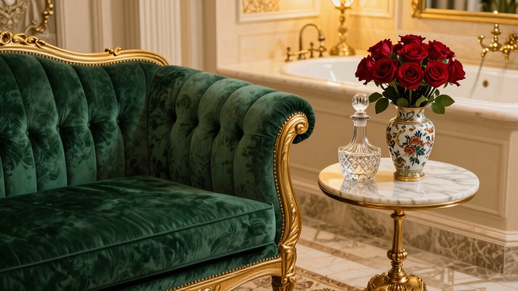
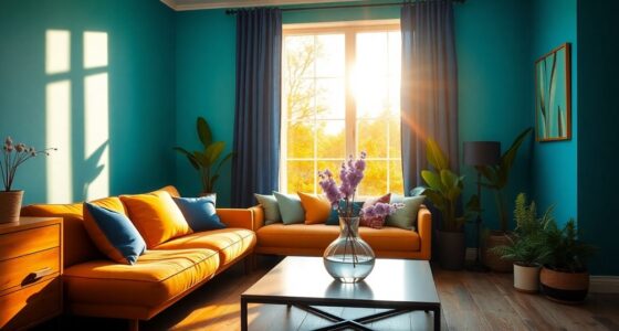
Have you ever wondered why some colors in your home instantly feel more luxurious than others? It’s not just about choosing a shade from a paint swatch; it’s about understanding how certain colors evoke a sense of elegance and sophistication. When you leverage luxury color palettes, you’re tapping into hues that naturally exude richness and depth. These palettes often include deep, muted tones like navy, charcoal, emerald green, and warm metallics. They’re carefully curated to create a refined atmosphere that feels upscale and timeless. Incorporating these colors into your space can elevate your entire decorating scheme, making even simple furnishings appear more opulent.
Luxury colors evoke elegance; deep, muted tones and metallics create timeless sophistication and opulence in any space.
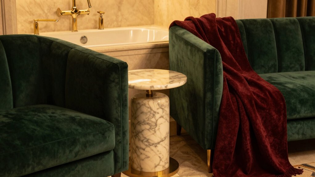
Sophisticated decorating schemes rely heavily on color choices that convey a sense of exclusivity and class. Rather than opting for bright, playful shades, you gravitate toward hues that have a subdued, muted quality. Think of matte finishes and velvety textures that complement the colors, adding a tactile layer of luxury. When you select a color palette rooted in sophistication, you’re intentionally choosing shades that are versatile and classic, avoiding trends that quickly fade. These colors often have undertones—like a hint of gold or silver—that subtly catch the light, creating a dynamic and layered look. Additionally, understanding how luxury color palettes are curated can help you select hues that are inherently more timeless and elegant. Recognizing how color theory influences the perception of luxury can further refine your choices and elevate your home’s aesthetic. Incorporating color psychology can also enhance the ambiance, making your space feel even more refined.
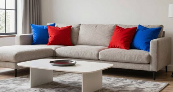
The way you pair colors also influences how expensive they feel. Combining deep, rich hues with neutral tones like beige, cream, or soft gray creates a balanced, harmonious look that reads as polished and expensive. When you use these colors in your furniture, accessories, and walls, you craft a cohesive environment that feels curated rather than cluttered. Metallic accents, such as gold or bronze fixtures, further enhance the sense of luxury, reflecting light and adding a subtle glow. The key is moderation—using high-quality materials and finishes with your chosen color palette guarantees that the overall effect is refined.
Lighting plays an essential role in making these colors feel even more expensive. Soft, warm lighting enhances the richness of your luxury color palettes, emphasizing their depth and complexity. Avoid harsh, bright lights that can wash out the subtlety of sophisticated hues. Instead, opt for layered lighting—table lamps, sconces, and dimmable fixtures—that highlight your color choices and create a cozy, inviting ambiance. When you master the art of combining color, texture, and lighting, your home naturally radiates an air of exclusivity, making even simple spaces feel like high-end interiors.

Alerfa Green Brown Floral Throw Pillow Cover 20 x 20 Inch Cut Velvet Sqaure Luxury Decorative Pillow Cover for Couch Living Room Bedroom
- Package Includes: 1 Pillow Cover (Insert not included)
- Size: 20 x 20 inches with slight deviation
- Material: Cut velvet for a luxurious feel
As an affiliate, we earn on qualifying purchases.
As an affiliate, we earn on qualifying purchases.
Frequently Asked Questions
How Do Lighting Choices Affect the Perception of Color Expense?
Lighting choices markedly influence how you perceive color expense by enhancing color psychology and material textures. Warm, soft lighting makes luxurious colors appear richer and more inviting, while bright, cool lighting can diminish their perceived value. By carefully selecting lighting that complements and highlights your material textures and color palette, you create an upscale atmosphere that feels both sophisticated and expensive. Proper lighting elevates your decor’s overall perception effortlessly.
Can Accessories Influence the Perceived Value of a Color?
Accessories can profoundly influence how valuable a color feels, like the finishing touches on a masterpiece. By thoughtfully coordinating accessories, you harness color psychology to elevate the overall look. Well-chosen pieces complement and enhance your color palette, making it appear more sophisticated and expensive. When your accessories match or contrast intentionally, they create a cohesive, polished space that amplifies the perceived value of your color choices, giving your home a luxurious feel.
Do Interior Layout and Furniture Impact Color Sophistication?
Yes, your interior layout and furniture considerably impact color sophistication. Using thoughtful color psychology, you can choose shades that evoke elegance or luxury. Complement these with material textures like velvet, marble, or polished wood to enhance the perceived value. A well-arranged layout with carefully selected furniture creates a cohesive, upscale look, making colors appear more refined and expensive. Your choices influence how sophisticated and high-end your space feels.
How Does Color Saturation Impact Its Perceived Cost?
When you choose highly saturated colors, you make your space feel more luxurious because color purity and shade richness catch the eye. Bright, vivid hues often seem more expensive than muted tones, as they convey confidence and sophistication. Conversely, desaturated or dull colors can appear cheaper. So, by playing with saturation levels, you control your room’s perceived cost—bold, rich shades elevate the ambiance instantly.
Are There Cultural Factors That Make Certain Colors Seem More Expensive?
Yes, cultural factors influence how you perceive a color’s expense. Cultural symbolism and regional preferences shape your views; for instance, gold often symbolizes wealth in many cultures, making it seem more luxurious. Similarly, certain hues like deep reds or vibrant blues may be more expensive-looking depending on your cultural background or regional tastes. These factors can make some colors feel inherently more costly and sophisticated to you.
Conclusion
Ultimately, choosing the right colors can subtly elevate your home’s ambiance, hinting at a touch of refinement without overt grandeur. When you embrace deep, rich hues or soft, sophisticated shades, you invite a sense of quiet luxury that’s felt rather than seen. Think of your space as a carefully curated garden—each color a gentle bloom, whispering elegance and warmth. With thoughtful choices, your home can radiate an understated charm that feels both inviting and effortlessly refined.