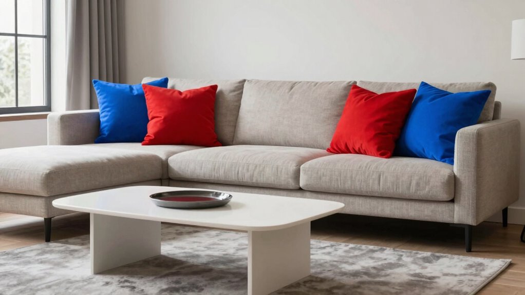
Suppress your accent color’s loudness with simple adjustments to hue, saturation, and surrounding tones to create a balanced and calming space.
Browsing Category
Color and Style Guides
163 posts
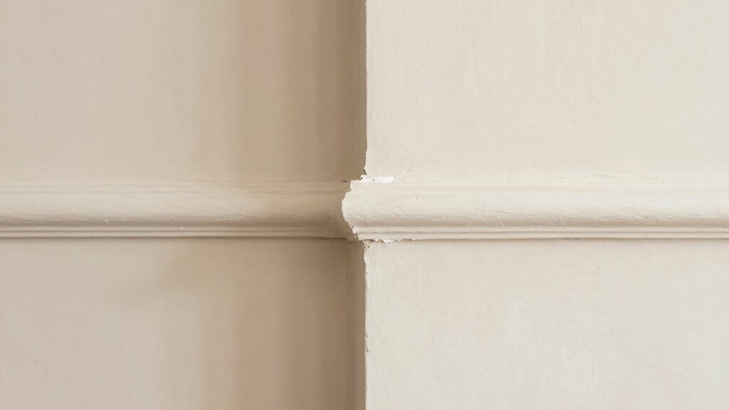
Trim Color Mistakes That Make Walls Look “Off”
Trim color mistakes that make walls look “off” can disrupt your room’s harmony—discover how to choose the perfect shade for a flawless finish.
Greige, Beige, Taupe… Here’s the Difference (Finally)
Ongoing confusion about greige, beige, and taupe ends here—discover how to distinguish these neutral shades and choose the perfect hue for your space.
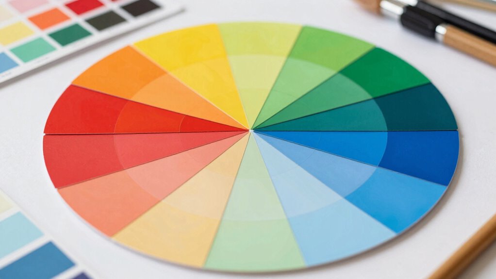
The Color Wheel Trick That Makes Matching Easy
Have you ever struggled with color matching? Discover how the color wheel trick simplifies choosing harmonious or contrasting palettes effortlessly.
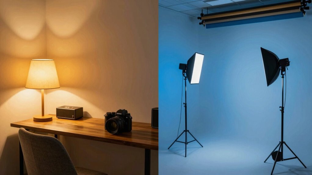
Warm vs Cool Lighting: The Cheat Sheet Designers Use
Navigating warm versus cool lighting can transform your space—discover the key differences designers rely on to create perfect ambiances.
Stop Guessing: How to Test Paint Samples Without Regret
Meta description: “Master how to test paint samples without regret and discover the essential tips that will ensure your perfect color choice—don’t miss out on these expert strategies.
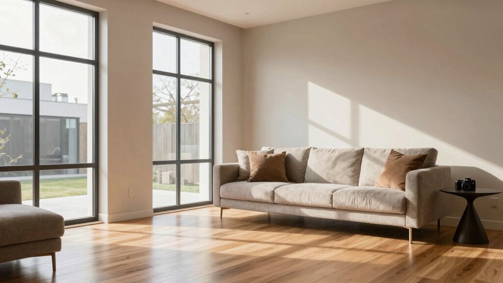
LRV Explained: The Number That Predicts a Room’s Brightness
Discover how LRV influences your room’s brightness and ambiance—learn why this number can make all the difference in your space.
Undertones Exposed: Why Your “Gray” Looks Purple at Night
Theories behind your “gray” lipstick turning purple at night reveal how lighting and undertones influence color perception. Continue reading to uncover the full explanation.
Choosing a Cohesive Palette for Holiday Decor
Unlock the secrets to choosing a cohesive holiday color palette that transforms your space into a harmonious festive haven.
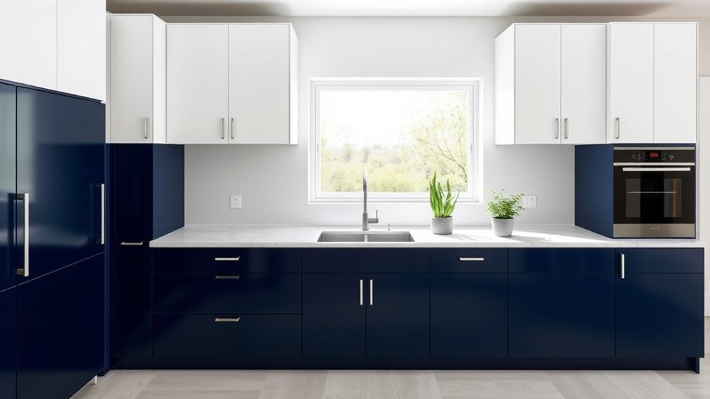
Two‑Tone Kitchen Cabinet Ideas
Here’s a captivating way to upgrade your kitchen with two-tone cabinets that will leave you inspired to explore endless stylish options.