
To rock maximalist color strategies, start by embracing bold color blocking with contrasting hues that reflect your personality. Choose a cohesive palette with harmony and balance bright shades with neutral anchors to prevent overwhelm. Layer patterns and textures for depth, creating visual interest. Begin with a small palette and expand gradually, practicing thoughtful combinations. Keep exploring these vibrant ideas, and you’ll discover more ways to craft eye-catching, confident looks that truly stand out.
Key Takeaways
- Use bold, contrasting colors through color blocking to create eye-catching, statement-making outfits.
- Select a cohesive, vibrant color palette to maintain balance and confidence in maximalist styling.
- Layer patterns and textures for visual depth and tactile interest, mixing prints and fabrics intentionally.
- Ground bright hues with neutral shades to prevent overwhelming the look and ensure visual harmony.
- Start with a limited color palette and expand gradually to build confidence and cohesive maximalist looks.
Embrace the Power of Color Blocking
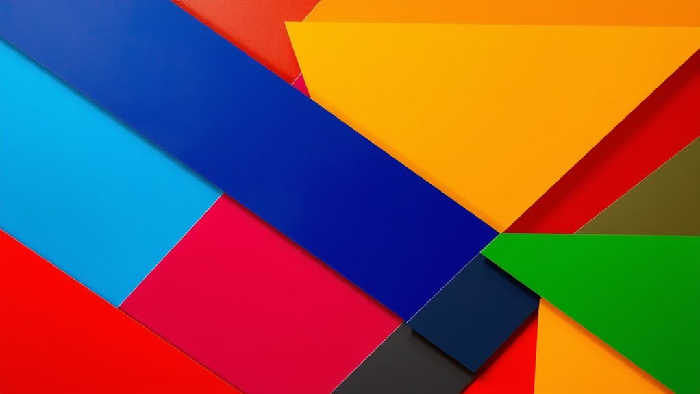
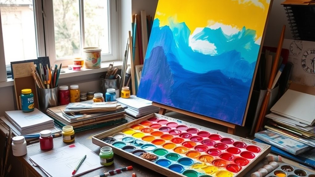
Color blocking is one of the boldest ways to make a statement with your wardrobe, and when done right, it can instantly elevate your style. It all begins with color mixing—pairing contrasting hues to create eye-catching combinations. Understanding color psychology helps you choose shades that evoke the right emotions and set the tone for your look. Bright reds and yellows can energize your outfit, while cool blues and greens convey calmness and confidence. Focus on balancing your colors to avoid overwhelming your ensemble. By mastering color blocking, you harness the power of visual impact and personal expression. Use bold, solid colors to highlight your best features and make a confident statement. With practice, color blocking becomes your secret weapon for a striking, memorable wardrobe. Additionally, incorporating knowledge of personality traits can help you select colors that align with your personality and enhance your overall appearance.
Use a Bold, Cohesive Color Palette
Building on your understanding of bold color combinations, choosing a cohesive palette guarantees your outfit makes a polished statement rather than appearing chaotic. Focus on color harmony to assure the colors work seamlessly together, creating a visually pleasing effect. Stick to a consistent palette by selecting a core set of shades and variations within those hues. This palette consistency helps your look feel intentional and balanced, even with vibrant or contrasting colors. When your colors complement each other naturally, your outfit comes across as deliberate and sophisticated. Use bold shades strategically within this cohesive framework to make a striking impact without overwhelming. By maintaining a unified color palette, you establish a strong, confident style that radiates maximalist flair with clarity. Additionally, understanding best vacuums for dust removal in 2024 can inspire you to choose tools that keep your environment as vibrant and fresh as your wardrobe.
Layer Patterns and Textures for Depth

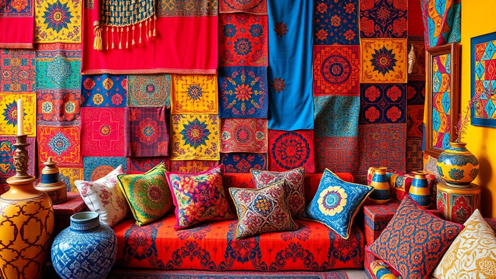
While a bold color palette sets the foundation, layering patterns and textures adds essential depth and visual interest to your look. Use textured fabrics like velvet, boucle, or embroidered textiles to create tactile richness. Mix layered patterns—geometric, floral, or abstract—to add complexity without overwhelming. Combining different textures and patterns keeps the eye engaged and enhances your overall style. For example, pair a patterned silk blouse with a textured leather jacket or layer printed cushions with textured throws. Be intentional with your choices; contrast textures to highlight each element. This approach allows your vibrant colors to stand out even more, giving your space or outfit a curated, dynamic feel. Understanding the divorce process can also inspire you to embrace change and create new beginnings. Embrace the mix, and let textures and layered patterns make your maximalist vision come alive.
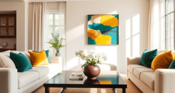
Balance Bright Hues With Neutral Anchors
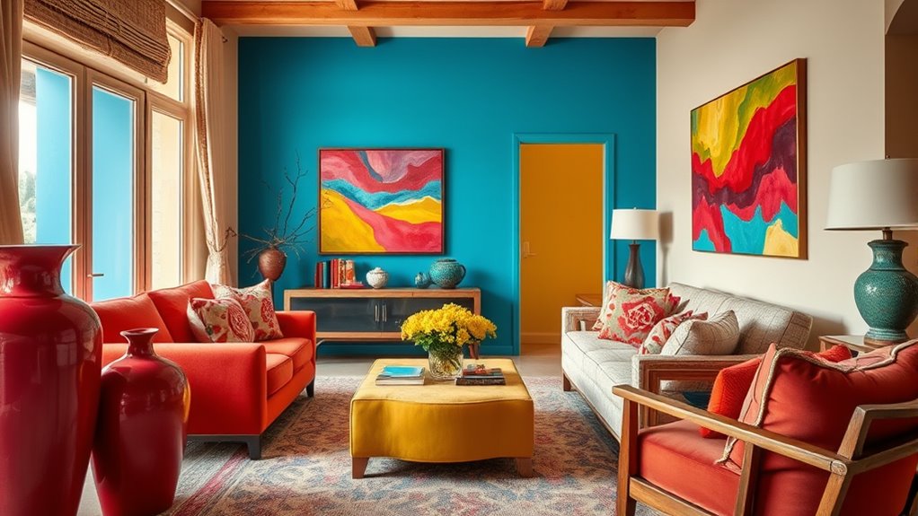
After layering bold patterns and textures, it’s important to ground your look with neutral anchors. Neutral shades like beige, gray, or soft whites create a foundation that balances bright hues, ensuring your space feels cohesive rather than overwhelming. This approach enhances color harmony by allowing vivid colors to stand out without clashing. Neutral elements serve as visual anchors, providing a calm backdrop that guides the eye and maintains visual equilibrium. By strategically incorporating these subdued tones, you prevent your design from becoming chaotic while still embracing maximalist vibrancy. The key is to use neutral anchors thoughtfully, so your bright colors pop effortlessly without competing for attention. Incorporating neutral color schemes can also help achieve a more polished and sophisticated look. This balance keeps your space lively yet harmonious, reflecting a confident and curated maximalist style.
Start Small and Gradually Expand Your Palette
Starting with a limited color palette allows you to confidently incorporate bold hues without feeling overwhelmed. Using basic principles of color theory, you can create visual harmony by choosing colors that complement each other. Begin by selecting a few core shades and observe how they interact in your space or design. As you gain confidence, gradually introduce new colors, ensuring they enhance rather than clash with your existing palette. This slow expansion helps you understand how different hues work together and prevents visual chaos. Remember, mastering maximalist color strategies doesn’t mean filling every space at once; it’s about thoughtful layering. Over time, your palette will grow richer, and your sense of visual harmony will become more intuitive and refined. Incorporating color combinations that work well together will make your maximalist approach both vibrant and cohesive.
Frequently Asked Questions
How Do I Choose Colors That Complement Each Other Effectively?
When choosing colors that complement each other, start with the color wheel to identify complementary hues, which sit opposite each other. You can create vibrant contrasts by pairing these hues, making your design pop. Trust your eye—if the colors look pleasing together, they work. Experiment with different combinations, and don’t be afraid to adjust shades slightly to find the perfect balance that enhances your overall aesthetic.
What Are Common Mistakes to Avoid With Maximalist Color Schemes?
Think of your space as a vibrant garden—without careful tending, chaos can take root. Avoid common mistakes like color clash, where hues fight for attention, and overuse of patterns, which can drown the eye. Keep balance in mind; too many bold colors or excessive patterns overwhelm the senses. Instead, let your palette breathe, creating harmony that invites curiosity without overwhelming, ensuring your maximalist vision remains bold yet refined.
Can Maximalist Color Strategies Work in Small Spaces?
You might wonder if maximalist color strategies can work in small spaces. The answer is yes, if you use techniques like color blocking and accent walls wisely. Bright hues can make a space feel lively without overwhelming it, especially when applied to one wall or specific areas. Keep the palette cohesive and balance bold colors with neutral accents to avoid clutter, creating a vibrant yet harmonious small space.
How Do I Maintain Harmony Without Overwhelming the Senses?
Balancing boldness and subtlety, you can masterfuly manage maximalist color strategies by focusing on color balance and visual cohesion. Keep larger elements in neutral hues to ground the space, then add pops of vibrant, coordinated colors through accessories or artwork. This creates harmony without chaos, allowing your space to feel lively yet livable. By carefully controlling contrasts and maintaining a unified palette, you preserve harmony while showcasing your vibrant personality.
Are There Specific Tools or Apps to Help Plan Color Combinations?
You’re asking if there are tools to help plan color combinations. Absolutely! You can use digital color tools and color palette generators to easily experiment with different hues and create harmonious combinations. These apps let you visualize your color schemes in real-time, making it simple to balance bold and subtle shades without feeling overwhelmed. They’re perfect for ensuring your maximalist approach remains vibrant yet cohesive.
Conclusion
Remember, Rome wasn’t built in a day, and your color mastery won’t be either. Embrace bold choices gradually, layering and balancing hues to create stunning, vibrant looks. Trust your instincts, stay playful, and don’t be afraid to experiment. With patience and confidence, you’ll turn your space or wardrobe into a lively masterpiece. After all, the sky’s the limit when you release the power of color—so go ahead and make your boldest statement yet!