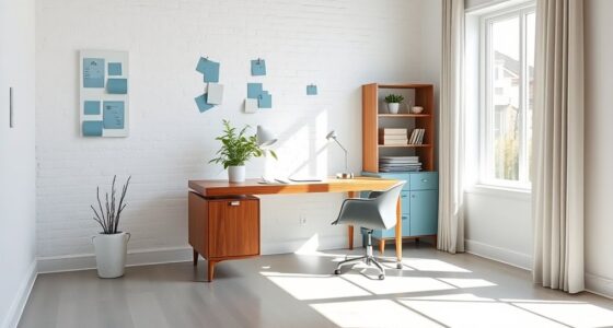
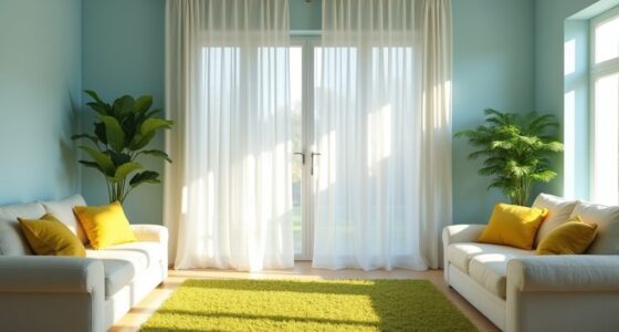
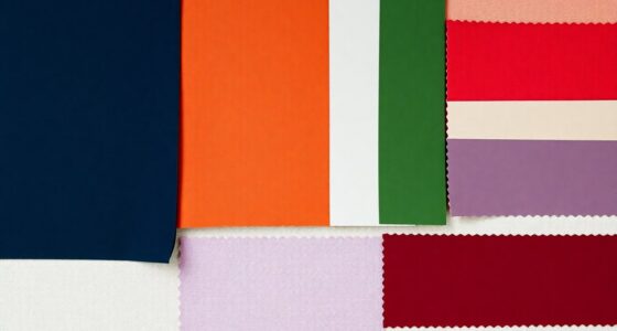
To expand your industrial chic palette beyond gray, try incorporating warm earth tones like rust, terracotta, and wooden finishes for a cozy feel. Add vibrant accent walls in bold hues such as deep red, electric blue, or sunny yellow to create focal points. Rich jewel tones like emerald or sapphire can add sophistication, while metallic accents like brass or copper provide contrast and texture. Soft pastels can also soften rugged elements. Keep exploring to discover more ways to balance bold and neutral tones effortlessly.
Key Takeaways
- Incorporate warm earth tones like rust, terracotta, and wooden finishes for a cozy industrial vibe.
- Use vibrant colors such as deep reds, electric blues, and bright yellows to create bold focal points.
- Add rich jewel tones like emerald, sapphire, and amethyst to introduce depth and luxury.
- Combine metallic accents like brass or copper with colorful elements for layered visual interest.
- Use soft pastels and neutral tones to balance vibrant hues and soften raw industrial features.
Embracing Warm Earth Tones in Industrial Spaces
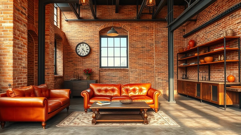
While industrial spaces often feature cool, metallic hues, incorporating warm earth tones can create a more inviting and balanced environment. You can achieve this by choosing warm-colored industrial lighting that softens the harshness of metal fixtures. Adding warm tones to your warehouse shelving, like rust-colored or wooden finishes, introduces a cozy contrast to the metallic backdrop. These earth tones complement exposed brick walls and concrete floors, making the space feel less sterile. You might also consider incorporating accessories or furniture in warm hues to enhance the overall aesthetic. The key is to blend these tones seamlessly with your existing industrial elements, creating a space that feels both functional and welcoming without sacrificing the raw, rugged charm that defines industrial design. Incorporating color harmony principles can help achieve a cohesive and aesthetically pleasing look.
Vibrant Accent Walls for a Bold Statement
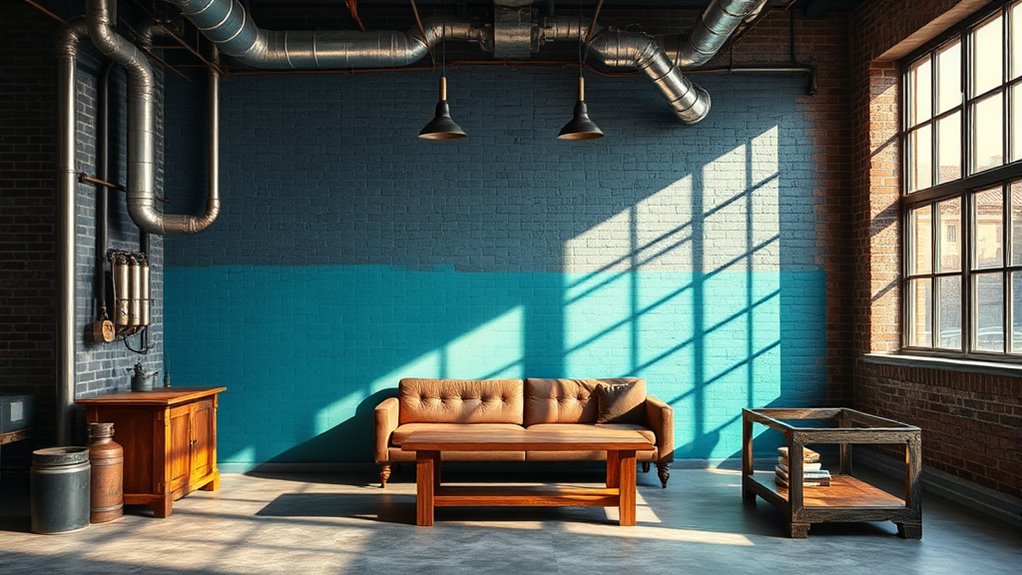
Choosing the right vibrant color can instantly energize your space and create a focal point. You’ll want to balance bold hues with neutral tones to keep the look cohesive and inviting. Think carefully about placement to maximize impact without overwhelming the room. Incorporating attention in creative practice can help you stay focused and intentional in your color choices.
Choosing Eye-Catching Colors
If you want your space to stand out, selecting vibrant accent wall colors can instantly create a focal point that captures attention. Use color psychology to choose shades that evoke energy, creativity, or calm, depending on your mood. To guarantee a professional look, master paint application techniques like proper surface prep and even brush strokes. Consider these tips: 1. Pick bold hues like deep red, electric blue, or bright yellow to energize the room. 2. Use contrasting or complementary colors to enhance visual impact. 3. Test samples first, observing how natural and artificial light influence the shade. Incorporating an understanding of relationship dynamics can also help you create a space that fosters positive interactions and emotional well-being.
Balancing Bright and Neutral
Balancing vibrant accent walls with neutral surroundings creates a striking yet harmonious look that prevents the space from feeling overwhelming. Using color psychology, choose bold hues that energize or soothe, depending on your desired atmosphere. For example, deep blues evoke calm, while fiery reds add vibrancy. When applying color, start with small areas or partial walls to test how the shade interacts with your neutral palette. Techniques like tape borders or color blocking help create clean lines and precise edges. Keep the neutral tones in furniture, flooring, or larger walls to serve as a visual anchor, allowing the accent to stand out without overpowering. Incorporating color psychology principles can help you select hues that evoke the desired emotional response. This balance ensures your space feels lively yet cohesive, making your vibrant statement both impactful and inviting.
Placement for Maximum Impact
To maximize the impact of a vibrant accent wall, focus on strategic placement within your space. First, choose a wall that naturally draws attention, such as behind your sofa or main entryway. Second, consider window placement; avoid placing the accent wall opposite large windows to prevent glare and maintain visual balance. Third, plan artwork positioning carefully—hang key pieces at eye level on or near the accent wall to enhance its boldness. These steps ensure your vibrant color becomes a focal point rather than competing with other elements. Additionally, understanding lighting conditions can influence how the color appears throughout the day, ensuring your accent wall remains striking in different lighting. By thoughtfully selecting the wall, considering natural light, and aligning artwork, you create a cohesive, striking feature that elevates your industrial chic style.
Incorporating Deep Blues and Navy Hues
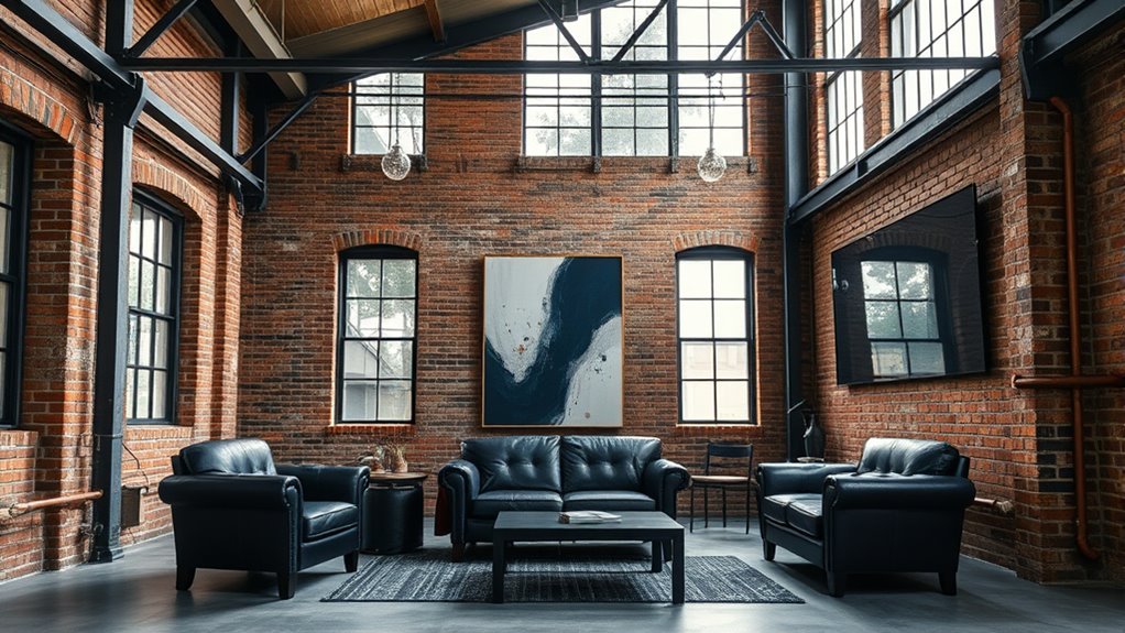
Deep blues and navy hues add a sophisticated touch to industrial chic spaces, creating a striking contrast against raw materials like exposed brick and metal. These rich shades enhance wall textures, making them stand out while maintaining a sleek, modern vibe. To maximize their impact, consider lighting effects that highlight the depth of these colors, such as warm ambient or focused task lighting. Incorporate deep blue or navy on accent walls, cabinetry, or textiles to bring a refined yet edgy feel to your space. Use the table below for inspiration on how to blend these hues seamlessly. Additionally, selecting high-quality Vetted paints ensures long-lasting color vibrancy and durability, helping to preserve your design choices over time.
| Element | Color Application | Tip |
|---|---|---|
| Walls | Navy accent wall | Use matte finish for sophistication |
| Furniture | Deep blue sofas | Pair with metallic accents |
| Wall textures | Exposed brick with navy trim | Highlight with directional lighting |
| Lighting effects | Warm LED spotlights | Emphasize wall textures and hues |
Brightening up With Sunny Yellows and Mustard Shades
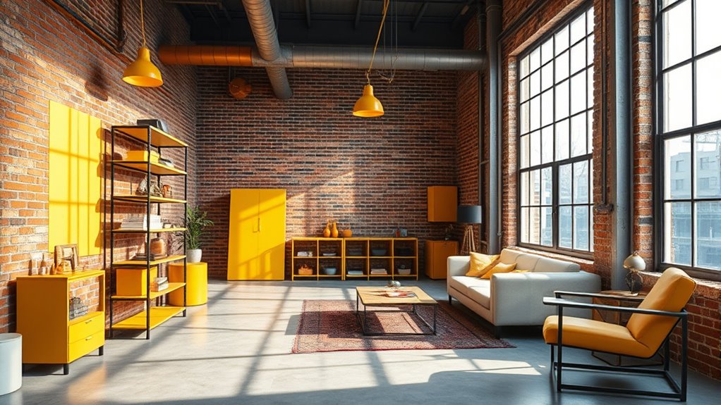
Sunny yellows and mustard shades instantly energize your industrial spaces, making them feel brighter and more inviting. Pairing these vibrant hues with raw metal or exposed brick enhances the industrial vibe while adding a cheerful touch. This combination creates a lively atmosphere that balances rugged elements with a pop of warmth. Incorporating color harmony helps to create a cohesive and appealing look that seamlessly blends bold hues with industrial textures.
Energizing Spaces Instantly
Bright yellows and mustard shades instantly energize any space, transforming dull areas into vibrant, lively environments. These colors tap into color psychology, boosting positivity and creativity. Cultural influences also shape how you perceive and use these hues; in some cultures, yellow symbolizes happiness, while in others, it signifies caution. To maximize their impact: 1. Use yellow accents to create focal points and uplift moods. 2. Pair mustard shades with darker tones for a sophisticated, energetic vibe. 3. Incorporate yellow in lighting or accessories to instantly brighten spaces. Additionally, incorporating color psychology principles can help you select the right shades to evoke specific emotions and atmosphere.
Pairing With Industrial Elements
Pairing sunny yellows and mustard shades with industrial elements creates a dynamic contrast that energizes any space. These vibrant hues brighten up raw materials like exposed brick, metal fixtures, and concrete surfaces. Incorporate artistic murals with bold yellow accents to add personality and visual interest, transforming stark walls into focal points. Floral patterns in mustard tones soften the gritty industrial vibe, creating a balanced mix of rugged and refined. Use yellow accessories or artwork to inject warmth and optimism, making the space feel inviting. Combining these colors with industrial features results in a lively, modern aesthetic that’s both stylish and approachable. Whether in a living room, office, or café, this pairing elevates industrial design with a cheerful, unexpected splash of color. Additionally, integrating vertical storage solutions can help maintain an organized and clutter-free environment, enhancing the overall aesthetic and functionality of the space.
Using Rich Jewel Tones for Sophistication
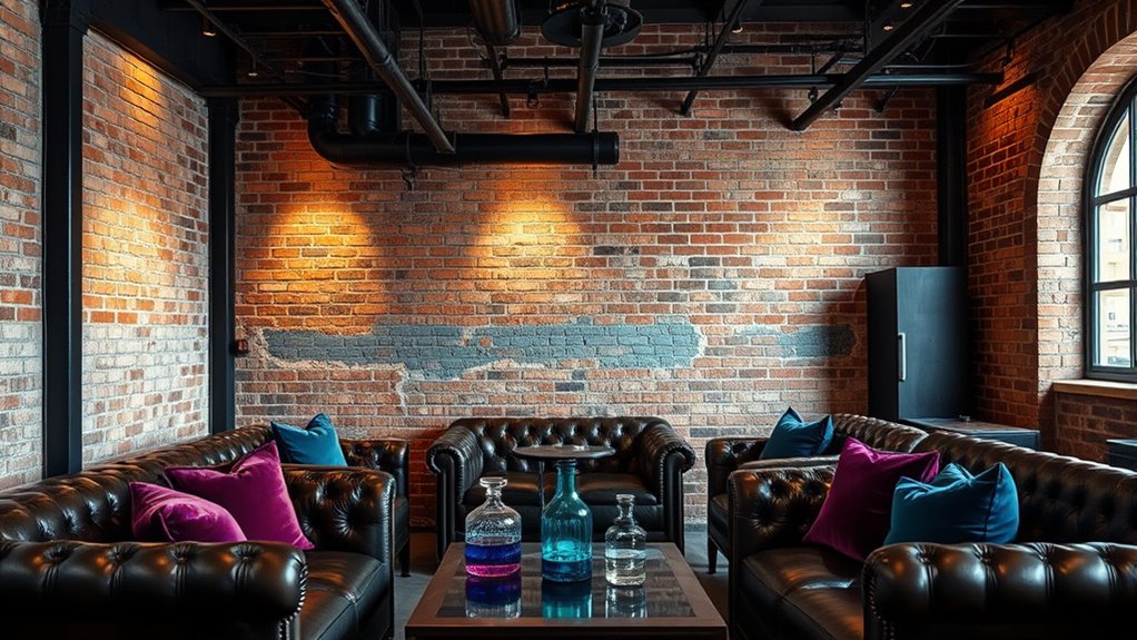
Rich jewel tones instantly elevate your industrial space, adding a layer of sophistication that contrasts beautifully with raw materials like metal and concrete. These gemstone-inspired palettes bring depth and richness, making your environment feel luxurious. To incorporate these colors effectively, consider:
- Using luxury upholstery in emerald, sapphire, or amethyst to create focal points and plush textures.
- Painting accent walls with deep ruby or topaz shades to add warmth and visual interest.
- Accessorizing with jewel-toned decor—like cushions, vases, or artwork—to subtly enhance the overall aesthetic.
- Incorporating local resources to find high-quality fabrics and accessories that complement your color scheme.
Popping Bright Reds and Oranges for Energy

Adding popping bright reds and oranges injects instant energy into your industrial space, transforming it from subdued to vibrant. These bold hues tap into color psychology, evoking feelings of excitement and passion, which can stimulate productivity and creativity. Bright reds and oranges create a lively energy flow that keeps the space dynamic and engaging. Use these colors sparingly on accent walls, furniture, or decor to prevent overwhelming the environment. Their warmth contrasts beautifully with the raw, cool tones typical of industrial design, adding a lively focal point. When you incorporate these shades thoughtfully, they serve as visual cues that energize the space without sacrificing its industrial charm. Ultimately, reds and oranges are your go-to choices for infusing any area with vitality and vigor.
Combining Metallic Accents With Colorful Elements

You can create striking contrasts by balancing metallic shines with vibrant colors, ensuring neither overpowers the other. Pairing complementary hues, like teal with warm copper, enhances visual interest without clashing. Incorporate textured metal accents, such as brushed silver or matte brass, to add depth and sophistication to your colorful space.
Balancing Shine and Hue
Balancing shine and hue involves skillfully pairing metallic accents with vibrant colors to create a cohesive and dynamic space. You can achieve this by considering how metallic finishes reflect light and complement bold hues. Use these tips:
- Stick to monochrome palettes with metallic accents to keep the look sleek and unified.
- Leverage color psychology to select hues that evoke desired emotions, like warm reds or calming blues.
- Limit metallic elements to key areas, ensuring they enhance rather than overpower the vibrant colors.
Complementary Color Pairings
Integrating metallic accents with colorful elements creates a striking and harmonious visual effect that elevates any space. Using color theory, you can pair metallics like gold or copper with bold hues such as teal or coral to create vibrant contrasts. These combinations grab attention and add energy, while also balancing the metallic’s reflective quality. Color psychology plays a role here—warm metallics paired with lively colors evoke feelings of warmth and excitement, making your space feel inviting. Conversely, cooler metallics like silver combined with serene blues or greens promote calmness and sophistication. By understanding these principles, you can craft a dynamic palette that enhances your industrial chic aesthetic, blending metallic accents with colorful elements for a space that’s both lively and cohesive.
Textural Metal Accents
Textural metal accents add depth and tactile interest to colorful elements in industrial chic spaces. They create a dynamic contrast that highlights vibrant hues while maintaining the raw, edgy feel of industrial chic finishes. By incorporating these accents, you can elevate your design with subtle sophistication. Consider these ideas:
- Use matte or brushed metals like copper or brass for picture frames or hardware to add warmth.
- Incorporate textured metal lighting fixtures to draw attention and add visual complexity.
- Combine colorful upholstery or decor with distressed metal furniture for a layered, industrial look.
These textural metal accents balance color and material, enriching your space with tactile variety and visual interest, all while embracing the industrial chic aesthetic.
Soft Pastels to Add Subtle Color Touches
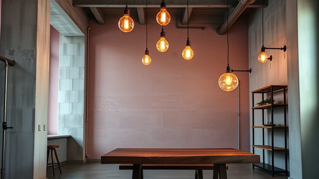
Soft pastels are perfect for adding subtle color touches that brighten industrial spaces without overwhelming their raw aesthetic. You can incorporate pastel wall accents to create focal points that soften exposed brick or concrete walls. These gentle hues, like blush pink, mint green, or powder blue, work well within subtle color palettes, maintaining the industrial vibe while introducing a touch of warmth. Using pastels allows you to keep the space feeling airy and inviting without clashing with the neutral tones typical of industrial design. They’re ideal for small areas, such as nooks or corners, where a hint of color can make a significant impact. Overall, soft pastels provide a delicate balance, blending the ruggedness of industrial elements with subtle, calming shades.
Colorful Furniture and Decor Pieces
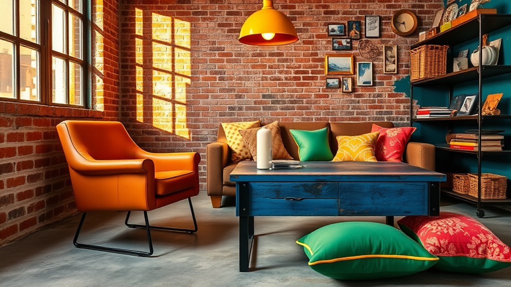
Adding colorful furniture and decor pieces can instantly energize an industrial space, creating visual interest amid the raw materials. Incorporate vibrant textiles, such as cushions or throws, to add warmth and texture. Bold artwork on the walls brings personality and contrast, breaking up the neutral tones. To maximize impact, consider these options:
- Use a statement sofa or chairs in bright hues to serve as focal points.
- Incorporate bold artwork with vivid colors to draw attention and add depth.
- Combine vibrant textiles with metallic or wooden furniture pieces for a balanced look.
These elements make your space lively without overwhelming the industrial aesthetic. The key is to select pieces that complement the raw materials while adding a pop of color. This approach keeps your space dynamic and inviting.
Balancing Bright Colors With Neutral Foundations
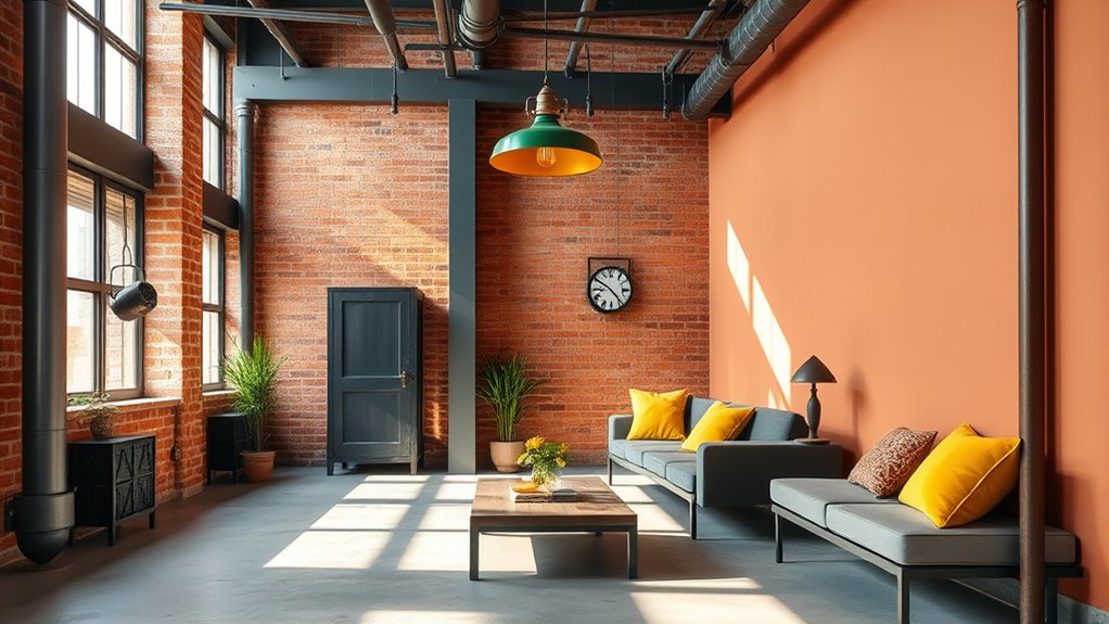
While vibrant furniture and artwork inject energy into an industrial space, maintaining balance is key to creating a cohesive look. Using neutral foundations like concrete, black, or white helps ground bright colors, preventing overwhelming chaos. Color psychology plays a role here; neutral tones evoke calm, allowing vivid hues to stand out without clashing. When applying color, consider techniques like accent walls or accessories to introduce pops of brightness strategically. You might choose a bold yellow or rich teal as focal points, balanced by neutral walls and flooring. This approach ensures your space feels lively yet harmonious. Proper color application techniques—such as pairing contrasting shades or using muted tones alongside brights—help you achieve a vibrant, yet balanced industrial aesthetic.
Frequently Asked Questions
How Can I Incorporate Industrial Chic Colors Into Small Spaces?
You can incorporate industrial chic colors into small spaces by using metal accents like fixtures or decor to add an edgy touch. Opt for textured walls with concrete or brick finishes to create depth without overwhelming the room. Keep the color palette simple with dark hues or warm neutrals, and balance bold elements with lighter tones. This approach enhances the industrial vibe while maintaining a cozy, stylish atmosphere in your small space.
What Are Some Eco-Friendly Paint Options for Industrial Color Schemes?
When choosing eco-friendly paints for your space, look for sustainable color options that minimize environmental impact. Eco-friendly paints, like those made with low or zero VOCs, are great choices. They help reduce indoor air pollution while offering vibrant, industrial-inspired hues. You can find sustainable color options in brands that prioritize natural ingredients, ensuring your industrial aesthetic remains stylish and eco-conscious without compromising on color quality or safety.
How Do Lighting Choices Affect Industrial Color Aesthetics?
Lighting effects play a vital role in shaping your space’s ambiance and highlighting color harmony. You can use warm, cool, or neutral lighting to enhance different tones and textures, emphasizing industrial design elements. Proper lighting choices can create contrast, evoke mood, and make your colors pop or soften. By carefully selecting lighting, you guarantee your industrial aesthetic feels cohesive and visually striking, maximizing the impact of your color scheme.
Can Industrial Colors Be Suitable for Residential Bedrooms?
You can definitely use industrial colors in residential bedrooms, as they create a bold, modern vibe. Industrial color psychology suggests these hues evoke strength and sophistication. To make them work, focus on industrial color palette coordination, blending these shades with softer accents or warm lighting. This balance guarantees your bedroom feels inviting rather than cold, allowing you to enjoy a stylish space that reflects an industrial aesthetic.
What Are Tips for Maintaining Vibrant Industrial Colors Over Time?
Think of your vibrant industrial colors as a reflection of resilience—bright and bold, yet needing care. To maintain their vibrancy over time, you should use gentle cleaning techniques and avoid harsh chemicals that accelerate color fading. Regular dusting and spot cleaning help preserve their richness, much like nurturing a lasting bond. With proper upkeep, your industrial palette stays striking, symbolizing strength and character in your space.
Conclusion
Now that you’ve explored these vibrant industrial chic colors, it’s time to get creative. Mix warm earth tones with bold accents, and don’t shy away from jewel tones or pastels for a truly unique space. Think of your home as a modern-day Versailles—rich, layered, and full of personality. With a little daring, you’ll transform your industrial space into a stunning, stylish haven that’s anything but dull. Let your color palette be your masterpiece!

