TL;DR

Get furniture and decor delivered free with Prime
- Fast, free delivery on millions of items
- Prime Video, Amazon Music and more included
- Member-only deals all year
House Beautiful’s design report presents 18 color pairings for blue, illustrated through rooms by interior designers and homeowners. The examples range from warm shades such as rust, ochre and peach to cooler choices such as gray, green and lilac; the report offers design guidance, not a universal rule or new research finding.
House Beautiful’s design report highlights 18 colors that designers and homeowners have paired with blue in bedrooms, kitchens, living rooms and other spaces. The examples show a range of approaches—from rust red, golden yellow and orange to green, gray, lilac and more blue—offering readers inspiration rather than a single formula for choosing a palette.
The article’s examples connect color recommendations to specific rooms and design choices. In a San Francisco apartment, designer Caitlin Jones Ghajar paired a warm golden-yellow velvet bed frame with blue chinoiserie wallpaper. In a kitchen designed by Amber Lewis, duck-egg-blue cabinets sit alongside rust-red and cream floor tile; the report identifies the blue as Farrow & Ball’s Light Blue and says it can appear almost gray in softer light.
Other examples use contrast to shape a room’s mood. Black accents add depth to slate-blue cabinetry in a Woodstock, New York, kitchen by Melissa Anderson of OAD Interiors. A bedroom by Serena Dugan uses golden-tan wallpaper to soften indigo accents, while a Santa Fe home by French & French repeats terra-cotta red in bookcases, a rug and chair details against vibrant blue.
The roundup also recommends combinations that stay closer in tone. Its examples include blue with white in a patterned lounge, blue with gray at similar levels of brightness, and a blue sectional paired with a lilac rug. It also points to grass green, chartreuse, peachy pink, mustard, ochre, bronze and brass. The report illustrates each suggestion with a home or room; it does not present controlled testing or claim that the pairings suit every space.
How Color Pairings Change a Room
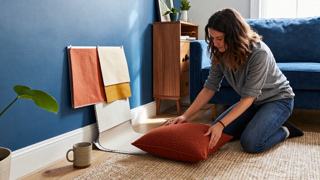
Blue appears in the report across a wide range of interiors, from pale cabinetry to navy kitchens and vivid cobalt walls. The examples show why choosing a companion color can matter: warm hues can add contrast to cool blues, while related shades can create a quieter, more unified scheme. For readers planning a room, the roundup offers concrete examples to compare before selecting paint, wallpaper, furnishings or accessories.
The guidance is practical but subjective. A pairing’s effect depends on the particular shades, materials, lighting and amount of each color in a room. For instance, the report says blue-green chartreuse is used with light blue to temper its brightness, while neutral bedding is suggested to ground a mustard-and-navy guest room. These are design interpretations of pictured rooms, not guarantees that a palette will look the same in another home.
Products Worth Considering

Blueair Blue Pure 211i Max Air Purifier for Large Rooms

Blueair Blue Pure 311i Max Air Purifier

Dyson Airwrap i.d. Multi-Styler for Straight and Wavy Hair
As an affiliate, we earn on qualifying purchases.
Eighteen Palettes, One Base Color
The source is a House Beautiful roundup titled “Designers Say These Are the Best Colors to Pair With Blue in Any Room.” It gathers room examples rather than reporting a new survey, product launch or formal industry study. The examples credit designers including Ghajar, Anderson, Dugan, and the team at French & French, alongside homeowners and projects featured by the publication.
Blue is treated broadly: the rooms include duck egg, slate, light blue, indigo, teal, cobalt and navy. The companion colors also vary, with some recommendations emphasizing contrast—such as burnt orange with bright blue—and others relying on related or repeated shades, such as blue with lilac or a monochrome combination of different blues. The article’s “best” framing is therefore an editorial selection of examples, not a ranked list supported by a stated scoring method.
““This particular kind of blue lends itself really well to the vistas that are beyond, so you get some Bay view looks.””
— Caitlin Jones Ghajar, interior designer, as quoted by House Beautiful
What the Examples Cannot Establish
The roundup does not explain how its 18 combinations were selected or define a measurable standard for “best.” It also does not give a full account of each room’s lighting, dimensions, finishes or color specifications, details that can affect how a palette appears in a different home. The examples are not a controlled comparison, and the article does not claim that every pairing will work in every room.
The supplied report text does not specify its publication date. It also does not provide evidence about how readers respond to the recommendations or whether the featured colors are current sales trends. Those points cannot be established from the examples themselves.
Applying the Ideas at Home
Readers can use the pictured rooms as starting points, then test the specific shades and materials in their own space before committing to a larger change. The report’s examples suggest comparing colors under the room’s usual lighting and considering how much of each shade will appear across walls, floors, furniture and smaller accents. Testing samples in the intended room can help reveal shifts in appearance, such as the reported tendency of Light Blue to look grayer in soft light.
House Beautiful’s article does not announce a follow-up study, product release or scheduled update. Any further guidance would depend on additional reporting or new examples; for now, the published roundup remains a set of attributed design examples and suggestions, rather than a definitive rulebook.
Key Questions
Which colors does the report suggest pairing with blue?
Its examples include goldenrod, rust red, black, chartreuse, golden tan, white, bronze, terra-cotta, mustard, peachy pink, grass green, ochre, gray, dark red, burnt orange, lilac, brass and other shades of blue.
Does the article say one color is best with every shade of blue?
No. The roundup presents multiple combinations in different rooms and does not establish a single best match for every shade, space or lighting condition.
What are some warm colors shown with blue?
The examples include golden yellow, rust red, golden tan, terra-cotta, mustard, ochre and burnt orange. They appear in details such as flooring, wallpaper, upholstery and shower curtains.
Can blue be paired with other cool colors?
Yes. The report includes blue paired with gray, lilac, green and additional shades of blue. Its examples suggest that similar brightness or repeated shades can make a palette feel coordinated, though the result depends on the room.
Are the color recommendations based on a formal study?
The source presents a design roundup with room examples. It does not describe a survey, experiment or scoring system behind its recommendations.
Source: housebeautiful.com