
TL;DR

Get furniture and decor delivered free with Prime
- Fast, free delivery on millions of items
- Prime Video, Amazon Music and more included
- Member-only deals all year
A House Beautiful report describes interior designers using red in kitchens as an alternative to long-popular white, cream and ivory schemes. Designers interviewed say the color can work in small doses or across larger areas when balanced with warm neutrals and textured materials; the report does not establish how widespread the trend is.
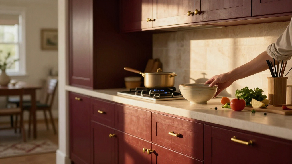
Interior designers interviewed by House Beautiful say they are using red in kitchen projects as an alternative to the cream, ivory and white palettes long common in the room. Their examples range from a burgundy peninsula to red cabinetry, but the report offers design observations and project examples—not data showing how widely the look is spreading.
British interior designer Uns Hobbs told House Beautiful that some homeowners want more personality after years of playing it safe with neutral interiors. Her own kitchen uses deVOL’s Refectory Red, a deeper shade she described as rich and bold while still feeling timeless. Hobbs said she tends to favor deeper reds over brighter tomato tones.
New York architect Aria Jahanshahi and designer Kevin Lichten of Lichten Architects also discussed red kitchens in the report. A city apartment by Opa Architecture, photographed by Hanna Grankvist, uses Benjamin Moore’s Classic Burgundy on a peninsula. Another project pairs bold lower cabinets with gray upper cabinets, a contrast Lichten said helps balance the color.
The designers’ advice centers on proportion and supporting materials. Lichten recommends starting with a smaller application and balancing red with other colors; Jahanshahi says surrounding materials can soften its intensity. Hobbs suggested combinations including warm neutrals, granite, brass, marble, wood floors, vintage art and ceramics. These are the designers’ recommendations, not evidence that a particular palette will suit every kitchen.
Red Adds Options Beyond White
The report points to a change in how some designers approach the kitchen: rather than treating it only as a functional room finished in safe neutrals, they are using color to give the space a more personal feel. Jahanshahi described the kitchen as a place where families gather, work and spend time together, making its appearance part of the wider home design.
For readers planning a renovation, the examples show that choosing red need not mean painting every surface. A single peninsula, lower cabinets or smaller accents can introduce the color while leaving room for neutral finishes. Still, the source does not establish whether red improves a home’s resale value, changes appetite, or has become a broad consumer trend.
As an affiliate, we earn on qualifying purchases.
From Neutral Kitchens to Red
White, cream and ivory have been familiar kitchen choices for years, according to the House Beautiful report. The designers interviewed frame red as a response to that restrained look, with options running from cherry and tomato shades to burgundy and brick. The examples are drawn from individual design projects rather than a survey of homeowners or sales data.
Lichten said red has a strong visual presence, while Hobbs described it as capable of feeling warm and traditional as well as bold. Their comments reflect professional design opinions. The report also mentions the association between red and appetite, including the use of red in some fast-food branding, but does not present evidence that this explains the kitchen trend.
“People have become a little bored with playing it safe and want more personality in their homes.”
— Uns Hobbs, British interior designer
How Broad Is the Red Trend?
The report does not quantify how many designers or homeowners are choosing red, compare kitchen color sales, or establish whether the shift is lasting. It also does not provide a publication date in the supplied material. The projects and comments show that some designers are using the color, but the scale and duration of the trend remain unclear.
Claims about red stimulating hunger are mentioned as context, not tested as an explanation for these design choices. The source does not show that appetite effects, medication use or any other health trend is influencing homeowners’ color decisions.
Watch for More Project Evidence
The source identifies no upcoming survey, product launch or industry milestone that would confirm whether red kitchens are gaining wider popularity. Further reporting would need broader evidence—such as homeowner surveys, design-industry data or additional project examples—to measure whether these designers’ choices reflect a sustained shift.
For now, readers considering the look can compare paint samples in their own lighting and test the color on a limited surface before committing to larger areas. The designers’ guidance is to balance red with warm neutrals and varied materials; the right choice will depend on the room and the homeowner’s preferences.
Key Questions
Are designers replacing neutral kitchens with red?
The House Beautiful report says several interviewed designers are using red in kitchen projects. It does not provide data showing that designers broadly are abandoning neutral palettes.
Which red shades did the designers recommend?
Uns Hobbs said she favors deeper reds, including burgundy, over brighter tomato shades. Kevin Lichten said an earthy red such as Benjamin Moore’s Red Parrot can work, while cautioning against tones that look too artificial.
How can red be added without covering the whole kitchen?
The examples include a red peninsula and bold lower cabinets paired with gray uppers. The designers also suggested using red in smaller doses and balancing it with warm neutrals, wood, stone, brass or ceramics.
Does the report show that red kitchens are becoming more popular?
No. It presents designers’ views and selected projects but gives no survey, sales figures or other measure of how widespread the choice is.
Source: rss
Columbus Day / Indigenous Peoples' Day Picks
long weekend sales
As an affiliate, we earn on qualifying purchases.