
To create contrast without bold colors, focus on playing with light and shadow to add depth and highlight focal areas. Incorporate various textures, combining smooth and rough surfaces, to add visual interest and dimension. Use shape and size differences to guide the viewer’s eye and establish a clear hierarchy. Sticking to monochromatic schemes with varied shades, tints, and tones can also produce subtle contrast. Continue exploring these techniques to master sophisticated, visually engaging designs.
Key Takeaways
- Utilize shades, tints, and tones of a single color to establish subtle contrast and visual interest.
- Incorporate shape and size variations to emphasize focal points without relying on color differences.
- Add diverse textures, such as smooth versus rough surfaces, to create tactile contrast visually.
- Use light and shadow techniques to produce depth and dimension, enhancing visual hierarchy.
- Combine contrasting textures and visual elements to create layered, dynamic designs.

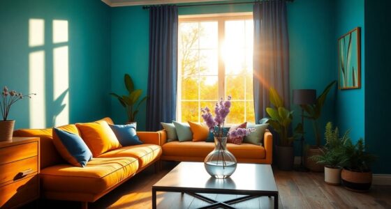
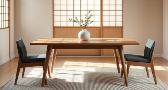
Creating contrast in your design doesn’t always require bold colors; instead, you can rely on other visual elements to make your work stand out. One effective approach is to use monochromatic schemes, which involve varying shades, tints, and tones of a single color. This method creates a harmonious, unified look while still providing contrast through differences in lightness and darkness. For example, pairing a light pastel with a deep, dark hue of the same color can draw attention to specific areas without the need for bright, contrasting colors. Monochromatic schemes are especially useful when you want a subtle yet impactful design that feels cohesive and sophisticated. They allow you to focus on other contrasts, such as texture or shape, to make your elements pop. Additionally, understanding visual hierarchy can help you strategically emphasize key parts of your design without relying on color. Incorporating contrast techniques like varying shapes and sizes can further enhance visual interest and guide the viewer’s eye effectively. For instance, a flat, matte background paired with a glossy, textured focal point creates a visual hierarchy that draws attention naturally. Texture variations are another powerful tool for creating contrast. When colors are similar or subdued, adding different textures can make certain parts of your design stand out. Think about combining smooth surfaces with rough, embossed, or patterned textures. This variation engages the viewer’s sense of touch visually and guides their eye across your composition. For example, using contrasting texture types can emphasize depth and dimension within your work. Furthermore, experimenting with light and shadow can create striking visual effects that enhance contrast without relying on color differences. Texture can also add depth and dimension, making your design appear more layered and interesting. Using visual contrast intentionally can transform a simple monochromatic palette into a dynamic visual experience that captures attention and adds sophistication.
monochromatic color palette art supplies
As an affiliate, we earn on qualifying purchases.
As an affiliate, we earn on qualifying purchases.
Frequently Asked Questions
Can Texture Alone Create Effective Contrast in a Design?
Yes, texture alone can create effective contrast in your design. By incorporating texture variety and material differences, you add visual interest and depth. You might combine smooth surfaces with rough or embossed textures, or mix matte and glossy finishes. These variations draw the eye and highlight different elements, making your design more dynamic without relying on bold colors. Texture is a powerful tool to achieve subtle yet impactful contrast.
How Does Contrast Affect User Experience and Readability?
Contrast greatly impacts user experience and readability by guiding your eye through content. It enhances typography hierarchy and visual hierarchy, making important information stand out. When you create contrast with textures, sizes, or subtle color shifts, you help users easily differentiate sections and understand content flow. Without bold colors, thoughtful contrast ensures your design remains engaging and accessible, making it easier for users to navigate and comprehend your message effortlessly.
Are There Specific Color Combinations That Work Well Without Bold Colors?
You can’t go wrong with monochrome harmony or complementary schemes. Monochrome harmony creates contrast through subtle variations in shades and tints, making your design feel cohesive yet interesting. Complementary schemes, pairing colors opposite each other on the wheel, produce vibrant contrast without bold hues. These combinations are powerful tools that command attention and improve readability, proving you don’t need loud colors to make your message stand out and captivate your audience.
How Can Contrast Be Maintained in Different Lighting Conditions?
You can maintain contrast in different lighting conditions by focusing on lighting harmony and shadow interplay. Adjust your lighting setup to guarantee highlights and shadows remain distinct, regardless of brightness changes. Use diffused lighting for softer contrast or directional lighting for sharper shadows. By observing how light interacts with your elements, you can create balanced contrast that stays effective across various environments, enhancing depth and visual interest without relying on bold colors.
What Are Common Mistakes to Avoid When Creating Subtle Contrast?
Did you know that 85% of successful designs rely on subtle contrast? When creating this, avoid common mistakes like overusing monochrome balance, which can make your design look flat, or disrupting gradient harmony, leading to visual confusion. Keep progressions smooth and maintain a careful balance in shades. Don’t overdo it—subtlety is key. Instead, focus on slight variations that enhance depth without overpowering the overall composition.
Conclusion
By mastering subtle contrasts, you paint your space with gentle whispers rather than shouting colors. Imagine delicate shadows dancing softly alongside muted tones, creating a harmonious balance that invites calm and reflection. When you avoid bold hues, you craft an environment where every detail whispers its story, echoing quiet confidence. Embrace these nuanced differences, and you’ll find your space transforming into a serene canvas, where contrast speaks softly but leaves a lasting impression.