
The color wheel trick makes matching colors easy by using simple schemes like complementary, analogous, and triadic combinations. You can quickly identify contrasting, harmonious, or balanced palettes by visualizing opposite, neighboring, or evenly spaced hues on the wheel. This approach helps you create eye-catching designs and stylish outfits without guesswork. Keep exploring further to discover how to avoid common mistakes and boost your confidence with every color choice.
Key Takeaways
- Use the opposite colors on the wheel for vibrant contrast and eye-catching combinations.
- Select neighboring hues for harmonious, cohesive color schemes.
- Choose three evenly spaced colors for balanced triadic palettes.
- Consider shade variations and real-world testing to ensure color harmony.
- Align color choices with seasonal trends and psychology for impactful designs.
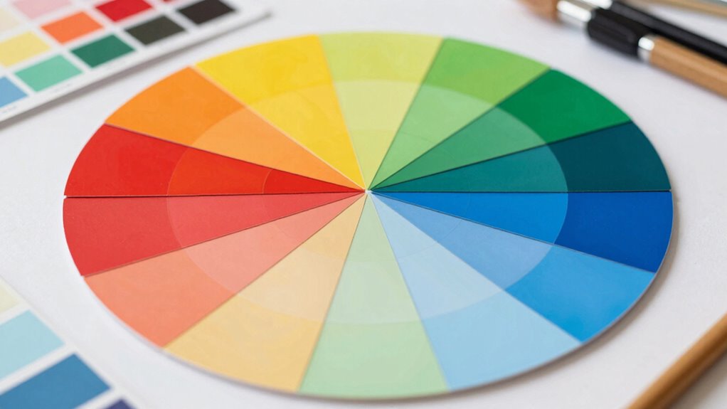
What Is the Color Wheel and How Does It Help You Match Colors?

Have you ever wondered how designers choose colors that look great together? The answer lies in understanding the color wheel and its role in color theory. The color wheel is a visual tool that displays primary, secondary, and tertiary colors arranged in a circle, helping you see how colors relate to each other. It’s essential for achieving color harmony, which is about creating visually pleasing combinations. By understanding the wheel, you can identify which colors complement each other or contrast nicely. This knowledge simplifies the matching process, ensuring your designs look balanced and appealing. Whether you’re picking shades for a room or designing a logo, the color wheel gives you a solid foundation for making confident, harmonious color choices. Understanding color relationships makes it easier to select colors that work well together in any project, especially when considering color harmony principles. Exploring color contrast can further enhance your ability to create dynamic and engaging color schemes. Additionally, learning about color schemes can help you develop more sophisticated and appealing designs. Recognizing how color temperature affects mood and perception allows for more nuanced color matching in your projects.
Quickly Identify Complementary, Analogous, and Triadic Color Schemes

Understanding how to quickly identify different color schemes can make your design process more efficient and effective. Using basic color theory, you can recognize complementary, analogous, and triadic schemes at a glance, ensuring visual harmony in your work. Complementary schemes pair colors opposite each other on the color wheel, creating contrast and vibrancy. Analogous schemes involve neighboring colors, offering a harmonious and cohesive look. Triadic schemes use three evenly spaced colors, delivering balance and visual interest. By mastering these quick identification techniques, you’ll streamline your color selection process, avoid clashing combinations, and produce designs that are both appealing and well-balanced. This skill helps you make informed choices, saving time and enhancing your overall creative output.
The Color Wheel Trick: How to Create Harmonious and Eye-Catching Color Matches

The Color Wheel Trick simplifies creating harmonious and eye-catching color matches by leveraging a straightforward visual method. By understanding basic color theory, you can use the wheel to easily spot complementary, analogous, and triadic schemes that enhance visual harmony. To create stunning combinations:
- Select colors opposite each other for vibrant contrast.
- Use neighboring hues for a cohesive, harmonious look.
- Mix three evenly spaced colors for balanced vibrancy.
This trick helps you quickly visualize how different colors interact, ensuring your choices are both appealing and effective. Whether designing a website, decorating a room, or choosing outfits, mastering this technique empowers you to craft eye-catching arrangements effortlessly. The color wheel becomes your go-to tool for consistent, beautiful color matching.
Common Mistakes to Avoid When Matching Colors Using the Wheel

Many people make the mistake of relying solely on the color wheel without considering context or the actual shades they’re working with, which can lead to mismatched or jarring color combinations. One common error is creating a color clash by choosing hues that don’t complement each other in real life, even if they appear harmonious on the wheel. Avoid overused palettes that can make your design look generic or boring; instead, aim for unique pairings that suit your style or project. Remember, the color wheel offers guidance, but it’s essential to test colors together in your specific setting and lighting. Additionally, understanding color theory principles can help you make more informed decisions beyond just the wheel. Being aware of shade variations ensures that colors work well together in real-world applications rather than just on a flat color chart. Ignoring these factors can result in mismatched outcomes, reducing the overall impact of your color choices.
Boost Your Style: Applying the Color Wheel Trick for Confident Outfits and Designs

While avoiding common mistakes with the color wheel helps you make better choices, applying it confidently can truly elevate your style and design. To do this, leverage color psychology and seasonal color palettes to create harmonious, impactful looks. Start by understanding how colors evoke emotions and influence perception—warm tones boost energy, while cool tones promote calm. Use seasonal palettes to match your outfits or designs to current trends or natural seasons, enhancing your overall aesthetic.
- Combine complementary colors for striking contrast
- Use analogous shades for smooth, cohesive blends
- Incorporate seasonal palettes to stay stylish and relevant
Frequently Asked Questions
Can the Color Wheel Be Used for Digital and Print Color Matching?
Yes, you can use the color wheel for digital and print color matching. You’ll want to guarantee proper digital calibration of your monitor and use accurate color profiles to maintain consistency. The color wheel helps you visualize complementary and analogous colors, making it easier to select harmonious shades across digital screens and print materials. This method streamlines your process, ensuring your colors match perfectly in both mediums.
How Do Lighting Conditions Affect Color Matching With the Wheel?
Lighting conditions substantially impact your color matching using the wheel. Lighting nuances, like warm or cool tones, can alter how colors appear, so you might need to adjust your perception accordingly. Shadow effects can also distort color accuracy, making it harder to match precisely. To get the best results, view your colors under consistent, natural lighting, and be aware of how different lighting environments can influence your color choices.
Are There Color Schemes Suitable for Specific Seasons or Occasions?
You can absolutely find color schemes suited for specific seasons or occasions. Seasonal palettes often feature warmer tones for fall and winter, while spring and summer embrace brighter, more vibrant shades. For occasions, choose occasion-specific colors like elegant pastels for weddings or bold hues for parties. Don’t worry about matching perfectly; trust your instincts and use the color wheel to create harmonious combinations that reflect the mood and setting perfectly.
How Can I Adapt the Color Wheel for Monochromatic Designs?
You can adapt the color wheel for monochromatic harmony by choosing a single hue and exploring its various shades and tints. Use subtle gradient blending to create a seamless shift between light and dark tones, adding depth and interest. Focus on color saturation and value variations, which keep the design cohesive while maintaining visual appeal. This technique guarantees a harmonious, elegant look that’s easy to achieve with the color wheel.
What Tools or Apps Can Assist With Color Matching Using the Wheel?
You can use color matching apps like Adobe Color, Coolors, or Pantone Studio, which are excellent digital color tools. These apps help you find complementary, analogous, or monochromatic schemes effortlessly by exploring the color wheel. Simply upload your images or input your preferences, and they generate matching palettes. They’re perfect for ensuring your colors harmonize, saving you time, and making your design process smoother and more precise.
Conclusion
Remember, beauty is in the eye of the beholder, and the color wheel is your best friend in making confident choices. By understanding how to match colors harmoniously, you’ll effortlessly create eye-catching outfits and designs. Don’t be afraid to experiment and trust your instincts—after all, practice makes perfect. With the color wheel trick up your sleeve, you’re well on your way to mastering color coordination and expressing your unique style.