
To use bold patterns without creating chaos, focus on balance and scale. Choose large, simple designs for small spaces and busier patterns for bigger rooms. Pair bold prints with neutral tones or subtle textures to keep the look grounded. Use them as focal points, like on one wall or a statement piece, and keep other elements calm. If you keep pattern sizes in check and strategically place them, you’ll achieve a lively yet harmonious space. Keep going to learn how to master this art effortlessly.
Key Takeaways
- Use bold patterns as focal points on accent walls or specific areas to highlight without overwhelming the space.
- Balance energetic prints with neutral tones or calming textures to maintain visual harmony.
- Mix large and small patterns strategically to create contrast while preventing clutter.
- Incorporate negative space and limit pattern complexity for a clean, organized look.
- Anchor bold patterns with muted hues and thoughtful placement to achieve a balanced, chaos-free environment.
Choosing the Right Bold Patterns for Your Space
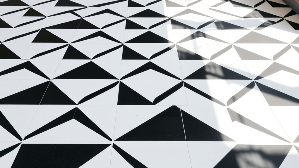
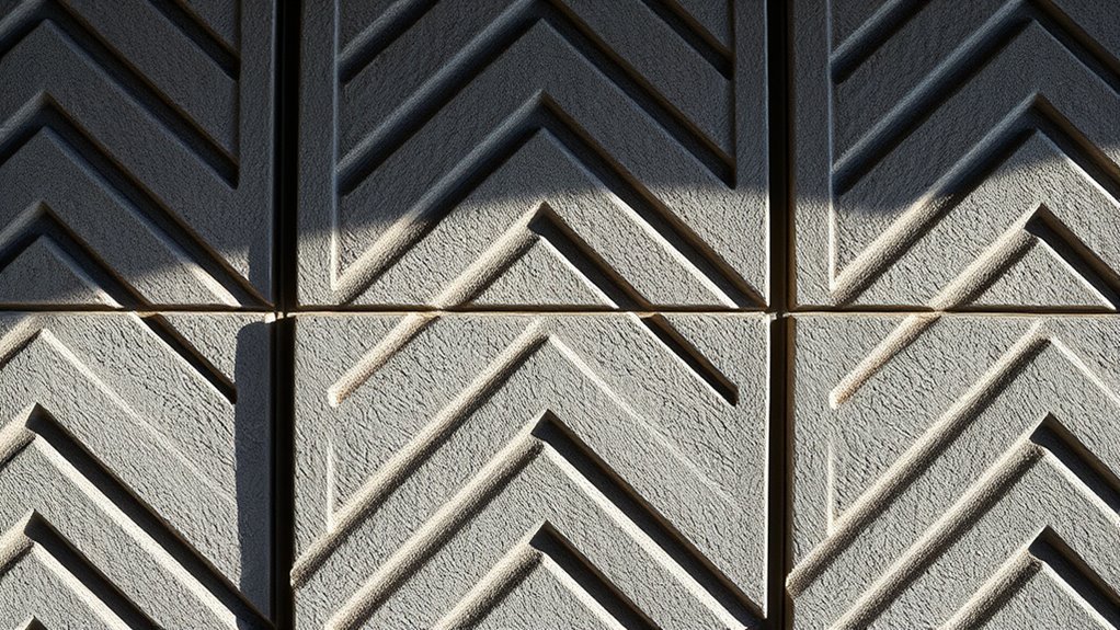
When selecting bold patterns for your space, it’s essential to think about the room’s size and natural lighting. Smaller rooms benefit from patterns with larger, less intricate designs to avoid overwhelming the space. Conversely, larger rooms can handle more complex, busier patterns that add visual interest. Pattern psychology plays a role here; certain designs evoke specific emotions—geometric patterns can create a sense of order, while floral motifs bring softness. Cultural influences also impact your choice, as patterns rooted in particular traditions can add depth and meaning. Consider what vibe you want to establish—bold patterns should complement your space’s personality. By understanding these factors, you’ll choose patterns that enhance your environment without creating chaos, making your space both dynamic and harmonious. Additionally, selecting patterns that align with modern energy-saving trends can help improve overall comfort and efficiency in your living space.
Balancing Pattern Scale and Proportion

Achieving harmony with bold patterns depends heavily on balancing their scale and proportion within your space. Focus on creating scale harmony by mixing large, bold patterns with smaller, subtler ones to prevent overwhelming your room. Proper proportion balance ensures that no single element dominates; for example, if you choose a large-patterned sofa, pair it with smaller accent pillows or artwork. Consider how each pattern relates to the overall size of your room and furniture to maintain visual coherence. Use larger patterns sparingly in smaller spaces, and reserve bold designs for focal points. By thoughtfully balancing scale and proportion, you’ll prevent chaos and create a dynamic yet harmonious environment that highlights your bold patterns without overpowering your design. Understanding pattern scale is essential for creating a cohesive and visually pleasing space.
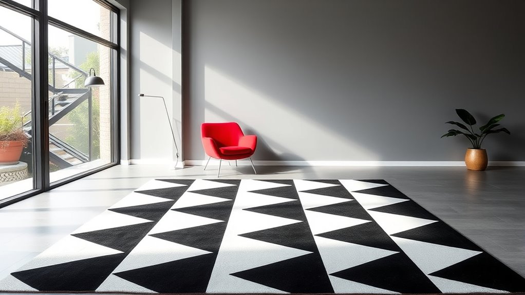
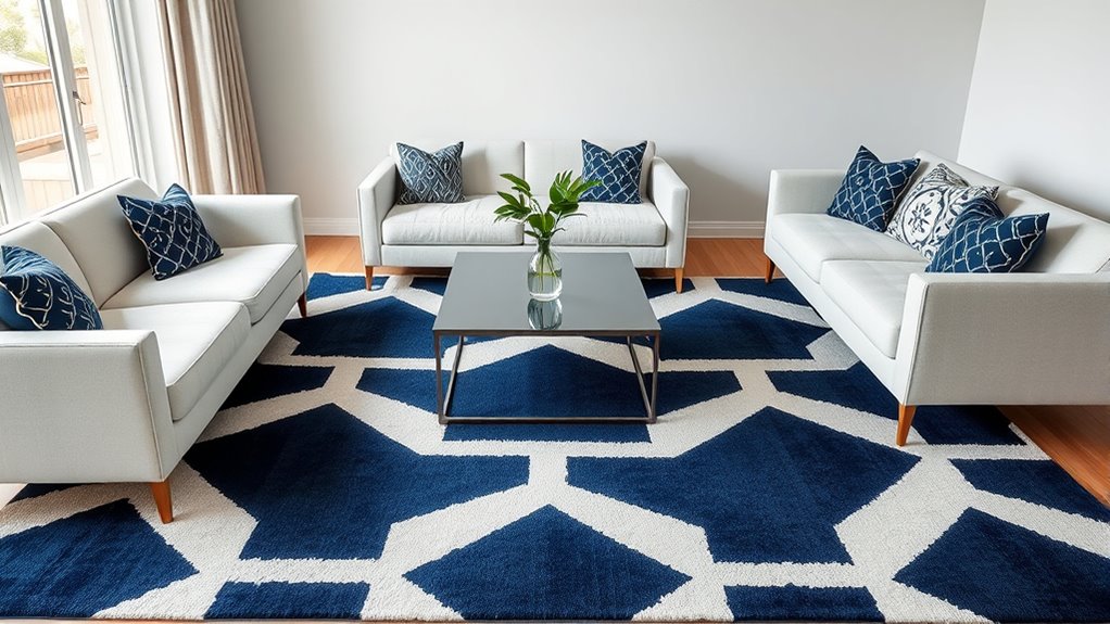
Pairing Bold Patterns With Neutral Elements
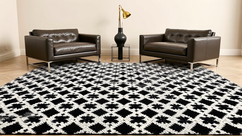
When pairing bold patterns with neutral elements, balance is key. You can achieve this by incorporating solid colors to ground your look and using minimal accessories to keep the focus on the patterns. Adding textural contrasts also creates visual interest without overwhelming the overall design. Incorporating antiques with character and charm can further enhance the aesthetic while maintaining harmony.
Balance With Solid Colors
Pairing bold patterns with neutral colors creates a striking, balanced look that keeps your outfit from feeling overwhelming. To achieve this, focus on pattern repetition to create cohesion, ensuring the bold pattern appears in a way that feels intentional. Use neutral colors like beige, gray, or white to serve as a calming backdrop that enhances the pattern without competing for attention. Effective color coordination helps the look stay harmonious; choose solids that complement the hues in your pattern. For example, if your pattern includes navy and white, add neutrals like beige or soft gray. This approach prevents chaos, letting the bold pattern stand out while maintaining an overall polished, sophisticated vibe. It’s all about striking that perfect balance between eye-catching and understated. Additionally, understanding the symbolism behind patterns can help you select designs that convey the desired message or mood.
Use Minimal Accessories
After balancing bold patterns with neutral colors, the next step is to keep accessories minimal. Opt for minimal jewelry that complements your look without overwhelming it. Simple studs, delicate chains, or sleek rings work best, allowing the pattern to stay the focal point. When it comes to decor, choose understated decor pieces that don’t compete with your bold patterns; clean lines and subtle textures keep the space balanced. Avoid cluttering your outfit or room with excessive accessories—less truly is more here. This approach creates a sophisticated vibe, letting your patterns shine while maintaining a calm, cohesive aesthetic. Incorporating minimalist decor can further enhance the harmony of your space. Remember, the goal is harmony—so stick to understated details that enhance your bold elements without stealing the spotlight.
Incorporate Textural Contrasts
Incorporating textural contrasts is a powerful way to elevate your bold patterns while maintaining visual balance. By using textural layering, you add depth and interest without overwhelming the space. Tactile contrast, such as pairing a plush velvet cushion with a sleek, matte vase, creates a dynamic visual effect that feels both rich and sophisticated. Neutral elements act as a calming backdrop, allowing bold patterns to stand out while the varied textures keep the eye engaged. Don’t be afraid to mix different materials—think rough woven throws against smooth ceramics or soft rugs with textured wallpaper. This interplay of textures emphasizes the bold patterns without clutter, ensuring your space remains stylish and harmonious. Recognizing the importance of emotional boundaries can help you maintain a healthy environment where your interior design choices reflect your personal resilience and growth.
Creating Focus Areas With Statement Patterns

To create striking focus areas, you need to place statement patterns thoughtfully within your space. Balancing bold patterns with calmer elements guarantees they stand out without overwhelming the room. When you strategically position these patterns, you guide the eye and craft a harmonious, attention-grabbing design. Incorporating personal debt forgiveness bills into your planning can help you understand financial options and create a more balanced environment.
Strategic Pattern Placement
Strategic pattern placement transforms bold patterns into focal points by carefully positioning them within a design. To create a compelling visual, focus on pattern repetition in key areas, guiding the eye naturally across the space. Use color coordination to keep the pattern from overwhelming the room; choose shades that complement your overall palette. Place statement patterns where they’ll have the most impact, such as on an accent wall or in a small, defined area. This approach prevents chaos and ensures the pattern stands out without competing with other design elements. By thoughtfully positioning bold patterns and maintaining harmonious color schemes, you draw attention precisely where you want it, creating a balanced and striking aesthetic. Additionally, understanding the importance of contrast ratio can help in selecting patterns that stand out effectively against your background, ensuring visual clarity and impact.
Balancing Bold and Calm
Balancing bold patterns with calming elements creates a visually harmonious space where statement pieces stand out without overwhelming. Understanding pattern psychology helps you choose patterns that evoke the right mood, pairing energetic prints with subdued textures or neutral tones. Color coordination plays an essential role—you can anchor a bold pattern with complementary or muted hues to prevent visual chaos. Incorporate calmer elements like solid-colored walls or subtle textiles to give the eye a resting place. This balance ensures your focal points grab attention while maintaining overall serenity. Utilizing sound design techniques can also enhance the atmosphere by subtly reinforcing the mood through auditory cues. By thoughtfully combining statement patterns with soothing accents, you create a dynamic yet peaceful environment. The key is to let bold patterns energize the space without dominating it, fostering a sense of balance and focus.
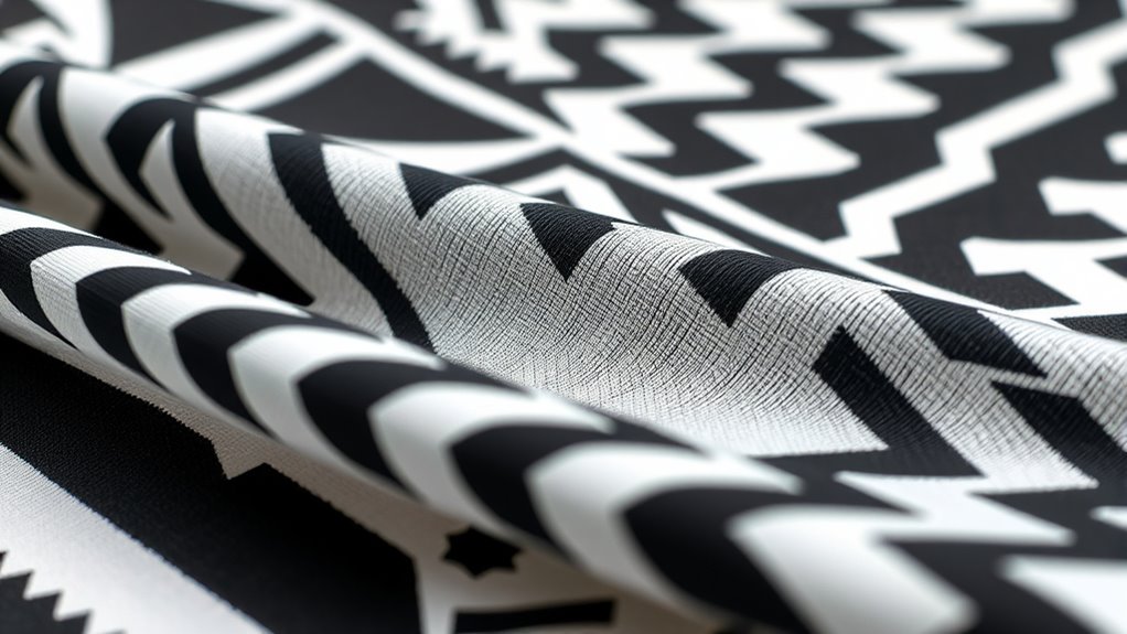
Mixing and Matching Patterns Safely

Mixing and matching patterns can add exciting visual interest to your outfits, but it’s easy to feel overwhelmed or risk clashing if you don’t do it thoughtfully. To master pattern mixing, start with a neutral base item, like a solid-colored top or bottom, then add patterned pieces that complement each other through similar tones or styles. Focus on color coordination—pairing patterns with shared hues creates harmony and prevents chaos. Limit yourself to two or three patterns per outfit to keep the look balanced. Pay attention to scale: mix large and small patterns for contrast without overwhelming your look. Confidence is key, so experiment carefully, and soon you’ll find stylish combinations that feel both bold and cohesive. Incorporating best advice for fashion can help guide your choices and make pattern mixing more intuitive.
Using Color to Tie Patterns Together
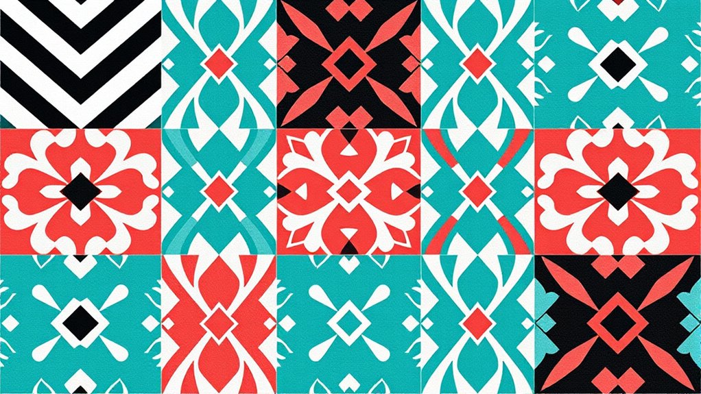
Using color is one of the most effective ways to create harmony when pairing patterns. It helps you achieve color harmony, making different prints feel intentional and cohesive. Start by choosing a unifying color palette—this could be a dominant hue or a subtle accent that appears across patterns. Use this color to connect various prints, whether through matching backgrounds, accents, or details. Pattern coordination becomes easier when you stick to a limited color scheme, preventing chaos and emphasizing balance. Don’t be afraid to mix bold and subtle patterns as long as they share key colors. This approach grounds your design, giving your space a polished, unified look while allowing each pattern to stand out without overwhelming the eye.
Incorporating Texture to Enhance Visual Interest
Incorporating texture into your pattern pairing adds depth and visual interest, making your space feel more dynamic and inviting. You can achieve this through textural layering—combining different fabrics, surfaces, and materials that offer tactile contrast. For instance, pair smooth, bold-patterned textiles with rougher, textured surfaces like woven rugs or embroidered cushions. This contrast draws the eye and prevents your design from feeling flat or monotonous. Tactile contrast invites touch and curiosity, adding an engaging sensory element to your decor. Focus on balancing sleek, polished pieces with natural, textured elements to create harmony. By thoughtfully integrating various textures, you enhance your bold patterns without overwhelming, ensuring your space feels curated and lively.
Keeping Clutter at Bay With Thoughtful Layouts
To keep clutter at bay, focus on creating a balanced layout that guides the eye smoothly through your space. Use negative space wisely to give your bold patterns room to breathe and prevent overwhelm. Limiting pattern complexity helps maintain clarity and keeps your design feeling fresh and organized.
Prioritize Visual Balance
Achieving visual balance is essential to prevent clutter and create a cohesive, appealing pattern. Focus on pattern repetition and thoughtful color coordination to guide the eye smoothly across your design. Distribute bold patterns evenly, balancing larger and smaller motifs. Use a consistent color palette to unify elements and avoid overwhelming the space.
| Pattern Repetition | Color Coordination |
|---|---|
| Repeat shapes evenly | Match colors for harmony |
| Vary pattern size | Use accent colors sparingly |
| Balance busy and simple areas | Create focal points |
| Avoid overcrowding | Stick to a limited palette |
This approach helps you maintain harmony, ensuring your bold patterns stand out without chaos. Prioritize layout and color choices to keep clutter at bay and your design visually balanced.
Use Negative Space Effectively
Effective use of negative space is key to preventing your bold patterns from feeling overwhelming. Negative space creates visual breathing room, allowing your patterns to stand out without clutter. By strategically leaving areas intentionally empty, you guide the eye and balance the overall layout. This approach helps to emphasize your focal points while maintaining a clean, organized look. Avoid crowding your design with too many patterns or details; instead, let negative space highlight the boldness of your choices. Thoughtful placement of negative space ensures that each pattern has room to breathe, making the entire composition more harmonious. Remember, sometimes less is more—using negative space effectively keeps your design lively, balanced, and visually appealing.
Limit Pattern Complexity
While negative space helps prevent your design from feeling cluttered, managing pattern complexity is equally important. To keep your bold patterns balanced, limit pattern repetition and focus on simple, cohesive layouts. Use fewer pattern types to avoid visual overload, and guarantee color coordination is consistent across elements. Break complex patterns into sections or layers to create visual hierarchy. Stick to a few bold patterns rather than mixing many, which can cause chaos. Play with scale—large patterns draw attention but can be overwhelming if overused. Incorporate subtle patterns as accents to add interest without clutter. By thoughtfully controlling pattern repetition and color coordination, you create striking designs that are bold yet balanced.
Accessorizing to Complement Bold Designs

When working with bold patterns, choosing the right accessories can make or break your overall look. Understanding pattern psychology helps you select pieces that enhance rather than compete with your clothing. For example, pairing a lively floral with simple, understated jewelry keeps the focus balanced. Color coordination is equally important; opt for accessories that pick up a hue from your pattern to create harmony. Neutral tones work well to tone down busy designs, while metallics add sophistication without overwhelming. Keep accessories minimal if your pattern is particularly bold, or go bold with statement pieces if the pattern is more subdued. The key is to strike a balance that complements your pattern without overshadowing it, ensuring your style remains polished and cohesive.
Tips for Testing Patterns Before Committing
Before committing fully to a bold pattern, it’s smart to test how it suits you in real life. This helps you avoid overwhelming your look with excessive pattern repetition or poor color coordination. To test effectively, try a few simple steps:
- Use fabric swatches or wallpaper samples to see how the pattern repeats on your space or outfit.
- Mix and match small accessories to gauge how different patterns interact.
- Layer clothing items or add cushions to observe pattern repetition and color harmony.
- Take photos from a distance to evaluate overall balance and visual impact.
- Experiment with different lighting to see how colors and patterns change.
These steps help you assess whether the pattern enhances your style without creating chaos, ensuring your bold choice feels intentional and stylish.
Frequently Asked Questions
How Can I Update Bold Patterns as Trends Change?
When updating bold patterns as trends change, you should focus on pattern layering and color coordination. Mix different patterns thoughtfully to keep the look fresh, using smaller or more subdued designs to balance larger, bolder ones. Incorporate trending colors to modernize your style and prevent overload. Regularly refresh your wardrobe with key pieces that highlight current patterns and colors, making it easy to stay fashionable without feeling chaotic.
Are There Specific Lighting Tips for Highlighting Bold Patterns?
To highlight bold patterns effectively, you should use strategic lighting techniques. Accent lighting works well, as it draws attention without overwhelming the pattern. Consider installing wall sconces or track lighting to cast focused light on the design, enhancing its visual impact. Use warm or neutral tones to complement the pattern’s colors, and avoid harsh overhead lighting that can create glare. These tips help your patterns stand out beautifully and add depth to your space.
How Do Bold Patterns Affect Room Acoustics?
Imagine your room as a concert hall; bold patterns act like sound reflection and acoustic absorption, shaping how sound travels. They can amplify certain frequencies or scatter sound waves, creating a lively atmosphere or a muffled space. Large, busy patterns might reflect sound, causing echoes, while textured fabrics absorb noise. You’re fundamentally designing your room’s acoustic landscape, balancing reflection and absorption for ideal sound quality.
Can Bold Patterns Influence the Perceived Size of a Room?
You might notice that bold patterns can influence the perceived space in a room. Large, striking designs draw the eye and create a sense of depth, making the room feel bigger or more dynamic. The visual impact of these patterns can add to the overall ambiance, enhancing your perception of size. By choosing bold patterns thoughtfully, you can manipulate how spacious or cozy your room appears, tailoring the environment to your preferences.
What Are Common Mistakes to Avoid With Bold Patterns?
Jumping the gun can lead to common mistakes when using bold patterns. You should avoid pattern clash by ensuring color coordination stays harmonious, and don’t overdo it—less is often more. Mixing too many bold patterns can create chaos, so pick a focal point and keep other elements subtle. Remember, balance and thoughtful pairing keep your space lively without overwhelming it. This way, bold patterns enhance your room instead of overwhelming it.
Conclusion
Remember, using bold patterns can transform your space, but balance is key. Studies show that rooms with well-chosen patterns feel 30% more inviting and vibrant. By carefully pairing patterns with neutral tones and incorporating texture, you create a lively yet harmonious environment. Don’t rush—test your ideas first. When you approach bold patterns thoughtfully, you’ll achieve a stunning, cohesive look that reflects your style without chaos.