TL;DR

Get furniture and decor delivered free with Prime
- Fast, free delivery on millions of items
- Prime Video, Amazon Music and more included
- Member-only deals all year
Veranda’s design report identifies seven colors that designers say pair well with chocolate brown: jewel tones, dusty pink, off-whites, camel and other warm neutrals, butter yellow, crimson and chartreuse. The recommendations are design opinions, not measured findings; the report also advises avoiding cool grays and very dark purples that may compete with brown.
Veranda has published a guide to seven colors designers recommend pairing with chocolate brown, including dusty pink, warm off-whites, camel, butter yellow, crimson, chartreuse and jewel tones. The report offers practical palette advice for decorating, while noting that the effect depends on each shade’s warmth, depth and balance in a room.
The designers’ suggestions range from restrained combinations to more saturated schemes. Dusty pink is presented as a counterpoint to brown’s depth: Alabama-based designer Sarah Moore says the pink’s “softness and lightness” balance the darker hue. For a more classic pairing, Little Greene creative director Ruth Mottershead recommends warm whites, natural stone shades or warm grays rather than a stark white, which she says can feel cold and create a sharp contrast.
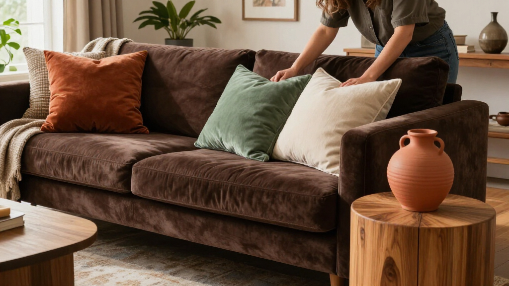
For warm, layered neutrals, Atlanta designer Liz Williams favors camel over gray, arguing that its warmth gives chocolate brown more contrast. Moore describes butter yellow as a lively partner with a related undertone. The guide also proposes crimson and chartreuse for bolder accents, and jewel tones such as emerald, citrine and sapphire for richly colored rooms. Georgia designer Grace Brackman specifically recommends considering chocolate brown velvet, whose sheen can make the color appear richer.
The report includes cautions as well as suggestions. Moore says some dark purples, including amethyst and aubergine shades that approach black, can be too close in tone to brown and compete with it. The article also advises against cool-leaning neutrals and grays, which its designers say may make brown look dull. These are attributed design judgments, not universal rules or results from a formal color study.
Choosing Brown’s Supporting Colors
The recommendations give readers a way to use a deep brown without letting it dominate a room. Lighter partners such as dusty pink and warm white can create contrast, while camel and other warm neutrals keep a palette grounded. Jewel tones, crimson and chartreuse offer more saturated options for people who want brown to anchor a stronger color scheme.
The advice also underscores that undertone and relative darkness matter, not just the names of the colors. A warm white may sit more comfortably beside brown than a crisp, cool white, while two very dark shades may compete rather than complement each other. That makes the guide relevant to choices involving paint, upholstery, trim and accessories, though the final effect will vary with the room’s light, materials and proportions.
As an affiliate, we earn on qualifying purchases.
Why Brown Is Returning
Veranda frames chocolate brown’s appeal as part of a wider move toward warm, earthy colors. Mottershead says brown was long dismissed as dated or dull, but that designers and homeowners have recently embraced earthy neutrals, deep chocolate shades, caramel and honey tones. The article also points to brown’s connection to natural materials and its history in interiors associated with designers including David Hicks and Billy Baldwin.
The guide says brown can enter a room through several routes: paint, textiles or dark wood furniture. Its specific pairings build on that flexibility, describing ways to combine a brown foundation with lighter accents or more vivid colors. The supplied source does not establish a date for the report or provide market data on how widely the trend has spread.
“For a long time, brown was dismissed as dated or dull, but in recent years we’ve seen a clear movement towards warm, earthy colors that help us feel connected to the natural environment.”
— Ruth Mottershead, creative director at Little Greene
Where Palette Advice Has Limits
The seven pairings are designer recommendations, not a ranked list or a tested formula. The source does not specify exact paint colors, color values, proportions or lighting conditions, so it cannot establish how a given combination will look in every room. It also does not report survey results or sales data confirming that chocolate brown is becoming more popular.
The article’s cautions are similarly subjective: a cool gray or deep purple may work in some settings depending on undertones, finishes and surrounding colors. Readers should treat the advice as a starting point and test samples in their own space. The supplied material does not state the report’s publication date or identify any follow-up research.
Testing the Colors at Home
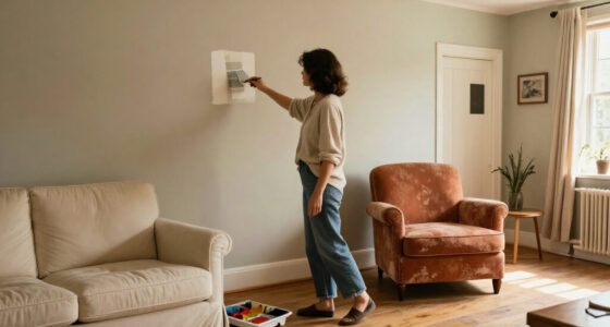
For readers planning a room update, the next step is to compare samples together in the intended space. Check the colors under the room’s natural and artificial light, and consider whether the brown will appear on walls, furniture or smaller accents. Warm whites, camel and dusty pink offer options for a softer contrast; jewel tones, crimson and chartreuse create more vivid combinations, according to the designers quoted by Veranda.
The source announces no further study, product launch or scheduled update. Its guidance remains a set of palette suggestions rather than a prescriptive scheme, leaving final choices to the room, materials and personal preferences.
Key Questions
Which colors does the report recommend with chocolate brown?
Veranda lists jewel tones, dusty pink, off-whites, camel and other warm neutrals, butter yellow, crimson and chartreuse.
What kind of white works best with chocolate brown?
Little Greene creative director Ruth Mottershead recommends warm whites, natural stone shades or warm grays rather than stark white, which she says can feel cold and create a sharp contrast.
Which colors do the designers suggest avoiding?
The report cautions against cool-leaning grays and neutrals, which may make brown look dull, and some very dark purples that can compete with chocolate brown because their tones are too similar.
Are these color combinations guaranteed to work in every room?
No. They are designers’ recommendations, not universal rules. Lighting, undertones, materials and how much of each color is used can change the result; testing samples in the room is a practical next step.
Source: rss
Halloween Picks
halloween
As an affiliate, we earn on qualifying purchases.