Spring 2026 brings a lively mix of soft pastels, vibrant florals, earthy neutrals, and invigorating greens and blues. Expect gentle hues like blush, mint, and lavender paired with bold floral patterns in reds and oranges. Luminous greens and calming sky blues add freshness, while sunset pinks and citrus brights inject warmth and energy. Incorporating metallic accents offers a touch of shine. Keep exploring to discover how to seamlessly blend these vibrant and soothing tones into your style and space.
Key Takeaways
- Spring 2026 palette emphasizes soft pastels and earthy neutrals for a calming, natural aesthetic.
- Vibrant floral colors like bright pinks, oranges, and yellows highlight energetic spring blooms.
- Contrasting bold and soft shades create fresh, balanced looks in fashion and design.
- Luminous greens and sky-inspired blues symbolize renewal and tranquility for a revitalized spring vibe.
- Trend incorporates large floral patterns, color blocking, and muted tones with pops of bright color.
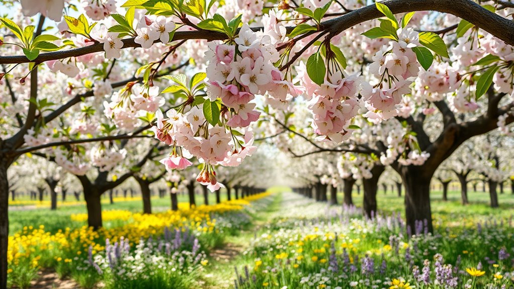
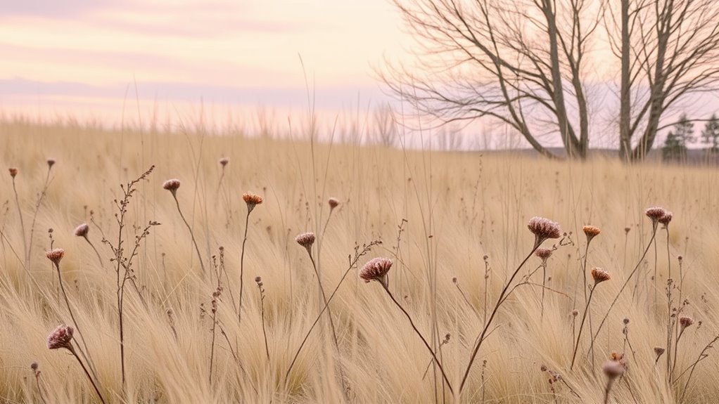
Soft Pastels: Gentle Hues That Evoke Freshness
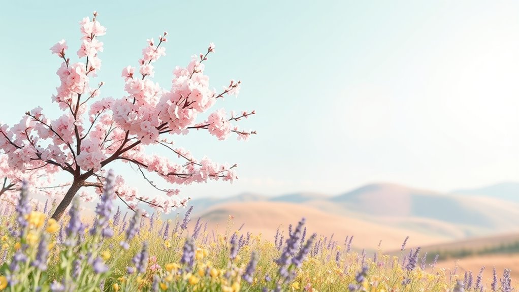
Soft pastels are perfect for capturing a fresh and airy vibe, especially during spring and early summer. These gentle hues embody seasonal color psychology, promoting feelings of calm, renewal, and optimism. When you choose pastel color pairings, you create a harmonious palette that feels light and inviting. Think blush pink with mint green or baby blue with lavender—these combinations enhance the sense of freshness and balance. Pastels aren’t overpowering; instead, they subtly evoke a sense of ease and elegance. Use them in your wardrobe, decor, or art to reflect the natural awakening of the season. By embracing soft pastels, you channel the spirit of spring, making your style and spaces feel more vibrant and soothing at the same time. Incorporating color combinations can elevate your seasonal aesthetic and create a cohesive, stylish look.
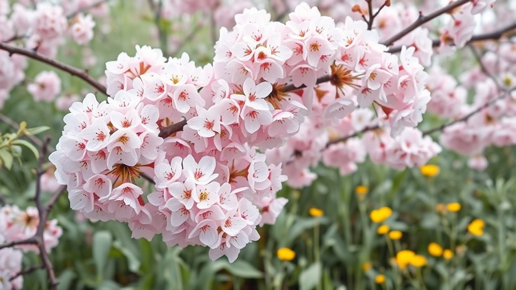
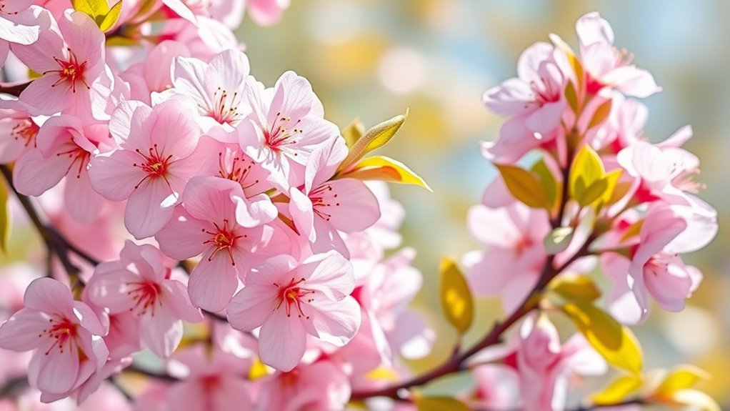
Vibrant Florals: Bold Colors Inspired by Spring Blooms
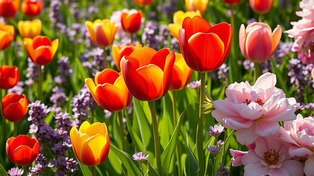
Vibrant floral colors bring spring’s energy into your wardrobe with bold, eye-catching shades inspired by blooming gardens. Mixing these vivid hues with softer tones creates dynamic, balanced looks that stand out. Floral pattern trends now embrace both large, statement blooms and subtle, intricate designs for versatile styling. Incorporating vintage decor elements can further enhance the nostalgic feel of spring-inspired fashion.
Bloom-Inspired Color Choices
Spring blooms burst into life with colors that inspire bold wardrobe choices, encouraging you to embrace shades that mirror the season’s energy. These bloom-inspired color choices tap into color psychology, evoking feelings of freshness, optimism, and renewal. Bright pinks, fiery oranges, and vivid yellows reflect the vibrancy of spring flowers, making your outfits stand out. Seasonal color forecasting guides you toward trending hues that capture the season’s spirit, ensuring your wardrobe stays current and lively. By incorporating these bold floral-inspired shades, you connect with nature’s awakening and project confidence. Whether you opt for a striking dress or accessories in floral hues, let these colors energize your style and reflect the lively essence of spring.
Mixing Bold & Soft
While bold floral hues make a striking statement, blending them with softer shades creates a balanced and sophisticated look. Using color blocking techniques, you can pair vibrant pinks or fiery oranges with muted pastels like blush or lavender. Monochrome styling also helps integrate bold colors seamlessly by varying shades of the same hue, adding depth without overpowering. To visualize, consider this combination:
| Bright Floral | Soft Complement |
|---|---|
| Hot Pink | Light Pink |
| Tangerine | Peach |
| Lemon Yellow | Cream |
Mixing these contrasts allows your outfit to stand out while maintaining elegance. Focus on balancing intensity and softness, letting each hue enhance the other for a fresh, spring-inspired look.
Floral Pattern Trends
Floral pattern trends are embracing bold colors that capture the energy and freshness of blooming landscapes. You’ll notice designers favor vibrant palettes filled with lively reds, pinks, and oranges, inspired by spring blooms. Botanical motifs and floral motifs dominate fabrics, wallpaper, and accessories, creating eye-catching statements. These patterns emphasize large, exaggerated blossoms, making a strong visual impact. You might choose a floral motif dress with vivid hues or incorporate botanical motifs into home decor for a lively touch. The trend celebrates nature’s abundance, encouraging you to experiment with contrasting shades and intricate designs. Overall, vibrant florals bring an energetic, optimistic vibe to your wardrobe and spaces, reflecting the dynamic beauty of spring’s botanical world.
Earthy Neutrals: Grounding Tones for Balance and Calm
Earthy neutrals evoke a sense of grounding and tranquility, making them perfect for creating balanced and calming spaces. In color psychology, these tones promote relaxation and mental clarity, helping you feel centered. When choosing earthy neutrals, prioritize sustainable sourcing to reduce environmental impact and support eco-friendly practices. These tones—think warm beiges, soft browns, and muted taupes—bring warmth and depth without overwhelming a room’s atmosphere. They serve as versatile backdrops that complement other seasonal hues, grounding your palette with a natural appeal. By integrating sustainable materials, you not only enhance the calming effect but also align your space with eco-conscious values. Incorporating cultural and regional influences can further enrich the aesthetic and create a more authentic environment. Earthy neutrals foster a peaceful environment, perfect for unwinding and finding balance amidst daily chaos.
Luminous Greens: Shades of New Growth and Renewal
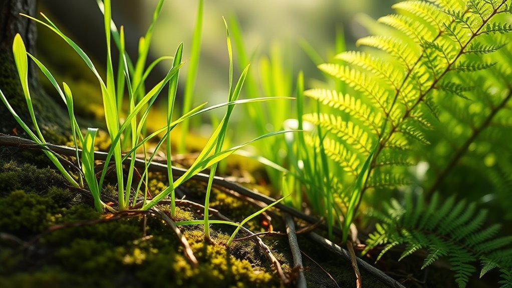
Luminous greens bring a fresh burst of liveliness to any space, echoing the energy of new growth. They serve as perfect nature-inspired accents that brighten and refresh your environment. Embrace these shades to evoke a sense of renewal and natural beauty all season long. Incorporating beach town aesthetics can also enhance your space with a relaxed, coastal vibe.
Freshness and Vitality
As spring unfolds, luminous greens burst onto the scene, symbolizing new growth and renewal. This vibrant palette taps into seasonal color psychology, evoking feelings of freshness, energy, and vigor. These shades are perfect for capturing the spirit of rejuvenation and can instantly brighten your look. In spring fashion trends, luminous greens are making a statement in everything from accessories to statement pieces. They boost your confidence and add a lively touch to any outfit. Wearing these invigorating hues helps you embrace the season’s sense of renewal and enthusiasm. Whether in clothing, décor, or accessories, luminous greens serve as a visual reminder of renewal, making your style feel fresh, dynamic, and full of life. Additionally, incorporating color accuracy into your wardrobe or décor ensures these vibrant shades remain true and eye-catching.
Nature-Inspired Accents
Incorporating luminous greens inspired by nature instantly brings a sense of liveliness and renewal to your space or wardrobe. These shades evoke garden elements like fresh leaves, new shoots, and moss, creating a vibrant connection to the natural world. Seasonal color psychology suggests that green symbolizes growth, harmony, and rejuvenation, making it perfect for spring updates. Use these hues in accent pieces, textiles, or decor to energize your environment. In clothing, luminous greens can refresh your look and evoke a sense of freshness, aligning with the theme of new beginnings. Whether you’re adding small touches or bold statements, these shades anchor your space or wardrobe in the spirit of renewal, celebrating the season’s essence through nature-inspired accents.
Sky-inspired Blues: Calm and Refreshing Hues

Sky-inspired blues evoke a sense of calm and refreshment that instantly soothes the mind. These hues are perfect for spring, adding a tranquil touch to your seasonal palettes. In color psychology, blue symbolizes peace, clarity, and stability, making it ideal for creating relaxing environments. When selecting sky-inspired blues, consider their versatility across various design elements. Incorporating proper paint application techniques ensures a smooth and professional finish that enhances the calming effect of these colors. They enhance spaces with a peaceful, open feel. Pair well with soft neutrals or crisp whites. Elevate both modern and classic styles. Promote a sense of tranquility and focus. In spring 2026, these hues will be trending for their ability to refresh your surroundings and evoke the serenity of clear skies. Incorporating sky-inspired blues taps into the calming power of color psychology, making your space inviting and soothing.
Sunset Pinks and Corals: Warmth and Optimism in Color

Sunset pinks and corals introduce a vibrant warmth that energizes any space, perfectly complementing the calm serenity of sky-inspired blues. In color psychology, these hues evoke feelings of optimism, passion, and comfort, making them ideal for creating inviting environments. Cultural influences shape their significance worldwide; for example, coral tones symbolize celebration in some Asian traditions, while sunset pinks represent hope and renewal in Western contexts. Incorporating these colors can boost mood and foster a positive atmosphere, especially in spaces where vitality and friendliness are desired. Their dynamic presence adds a sense of warmth and joy, making your design feel both lively and welcoming. Embracing ethical hacking principles can help ensure the security of color schemes and digital designs alike, protecting your creative assets from cyber threats. Infuse your surroundings with energetic optimism rooted in diverse cultural meanings.
Citrus Brights: Energetic Accents for Dynamic Designs
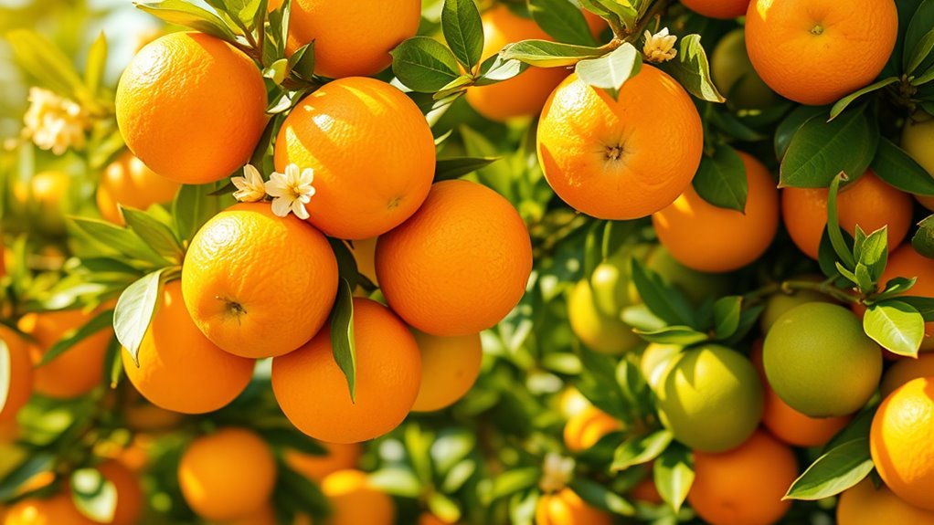
Citrus brights, such as lemon yellows, lime greens, and tangerine oranges, inject energy and vibrancy into any space. These lively hues stimulate the senses through color psychology, awakening enthusiasm and optimism. When creating a palette, combine these shades for a bold, dynamic look that commands attention. Effective palette combinations include pairing citrus tones with neutral backgrounds to keep the design balanced, or mixing them with deep blues for contrast and depth. Use these accents sparingly to add pops of energy without overwhelming the senses. Remember, energetic accents work best when strategically placed, creating a sense of movement and vitality. Incorporate citrus brights to elevate your design’s mood, making spaces feel more lively and engaging.
Muted Tones With a Pop: Subtle Sophistication With a Spark of Color
Muted tones offer a sophisticated backdrop for adding a subtle touch of color that elevates your design without overwhelming it. These shades align with seasonal color psychology, evoking calmness and balance, perfect for creating refined aesthetics. To achieve the right look, use color pairing techniques that balance muted hues with pops of brighter shades. For example, pairing soft taupe with a hint of coral or dusty blue with a vibrant mustard can create visual interest while maintaining elegance. This approach allows you to introduce subtle sophistication with a spark of color, making your design both understated and dynamic. Incorporating color contrast techniques can further enhance the visual harmony and depth of your palette. Keep in mind that the goal is to enhance, not overpower—so choose your accents carefully to create depth and harmony.
Metallic Accents: Adding Shine to Spring’s Color Palette
Adding metallic accents to your spring color palette instantly introduces a touch of shine and sophistication. Whether in home decor or fashion, metallic accents elevate your look with effortless elegance. Incorporate these shimmering details to make your style stand out:
Metallic accents add shine and sophistication to your spring style effortlessly.
- Use metallic cushions or vases to add sparkle to your living space
- Choose metallic jewelry or accessories for a chic outfit upgrade
- Incorporate subtle metallic trims in your clothing or footwear
- Mix matte and shiny finishes for visual interest
- Be mindful of store hours when shopping for metallic decor or accessories to ensure availability during your preferred visit times.
These accents work well with spring hues like soft pastels or vibrant shades, creating a dynamic and fresh aesthetic. Metallic accents in home decor reflect light, making rooms appear brighter, while in fashion, they add a modern edge. Embrace shine to refresh your spring style with minimal effort.
Frequently Asked Questions
How Do Seasonal Palettes Influence Fashion Trends in 2026?
You see, seasonal palettes shape fashion trends by guiding your choices based on color psychology, which influences mood and perception. In 2026, trends will emphasize sustainable dyeing techniques, making eco-friendly colors more prominent. This shift encourages you to embrace environmentally conscious styles while aligning with seasonal hues. As a result, your wardrobe can reflect both current trends and a commitment to sustainability, shaping the overall fashion landscape for the year.
What Are the Key Color Combinations for Spring 2026?
You’ll see key color combinations for spring 2026 include pastel neutrals paired with vibrant contrasts. Think soft pinks and creams balanced with bold oranges or electric blues. These combinations create a fresh, lively look that captures the season’s energy. By mixing subtle shades with striking hues, you get eye-catching outfits that stay stylish and modern. This trend encourages you to experiment and express your personality through vibrant yet sophisticated color pairings.
How Can These Hues Be Incorporated Into Home Decor?
Did you know 78% of homeowners say fresh decor boosts their mood? You can incorporate these hues by adding botanical accents, like leafy prints and plants, which bring spring’s vibrancy inside. Try pastel pairing with soft pinks, blues, and greens in pillows, curtains, or artwork for a soothing, cohesive look. These colors create a lively, inviting space perfect for spring’s renewal and energy.
Are There Specific Industries Adopting These Color Trends?
You’ll notice that industries like corporate branding and wedding themes are quickly adopting these color trends. Companies incorporate vibrant spring hues to refresh their branding, making logos and campaigns more appealing, while wedding planners use these shades to create fresh, lively atmospheres. These hues help convey optimism and renewal, aligning perfectly with spring’s spirit. As a result, these industries actively embrace the latest color palettes to stay modern and engaging.
How Do Cultural Influences Shape Spring Color Choices for 2026?
You might think cultural influences only affect fashion, but they deeply shape spring color choices for 2026. Cultural symbolism in color influences regional preferences, guiding designers to select hues that resonate locally. Even if trends seem universal, understanding these cultural nuances guarantees your choices are authentic and meaningful. You’ll find that regional color preferences and cultural meanings blend to create vibrant, relevant palettes that reflect diverse perspectives this spring.
Conclusion
As you explore spring 2026’s color palettes, remember that 85% of consumers say color influences their purchasing decisions. By embracing these fresh, vibrant, and calming hues, you can create designs that resonate deeply and evoke emotion. Whether you choose soft pastels or bold florals, your color choices can inspire renewal and optimism. So, immerse yourself in these palettes and make your projects stand out with the perfect seasonal touch.