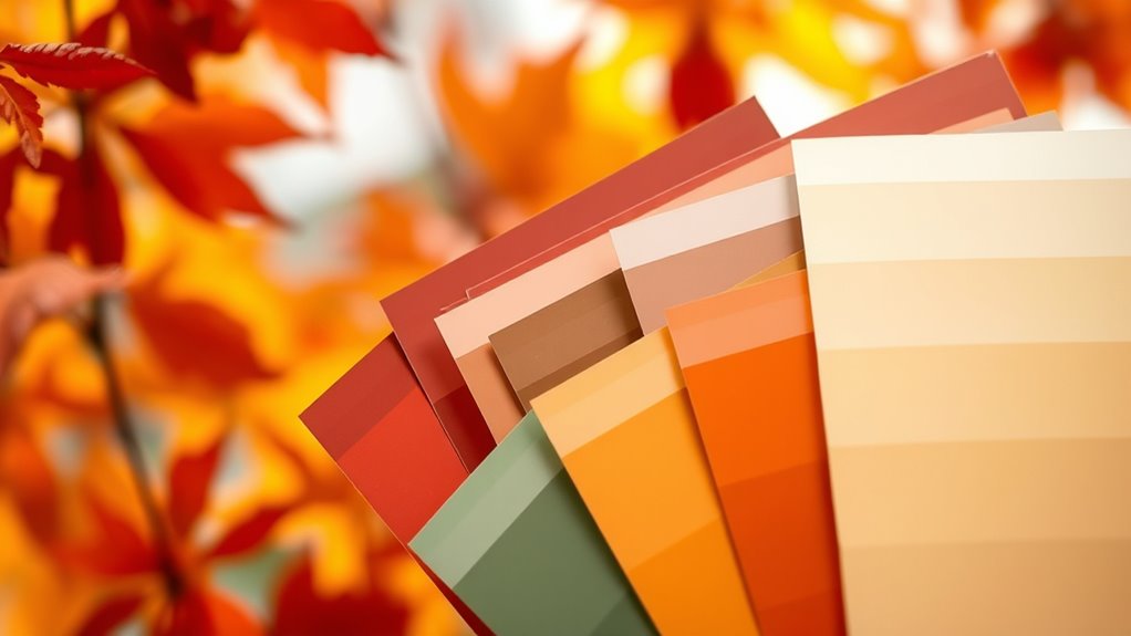

A seasonal paint color guide helps you choose hues that match each time of year’s mood and environment. Bright, lively shades like yellows and blues energize summer spaces, while cozy neutrals and warm tones promote relaxation in autumn. Rejuvenating greens and yellows invigorate spring, and deep reds or earthy browns create warmth in winter. Incorporating these colors thoughtfully can boost your mood and focus—stick around to discover more tips for perfect seasonal palettes tailored for you.
Key Takeaways
- Seasonal color palettes influence mood: bright summer hues boost energy, autumn tones promote relaxation, spring shades evoke renewal, and winter colors add warmth.
- Color psychology varies by season: warm tones create coziness in winter, calming neutrals in autumn, vibrant greens and yellows in spring, and lively primaries in summer.
- Light exposure and surroundings alter perceived colors, making testing in the actual space crucial for accurate color selection.
- Calm colors like blues and greens enhance focus and reduce stress, while brighter shades stimulate creativity and mental activity year-round.
- Cultural symbolism and seasonal context shape color choices, aligning space ambiance with natural and cultural moods for emotional resonance.
Bright and Energizing Colors for Summer

When summer arrives, bright and energizing colors can instantly lift your mood and refresh your space. To achieve these vibrant hues, focus on color mixing by blending primary shades like yellow, red, and blue to create lively, eye-catching tones. Use paint application techniques such as sponge brushing or stippling to add texture and depth, making your colors pop even more. Applying multiple thin coats ensures a smooth, even finish, enhancing the brightness. Don’t be afraid to experiment with combinations—think sunny yellows, lively oranges, or electric blues—to evoke energy and positivity. Proper preparation, like priming walls and using quality brushes, helps you get clean lines and prevents streaks, ensuring your summer-inspired palette truly invigorates your home. Additionally, understanding color accuracy can help you select shades that remain vibrant and true to your vision over time.
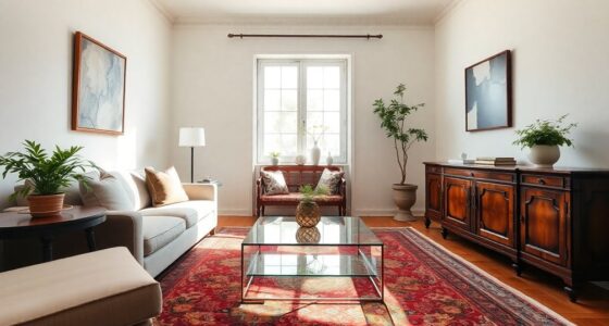
Calm and Cozy Tones for Autumn

As autumn arrives, embracing calm and cozy tones can transform your home into a warm, inviting retreat. In color psychology in interior design, these shades promote relaxation and comfort, enhancing your mood during shorter, darker days. Warm neutrals like soft taupe or gentle greys create a soothing environment, while deep hues like burnt orange or rich browns add a sense of grounding. These colors evoke feelings of safety and stability, making your space feel like a cozy haven. To maximize psychological effects of paint colors, consider incorporating textures and accents that complement these tones. Using mindful decluttering strategies can also help create a calmer space, allowing the colors and textures to truly stand out and foster a peaceful atmosphere.
- Soft beige walls paired with plush throws
- Warm terracotta accents in décor
- Muted sage or olive for a calming touch
Refreshing and Invigorating Shades for Spring

Spring calls for colors that energize your space and lift your mood. Vibrant green hues bring a fresh, natural vibe, while sunny yellow tones add warmth and cheer. These shades instantly invigorate your environment and create a lively, welcoming atmosphere. Incorporating home decoration inspiration can further enhance the uplifting effect of these colors, making your space feel more vibrant and inviting.
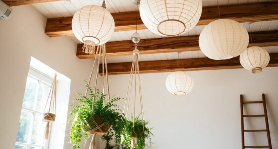
Vibrant Green Hues
Vibrant green hues instantly evoke feelings of freshness and renewal, making them perfect choices for energizing your space during spring. These shades draw from nature-inspired palettes, creating a lively atmosphere that boosts your mood. The psychological effects of green are calming yet invigorating, helping you feel balanced and revitalized. Incorporating vibrant greens can enhance indoor aesthetics and make your space feel more connected to nature, which further promotes serenity. They also increase energy levels and motivation with their lively presence and promote a sense of growth and renewal, perfect for spring refreshes.
Sunny Yellow Tones
Bright yellow tones immediately energize a space, capturing the cheerful spirit of spring. This color symbolism evokes feelings of happiness, optimism, and warmth, making your environment feel lively and inviting. The psychological effects of sunny yellow shades can boost your mood and stimulate mental clarity, helping you feel more alert and focused. These invigorating hues are perfect for spaces where you want to foster creativity and positivity, such as kitchens, living rooms, or home offices. Keep in mind, however, that too much yellow can be overwhelming, so balance it with neutral accents or softer shades. Incorporating sunny yellow tones into your decor energizes your space, creating an uplifting atmosphere that mirrors the vibrant energy of spring. Embracing artistic expression can further enhance your ability to create inspiring and joyful environments.
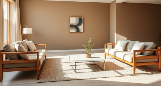
Warm and Comforting Colors for Winter

As winter settles in, choosing warm and comforting colors can transform your space into a cozy retreat. These hues tap into color psychology in interior design, creating a sense of warmth and security. Winter hues often carry cultural significance, symbolizing stability, hope, and renewal during the colder months. Deep reds evoke feelings of passion and comfort, while rich browns ground your space with warmth. Soft, muted oranges and warm taupes add inviting softness, perfect for cozy evenings. Incorporating these colors can make your home feel more welcoming and emotionally comforting, aligning with the seasonal mood. Understanding color psychology can help you select hues that evoke the desired emotional response. By selecting winter-inspired shades, you embrace the cultural meanings behind these hues and enhance your space’s emotional appeal during the coldest months.
Colors to Boost Productivity and Focus Year-Round

Certain colors can markedly enhance your productivity and focus throughout the year. The color therapy benefits of blues and greens are well-documented, offering calming effects that reduce stress and improve concentration. Cool hues like these activate the psychological effects of hues related to clarity and stability, making them ideal for workspaces. Bright shades such as yellow stimulate mental activity and creativity, helping you stay alert and motivated. Incorporating these colors into your environment can foster a focused atmosphere without overstimulation. By understanding how specific hues influence your mood and cognitive function, you can select paint colors that support sustained attention and efficiency. Additionally, understanding the financial impact of color choices can help optimize your workspace for better productivity. Overall, choosing the right palette boosts your ability to work effectively, regardless of the season.
Creating Balance With Neutral Hues in Every Season

Neutral hues create a versatile foundation that promotes balance and harmony in any season. They serve as a backdrop that allows you to play with contrast and maintain a cohesive mood and ambiance year-round. Using neutral tones like beige, gray, or taupe helps create visual harmony, making spaces feel calm and inviting. To enhance this balance, consider:
- Adding textured accessories or artwork for subtle contrast
- Incorporating seasonal accents to shift mood without overwhelming the space
- Using lighting to adjust the ambiance, highlighting neutral tones differently throughout the year
- Incorporating sensory experiences to deepen the sense of harmony and engagement within your space
These strategies help you keep a harmonious environment, where neutral hues support changing seasonal vibes while maintaining visual steadiness. It’s all about creating a balanced space that adapts effortlessly to each season’s unique energy.
Tips for Selecting the Perfect Seasonal Palette

Choosing the right seasonal palette involves understanding the mood and energy you want each season to evoke. Use color psychology principles to select hues that align with that feeling—warm reds and oranges for autumn’s coziness or cool blues and greens for winter calm. Consider cultural color associations, as certain colors carry specific meanings across different cultures, influencing how your space feels. For spring, opt for fresh pastels that evoke renewal, while summer calls for vibrant, energetic shades. Keep in mind that color perception varies based on lighting and surroundings, so test palettes in your space before committing. Additionally, understanding Private Placement Memorandum concepts can help you recognize how investment strategies adapt to market conditions, much like choosing colors that suit each season’s trends. By blending these insights, you’ll select a seasonal palette that enhances your mood, complements your environment, and reflects the spirit of each season.
Frequently Asked Questions
How Do Cultural Differences Influence Seasonal Color Choices?
You should consider that cultural differences heavily influence seasonal color choices through cultural symbolism and regional traditions. For example, red might symbolize luck in China, while it represents passion in Western cultures. Regional traditions also guide preferences, like earthy tones in rural areas or vibrant hues in urban settings. Being mindful of these cultural nuances guarantees your color choices resonate better, creating a meaningful and respectful environment.
Can Color Psychology Impact Mood Changes Throughout the Year?
Yes, color psychology can impact your mood changes throughout the year. You might find that certain colors, based on their emotional well-being and color associations, boost your mood during winter’s gloom or help you relax in summer. By intentionally choosing colors aligned with positive emotional responses, you can influence how you feel seasonally, creating a more balanced emotional state and fostering overall well-being across different times of the year.
Are There Specific Colors That Suit Small or Dark Spaces Seasonally?
For small spaces, light colors like soft pastels or warm neutrals make your room feel more open and inviting. In dark rooms, consider using bright or reflective dark hues, such as deep blues or charcoal with gloss finishes, to add depth without making the space feel cramped. These small space color choices and dark room hues enhance your environment seasonally, creating a cozy yet airy atmosphere year-round.
How Do Personal Preferences Override Seasonal Color Trends?
Your personal taste and individual expression play a significant role in choosing paint colors, often overriding seasonal trends. You should select hues that resonate with your personality and make you feel comfortable, regardless of what’s fashionable. Trust your instincts and opt for shades that reflect your unique style. Seasonal trends are helpful guides, but your preferences ultimately create a space that feels truly yours, fostering comfort and personal satisfaction.
What Are Sustainable Options for Seasonal Paint Colors?
You can choose sustainable seasonal paint colors by opting for eco-friendly pigments and biodegradable paint options. These choices reduce environmental impact while still allowing you to enjoy fresh, seasonal hues. Look for brands that prioritize natural ingredients and sustainable production methods. By selecting these eco-conscious options, you help support environmental health and enjoy vibrant, seasonally appropriate colors without compromising your values or the planet’s well-being.
Conclusion
As you paint your space with the colors of the seasons, let each hue be a brushstroke of your mood and energy. Think of your home as a living canvas, shifting with the seasons’ symphony of shades. Embrace the dance of vibrant, calming, and neutral tones—each one a note that harmonizes your environment. With this palette of possibilities, you’ll create a sanctuary that’s as dynamic and beautiful as the changing year.