
To balance bold color accents, start with a neutral base to let your colors pop without overwhelming. Use color theory to choose harmonious shades and limit yourself to one or two focal points for a clean look. Balance bright hues with calming neutrals, and add textures or patterns to create depth. Applying the rule of three can help arrange colors in a pleasing way. Keep these tips in mind to craft a harmonious space and discover more ways to perfect your design.
Key Takeaways
- Use a neutral base to allow bold accents to stand out without overwhelming the space.
- Limit the number of bold accents to 1-2 focal points for visual harmony.
- Balance bright hues with calm neutrals to prevent visual overload and create cohesion.
- Apply the rule of three to strategically position accents in a triangle for balanced composition.
- Incorporate textures and patterns to add depth and visual interest, enhancing overall balance.
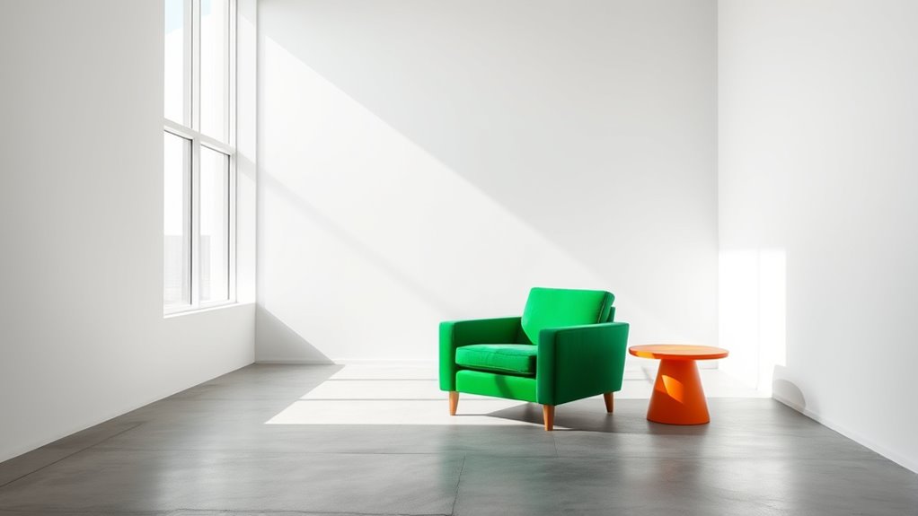
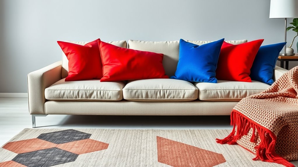
Start With a Neutral Base
Starting with a neutral base creates a versatile foundation for adding bold color accents. Monochrome palettes are an excellent choice, providing subtle shading that enhances your space without overwhelming it. Neutral tones like beige, gray, or soft taupe allow your accents to truly stand out. By keeping the background subdued, you create a balanced environment where bold hues can shine without clashing. This approach also makes it easier to change or update accents later, as the neutral base remains constant. Whether you’re designing a room or an outfit, starting with subtle shading ensures that your bold choices are highlighted effectively. It’s a simple yet powerful way to create visual harmony while allowing your personality to come through with vibrant touches. Additionally, understanding dream symbolism can inspire more meaningful color choices that resonate with your emotional goals.
Use Color Theory to Guide Your Choices

Understanding color theory is essential for making bold accents work harmoniously within your space. When you choose colors thoughtfully, you create a balanced look that feels intentional and vibrant. Focus on color harmony to guarantee your accents complement the existing palette, avoiding chaos or visual discord. Complementary contrast is a powerful tool—pairing colors opposite each other on the color wheel—making your accents pop without overwhelming the room. For example, a bold orange with blue can energize a space while maintaining visual balance. By applying principles of color theory, you can select accent colors that enhance your design, draw attention where you want it, and keep everything feeling cohesive. Recognizing visual balance ensures your bold choices contribute to a harmonious environment. This strategic approach helps you achieve striking, stylish results with confidence.
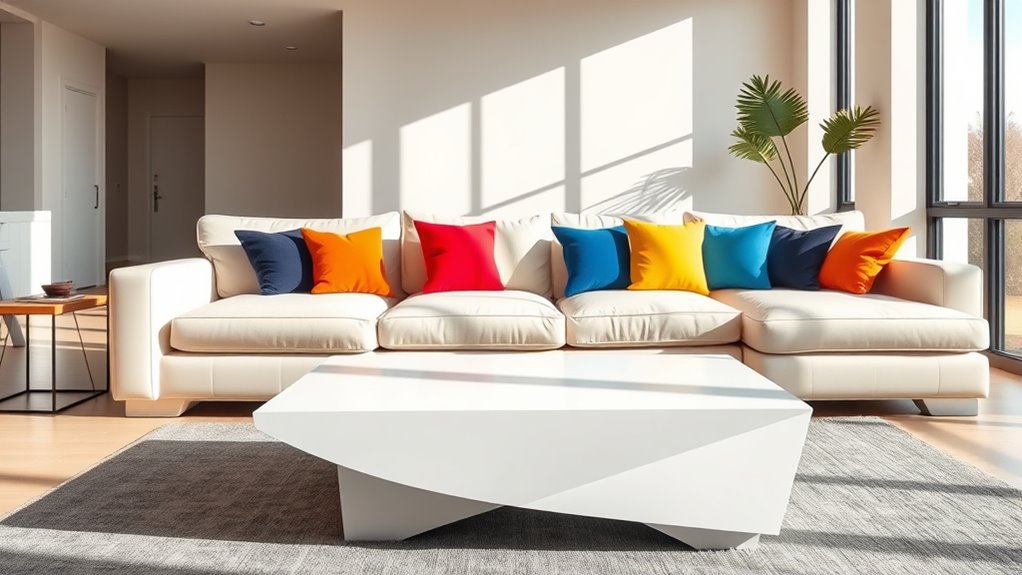
Limit the Number of Bold Accents
To create a balanced and impactful space, it’s best to limit the number of bold accents you introduce. This minimalist approach helps prevent visual overload and keeps your design cohesive. Instead of scattering bright colors throughout, choose one or two areas to serve as focal points. This focal point strategy ensures your bold accents stand out without overwhelming the room. By focusing on a limited palette of accents, you allow each color to make a statement. Keep other elements subdued and neutral to enhance the effect. Remember, less is more—using fewer bold accents creates a more sophisticated, harmonious environment. This approach helps you highlight your chosen colors intentionally, making your space feel thoughtfully designed and visually balanced. Additionally, understanding the evolution of portable restrooms can inspire creative design choices for outdoor events.
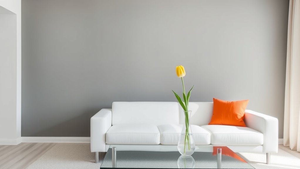
Balance Bright Hues With Calm Neutrals

Using a neutral base helps your bright hues stand out without overwhelming the space. It softens bold colors, creating a balanced and inviting atmosphere. When you incorporate calm neutrals, your vibrant accents become eye-catching yet harmonious. Incorporating seasonal arrangements can further enhance the overall aesthetic and keep your decor fresh and engaging.
Neutral Base Importance
Balancing bright color accents with calm neutrals creates a harmonious and inviting space. A neutral base provides stability, allowing bold hues to stand out without overwhelming. To achieve this, consider these strategies:
- Use monochrome palettes for a sophisticated, cohesive look that highlights your chosen color accents.
- Incorporate neutral shades like beige, gray, or taupe as the foundation, ensuring they complement your vibrant hues.
- Experiment with color blocking by pairing neutral backgrounds with striking accent colors, creating visual interest without clutter.
- Pay attention to bank opening hours to plan your shopping or appointments efficiently, especially during holidays or special hours.
Softening Bright Colors
When working with bright colors, incorporating calm neutrals can soften their intensity and create a more inviting atmosphere. Effective color pairing balances bold hues with gentle neutrals like beige, gray, or soft white, preventing the space from feeling overwhelming. This approach allows the vibrant colors to stand out without dominating the room, promoting a harmonious visual flow. By carefully selecting neutral tones, you enhance the overall mood, making the space feel relaxed and welcoming. Neutral accents act as a visual break, giving your eyes a rest and allowing the bright colors to serve as focal points. Incorporating diverse planter designs can further complement this balance by adding interesting textures and shapes that harmonize with the neutral palette. Ultimately, this balance boosts mood enhancement, making your environment both lively and soothing. Softening bright colors with neutrals creates a sophisticated, comfortable space that feels thoughtfully designed.
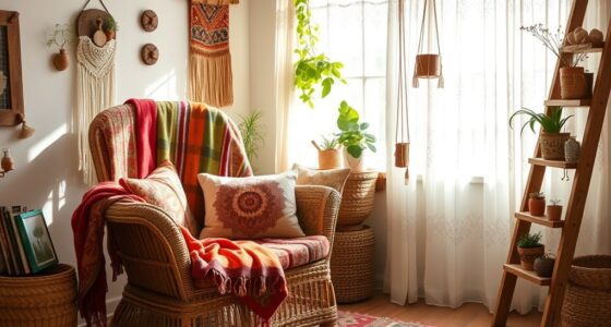
Incorporate Textures and Patterns
Incorporating textures and patterns into your space adds depth and visual interest, making bold color accents feel more intentional and cohesive. Using textured fabrics, like plush cushions or woven throws, creates tactile contrast that enhances your color choices. Patterned wallpapers can serve as focal points, adding visual complexity without overwhelming the room. To balance these elements effectively, consider:
Adding textures and patterns creates depth, making bold colors feel intentional and harmonious.
- Mixing large-scale patterns with solid colors to prevent clutter.
- Combining different textures, such as velvet with linen, for layered richness.
- Using patterned wallpapers strategically on accent walls to highlight bold hues.
These techniques help your bold accents stand out while maintaining harmony through varied textures and patterns. When thoughtfully integrated, textures and patterns elevate your design, making your space both lively and balanced. Additionally, understanding the store hours of beauty retailers can help you plan your visits for inspiration and shopping.
Apply the Rule of Three for Visual Harmony

Applying the Rule of Three is a simple yet powerful way to create visual harmony in your space. You do this by arranging your bold color accents to form a visual triangle, guiding the eye smoothly across the room. Start by grouping three elements with similar or complementary colors, ensuring they’re spaced evenly. This color grouping establishes a cohesive look. Position these accents at strategic points—such as corners, focal points, or across different areas—to maintain balance. The visual triangle helps prevent clutter and over-accumulation of color, making your space feel intentional and well-structured. Incorporating color psychology can enhance the impact of your accents and create a more harmonious environment. When you apply this rule, your bold color accents will feel natural and pleasing, creating an inviting atmosphere that’s both lively and harmonious.
Frequently Asked Questions
How Do I Choose the Best Bold Color for My Space?
When choosing the best bold color for your space, start with the color wheel to understand your options. Think about accent harmony—pick shades that complement or contrast nicely with your existing decor. Consider the mood you want to create and test swatches in your space before committing. This way, you’ll find a bold color that enhances your room without overwhelming it, creating a balanced and vibrant environment.
Can Bold Accents Work in Small Rooms Effectively?
Yes, bold accents can work in small rooms effectively if you consider color psychology and visual harmony. Use bold colors strategically to create focal points that draw the eye and add personality without overwhelming the space. Incorporate these accents through accessories or artwork, and balance them with neutral tones to maintain openness. This approach helps you add vibrancy while keeping the room feeling spacious and visually balanced.
What Are Common Mistakes When Balancing Bold Colors?
When balancing bold colors, you often make mistakes like choosing clashing hues that fight for attention or overusing boldness, which overwhelms the space. You might also forget to incorporate neutral tones to create harmony or underestimate the power of subtle accents. To avoid these errors, step back and evaluate how your colors interact, ensuring they complement rather than clash, and use bold accents thoughtfully to enhance your room’s overall aesthetic.
How Do I Update Bold Accents for Seasonal Changes?
Think of your space as a canvas that shifts with the seasons. To update your bold accents, embrace seasonal color palettes—warm tones in fall or icy hues in winter. Use accent update tips like swapping out pillow covers, curtains, or decorative accessories to mirror the changing mood. This rhythm keeps your home vibrant and aligned with the seasons, ensuring your bold accents stay fresh and harmonious year-round.
Are There Specific Lighting Tips for Highlighting Bold Accents?
To highlight bold accents effectively, you should use accent lighting like spotlights or track lights to draw attention. Position these lights carefully to avoid glare and make sure they enhance your color choices. Additionally, take advantage of natural sunlight during the day, which can beautifully illuminate your accents without overpowering them. Adjust your lighting throughout the day to keep your bold accents vibrant and eye-catching, creating a dynamic and inviting space.
Conclusion
By mastering bold color accents, you hold the power to transform any space into a vibrant masterpiece. It’s not just about adding pops of color — it’s about creating a symphony that captures attention and sparks emotion. When you balance daring hues with calm neutrals and thoughtful textures, your environment becomes an unstoppable force of style. Embrace this art, and watch your space become a breathtaking canvas that leaves everyone in awe — a true affirmation to your bold vision.