Valentine's Day Decoration
How Much Ribbon Is Needed to Make a Wreath?
2025
When it comes to making a wreath, calculating the amount of ribbon needed is like solving a puzzle – it requires precision and a keen eye for detail. As we explore the art of wreath-making, we'll uncover the factors that influence the quantity of ribbon required.
From wreath size to ribbon width, and from seasonal variations to design intricacies, there's a multitude of considerations at play.
Join us as we unravel the mystery of ribbon estimation for wreaths, and discover the tips and tricks that can make this process a seamless and enjoyable part of your crafting journey.
Key Takeaways
- Wreath size should be determined based on where it will be displayed and the desired visual impact, with 22-24 inches being ideal for a front door.
- Ribbon length should be twice the diameter of the wreath, but can vary based on bow style and desired ribbon tail length. Consider if the ribbon will be used solely for a bow or if it will also be woven throughout the wreath.
- A 2-inch ribbon width provides a balance of visual impact and maneuverability, allowing for the creation of stunning wreaths with various textures and colors.
- The style of the wreath determines the ribbon measurement technique, with simple round wreaths requiring approximately 3 times the diameter for a classic bow and more intricate designs like cascading ribbon wreaths requiring up to 5 times the diameter. Adjust the amount of ribbon needed based on the wreath's fullness to maintain a balanced look.
Understanding Wreath Size and Ribbon Length
As wreath makers, we know that understanding the appropriate wreath size and ribbon length is crucial for creating a visually stunning and balanced design.
When determining the size of the wreath, we consider where it will be displayed and the overall visual impact we want to achieve. For a front door, a wreath measuring 22 to 24 inches in diameter is usually ideal, while smaller wreaths around 18 inches work well for interior spaces or windows.
Once the wreath size is decided, we move on to the ribbon length. The general rule of thumb is to use twice the diameter of the wreath for the ribbon length. So, for a 24-inch wreath, we'd use approximately 48 inches of ribbon. However, this can vary depending on the style of the bow and the desired length of the ribbon tails.
It's important to consider if the ribbon will be used solely for a bow or if it will also be woven throughout the wreath. This can affect how much ribbon is needed. These considerations ensure that the ribbon not only complements the wreath size but also enhances its overall aesthetic appeal.
Choosing the Right Ribbon Width

When it comes to choosing the right ribbon width for a wreath, we need to consider the various options available and how they can impact the overall appearance of the wreath.
The width of the ribbon plays a crucial role in determining the style and visual impact of the final product. It's important to carefully consider the different widths and their potential effects on the wreath's design.
Ribbon Width Options
After experimenting with various ribbon widths, we found that a 2-inch width provided the perfect balance of visual impact and maneuverability for creating a stunning wreath. This width allows for intricate designs while still making a bold statement.
When considering ribbon width options, it's crucial to factor in the ribbon texture options and ribbon color choices. A 2-inch width complements a variety of textures, from satin and velvet to burlap and lace, providing versatility in wreath designs. Additionally, it allows for the interplay of multiple colors, enhancing the visual appeal of the wreath.
The 2-inch width offers flexibility in creating bows, loops, and other decorative elements, making it easier to work with while ensuring a captivating and professional finish.
Impact on Wreath Appearance
Experimenting with various ribbon widths, we discovered that a 2-inch width not only provides the perfect balance of visual impact and maneuverability for creating a stunning wreath but also enhances the overall appearance, making it an optimal choice for ensuring a captivating and professional finish.
Here are four reasons why the 2-inch ribbon width has a significant impact on wreath aesthetics and ribbon quantity decisions:
- Enhanced Fullness: The wider ribbon creates a fuller, more luxurious look, elevating the overall appeal of the wreath.
- Easier Handling: Maneuvering a 2-inch ribbon is effortless, allowing for intricate designs and detailing.
- Sophisticated Visual Impact: The wider ribbon makes a bold statement, adding a touch of elegance and grandeur to the wreath.
- Professional Finish: Using the 2-inch width ensures a polished, high-quality finish, elevating the wreath from charming to captivating.
Calculating Ribbon for Different Wreath Styles
For an eye-catching wreath with a full and elegant ribbon display, it's essential to calculate the right amount of ribbon for the specific style of wreath you're creating.
When it comes to ribbon measurement techniques, the style of the wreath plays a crucial role. For a simple round wreath, you'll need approximately 3 times the diameter of the wreath in ribbon to make a classic bow. However, for a more intricate design like a cascading ribbon wreath, you may need up to 5 times the diameter to achieve the desired effect.
Wreath style variations greatly impact the ribbon calculation process. For example, a lush, full foliage wreath with minimal ribbon accents may require less ribbon compared to a minimalist wreath where the ribbon is the focal point.
Understanding the specific style and vision for your wreath will ensure that you calculate the right amount of ribbon for a harmonious and visually pleasing result.
Adjusting Ribbon Amount for Fuller Wreaths
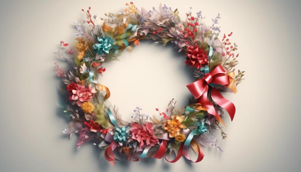
As wreath enthusiasts, we've found that as the fullness of a wreath increases, the amount of ribbon needed for a balanced and beautiful display also increases accordingly. When dealing with fuller wreaths, it's essential to adjust the ribbon amount to ensure a harmonious and visually appealing result. Here's how we've learned to do it:
- Consider Ribbon Density: As the fullness of the wreath grows, the ribbon density should also increase to maintain a balanced look. Sparse ribbon on a full wreath may make it appear unfinished or uneven.
- Factor in Wreath Fullness: The fuller the wreath, the more ribbon it will require to wrap around and maintain its intricate design. Neglecting this could result in an uneven distribution of ribbon, detracting from the wreath's overall beauty.
- Visualize the End Result: When adjusting the ribbon amount for a fuller wreath, envision how the ribbon will interact with the increased greenery or decorations. This visualization helps in determining the right amount of ribbon needed for optimal coverage.
- Maintain Proportions: As the wreath becomes fuller, it's crucial to ensure that the ribbon amount maintains proportionality with the overall size and density of the wreath. This will result in a visually stunning and well-balanced final product.
Making these adjustments will help ensure that the ribbon complements the wreath's fullness, resulting in a stunning display that captures the eye and imagination.
Factoring in Ribbon Bows and Accents
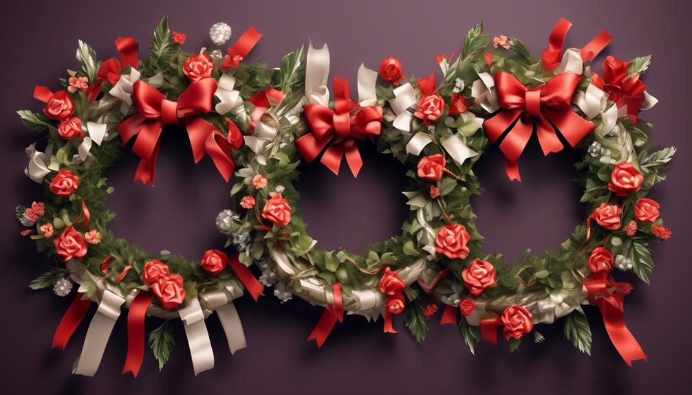
Exploring various ways to incorporate ribbon bows and accents into a wreath design enhances its visual appeal and adds a touch of elegance to the overall presentation.
When it comes to accents placement, consider attaching small bows at the base of clusters of flowers or foliage to create a balanced and harmonious look. Placing accents strategically throughout the wreath can draw attention to specific areas and create a sense of movement and depth.
To achieve a cohesive and polished appearance, it's essential to pay attention to ribbon color coordination. Choose ribbon colors that complement the overall color scheme of the wreath and the surrounding decor. For a classic and timeless look, opt for a neutral-colored ribbon that complements the natural elements in the wreath.
On the other hand, if you're aiming for a more vibrant and eclectic style, consider incorporating ribbons in contrasting or complementary hues to add a pop of color.
Accounting for Ribbon Tails and Streamers

After enhancing the wreath's visual appeal with well-placed ribbon bows and accents, we now turn our attention to accounting for ribbon tails and streamers, which can further elevate the wreath's overall presentation and add a sense of movement and playfulness.
When considering the ribbon tails and streamers for your wreath, it's essential to account for the variations in ribbon length to achieve a balanced and harmonious look. Different lengths of ribbon tails can create a dynamic and flowing effect, adding depth and texture to the wreath.
Here are some ribbon tail techniques to consider:
- Varying Lengths: Experiment with different lengths of ribbon tails to create an organic and visually appealing flow.
- Layering: Layering ribbons of varying lengths can add dimension and interest to the wreath, making it look fuller and more luxurious.
- Angle Placement: Angle the ribbon tails in different directions to create a sense of movement and whimsy, adding a playful element to the wreath.
- Secure Fastening: Use secure fastening techniques to ensure that the ribbon tails and streamers stay in place, even in windy conditions, maintaining the wreath's polished and elegant appearance.
Considering Multiple Ribbon Layers
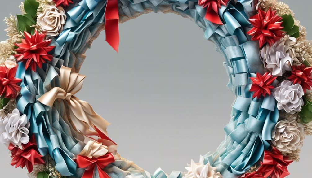
Let's talk about the art of layering ribbon to create a dynamic and visually appealing wreath.
We'll explore techniques for effectively arranging multiple ribbon layers to add depth and dimension to your design.
Additionally, we'll delve into the importance of color coordination, offering practical tips to ensure that your ribbon layers complement each other seamlessly.
Layering Ribbon Effectively
Layering ribbon effectively can add depth and visual interest to a wreath, creating a beautiful and dynamic decoration. When layering ribbon, it's important to consider the overall visual impact and cohesion of the design. Here are some techniques for layering ribbon effectively:
- Varying Widths: Using ribbons of different widths adds dimension and texture to the wreath, creating a visually captivating display.
- Mixing Textures: Combining smooth satin ribbons with textured or patterned ones adds depth and tactile interest to the overall look of the wreath.
- Color Coordination: Selecting ribbons in complementary or contrasting colors can make the layers pop, adding a vibrant and eye-catching element to the wreath.
- Overlapping Layers: Overlapping ribbon layers creates an intricate and visually appealing pattern, enhancing the overall aesthetic of the wreath.
Color Coordination Techniques
When layering ribbon effectively by varying widths and mixing textures, the next important consideration is the color coordination techniques to enhance the visual impact of multiple ribbon layers in a wreath. Color mixing and pattern pairing are essential elements in creating a cohesive and visually appealing design. By carefully selecting colors that complement each other and incorporating various patterns that work harmoniously, the layers of ribbon can create a stunning visual impact. Here's a helpful guide for color coordination techniques when using multiple ribbon layers in a wreath:
| Color Mixing | Pattern Pairing |
|---|---|
| Monochromatic | Polka Dots & Stripes |
| Analogous | Plaid & Floral |
| Complementary | Geometric & Solid |
Careful consideration of color mixing and pattern pairing can elevate the overall aesthetic of the wreath, ensuring that the multiple ribbon layers work together seamlessly.
Estimating Ribbon for Seasonal Wreaths

Estimating the amount of ribbon needed for seasonal wreaths can be a precise and rewarding process, ensuring that the final result is beautifully adorned with just the right amount of ribbon. As someone who's spent years creating stunning wreaths, we understand the importance of getting the ribbon estimation just right. Here are some tips to help you estimate the amount of ribbon needed for your seasonal wreaths:
- Consider the Size of the Wreath: Smaller wreaths may only require a few yards of ribbon, while larger ones could need significantly more. Understanding the size of your wreath will help you estimate the right amount of ribbon to use.
- Account for Ribbon Arrangements: If you plan to create elaborate ribbon arrangements, such as bows and cascading ribbons, you'll need to factor in extra ribbon to accommodate these creative designs.
- Match the Seasonal Theme: Take into account the overall theme of your wreath. For example, a lush and full holiday wreath may require more ribbon for a festive and extravagant look.
- Personal Preference: Lastly, consider your personal style and the aesthetic you wish to achieve. Some individuals prefer a more minimalistic approach, while others may desire a more opulent and ribbon-adorned wreath.
Estimating ribbon for seasonal wreaths is a delightful part of the creative process, allowing you to bring your vision to life with just the right amount of ribbon.
Compensating for Ribbon Patterns and Designs

When it comes to working with different ribbon patterns and designs, we've learned that it's essential to consider the impact of the chosen design on the overall look of the wreath.
We've found that compensating for the design by adjusting the length or width of the ribbon can make a significant difference in the final result.
Choosing the right width of ribbon also plays a crucial role in achieving the desired aesthetic, and we've discovered some useful techniques for making these decisions.
Ribbon Pattern Considerations
Considering the variety of ribbon patterns and designs available, it's essential to carefully evaluate how they'll complement the overall aesthetic of the wreath. When it comes to pattern mixing, we recommend balancing bold patterns with more subtle ones to create visual interest without overwhelming the design.
Color coordination is crucial; harmonizing the colors in the ribbon patterns with the floral elements can tie the whole look together. Additionally, incorporating textured ribbons can add depth and dimension to the wreath. We suggest experimenting with different ribbon widths to achieve a balanced and cohesive look.
Design Impact on Ribbon
As we approach the discussion on the impact of design on ribbon selection, it becomes crucial to consider how the overall aesthetic vision of the wreath can be enhanced through thoughtful ribbon patterns and designs. Ribbon texture impact and color scheme influence play a significant role in the overall impact of the wreath. The texture of the ribbon, whether it's smooth, wired, or patterned, can add depth and dimension to the design. A smooth ribbon may create a more elegant and classic look, while a wired ribbon allows for more flexibility in shaping and styling. Similarly, the color scheme of the ribbon can greatly influence the visual appeal of the wreath, complementing or contrasting with the other elements. Carefully selecting the texture and color of the ribbon ensures that it harmonizes with the overall design, elevating the wreath to a truly captivating piece of art.
| Ribbon Texture | Color Scheme |
|---|---|
| Smooth | Monochromatic |
| Wired | Contrasting |
| Patterned | Complementary |
Choosing Ribbon Width
Exploring various ribbon widths allows for the strategic compensation of patterns and designs, ensuring a harmonious and visually appealing integration within the wreath. When choosing ribbon widths, consider the following:
- Emotional Impact: Thicker ribbons can convey a sense of opulence and grandeur, while thinner ribbons evoke delicacy and elegance, influencing the emotional response to the wreath.
- Visual Balance: The width of the ribbon should complement the size of the wreath, creating a visually balanced and aesthetically pleasing result.
- Ribbon Material Options: Different widths work better with specific materials, such as wider ribbons for stiffer fabrics and narrower ones for softer materials, affecting the overall look and feel of the wreath.
- Choosing Ribbon Colors: The width of the ribbon can also impact how the colors interact, with wider ribbons allowing for more prominent color displays and narrower ribbons creating a subtler, more intricate color blend.
Tips for Minimizing Ribbon Waste

To minimize ribbon waste, I recommend carefully planning the length of ribbon needed for each part of the wreath and cutting only what's necessary. One effective tip is to measure the circumference of the wreath form and then add a little extra for tying off the ends. This way, you can avoid cutting excessively long pieces that may end up as waste.
Additionally, consider using creative alternatives such as fabric scraps, old clothing, or even eco-friendly options like repurposed cotton or silk ribbons. These sustainable ribbon options not only minimize waste but also add a unique touch to your wreath.
When cutting the ribbon, I suggest using sharp scissors to ensure clean, precise cuts, which can help prevent unnecessary fraying and waste. Another tip is to save and repurpose any leftover ribbon scraps for future projects, such as crafting ornaments or accent pieces for other decorations.
Frequently Asked Questions
Can I Use the Same Amount of Ribbon for a Square or Heart-Shaped Wreath as for a Circular Wreath?
We found that ribbon shapes can influence the amount needed for different wreath designs. For square or heart-shaped wreaths, we adjust the ribbon length to account for the unique angles and edges.
Considering the ribbon colors and wreath materials, we ensure the right amount for a beautiful finish. Our experience has taught us to tailor the ribbon quantity to suit each wreath, creating an intimate touch that complements the design perfectly.
How Do I Factor in the Length of Ribbon Needed for a Large Bow or Other Decorative Accents on the Wreath?
When factoring in the length of ribbon needed for a large bow or other decorative accents on the wreath, estimating ribbon length for seasonal wreaths can be a challenge.
We've found that minimizing waste when cutting and using ribbon for wreaths is crucial. Additionally, adjusting the ribbon amount for fuller wreaths is important to achieve the desired look while ensuring efficient usage.
Do I Need to Adjust the Amount of Ribbon for a Fuller Wreath Compared to a Less Dense One?
When considering the ribbon density for a wreath, we've found that adjusting the length is crucial based on the wreath's fullness.
For a fuller wreath, you may need to increase the length to ensure proper coverage and a balanced look.
The shape and density of the wreath play a significant role in the amount of ribbon required, so it's essential to adapt accordingly to achieve the desired effect.
Should I Use a Different Technique for Estimating Ribbon Length for Seasonal Wreaths, Such as Those for Christmas or Halloween?
When estimating ribbon length for seasonal wreaths, like Christmas or Halloween, it's crucial to consider the ribbon types and wreath size.
Different ribbon types and varying wreath sizes can impact the amount of ribbon needed. For example, larger wreaths or more intricate designs might require longer lengths of ribbon. Also, specific ribbon materials, such as wired or sheer ribbons, can affect how much is needed.
It's all about finding the right balance to create a stunning seasonal wreath.
How Can I Minimize Waste When Cutting and Using Ribbon for My Wreath?
Minimizing waste and using efficient cutting techniques is essential when making wreaths. We've found that measuring the ribbon length before cutting it helps reduce waste.
Also, using a rotary cutter and mat allows for precise and clean cuts, minimizing excess ribbon.
Another tip is to carefully plan the ribbon placement on the wreath to ensure no leftover scraps.
These strategies have helped us create beautiful wreaths while minimizing waste.
Conclusion
As we wrap up our ribbon journey, remember that the amount of ribbon needed for a wreath is like the ingredients in a recipe – it all depends on the size and style of the wreath, just like the type of dish you're cooking.
So, just like a skilled chef, measure carefully, be creative, and don't be afraid to add a little extra flair to make your wreath truly shine.
Happy crafting!
- About the Author
- Latest Posts
Introducing Ron, the home decor aficionado at ByRetreat, whose passion for creating beautiful and inviting spaces is at the heart of his work. With his deep knowledge of home decor and his innate sense of style, Ron brings a wealth of expertise and a keen eye for detail to the ByRetreat team.
Ron’s love for home decor goes beyond aesthetics; he understands that our surroundings play a significant role in our overall well-being and productivity. With this in mind, Ron is dedicated to transforming remote workspaces into havens of comfort, functionality, and beauty.
When it comes to creating a sweet Valentine’s Day message, there is more to it than just writing a few nice words on a piece of paper. There are delicate details and thoughtful gestures that can really turn a simple note into something heartwarming and unforgettable.
From selecting the perfect stationery to incorporating humor and personal touches, there are several elements that can make your Valentine's Day note stand out in the best way possible.
Stick around to discover the secrets to creating a note that will leave your special someone feeling cherished and loved.
Key Takeaways
- Customized designs and unique paper options are essential for creating a cute Valentine's Day note.
- The note should convey genuine sentiment and reflect true feelings.
- Adding personal touches such as meaningful words, hand-drawn illustrations, and inside jokes can make the note more special.
- Incorporating humor and puns can add a lighthearted and fun touch to the Valentine's Day note.
Select the Right Stationery
We always choose stationery that reflects our personality and the style of the recipient. Customized designs and unique paper options are essential for creating a cute Valentine's Day note that truly stands out. When selecting stationery, we look for designs that capture the essence of our relationship and the recipient's preferences. Whether it's a playful and colorful design for a fun-loving partner or an elegant and sophisticated option for a more refined taste, the right stationery sets the tone for the heartfelt message we want to convey.
In addition to customized designs, we also consider unique paper options that add a special touch to our Valentine's Day note. From handmade paper with intricate textures to eco-friendly options that align with our values, the choice of paper can elevate the overall aesthetic and appeal of the note. The tactile experience of writing on high-quality paper and the visual impact it creates further enhances the sentiment behind our words.
Ultimately, the stationery we choose becomes an extension of our emotions, making the act of giving and receiving the Valentine's Day note even more intimate and meaningful.
Write From the Heart

How can we infuse our Valentine's Day note with genuine emotion and sincerity? When it comes to writing from the heart, it's essential to establish a deep emotional connection with the recipient. The words we choose should convey genuine sentiment and reflect our true feelings. To create a truly heartfelt Valentine's Day note, we must tap into our emotions and express our love and appreciation in a sincere and authentic manner. Here's a simple yet powerful table to guide us in writing from the heart:
| Express Your Feelings | Share Fond Memories | Use Endearing Nicknames | Convey Your Hopes and Dreams |
|---|---|---|---|
| Tell them how much they mean to you. | Recount a special moment you shared. | Address them with a sweet pet name. | Share your aspirations for the future together. |
| Let your vulnerability show. | Reminisce about a cherished experience. | Recall a funny or heartwarming memory. | Express your desire to grow old together. |
| Communicate your love and admiration. | Reflect on a time when they supported you. | Include a playful or affectionate term of endearment. | Communicate your excitement for what's to come. |
Add Personal Touches
Let's start by considering meaningful words and phrases that hold significance for both you and the recipient.
Hand-drawn illustrations can also add a charming and personal touch to your Valentine's Day note.
Another way to personalize your note is to incorporate inside jokes or references that are special to your relationship.
Meaningful Words and Phrases
Infuse your Valentine's Day note with heartfelt words and personal touches to make it truly memorable. Consider incorporating romantic gestures that hold special meaning for the two of you.
Express your love language in the note by using words and phrases that resonate with your partner's emotions. Share inside jokes, memories, and intimate moments that are unique to your relationship.
Use endearing terms of affection and appreciation that convey the depth of your feelings. Personalize the note further by adding a snippet of a meaningful song lyric, a special quote, or a reference to a shared experience.
Let your partner feel cherished and understood by including specific details that highlight what makes your bond so extraordinary. By adding these personal touches, your Valentine's Day note will be a beautiful expression of your love.
Hand-Drawn Illustrations
Adding hand-drawn illustrations to your Valentine's Day note can bring a personal and heartfelt touch to your message. Here are some tips for creating adorable hand-drawn illustrations:
- Hand Drawn Doodles: Sketch cute little doodles like hearts, flowers, or even little animals to add a whimsical touch to your note.
- Creative Lettering Styles: Experiment with different lettering styles to make your message visually appealing. You can try bubble letters, calligraphy, or even a combination of different styles for a unique look.
- Personalized Elements: Incorporate inside jokes, shared memories, or references to personal experiences through your illustrations to make the note more intimate.
- Colorful Accents: Use vibrant colors to make your illustrations pop and add an extra layer of charm to your Valentine's Day note.
Incorporate Inside Jokes
As we infuse our hand-drawn illustrations with personal touches, incorporating inside jokes creates a deeper connection and adds a heartfelt layer to our Valentine's Day note.
Inside jokes are like secret codes that only the two of us understand, making them perfect for a private message. For instance, referencing the time we got lost on our road trip or the silly nickname we've for each other adds a touch of intimacy to our note.
These inside joke examples serve as reminders of the special moments we've shared, making the note feel personalized and cherished. By including these meaningful references, we show our partner that we truly understand and value the unique bond we share, strengthening the emotional impact of our Valentine's Day message.
Incorporate Humor and Puns

When it comes to writing a cute Valentine's Day note, incorporating humor and puns can add a playful and lighthearted touch.
Funny pun examples can bring a smile to your partner's face and make the note memorable.
We'll share tips on how to add humor effectively and keep the tone light and fun.
Funny Pun Examples
Crafting a cute Valentine's Day note with funny pun examples can add an extra dose of humor and charm to your message. Here are some ideas for incorporating funny puns into your note:
- 'You're the pun for me' with a small illustration of a cute pencil and eraser.
- 'I'm wheelie glad we're together' alongside a doodle of two bicycles.
- 'Olive you very much' accompanied by an illustration of two olives hugging.
- 'You're tea-riffic' next to a drawing of a teacup with a smiling face.
Personalized jokes can make your note even more special, so consider including puns related to inside jokes or shared experiences. Remember, the key is to keep it light-hearted and fun, so let your creativity flow and have fun with it!
Adding Humor Effectively
To effectively incorporate humor and puns into your Valentine's Day note, consider personalizing jokes related to shared experiences or inside jokes for a more special touch. A well-placed pun or witty anecdote can bring a smile to your loved one's face and show that you've put thought into making them laugh.
For example, if you both laughed at a movie's cheesy lines, incorporate a playful reference to it. 'Our love is like a romantic comedy, full of cheesy lines and unforgettable moments.' Remember, the goal is to make them chuckle and feel closer to you.
Personalized humor can create an intimate connection and show that you cherish the moments you've shared together.
Choose Thoughtful Quotes
We carefully selected heartfelt quotes to add a special touch to our Valentine's Day note. We wanted to convey the depth of our feelings, so we chose these quotes:
- Inspirational quotes: We included quotes that inspire hope and celebrate the strength of our love. Words that remind us of the beauty of love enduring all things, like 'Love is composed of a single soul inhabiting two bodies' by Aristotle.
- Romantic phrases: We incorporated romantic phrases that speak to the tenderness and passion we feel for each other. Phrases like 'You are my today and all of my tomorrows' by Leo Christopher perfectly express the depth of our commitment.
- Classic love poetry: We included verses from classic love poems that evoke timeless romance. Lines from Shakespeare's sonnets or Elizabeth Barrett Browning's 'How do I love thee? Let me count the ways' resonate with the depth of our emotions.
- Personalized messages: We also added personalized messages that are unique to our relationship, capturing inside jokes, shared memories, and the quirks that make our love story one of a kind.
These thoughtful quotes will surely make our Valentine's Day note even more special and heartfelt.
Experiment With Creative Formats
Exploring innovative layouts and playful designs can infuse our Valentine's Day note with a delightful and unexpected charm. Visual storytelling can add a unique dimension to our message. Consider creating a mini scrapbook-style note, using a combination of photos, drawings, and handwritten messages to tell a personal story. This interactive format allows us to engage our significant other in a shared narrative, creating a deeper connection through the act of storytelling.
Another creative format to consider is a playful pop-up card. By incorporating interactive elements such as pull-tabs, flaps, or even 3D elements, we can surprise and delight our partner with an engaging and interactive experience. This tactile approach adds a sense of fun and whimsy to our note, making it a memorable keepsake.
Experimenting with these creative formats not only adds an element of surprise and delight but also shows our loved one the effort and thought we put into making the Valentine's Day note special. These innovative layouts and interactive designs can truly elevate our message, making it a cherished and memorable token of our affection.
Use Endearing Pet Names
Incorporating endearing pet names can add an affectionate touch to our creative Valentine's Day note, infusing it with warmth and personal charm. Using sweet gestures and romantic phrases can make our message feel more intimate and special.
Here are four ways to use endearing pet names effectively:
- Personalized Endearments: Addressing our beloved with a unique pet name that holds significance to our relationship can evoke a sense of closeness and tenderness. Whether it's 'sweetheart,' 'darling,' or a special nickname only the two of us share, it shows thoughtfulness and affection.
- Playful Teasing: Adding a touch of humor by using cute and playful pet names like 'lovebug,' 'snuggle muffin,' or 'honey bear' can infuse lightheartedness into our note, making it endearing and delightful.
- Nostalgic Nicknames: Recalling and using pet names from the early days of our relationship can evoke cherished memories and deepen our emotional connection, creating a sense of nostalgia and romance.
- Unexpected Endearments: Introducing new and unexpected pet names can surprise and delight our partner, adding a fresh and spontaneous charm to our Valentine's Day note.
Include Memories and Inside Jokes
Using shared memories and inside jokes can add a personal and heartfelt touch to our Valentine's Day note, creating a meaningful connection with our partner. Nostalgic memories have a way of evoking strong emotions and bringing us closer together. Recalling the time we laughed until we cried on our first road trip or the way we danced in the rain during our beach vacation can make our partner feel cherished and understood. These shared experiences create a sense of intimacy and remind us of the depth of our bond.
Additionally, incorporating inside joke anecdotes can infuse our note with humor and warmth. Reminding our partner of the silly moments when we created our secret language or the funny mishaps that only we can laugh about together can spark joy and laughter, reinforcing the unique connection we share. These inside jokes serve as a testament to the special dynamics of our relationship, making our Valentine's Day note not just cute, but deeply meaningful.
Express Gratitude and Appreciation
We always want to make our loved ones feel appreciated, especially on Valentine's Day. Expressing gratitude and appreciation in a cute note can mean the world to them.
Let's explore how to personalize our message, highlight their special qualities, and use playful language to show our love.
Personalized Heartfelt Message
Expressing gratitude and appreciation through a personalized heartfelt message is a wonderful way to show someone how much they mean to you. It's important to convey your emotions genuinely and sincerely.
Here are some tips to help you create a personalized message that truly expresses your feelings:
- Reflect on specific moments or qualities you appreciate about the person. This shows that your message is truly personal and heartfelt.
- Use specific examples to illustrate your gratitude. This demonstrates that your appreciation is genuine and not just a generic sentiment.
- Express how the person has positively impacted your life. This can make your message even more meaningful and heartfelt.
- Conclude by reiterating your gratitude and expressing your love and appreciation. This helps to ensure that your message leaves a lasting impact.
Crafting a personalized, heartfelt message takes time, but it's an incredibly meaningful way to show someone how much you care.
Highlight Special Qualities
Often, highlighting special qualities of a loved one allows us to express genuine gratitude and appreciation. It's important to acknowledge the unique personality traits that make our partner so special. By showing appreciation for their quirks, strengths, and kindness, we create emotional connections that deepen our bond. Using sentimental words to convey our admiration can truly brighten their day and make them feel cherished. Here's a simple yet heartfelt example of how to highlight their special qualities in a Valentine's Day note:
| Personality Trait | Appreciation |
|---|---|
| Sense of humor | I adore your ability to make me laugh, even on the toughest days. |
| Compassion | Your kindness and empathy towards others truly inspire me. |
| Creativity | Your artistic talents never fail to amaze me. |
| Resilience | Your strength in overcoming challenges is truly admirable. |
Use Playful Language
Using lighthearted and affectionate language in a Valentine's Day note adds a playful touch to expressing gratitude and appreciation. Here are some ways to incorporate playful language into your note:
- Playful Metaphors: Compare your loved one to something whimsical and sweet, like a cuddly teddy bear or a ray of sunshine on a rainy day.
- Whimsical Wordplay: Use puns and clever wordplay to express your affection. For example, 'You make my heart flutter like a butterfly in a field of flowers.'
- Expressive Emoticons: Add cute emoticons like hearts, kisses, or even playful winks to convey your feelings in a fun and light-hearted way.
- Inside Jokes: Include inside jokes or references to shared experiences that will bring a smile to your Valentine's face.
Incorporating playful language will make your Valentine's Day note unforgettable and endearing.
Finish With a Loving Sign-Off
We always like to end our Valentine's Day notes with a warm and affectionate sign-off to express our feelings. After adding loving doodles and romantic quotes, it's important to finish with a heartfelt closing that leaves a lasting impression.
One of our favorite ways to sign off is by using sweet terms of endearment like 'Yours always,' 'Forever yours,' or 'With all my love.' These phrases add an extra touch of tenderness to the note and convey a sense of commitment and adoration.
Another lovely sign-off is to use a quote that captures the essence of our emotions. For example, 'Forever and always,' 'You are my sunshine,' or 'With love and longing.' These quotes aren't only romantic but also timeless, expressing an enduring connection that goes beyond just the Valentine's Day occasion.
We believe that a loving sign-off is the perfect way to wrap up a heartfelt Valentine's Day note, leaving the recipient feeling cherished and special. It's the final touch that solidifies the affection and thoughtfulness conveyed in the note.
Frequently Asked Questions
What Are Some Common Mistakes to Avoid When Writing a Valentine's Day Note?
When writing a Valentine's Day note, it's important to avoid common mistakes that can affect the tone.
Overly cheesy expressions may come off as insincere, while length issues can detract from the message's impact.
It's essential to strike a balance and select a tone that feels authentic and intimate.
Avoiding these pitfalls can help ensure that your Valentine's Day note effectively conveys your feelings in a genuine and heartfelt manner.
How Can I Make My Valentine's Day Note Stand Out From Others?
To make your Valentine's Day note stand out, we need to get creative with illustrations and personalized jokes. This will make the note feel unique and intimate.
Think of it as painting a picture with words and images to capture their heart. Incorporating inside jokes or a funny memory will bring a smile to their face and show them how much you care.
It's all about making it personal and heartfelt.
Are There Any Cultural or Regional Differences in Valentine's Day Note Traditions That I Should Be Aware Of?
There are cultural differences and regional traditions in Valentine's Day etiquette that we need to be aware of.
When it comes to cross-cultural communication, it's important to understand the varying customs and expectations related to Valentine's Day notes.
In some cultures, the exchange of notes may be more reserved, while in others, it could be a grand gesture.
Being mindful of these differences can help us navigate the nuances of expressing love and affection on Valentine's Day.
Is It Appropriate to Include Romantic or Intimate Content in a Valentine's Day Note?
It's essential to consider privacy boundaries and appropriate content when creating a Valentine's Day note. Communication about relationship boundaries is crucial, ensuring both partners feel comfortable and respected.
What Are Some Alternative Ways to Deliver a Valentine's Day Note Besides Giving It in Person or Mailing It?
Crafting a heartfelt Valentine's Day note is an art in itself. When it comes to creative delivery, digital options like e-cards or personalized video messages infuse a modern touch.
Incorporating personalized touches and presenting it in a special way, such as adding a spritz of your favorite scent, can enhance the intimacy.
These alternative methods can evoke a sense of closeness, making the gesture even more memorable and cherished.
Conclusion
So there you have it, creating a cute Valentine's Day note is as easy as pie! Just follow these steps:
- Select the perfect stationery.
- Write from the heart.
- Add personal touches.
- Sprinkle in some humor and puns.
- Choose thoughtful quotes.
- Use endearing pet names.
- Include memories and inside jokes.
- Express gratitude and appreciation.
- Finish with a loving sign-off.
Your special someone is sure to swoon over your thoughtful and adorable note!
- About the Author
- Latest Posts
Introducing Ron, the home decor aficionado at ByRetreat, whose passion for creating beautiful and inviting spaces is at the heart of his work. With his deep knowledge of home decor and his innate sense of style, Ron brings a wealth of expertise and a keen eye for detail to the ByRetreat team.
Ron’s love for home decor goes beyond aesthetics; he understands that our surroundings play a significant role in our overall well-being and productivity. With this in mind, Ron is dedicated to transforming remote workspaces into havens of comfort, functionality, and beauty.
When it comes to enhancing a bulletin board’s appearance, it is akin to putting the final flourish on a room – it should be welcoming, well-organized, and visually pleasing.
We all know the feeling of being drawn to a beautifully curated board, where each element seems to effortlessly complement the next.
But how exactly do we achieve that level of aesthetic finesse in our own bulletin boards? Well, there are a few key strategies that can truly elevate the look of a bulletin board, making it not only visually pleasing but also highly functional.
Key Takeaways
- Consider the overall theme and purpose of the board when selecting the background color.
- Use color coordination to create a visually appealing and cohesive bulletin board.
- Incorporate different textures and colors to add dimension and visual interest.
- Add personalized elements like photos or quotes for a personal touch.
Choosing the Right Background Color
When selecting the perfect background color for your bulletin board, consider the overall theme and purpose of the board to ensure it complements the content effectively. Color coordination is key to creating a visually appealing and cohesive bulletin board.
Think about the colors that will best enhance the materials you plan to display. For instance, if you're creating a bulletin board about the environment, using calming shades of green and blue can evoke a sense of nature and sustainability, enhancing the visual impact of your message. On the other hand, for a board focused on motivation and positivity, vibrant and energetic colors like yellow and orange can help convey the intended mood.
Furthermore, consider the visual impact you want to achieve. Do you want the background color to be a subtle backdrop that allows the content to shine, or do you want it to be a bold statement that immediately draws attention? Understanding the purpose of your bulletin board and the emotions you want to evoke will guide you in choosing the right background color that not only looks nice but also effectively communicates your message.
Incorporating Eye-Catching Borders

To make your bulletin board stand out, consider incorporating eye-catching borders that complement the overall theme and content. Borders are a crucial element that can enhance the visual appeal of your board. Here are some creative options for border design to make your bulletin board pop:
- Thematic Borders: Choose borders that align with the theme of your content. For example, if it's a nature-themed board, opt for borders featuring leaves, flowers, or natural landscapes. This creates a cohesive and harmonious look.
- Contrast Selection: Select border colors that contrast with the background and content. This creates visual interest and helps the borders stand out. For instance, if your background is a dark shade, consider using bright or pastel-colored borders to create a striking contrast.
- Mix and Match: Don't be afraid to mix and match different border designs and colors. Experiment with layering borders to create a unique and visually appealing look. This adds depth and dimension to your bulletin board, making it more captivating.
Incorporating these creative border options and making deliberate color contrasts will elevate the overall aesthetic of your bulletin board, making it more visually appealing and engaging.
Selecting Complementary Patterns and Textures
As we explore the concept of 'Selecting Complementary Patterns and Textures', we can further enhance the visual appeal of our bulletin board by carefully considering how these elements can seamlessly integrate with our chosen borders. Mixing patterns and coordinating textures can truly elevate the overall look of the bulletin board. When choosing patterns, it's essential to ensure they complement each other. Similarly, textures should harmonize to add depth and interest to the board. Here's a table to help you understand how to coordinate patterns, textures, and colors effectively:
| Aspect | Consideration |
|---|---|
| Mixing patterns | Pair bold patterns with subtle ones for balance |
| Texture coordination | Combine smooth and rough textures for contrast |
| Color combinations | Use a complementary color scheme for a cohesive look |
| Stylish accessories | Add decorative pins or clips for an extra flair |
Utilizing Functional and Stylish Push Pins
Exploring a variety of functional and stylish push pins can add a touch of creativity and practicality to your bulletin board design. When it comes to utilizing push pins for both practical organization and aesthetic appeal, there are a few key factors to consider:
- Colorful and Decorative Designs: Opt for push pins in vibrant colors or unique shapes to add a pop of personality to your bulletin board. Whether it's mini cactus-shaped pins or pastel-colored ones, these stylish designs can elevate the overall look of your board.
- Multi-functional Push Pins: Look for push pins that serve a dual purpose, such as combining a pin with a clip to hold important notes or mini shelves to display small items. These multi-functional options not only keep your board organized but also serve as stylish accents.
- Eco-Friendly Materials: Consider eco-friendly push pins made from sustainable materials like bamboo or recycled plastics. Not only do they contribute to a more sustainable environment, but they also add a touch of natural warmth to your bulletin board.
Incorporating these stylish and practical push pins not only enhances the visual appeal of your bulletin board but also contributes to efficient and organized display of important information.
Adding Dimension With Layered Elements
Layering various elements on a bulletin board can create visual interest and depth, enhancing both its aesthetic appeal and functionality. By incorporating textural layering, tactile appeal is introduced, making the bulletin board visually and physically engaging. Utilizing a mix of materials such as fabric, cork, and paper can add depth perception, creating a dynamic visual experience.
Consider using fabric as a backdrop to add softness and warmth, while cork provides a functional surface for pinning items. To further enhance the dimension, incorporate shadow play by layering elements at varying depths. This can be achieved by using pins to secure items at different levels or utilizing adhesive putty to create a raised effect.
Incorporating Interactive and Functional Features
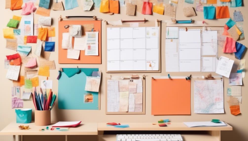
Let's infuse our bulletin board with interactive and functional features to elevate its utility and charm. We want our board to not only be visually appealing but also serve a practical purpose in our space.
Here are some creative and practical ideas to incorporate interactive and functional features into your bulletin board:
- Interactive Elements and Engaging Design: Consider adding elements such as mini whiteboards, sticky notes, or interactive pockets where people can leave messages, notes, or ideas. This will encourage participation and engagement, making the board a dynamic and evolving space.
- Functional Features and Interactive Layout: Create a functional layout by incorporating a calendar, to-do lists, or a key organizer. This will help keep everyone organized and informed while also providing a visually appealing and interactive display.
- Incorporate Technology: Integrate digital elements such as QR codes that link to relevant resources, interactive maps, or touch screen displays for added interactivity and functionality.
Creating a Balanced and Organized Layout
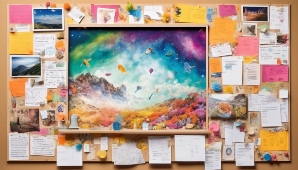
When creating a bulletin board, it's essential to consider the layout organization and visual balance to capture attention and convey information effectively.
We'll explore practical tips for arranging elements in a way that's visually appealing and easy to follow.
Layout Organization
Creating a balanced and organized layout is essential for a visually appealing and functional bulletin board. When organizing the layout, we focus on color coordination, creative displays, and practicality.
Color coordination helps create a cohesive and harmonious look, making the bulletin board visually pleasing. We love to mix and match colors to create an eye-catching display that draws attention.
Next, creative displays infuse personality and style into the bulletin board, making it unique and engaging. Whether it's incorporating handmade elements or using unconventional materials, creativity adds a touch of flair.
Lastly, we ensure that the layout is practical, with information arranged logically for easy access. A balanced and organized layout not only looks great but also serves its purpose effectively, making the bulletin board a valuable resource.
Visual Balance
To achieve a visually balanced and organized layout on a bulletin board, we focus on integrating design elements that harmonize colors, enhance creativity, and ensure practicality. Visual harmony is vital in creating an aesthetically appealing display that captures attention and conveys information effectively. When arranging the content on the bulletin board, it's crucial to consider the placement of different elements to achieve balance and coherence. By utilizing a combination of images, text, and decorative materials, we can create an engaging and harmonious composition. The following table provides practical tips for achieving visual balance on a bulletin board:
| Tips for Visual Balance |
|---|
| Use a variety of colors and textures |
| Create visual hierarchy with different sized elements |
| Balance out the layout by spreading elements evenly |
| Incorporate white space to avoid clutter |
| Regularly review and adjust the layout for optimal balance |
Implementing these strategies will result in a visually pleasing and well-organized bulletin board that effectively communicates its intended message.
Incorporating Personalization and Theme Integration
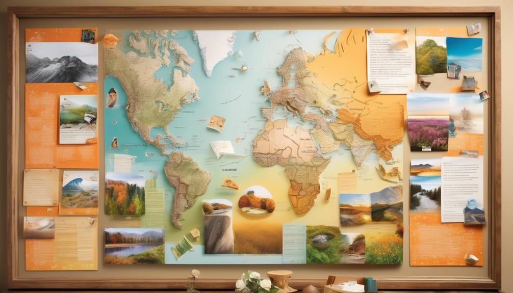
With a thoughtful approach to personalization and theme integration, we can transform a basic bulletin board into a stylish and practical display that reflects our unique personality and interests.
Personalized elements and theme coordination are essential for creating a bulletin board that truly speaks to us. Here's how we can achieve this:
- Personal Touch: Incorporate personalized elements such as photos, quotes, or mementos that hold sentimental value to us. These items not only add a personal touch but also serve as conversation starters.
- Theme Integration: Choose a theme that resonates with our interests, whether it's travel, nature, or a favorite hobby. Integrate this theme through color schemes, patterns, and relevant decorations to create a cohesive look.
- Functional Decor: Combine personalization with functionality by adding elements like a calendar, to-do lists, or pockets for storing important papers. This ensures that our bulletin board not only looks great but also serves a practical purpose in our daily lives.
Frequently Asked Questions
What Are Some Creative Ways to Use Push Pins on a Bulletin Board?
When it comes to creative displays on a bulletin board, we love using push pins to create unique arrangements. By arranging them in patterns or designs, you can add a stylish touch to your board.
Try using push pins to hold up fabric or string to create a visually appealing backdrop. You can also use them to attach small trinkets or decorations for an extra personal touch.
How Can I Make My Bulletin Board Interactive for Users?
To make our bulletin board interactive for users, we can add engaging elements like interactive quizzes, suggestion boxes, and collaborative projects.
By incorporating these features, we can foster a sense of interactive engagement and encourage user participation.
This will create a dynamic and engaging space that invites people to actively participate and contribute, making the bulletin board a vibrant and lively hub of ideas and creativity.
What Are Some Tips for Creating a Balanced and Organized Layout on a Bulletin Board?
Creating visual interest and color coordination are essential for a balanced and organized bulletin board layout. We always aim to mix up shapes, sizes, and textures while ensuring a cohesive color scheme. By strategically arranging the elements, we create an engaging and visually appealing display.
Emphasizing symmetry and balance helps maintain order while adding a touch of creativity. It's all about finding the perfect harmony between structure and style to make the bulletin board look amazing!
How Can I Incorporate Personalization and Theme Integration Into My Bulletin Board Design?
When it comes to personalization tips, we love adding photos, quotes, and personal mementos to bring a unique touch to the bulletin board.
For theme integration ideas, we enjoy using cohesive color schemes, themed borders, and relevant decorative elements to tie everything together.
It's all about infusing our personality and style into the design while ensuring it remains organized and visually appealing.
Are There Any Special Considerations for Using Layered Elements on a Bulletin Board?
When considering layered elements on a bulletin board, it's crucial to focus on creating visual hierarchy. By strategically placing different elements to add layered dimension, we can draw attention to key points and create a more dynamic display.
This approach not only adds depth and interest but also allows for a more visually appealing and organized board. It's a practical and stylish way to make your bulletin board stand out.
Conclusion
In the end, creating a beautiful and functional bulletin board is all about finding the perfect balance of style and practicality. So, let's bring out our creativity and make our bulletin board a reflection of our personality and style.
After all, a well-designed bulletin board isn't just a place to display information, but also a piece of art that can inspire and motivate us every day. Let's turn our bulletin board into a masterpiece that tells our unique story.
- About the Author
- Latest Posts
Introducing Ron, the home decor aficionado at ByRetreat, whose passion for creating beautiful and inviting spaces is at the heart of his work. With his deep knowledge of home decor and his innate sense of style, Ron brings a wealth of expertise and a keen eye for detail to the ByRetreat team.
Ron’s love for home decor goes beyond aesthetics; he understands that our surroundings play a significant role in our overall well-being and productivity. With this in mind, Ron is dedicated to transforming remote workspaces into havens of comfort, functionality, and beauty.
When it comes to decorating our mantels, we often struggle to strike a balance between making a statement and avoiding overcrowding the space.
Hanging beaded garland on a mantle can strike the perfect balance, adding a touch of elegance without being too overpowering.
But how exactly do you achieve that seamless, polished look?
Well, it all starts with selecting the right garland and finding the most effective method to hang it.
And let me tell you, there's a lot more to it than meets the eye.
So, if you're ready to elevate your mantle decor game, we've got some expert tips and tricks to share with you.
Key Takeaways
- Measure your mantle and choose the right garland based on length and style
- Consider the latest beaded garland trends and color coordination options
- Use appropriate attachment methods such as decorative knots, twine, or adhesive hooks
- Arrange and decorate the garland by weaving it through candle holders or fairy lights, incorporating natural elements, and adding lights, ornaments, and floral accents
Measure Your Mantle
Before you start hanging your beaded garland on the mantle, it's essential to measure the length and width to ensure a perfect fit. When it comes to mantle decor, precision is key for a polished look.
Start by measuring the length of your mantle, from end to end, to determine the appropriate length of garland needed. Consider the style you want to achieve – whether you prefer a gathered, draped look or a sleek, taut appearance. For a gathered look, add a few extra inches to the measured length to allow for elegant draping.
Next, measure the width of the mantle to determine how many strands of garland will be needed. For a full and lush appearance, consider using multiple strands layered together.
When it comes to measurement tips, always use a flexible measuring tape for accurate results. Make sure to account for any decorative elements on the mantle, such as candle holders or frames, that may affect the way the garland hangs.
Taking these measurements will ensure that your beaded garland enhances the aesthetic of your mantle, creating a stunning focal point in your space.
Select the Right Garland
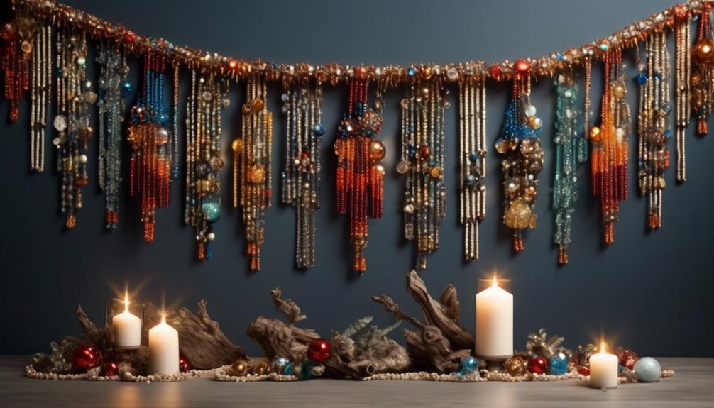
When choosing the right garland for your mantle, it's important to consider the length, color coordination, and attachment method.
The length of the garland should complement the size of your mantle, and the colors should harmonize with your existing decor.
Additionally, the method of attachment will determine how securely and elegantly the garland will hang.
Garland Length
We carefully measured the length of the mantle and selected a beaded garland that perfectly complemented the space, adding a touch of elegance and charm to the room. When choosing the right garland length, it's essential to consider the proportions and style of the mantle. To help you select the perfect garland length for your mantle decoration, we've created a handy guide below:
| Mantle Length (inches) | Recommended Garland Length (feet) |
|---|---|
| 40-50 | 6 |
| 50-60 | 7 |
| 60-70 | 8 |
| 70-80 | 9 |
Color Coordination
With a careful eye for color coordination, we sought out a beaded garland that would effortlessly enhance the aesthetic of the mantle, bringing a cohesive and stylish touch to the room.
When considering color coordination, it's essential to stay updated with the latest beaded garland trends. Currently, the trend leans towards natural, earthy tones, such as soft greens, muted blues, and warm browns, which can complement a variety of interior styles.
For a more personal touch, consider DIY garland ideas using a mix of colors that resonate with the room's decor. You can create a customized garland that perfectly matches the mantle and room's color scheme.
Whether opting for trending tones or crafting a unique DIY garland, color coordination plays a pivotal role in achieving a visually pleasing and harmonious mantle decor.
Attachment Method
After carefully selecting the perfect beaded garland to complement the mantle with its coordinating colors, the next crucial step is to ensure that the attachment method suits the style and structure of the mantle.
Decorative knots can be a charming way to secure the garland, adding an elegant touch to the overall presentation.
For mantles with a more traditional or rustic appeal, consider using twine or jute to tie the garland in place, creating a cozy and inviting atmosphere.
Additionally, for a more whimsical look, consider intertwining the beaded garland with floral arrangements, bringing a fresh and natural element to the display.
Use Adhesive Hooks

The adhesive hooks provide a secure and convenient way to hang the beaded garland on the mantle, ensuring a stylish and hassle-free display. These hooks come in various sizes and designs, allowing for creative arrangements to suit any mantle decor. Here's a comparison of some popular adhesive hooks for hanging beaded garlands:
| Adhesive Hook Brand | Weight Capacity |
|---|---|
| Command Hooks | Up to 7.5 lbs |
| Gorilla Hooks | Up to 15 lbs |
| 3M Adhesive Hooks | Up to 5 lbs |
| Velcro Removable Hooks | Up to 10 lbs |
| Scotch Mounting Squares | Up to 6 lbs |
Each of these options offers decorative alternatives to traditional nails or screws, providing flexibility in how you showcase your beaded garland. When selecting adhesive hooks, consider the weight of your garland and choose a hook that can safely support it. Additionally, be sure to follow the manufacturer's instructions for proper application and removal to avoid any damage to your mantle. With the right adhesive hooks, you can effortlessly elevate your mantle decor with beaded garlands.
Arrange the Garland

Arranging the beaded garland on the mantle allows us to showcase its beauty and style, building on the secure foundation provided by the adhesive hooks mentioned earlier.
When it comes to creative arrangements, consider weaving the garland through candle holders or intertwining it with fairy lights for a whimsical touch. You can also incorporate natural elements like eucalyptus branches or pinecones to add depth and texture to the display.
For a minimalist mantle styling, drape the garland in a simple swag pattern, allowing it to hang naturally and elegantly. Alternatively, create a focal point by gathering the garland into lush clusters at each end of the mantle.
To add a touch of personal flair, consider intertwining the garland with sentimental trinkets or small framed photos.
Don't be afraid to experiment with different arrangements until you find the perfect look that complements your decor and reflects your personal style. Remember, the key is to let your creativity shine through as you bring your mantle to life with the beaded garland.
Incorporate Lights

Intertwine twinkling fairy lights through the beaded garland to infuse your mantle with a captivating and enchanting glow, creating a mesmerizing ambiance in your living space. Light placement is crucial for achieving the perfect balance of warmth and radiance. Start by weaving the fairy lights in and out of the beaded garland, ensuring an even distribution of light. This will create a stunning visual effect, especially in the evening when the lights illuminate the beads, casting a soft, inviting glow throughout the room.
When it comes to cord management, it's essential to conceal the cords seamlessly to maintain a polished look. Tuck the cords discreetly behind the garland and secure them in place using small, clear clips or hooks. If your mantle has outlets nearby, consider using extension cords that match the color of your mantle to blend in seamlessly. Alternatively, you can use decorative cord covers that complement the beaded garland, adding a touch of elegance to the overall display.
Secure With Wire

How can we elegantly and securely attach the beaded garland to the mantle using wire?
When it comes to wire alternatives for hanging the garland, consider using fishing line or clear, thin jewelry wire. These options provide a nearly invisible solution, allowing the beauty of the garland to shine without any distraction.
To secure the garland with wire, start by draping the beaded garland across the mantle and then use small pieces of wire to gently twist and secure it in place. Be sure to space the wire evenly along the garland to provide adequate support and prevent any drooping.
For a creative display, consider intertwining the beaded garland with greenery or fabric ribbons and then securing the combination with wire. This not only adds a touch of elegance but also provides extra support for the garland.
Another option is to create small loops at the ends of the garland using wire, which can then be hooked onto nails or hooks on either end of the mantle, ensuring a secure and stylish display.
When using wire to secure the beaded garland, the key is to maintain a delicate touch to avoid damaging the garland while achieving a secure and visually appealing result.
Add Ornaments
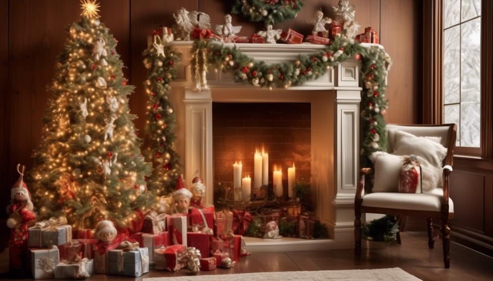
Let's talk about adding ornaments to our beaded garland!
We'll share some tips for placing ornaments in a way that enhances the overall look, as well as how to choose complementary colors to create a cohesive design.
Additionally, we'll discuss the importance of securing the ornaments properly to ensure they stay in place and maintain the desired arrangement.
Ornament Placement Tips
We carefully place each ornament on the garland, ensuring a balanced arrangement that highlights the beauty of each individual piece. As we adorn the mantle with the beaded garland, it's essential to consider the latest mantel decor trends to create a stunning visual impact. To achieve this, we suggest incorporating a variety of ornaments, such as glass baubles, metallic figurines, and natural elements like pinecones. Below, we've provided a helpful table to guide your ornament arrangement, ensuring a harmonious and eye-catching display.
| Ornament Type | Placement |
|---|---|
| Glass Baubles | Evenly spaced along the garland |
| Metallic Figurines | Clustered in odd numbers for visual interest |
| Natural Elements | Scattered throughout for a rustic touch |
| Personal Ornaments | Placed strategically for sentimental value |
Choosing Complementary Colors
As we carefully place each ornament on the garland, ensuring a balanced arrangement that highlights the beauty of each individual piece, we also consider the complementary colors that will enhance the overall visual impact.
Color psychology plays a significant role in choosing the right ornaments for the garland. We aim to evoke feelings of warmth, joy, and comfort through our color choices.
By applying decorating principles such as the 60-30-10 rule, we create a harmonious blend of colors that captivates the eye and exudes a sense of cohesion. The dominant color, the secondary color, and the accent color work together to create a visually pleasing arrangement.
We carefully select ornaments in shades that complement the existing color scheme, ensuring that each addition enhances the overall aesthetic appeal of the garland.
Securing Ornaments Properly
Carefully threading the delicate wire of each ornament through the garland, we ensure a secure and seamless attachment that maintains the integrity of the overall design.
When securing ornaments on the garland, we pay attention to the placement to create a balanced and visually appealing arrangement. Here's how we ensure the ornaments are properly secured:
- Ornament Placement
- We strategically place larger ornaments first and fill in the gaps with smaller ones to achieve a harmonious look.
- Hanging the ornaments at varying heights adds depth and dimension to the garland, creating an enchanting visual effect.
Opt for Floral Accents

Consider incorporating floral accents to add a touch of natural elegance to your beaded garland display. Including floral arrangements or seasonal wreaths can enhance the overall aesthetic of your mantle decor. Here, we provide a breakdown of different floral options to complement your beaded garland:
| Floral Option | Description |
|---|---|
| Fresh Flowers | Add a pop of color and fragrance with a carefully curated bouquet of seasonal blooms. |
| Dried Flower Wreath | Opt for a rustic touch by hanging a dried flower wreath above your beaded garland. |
| Faux Floral Garland | For low-maintenance elegance, consider intertwining a faux floral garland with your beads. |
| Seasonal Wreath | Embrace the spirit of the season by rotating different themed wreaths throughout the year. |
Incorporating floral accents into your mantle decor not only adds visual interest but also brings a sense of freshness and natural charm to the space. Whether you choose fresh, dried, or faux florals, these options can beautifully complement your beaded garland and create a captivating focal point for your mantle display.
Consider a Swag Effect

Let's create a graceful and flowing arrangement by draping the beaded garland in a swag effect across the mantle.
When considering a swag effect for your beaded garland, keep in mind the following tips to ensure a stunning display:
- Selecting the Right Length:
Begin by measuring the length of your mantle and then choose a beaded garland that's slightly longer to allow for an elegant drape.
- Creating Natural Cascades:
Once you have the garland in hand, gently drape it across the mantle, allowing it to form natural cascades and curves. To achieve the perfect swag effect, secure the ends with small hooks or discreetly placed clear wire to hold it in place without detracting from the overall look.
Layer With Greenery

Let's bring our mantle to life by adding some lush greenery for depth and texture.
By layering the beaded garland with fresh foliage, we can enhance the overall look and create a stunning visual impact.
The combination of beads and greenery will add a touch of natural elegance to our mantle decor.
Greenery for Depth
With a lush and vibrant backdrop of greenery, the beaded garland on the mantle gains depth and visual interest, creating a stunning focal point in the room.
To enhance the depth and texture of the mantle decor, incorporate floral accents such as small bouquets of fresh flowers in complementary colors. This adds a touch of natural elegance and softness to the overall display.
Consider using seasonal blooms or silk flowers for a long-lasting and low-maintenance option. This ensures the greenery and floral elements remain vibrant and appealing throughout the year.
Enhance With Foliage
Amidst the glistening strands of beaded garland, we layer the mantle with lush foliage, infusing the display with natural charm and a sense of verdant abundance.
Adding floral arrangements or seasonal decor can elevate the overall look, creating a stunning focal point for any room. We carefully intertwine sprigs of eucalyptus, ferns, or ivy with the beaded garland, allowing the greenery to cascade gently over the edges of the mantle.
The vibrant green hues complement the shimmering beads, creating a captivating contrast that draws the eye. Additionally, seasonal blooms like poinsettias or holly can be strategically placed among the foliage, adding a touch of festive flair.
Mix and Match Colors

Weaving together strands of vibrant beads, we can create a stunning and eclectic display on the mantle, infusing the space with a burst of color and personality. When it comes to mixing and matching colors for beaded garland on the mantle, the possibilities are endless. Here are some tips to help you elevate your mantle decoration inspiration:
- Beaded Garland Color Combinations:
- Play with Contrasting Hues: Mix bold and complementary colors like deep turquoise with fiery red to create a striking visual impact.
- Embrace Ombre Effects: Choose a beaded garland that transitions from one color to another, such as a gradient from soft pink to rich magenta, for a mesmerizing look.
- Mantle Decoration Inspiration:
- Seasonal Themes: Coordinate your beaded garland colors with the current season, like warm oranges and yellows for autumn or cool blues and silvers for winter.
- Nature-Inspired Palettes: Draw inspiration from nature by combining earthy tones like moss green, sunflower yellow, and rich brown for a rustic and inviting mantle display.
Hang at Varying Heights

We've found that hanging beaded garland at varying heights can really make a statement. By using different lengths, you can create a visually stunning effect that draws the eye in.
We recommend using hooks for stability, ensuring that your garland stays securely in place.
Varying Lengths for Impact
With the beaded garland, we can create a striking visual impact by hanging it at varying heights, adding depth and dimension to our mantle decor. By varying the lengths of the beaded garland, we can achieve a captivating and dynamic display that draws the eye and creates a sense of movement.
Here are some tips to make the most of varying lengths for impact:
- Play with Colorful Beads: Experiment with different colors and shades of beads to create an eye-catching and vibrant display that enhances the overall visual appeal of the mantle. Try mixing and matching beads in complementary or contrasting colors to add an element of excitement and creativity to the arrangement.
- Get Creative with Arrangements: Consider incorporating different textures and shapes into the garland to create an eclectic and visually stimulating display that adds personality to your mantle decor.
Use Hooks for Stability
To ensure stability and achieve the desired visual impact, we strategically use hooks to hang the beaded garland at varying heights along the mantle. By employing this stability solution, we create an eye-catching display that adds depth and dimension to the mantle decor.
When using hanging techniques that involve hooks, we can experiment with different heights to create a dynamic and visually appealing arrangement. By staggering the hooks along the mantle, we can hang the garland at varying heights, allowing it to cascade gracefully and creating an enchanting effect.
This method not only ensures the stability of the garland but also adds a touch of elegance to the overall presentation. The result is a captivating display that brings a sense of charm and sophistication to the space.
Utilize Clear Fishing Line
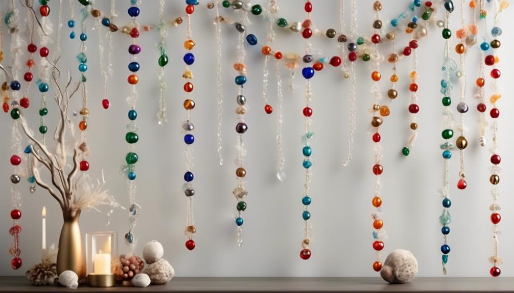
When hanging beaded garland on a mantle, consider utilizing clear fishing line for a seamless and elegant display. Clear fishing line provides a nearly invisible support, allowing the beauty of the beads to take center stage.
Here are some tips to make the most of this method:
- Knot Tying Techniques
- Begin by tying a secure knot at one end of the fishing line. A double knot can provide extra stability.
- To attach the beaded garland, create a small loop at the end of the fishing line and carefully thread it through the beads, ensuring a snug fit without causing damage.
- Bead Stringing Methods
- When stringing the beads onto the fishing line, take your time to prevent tangling and ensure an even distribution.
- Consider alternating bead sizes or colors to create a visually appealing pattern along the mantle.
Drape With Care
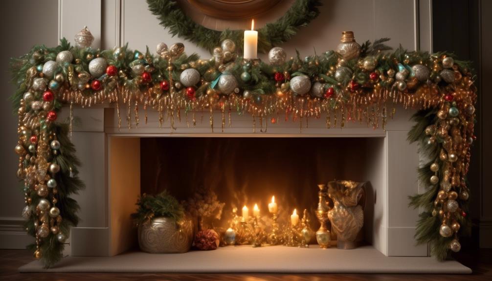
Carefully draping the beaded garland along the mantle ensures a graceful and captivating display, maintaining the seamless elegance achieved with clear fishing line. As we gently drape the garland, it's essential to pay attention to every curve and swoop, ensuring that it follows the natural lines of the mantle. This process not only showcases the intrinsic beauty of the beaded garland but also complements the overall mantle decoration, creating a harmonious and enchanting ambiance.
When styling the beaded garland, we should aim for a balanced and organic flow. Avoiding any abrupt or forced angles, we allow the garland to cascade and meander gracefully, enhancing the mantle's charm. By intertwining the garland with other decorative elements such as candles, greenery, or seasonal ornaments, we can create a visually stunning arrangement that exudes warmth and sophistication. The careful drape of the beaded garland not only elevates the mantle's aesthetic appeal but also infuses the space with a sense of timeless allure.
Intricately styling the beaded garland on the mantle is an art form that requires patience and an eye for detail. Each delicate curve and twist contributes to the overall ambiance, transforming the mantle into a captivating focal point within the room.
Ensure Even Distribution

With an eye for balance and precision, we strategically distribute the beaded garland along the mantle, creating a visual symphony of elegance and charm. Ensuring even distribution is essential for achieving a polished and cohesive mantel decor. Here's how we achieve this:
- Balanced Placement: We start by draping the garland evenly across the length of the mantle, allowing it to gently cascade down the sides. This creates a harmonious flow and prevents any clumping or overcrowding in one area.
- *Visual Inspection*: As we work, we step back frequently to assess the distribution, making adjustments as needed. This ensures that the garland maintains a consistent and pleasing appearance from every angle, emphasizing the mantle's holiday styling.
- *Utilize Accessories*: To further ensure even spacing, we incorporate decorative elements such as candle holders or small figurines along the mantle. These serve as anchor points, guiding the placement of the garland and contributing to a well-balanced overall look.
Frequently Asked Questions
Can I Use Beaded Garland on a Fireplace Mantel That Is Made of a Different Material, Such as Stone or Brick?
When working with different materials on a fireplace mantel, we can get creative with beaded garland. It can beautifully complement stone or brick, adding a touch of elegance.
For stone, try using neutral or metallic tones in the garland to complement the natural textures.
For brick, consider vibrant colored garlands to add a pop of contrast.
These design ideas offer styling options that can enhance the overall aesthetic of the space.
How Do I Prevent the Beaded Garland From Tangling or Getting Caught on the Items Displayed on the Mantle?
When it comes to preventing tangling and keeping our mantle decor ideas intact, we've found a few tricks up our sleeves.
First, we like to use clear adhesive hooks to secure the beaded garland in place. This keeps it from getting entangled with other items on the mantle.
Additionally, we sometimes intertwine the garland with twinkling fairy lights for a magical touch, adding an extra layer of security and charm to our display.
Are There Any Safety Concerns I Should Be Aware of When Hanging Beaded Garland on a Mantle, Such as Fire Hazards or Potential Damage to the Mantle?
Safety tips for hanging beaded garland on a mantle include:
- Securing it away from heat sources to prevent fire hazards.
- Using sturdy hooks or adhesive clips to avoid mantle damage.
- Ensuring that the garland doesn't drape too close to the fireplace.
What Are Some Creative Ways to Incorporate Other Decorative Elements, Such as Candles or Picture Frames, With the Beaded Garland on the Mantle?
Incorporating greenery and using fairy lights can elevate the mantle's look. We love intertwining leafy vines with the beaded garland for a natural, whimsical vibe. Adding small battery-operated fairy lights brings a magical glow.
As for decorative elements, we enjoy placing rustic candles nestled among the garland and leaning framed photos against the mantle for a personalized touch. It creates a cozy and enchanting atmosphere.
Can I Use Beaded Garland on a Mantle That Is Not Straight, Such as One With a Curved or Uneven Surface?
Certainly!
When dealing with a mantle that's not straight, like one with a curved or uneven surface, using adhesive hooks can be a game-changer.
Additionally, mastering stringing techniques can help ensure the beaded garland hangs just right.
The combination of these approaches can bring a touch of elegance to even the most challenging mantles, allowing for a stunning display that's both secure and stylish.
Conclusion
After carefully measuring our mantle and selecting the perfect garland, we used adhesive hooks to hang the beaded beauty.
Remember, 'measure twice, cut once' when arranging the garland and lights at varying heights for a stunning look. Clear fishing line helped ensure even distribution, and draping with care added the finishing touch.
Now our mantle is adorned with shimmering elegance, ready to impress all who see it.
- About the Author
- Latest Posts
Introducing Ron, the home decor aficionado at ByRetreat, whose passion for creating beautiful and inviting spaces is at the heart of his work. With his deep knowledge of home decor and his innate sense of style, Ron brings a wealth of expertise and a keen eye for detail to the ByRetreat team.
Ron’s love for home decor goes beyond aesthetics; he understands that our surroundings play a significant role in our overall well-being and productivity. With this in mind, Ron is dedicated to transforming remote workspaces into havens of comfort, functionality, and beauty.
-

 Decor7 days ago
Maximalist Decor Explained: Embrace More Style
-

 Vetted4 weeks ago
15 Best Drip Irrigation Systems to Keep Your Garden Thriving
-

 Vetted2 weeks ago
15 Best Foot Massagers for Neuropathy to Soothe Your Feet and Relieve Discomfort
-

 Vetted3 weeks ago
15 Best Sports Laundry Detergents for Keeping Your Activewear Fresh and Clean
-
 Vetted3 weeks ago
15 Best Tall Toilets for Seniors That Combine Comfort and Safety
-

 Vetted3 weeks ago
15 Best Dish Scrubbers to Keep Your Kitchen Sparkling Clean
-

 Decor3 weeks ago
What Is Eclectic Home Decor
-
 Vetted4 days ago
15 Best Organic Pest Control Solutions for a Naturally Pest-Free Home


