
Designers swear by these five timeless color palettes because they seamlessly blend aesthetics with emotion. Nature-inspired colors create a serene atmosphere or add energy, while classic combinations deliver sophistication and playfulness. Data visualization palettes ensure clarity in communication, making complex information accessible. Timeless interior design schemes prioritize balance and longevity, crafting spaces that feel cohesive. Lastly, understanding color harmony helps you create impactful visuals that reflect your brand's essence. Each palette serves a purpose, enhancing your design's effectiveness. If you're eager to discover how these palettes can elevate your projects, there's much more to explore.
Key Takeaways
- Timeless color palettes create a sophisticated atmosphere, making designs feel elegant and enduring across different trends.
- They provide a sense of harmony, ensuring colors complement each other and enhance the overall aesthetic.
- Limiting palettes to 4-5 colors prevents visual overwhelm, maintaining clarity and focus in design projects.
- The 60-30-10 rule effectively establishes visual hierarchy, guiding viewers' attention to key elements within the design.
- Classic combinations evoke emotional connections, fostering brand loyalty and enhancing the viewer's experience.
Nature-Inspired Colors
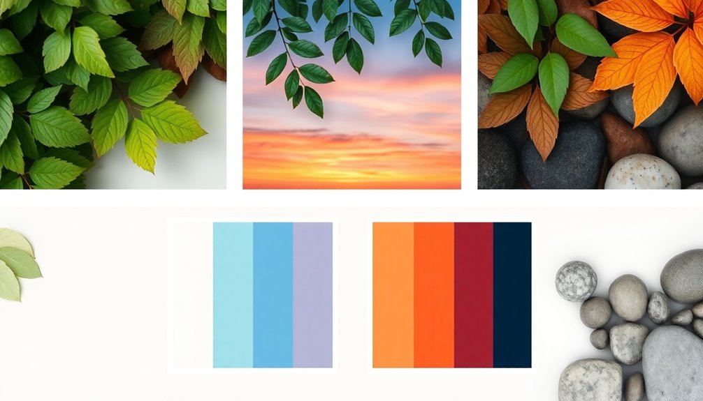
When you embrace nature-inspired colors, you tap into the harmony and balance that these hues provide.
Soft greens and earthy tones create a serene atmosphere, perfect for interiors that invite relaxation. Meanwhile, vibrant oranges and reds bring warmth and energy, ideal for marketing materials that need to grab attention.
Cool blues and grays evoke calmness, making them suitable for wellness retreats. Warm tones emphasize earthy vibes, enhancing organic skincare brands' natural appeal. Earth tones reflect stability and reliability, further solidifying the connection to nature in your designs.
Rich hues capture the essence of desert journeys, perfect for travel-related designs. By incorporating these colors, you not only enhance aesthetics but also create emotional connections, making your designs resonate deeply with your audience.
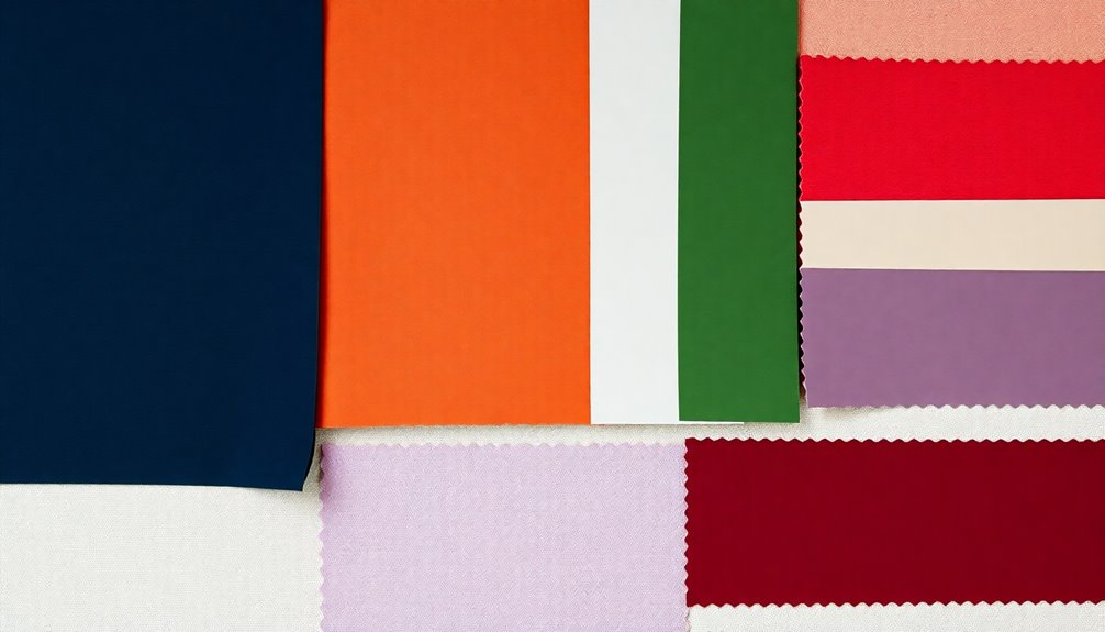
Classic Color Combinations
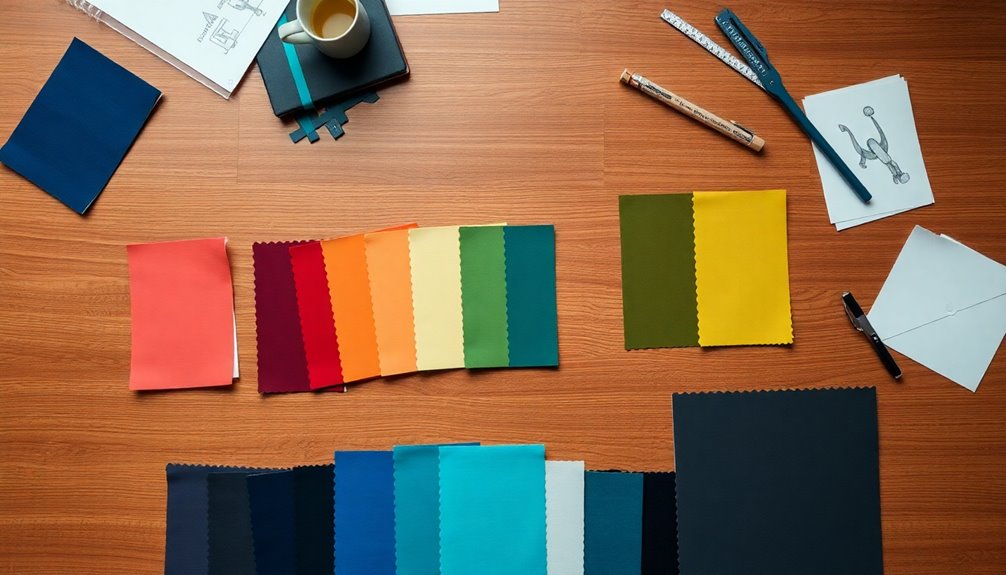
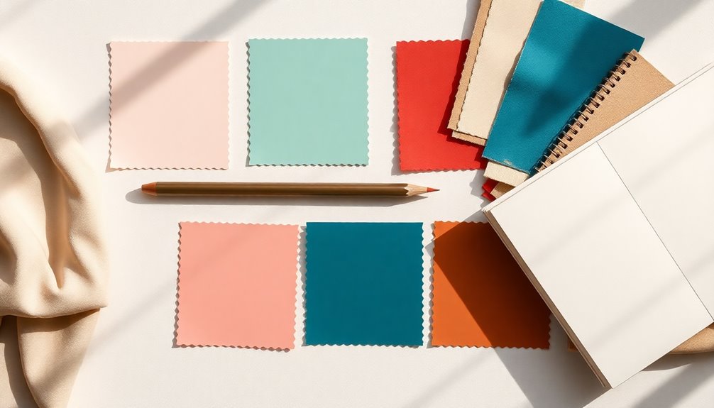
Classic color combinations have an undeniable charm that elevates design across various applications. Timeless palettes like black, white, and gold create a sophisticated atmosphere, perfect for high-end fashion or chic interiors. Retro pastels, featuring light pink and sky blue, infuse playfulness and calmness, while sophisticated neutrals balance depth and light for a sleek look. The impact of sustainable materials on design choices can also influence color selection, leading to more environmentally conscious palettes. Jewel tones, such as rich indigo and vibrant orange, add excitement and tranquility, ensuring a luxurious feel. Lastly, classic Americana, with bold red and deep blue, evokes pride and heritage. Limiting your palette to a few key colors enhances cohesion and ensures a more impactful design.
Data Visualization Color Palettes
Data visualization color palettes are essential tools that enhance the clarity and effectiveness of your data presentations. You can choose from several types, each serving specific purposes. Categorical palettes, for instance, help distinguish discrete data categories with a carefully curated color sequence. Sequential palettes work best for ordered values, displaying color gradients from dark to light. Diverging palettes are ideal for hot-vs-cold comparisons, while alert palettes communicate critical statuses like danger or success. Categorical palettes are particularly effective for distinguishing discrete categories without inherent correlation. Remember to prioritize purpose and clarity by selecting contrasting colors, maintaining consistency, and considering cultural implications. Also, ensure your choices are accessible to all users, including those with color blindness.
Timeless Interior Design Schemes

To achieve timeless interior design, invest in high-quality pieces that bring durability and sophistication to your space. Embrace symmetry for balance and elegance; place two couches opposite each other for a classic look. Additionally, prioritize craftsmanship and durability in your furniture selections to ensure longevity. Using aesthetic hooks can enhance vertical space utilization and add an extra layer of style to your decor. Opt for neutral color palettes to maintain consistency and flexibility, allowing you to easily incorporate accent colors. Consider built-in shelving for stylish storage and display options, enhancing the room's depth.
Finally, mix old and new design elements to create a layered, timeless feel that reflects your personal style.
Creating Timeless Color Palettes
Creating Timeless Color Palettes
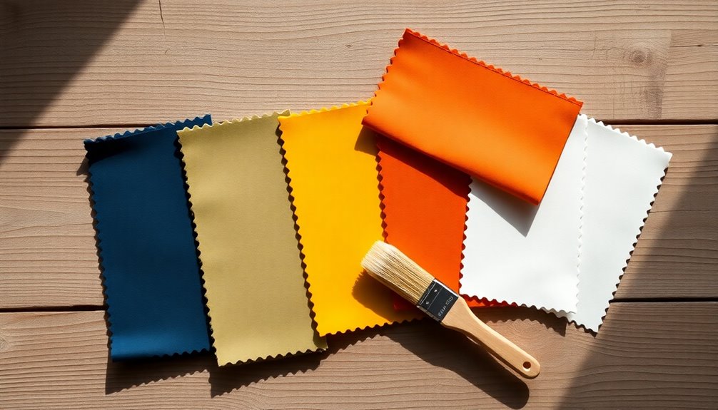
When crafting timeless color palettes, understanding the principles of color harmony is essential, as it ensures that the chosen colors complement each other beautifully. Start by selecting primary colors that reflect your brand's identity, and incorporate neutral tones to maintain balance. Limit your palette to 4-5 colors to avoid overwhelming users. Utilize the 60-30-10 rule to distribute colors effectively, reinforcing visual hierarchy. Draw inspiration from nature and architecture for unique combinations, and consider accessibility to ensure readability, as effective contrast enhances readability. Test your designs across different screens for consistency. Finally, don't hesitate to iterate and refine your palette as your brand evolves, ensuring it remains cohesive and visually appealing.
Frequently Asked Questions
How Can I Choose a Color Palette for a Small Space?
To choose a color palette for your small space, start with a light base color to create an airy feel.
Incorporate different shades and textures for depth while introducing accent colors to prevent monotony.
Don't forget to maximize natural light and consider strategic mirror placements.
Use bold accents wisely, ensuring they stand out against a neutral background.
This balance will bring your space to life while maintaining a cohesive and inviting atmosphere.
What Tools Can Help Me Create a Color Palette?
Feeling overwhelmed by color choices? You're not alone. Several tools can help you create the perfect color palette.
Try Coolors for random palettes and customization options, or explore Adobe Color for user-crafted palettes and seamless integration with Creative Cloud.
Paletton offers user-friendly randomization and previews, while Muzli's Colors assists with color matching.
Lastly, Colourcode's intuitive interface makes discovering new combinations fun. Dive in and unleash your creativity!
How Do Cultural Meanings Affect Color Choices?
Cultural meanings significantly affect your color choices, influencing how you perceive and use colors.
For example, red might evoke love in one culture but signify mourning in another. Similarly, yellow could represent happiness in some societies while symbolizing jealousy in others.
Understanding these cultural connotations helps you choose colors that resonate with your audience, ensuring your designs communicate the intended message effectively and avoid misinterpretation across different cultural contexts.
Can I Mix Different Styles in One Color Palette?
Yes, you can definitely mix different styles in one color palette!
Start by understanding color harmony—use complementary, triadic, or analogous colors to create balance.
Follow the 60-30-10 rule for distribution, and consider a neutral base to make your colors pop.
Don't hesitate to experiment with various categories, like pairing dark shades with light ones.
Trust your instincts, and let your creativity guide you to find a unique and cohesive look!
How Often Should I Refresh My Color Palette?
You should refresh your color palette every 5 to 10 years or whenever significant changes occur in your life or brand.
Pay attention to age-related changes in your hair, skin, and eye pigments, as they can affect your palette.
Also, consider industry trends and your target audience's expectations.
Keeping your color palette updated not only enhances visual appeal but also ensures it remains relevant and engaging for your audience.
Conclusion
In the world of design, choosing the right color palette can transform any project from ordinary to extraordinary. Remember, "a picture is worth a thousand words," and the colors you select speak volumes about your vision. By harnessing nature-inspired hues, classic combinations, and thoughtful palettes for data visualization and interiors, you can create designs that resonate. Embrace these timeless palettes, and you'll find your work not only stands out but also stands the test of time.