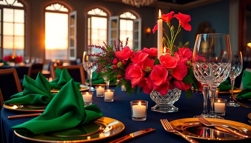
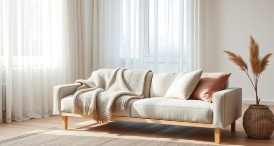
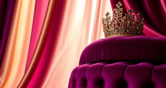
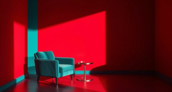
These stunning color pairings can turn your space into a jaw-dropping visual feast. Consider blending warm earthy tones like terracotta with serene sage for a natural vibe that invites comfort. For a more energetic feel, try complementary colors like vibrant blue and orange to add spark and brightness. Monochromatic palettes using varying shades of a single color can create a cohesive look, while accents of jewel tones bring in a touch of luxury. Combining classic blues with soft neutrals also creates elegance and tranquility. There's so much more to explore about these pairings to elevate your space even further!
Key Takeaways
- Pair complementary colors like blue and orange to create dynamic visual appeal that captures attention and energizes the space.
- Utilize earthy tones with bold accents, such as rust and dusty lavender, for a natural yet striking contrast that invites warmth.
- Employ the 60-30-10 rule to balance neutral colors with vibrant accents, ensuring a structured and harmonious design that enchants guests.
- Combine deep navy blue with crisp whites for an elegant and sophisticated look that evokes tranquility and timeless charm.
- Experiment with monochromatic palettes, incorporating various shades of a single color for a cohesive atmosphere that resonates with guests.
Color Temperature Harmony
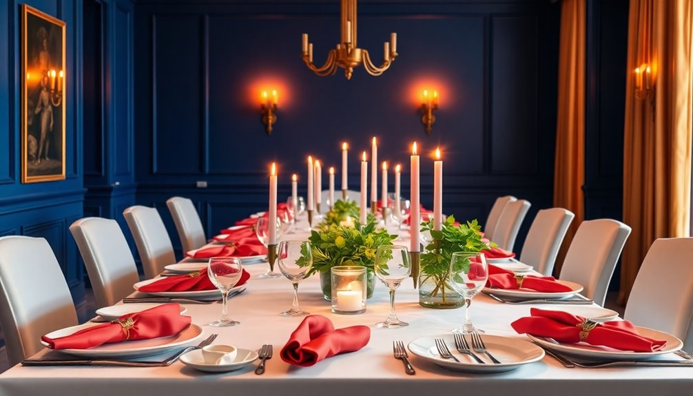
When you understand color temperature, you can significantly enhance your design's appeal.
Warm colors like red, yellow, and orange evoke energy and warmth, while cool colors such as blue, green, and purple promote calmness and serenity. Balancing these color temperatures is crucial for a harmonious visual effect. For instance, using warm colors for highlights against a cool background creates balance. This balance doesn't just make your design look good; it influences mood and emotions. Warm colors can stimulate action, while cool colors encourage relaxation. Additionally, be aware of cultural perceptions, as colors can carry different meanings in various contexts. By mastering color temperature, you can effectively guide users' emotions and reactions, enriching their experience. Understanding the importance of colour harmonies allows you to create visually stunning designs that resonate with viewers.
Monochromatic Palettes
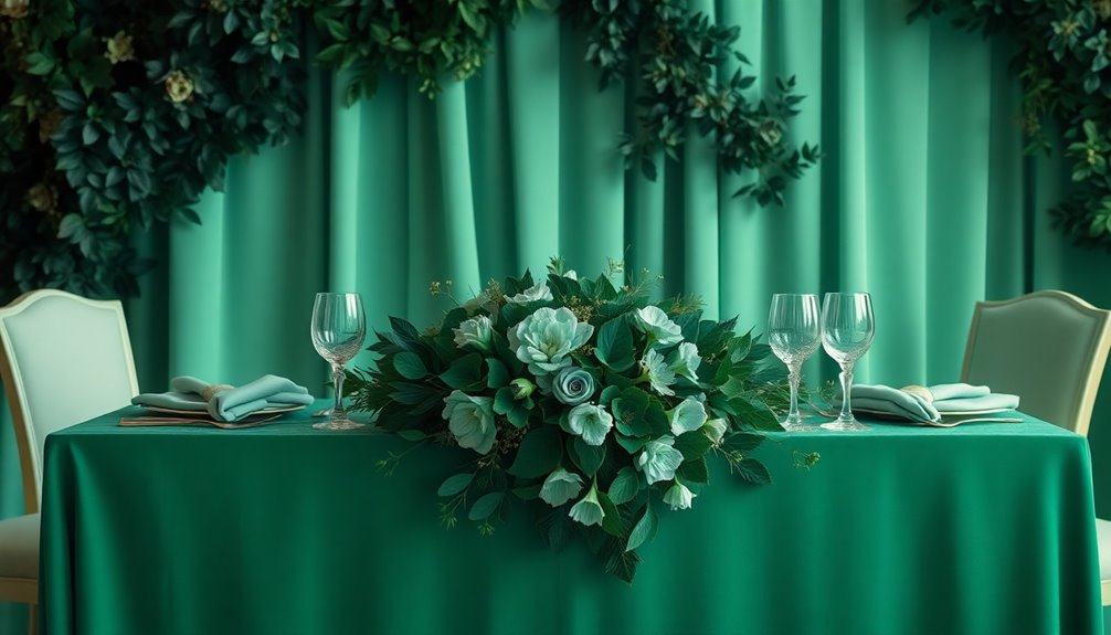
Understanding color temperature paves the way for exploring monochromatic palettes, which can elevate your design with a striking simplicity.
A monochromatic scheme uses various tones of a single color, creating a cohesive and harmonious look. You'll love how it eliminates the anxiety of clashing colors, allowing you to focus on your design's essence. Utilizing different colors in varying shades can evoke distinct emotions, enhancing the overall atmosphere of your space. Incorporating different textures into your design can further enhance the visual interest of your monochromatic palette.
Choose a base hue that aligns with your intent, then experiment with different shades, tints, and tones to add depth. Use accent colors sparingly to highlight key elements.
This approach works beautifully in photography, web design, and home décor, providing a minimalist backdrop that showcases your prized possessions.
Layering colors and textures will further enhance your space, ensuring it captivates your guests.
Complementary Colors
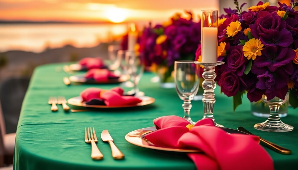
Complementary colors create vibrant visual contrasts that can transform any design. These pairs, located opposite each other on the color wheel, include combinations like red and green, yellow and purple, or blue and orange.
When you place these colors side by side, their brightness enhances dramatically, making your designs pop. You'll often see these striking combinations in nature, such as the blues and oranges of a sunset or the reds and greens of a lush forest. The concept of complementary pairs is essential in understanding how these colors interact to produce stunning visual effects.
In graphic and web design, using complementary colors adds visual appeal and draws attention. Whether you're decorating your home or creating art, understanding complementary colors will help you achieve dynamic and eye-catching results.
Embrace their versatility for stunning outcomes!
Earthy Tones
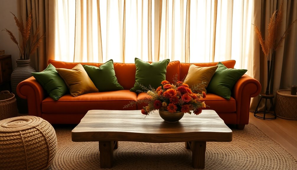
Although they may seem understated, earthy tones pack a powerful punch in design. These warm, inviting colors—like rust, terracotta, and sage—bring a natural vibe that's timeless. Their versatility allows them to complement a wide range of colors, making it easy to create harmonious designs.
You can easily incorporate earthy tones into your space, whether through home decor or fashion. Pair dusty lavender with burnt orange for a striking contrast, or use various shades of brown for a sophisticated, monochromatic look.
Don't shy away from bold accents; they can elevate your earthy palette beautifully. Experiment with combinations to find what resonates with you.
Coastal and Classic Blues
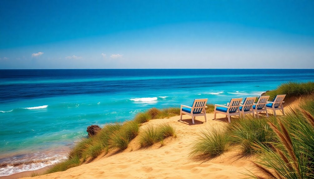
Coastal and classic blues offer a refreshing palette that brings the serenity of the sea into your home.
Start with deep navy blue for a timeless look; it pairs beautifully with crisp whites, creating a striking contrast. This combination works wonders in dining rooms and outdoor spaces, giving an elegant touch. Nautical themes are rooted in maritime traditions, enhancing the overall charm and sophistication of your decor. Incorporating antiques in decor can also add character and depth to your space.
To lighten the mood, incorporate sky and ocean blues, which evoke tranquility and can be layered for a sophisticated effect.
Blending these blues with neutral sands and soft beiges provides a balanced look, grounding the palette while maintaining an airy feel.
For added depth, consider accent colors like coral and seafoam green, enriching your coastal aesthetic without overwhelming your space.
Enjoy the calming vibes these shades bring!
Tropical and Modern Hues
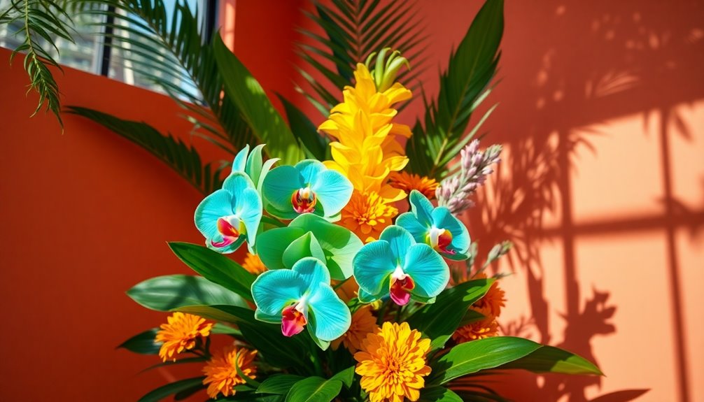
Embracing tropical and modern hues transforms your space into a vibrant oasis. Picture turquoise paired with coral and soft neutrals, creating a stunning balance that draws the eye. The use of tropical colors can evoke feelings of warmth and cheerfulness, enhancing the overall atmosphere of your home. Additionally, incorporating natural materials in your decor can further amplify the refreshing vibe that these colors bring.
You can mix tangerine and deep green for a cheerful yet sophisticated atmosphere or use bright yellows to lift spirits. Consider palettes inspired by sunrises—banana yellow, burnt orange, and subtle tangerine—or the tranquil colors of tropical waters like sapphire and slate blue.
For a playful touch, combine fuchsia with warm pinks and cool magentas to energize your designs. With these striking combinations, you'll achieve a dynamic ambiance that leaves your guests in awe, making your home feel like a true island paradise.
Pastel and Jewel Tones

When you blend pastel and jewel tones, you create a captivating visual contrast that can elevate any space or event.
Imagine lilac paired with deep amethyst or blush with ruby red—these combinations can transform your wedding decor into something truly elegant. Pastels add a light, airy feel, while jewel tones introduce depth and richness. Incorporating metallic accents like gold or silver can further enhance this palette for a touch of luxury. This pairing is versatile, seamlessly transitioning from spring and summer to fall and winter events.
Whether you opt for a whimsical pastel rainbow or a classic combination, the harmony between these color categories ensures your design will leave your guests speechless.
High-Contrast Neutrals
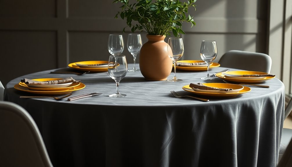
Combining pastel and jewel tones creates a stunning visual appeal, but exploring high-contrast neutrals opens up a different realm of design possibilities.
High-contrast neutrals, like black and dark gray, dramatically enhance saturated accent colors, making them pop. Pair light neutrals such as white or cream with vibrant hues for a fresh, eye-catching look. Neutral colors serve as a foundation, allowing accent colors to shine without overwhelming the space.
Be mindful, though—too much dark neutral can overshadow your accent colors. To maintain balance, use the 60-30-10 rule in your designs, allocating 60% to a dominant neutral, 30% to a secondary color, and just 10% to your accent.
This approach not only creates visual interest but also enhances brand identity, ensuring a cohesive and striking design that leaves a lasting impression on your guests.
Frequently Asked Questions
How Do I Choose Colors Based on My Room's Lighting?
To choose colors based on your room's lighting, start by understanding the temperature of the light.
If you have warm white lighting, opt for warm tones that enhance coziness. For cool white or daylight, select cooler colors to keep the space feeling fresh and modern.
What Colors Work Best for Small Spaces?
When it comes to small spaces, think of colors as the brushstrokes on your canvas.
Soft, neutral hues like pale blue or sage green can create a serene atmosphere, making your room feel like a breath of fresh air.
For a bolder touch, navy blue or electric red can add drama without crowding the space.
Balance is key—pair vibrant shades with calming tones to keep your sanctuary feeling inviting and open.
Can I Mix Different Color Styles Together?
Yes, you can mix different color styles together!
Start by establishing a cohesive color palette that ties everything together. Use the 60-30-10 rule for balance, and don't shy away from combining various textures and patterns.
Just ensure you avoid clashing elements; instead, look for common threads that connect your choices.
Experiment with tones and scales, and trust your instincts to create a visually appealing and harmonious space.
How Often Should I Change My Color Scheme?
Ever walk into a room and feel like something's off? That's your cue to change your color scheme!
You should reassess your colors every 3-5 years, especially if wear and tear starts showing. Lifestyle changes, like working from home or a growing family, might call for updates sooner.
And don't forget to keep an eye on trends—refreshing your space can make it feel inviting and lively again.
What Are the Best Color Pairings for Outdoor Spaces?
When choosing the best color pairings for outdoor spaces, consider combinations like green and yellow for tranquility or blue and purple for harmony.
You might also try warm tones like oranges and yellows to create an inviting atmosphere.
For a fresh look, incorporate earthy hues like mossy green with charcoal gray.
Remember to balance light and shadow with light beiges and pastels, making your outdoor area both appealing and comfortable.
Conclusion
By embracing these stunning color pairings, you'll elevate your space and impress your guests. Whether you choose harmonious hues, bold contrasts, or serene pastels, each combination has the power to transform your atmosphere. So, dive into monochromatic elegance, explore earthy tones, or savor tropical vibrance. Create a breathtaking backdrop, set a captivating mood, and inspire awe with every detail. Your color choices can speak volumes, so let them tell a beautiful story that resonates with everyone.
