
Pastel shades have evolved from gentle, muted colors into bold style statements that convey confidence and creativity. When you pair soft pinks, mint greens, or lavenders with vibrant accessories or striking contrasts, you create eye-catching looks and inviting spaces. These colors not only make a calming environment but also allow you to express individuality with flair. If you’re curious how to harness pastel power to make impactful choices, exploring further will reveal all the inspiring ways to do so.
Key Takeaways
- Pastel shades evoke calmness and sophistication while serving as bold statement pieces when paired with contrasting colors or accessories.
- Designers increasingly use pastels as focal elements in fashion and interior spaces, blending softness with impactful visual contrast.
- Combining bright, vibrant hues with subtle pastels creates striking, balanced looks that highlight the power of soft shades.
- Strategic use of accent walls, murals, and jewelry enhances the bold impact of pastel palettes in various settings.
- Pastels symbolize renewal and hope, making them a powerful tool for expressing creativity with a gentle yet impactful aesthetic.
The Evolution of Pastel Tones in Modern Style

Pastel tones have seamlessly shifted from soft nursery hues to bold, contemporary statements in modern style. Historically, these shades originated from subtle, muted colors used in art and fashion centuries ago, often symbolizing delicacy and refinement. Over time, cultural influences expanded their reach, blending pastel palettes into diverse fashion scenes worldwide. In the modern era, designers reinterpret these shades, elevating them from gentle backgrounds to powerful design elements. The evolution reflects a blend of tradition and innovation, where historical shades serve as a foundation, and cultural exchanges inspire new interpretations. Today, pastels are no longer just soothing tones but versatile tools that convey sophistication, freshness, and boldness—making them essential in shaping contemporary aesthetics. Additionally, understanding the color psychology behind pastels reveals their ability to evoke calmness and optimism in modern design.
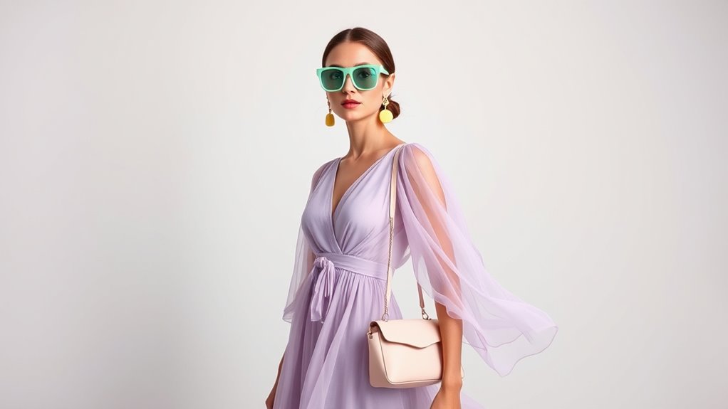
How Pastels Convey Confidence in Fashion
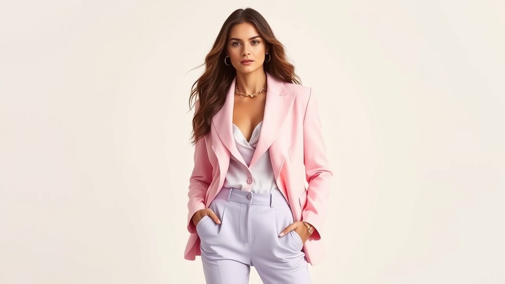
Pastels may seem soft, but they can make a bold statement when worn with confidence. By choosing subtle shades, you enhance your personal style without overpowering it. This balance of delicacy and assertiveness helps you convey confidence effortlessly. Incorporating personal growth techniques can further amplify your self-assurance when embracing pastel fashion.
Subtle Yet Assertive
Although they are often associated with softness and delicacy, pastels can also project confidence when styled correctly. Their pastel symbolism isn’t just gentle; it’s versatile, blending subtlety with assertiveness. Knowing pastel history reveals how these shades have evolved from symbols of innocence to expressions of sophistication and strength. When you wear pastels confidently, you show a refined sense of style that balances softness with boldness. Additionally, integrating hosting and VPS services can complement your fashion-forward approach by providing a professional online presence that reflects your confident style.
Enhancing Personal Style
To truly enhance your personal style with pastels, you need to understand how these shades can communicate confidence and sophistication. Incorporate pastel hair accessories to add a subtle yet impactful touch to your look, showcasing your attention to detail. Choosing bold yet soft pastel nail art allows you to express creativity while maintaining elegance. These small but strategic choices demonstrate your confidence and style awareness. Pastel hues make it easy to experiment without feeling overwhelmed, helping you to embrace imperfections and stand out without shouting. When you confidently pair pastel accessories with your outfits, you project a polished, approachable vibe. Ultimately, embracing pastels in your accessories and nail art elevates your style, making a bold statement with a gentle, refined touch.
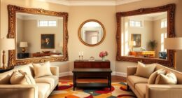
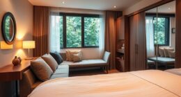
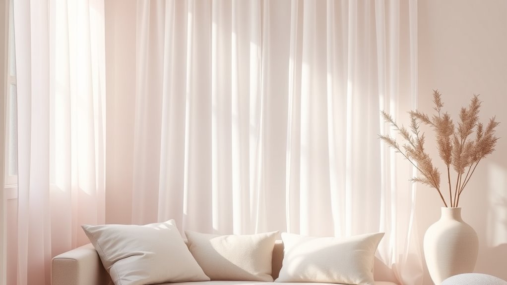
Creating Calm and Comfort With Pastel Interiors
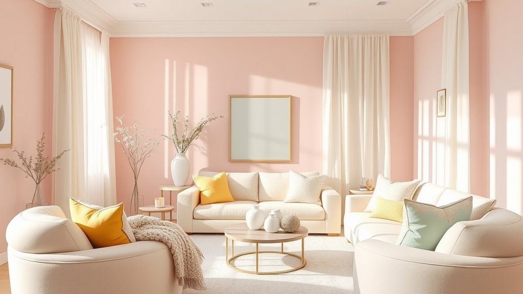
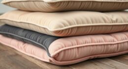
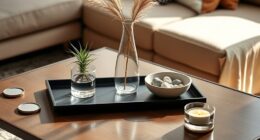
When you incorporate pastel colors into your interior design, creating a space that feels calm and inviting becomes effortless. Pastels naturally evoke tranquility, making your home a soothing retreat. To enhance this sense of comfort, focus on incorporating soothing textures like soft blankets, plush rugs, and gentle fabrics. Keep the decor minimalist to avoid clutter and maintain a clean, airy vibe. This approach allows the pastel shades to breathe and shine. You’ll find that simple, well-chosen pieces create a harmonious environment that promotes relaxation. Remember, less is often more with pastel interiors—less busy, more calming. By blending soothing textures with minimalist decor, you craft a space that’s not only visually appealing but also deeply comforting. Additionally, exploring design innovation can inspire new ways to incorporate calming elements into your space.
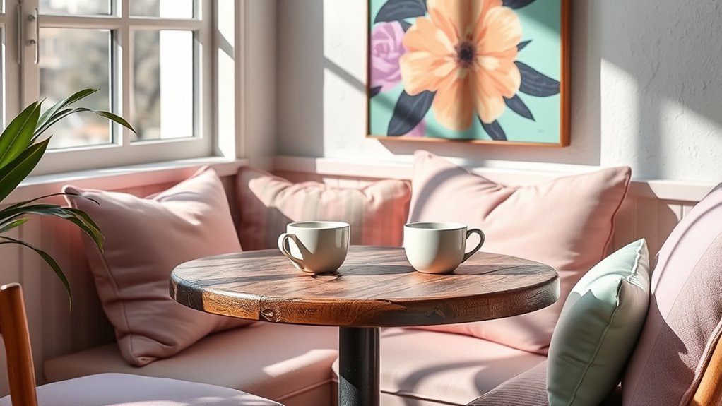
The Art of Pairing Pastel Shades for Maximum Impact

To make your pastel palette truly stand out, focus on color combinations that pop without overwhelming. Balance bright and soft shades to create harmony, and use contrasting accessories to add visual interest. Mastering these techniques guarantees your space or outfit makes a maximum impact with pastel shades. Embracing limits and constraints can also inspire creative solutions in your design choices, making your pastel pairings even more striking.
Color Combinations That Pop
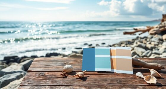
Pairing pastel shades effectively can turn a subtle color palette into a vibrant statement. To make your combinations truly pop, consider using monochrome contrast by selecting different shades of the same color for depth. Complementary hues—colors opposite each other on the color wheel—create striking contrast and visual interest. Incorporating rustic decor elements such as vintage furniture or farmhouse accessories can enhance the warmth and charm of your pastel palette, making the overall design more inviting. Here are some tips:
- Use light pinks and corals for a monochrome contrast that stays soft but engaging.
- Pair mint green with blush pink for a fresh, complementary hue combination.
- Mix lavender with soft yellow to add warmth and balance, making the pastels stand out.
Balance Bright and Soft
Balancing bright and soft pastel shades is essential for creating visually appealing outfits or designs that command attention without overwhelming. To achieve this, consider pairing vibrant hues with softer tones, allowing floral motifs to stand out without clashing. Vintage palettes work beautifully, blending bold and gentle shades for a timeless look. For instance, a bright coral can be softened with pastel pink or lavender, creating harmony and contrast simultaneously. Use floral motifs to tie these shades together, adding a touch of elegance and freshness. Remember, the key is moderation—balance the intensity of bright shades with muted pastels to avoid overpowering your overall aesthetic. This approach ensures your designs remain vibrant yet sophisticated, making a bold statement with subtle grace. Additionally, incorporating active listening and empathy can help refine your color choices to resonate more deeply with your audience.
Accessorizing for Contrast
Ever wondered how to make your pastel outfits pop even more? The key is contrast. By adding statement contrast jewelry or bold scarves, you create eye-catching interest without overwhelming your soft shades. Contrast jewelry, like chunky silver or vibrant gemstone pieces, draws attention and adds edge. A bold scarf in a striking pattern or vivid hue instantly elevates a pastel look. Mix and match for maximum impact—pair a blush pink dress with a deep emerald scarf, or wear mint green with daring coral jewelry. The goal is to create visual interest through contrast, highlighting your pastel shades while making your accessories stand out. Remember, simplicity in your clothing allows your contrast accessories to truly shine. Incorporating preppy dog names into your outfit inspiration can also add a playful touch to your style. These small touches pack a powerful punch, transforming subtle into stunning.
Pastels in Nature: Inspiration for Design and Art
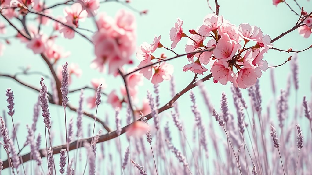
Have you ever noticed how the soft hues of a sunrise or the delicate shades of a blooming flower can spark your creativity? Nature’s pastel palette offers endless inspiration, especially in flower fields where gentle pinks, lavenders, and mint greens blend seamlessly. Mountain landscapes also showcase subtle gradients—misty blues, soft pinks, and muted earth tones—that evoke calm and serenity. These natural shades serve as a blueprint for designers and artists, helping you craft soothing interiors, delicate artwork, or even fashion palettes. By observing how pastel tones emerge naturally, you gain a deeper appreciation for their versatility. Incorporating these gentle hues into your work can create a sense of harmony, beauty, and understated elegance inspired directly by the world around you. Additionally, studying natural color palettes can enhance your understanding of how these hues can be effectively applied in various creative projects.
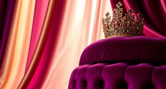
Bold Accents: Elevating Pastel Palettes With Vibrant Hues
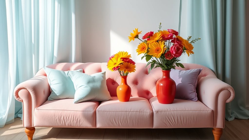
Adding bright colors to pastel palettes creates striking contrast that catches the eye. You can achieve this by juxtaposing vibrant hues or using accent walls to make a bold statement. These techniques instantly elevate a soft, muted look into something more dynamic and energetic.
Juxtaposing Bright Colors
To truly make pastel palettes pop, incorporating bold, vibrant hues creates a striking contrast that draws the eye. Juxtaposing bright colors adds energy and visual interest, making your design stand out. Neon juxtaposition, like pairing neon pink with soft lavender, creates a dynamic, modern look. Using complementary hues, such as mint green with coral, amplifies the effect by enhancing each color’s vibrancy. This technique prevents your pastel shades from appearing dull or washed out. You can emphasize certain elements by mixing these bold accents strategically throughout your space or design. Whether it’s a pop of color in accessories or a bold border, the key is balancing vibrancy without overwhelming. Keep it playful, eye-catching, and sophisticated with the right bright color pairings.
Accent Wall Effects
An accent wall can dramatically transform a pastel palette by introducing bold, vibrant hues that command attention. You can create striking visual interest through monochrome layering, where varying shades of a single color add depth and sophistication. For a more artistic touch, consider pastel murals that incorporate vibrant accents, making the space feel lively yet harmonious. These bold touches elevate your design, preventing the soft shades from becoming dull or monotonous. When choosing an accent wall, opt for a color that contrasts yet complements the surrounding pastels, ensuring it stands out without overpowering. Whether through a single vibrant hue or a detailed pastel mural, accent walls serve as focal points that enhance your overall aesthetic, giving your space a fresh, dynamic energy.
Pastel Trends in Contemporary Fashion and Accessories
Pastel shades have become a defining feature of contemporary fashion and accessories, offering a fresh, approachable palette that appeals to a wide audience. These soft tones symbolize calmness, hope, and renewal, making them perfect for current trends. The popularity of pastels is also driven by evolving pastel manufacturing processes, which allow for vibrant, consistent colors in everything from clothing to jewelry.
You’ll notice pastel accessories like handbags, sneakers, and jewelry gaining popularity because they effortlessly blend subtlety with boldness. They’re versatile, suitable for casual and formal wear alike. Plus, their widespread use in fashion underscores how pastel symbolism continues to influence style choices, emphasizing softness without sacrificing impact.
- Soft shades in statement pieces
- Pastel manufacturing processes ensuring color consistency
- Accessories highlighting pastel symbolism of calmness
Using Pastels to Express Creativity and Individuality

Pastels offer a versatile canvas for expressing your creativity and individuality. Throughout history, pastel symbolism has represented softness, hope, and renewal, allowing you to convey subtle yet powerful messages through color choices. The pastel history reveals their use in art and fashion as tools for personal expression, breaking away from bold, conventional palettes. When you select pastels, you’re embracing a tradition of gentle strength, showcasing your unique personality with understated elegance. These shades encourage experimentation—mixing, layering, or contrasting to craft a look that’s entirely your own. Whether in clothing, art, or design, pastels serve as a visual language that highlights your originality. By using pastels, you celebrate both their rich symbolism and history, turning soft shades into bold statements of your creativity.
The Psychological Effects of Soft Color Palettes
Soft color palettes can have a calming effect on your mood and mental state, often promoting feelings of tranquility and relaxation. When you surround yourself with pastel nostalgia and soothing aesthetics, you create an environment that reduces stress and anxiety. These gentle shades help clear your mind, encouraging focus and mental clarity. With consistent exposure to soft hues, you may notice improved mood and increased patience. Pastel colors also evoke a sense of innocence and comfort, making your space feel welcoming. Whether in your home or workspace, incorporating pastel shades can foster emotional balance and stability. Embracing these soft tones isn’t just about aesthetics—it’s about nurturing your mental well-being through subtle, impactful color choices.
Tips for Incorporating Pastel Power Into Your Everyday Life
To seamlessly incorporate pastel power into your daily routine, start by choosing a few key items that bring you joy and tranquility. Incorporate seasonal color palettes to keep your wardrobe and decor fresh and aligned with the time of year. Use pastel marketing strategies by subtly adding soft shades to your workspace or social media content to evoke calmness and approachability. Mix and match pastel accessories, like scarves or stationery, to brighten your day without overwhelming. When shopping, select pieces that reflect current seasonal trends in pastel hues, making your style feel intentional and current. Small changes, like pastel-themed phone cases or home accents, can create a soothing environment. These simple steps help you enjoy pastel power daily, blending soft shades with bold impact effortlessly.
Frequently Asked Questions
How Do Pastels Influence Emotional Well-Being Beyond Aesthetics?
When you consider how colors affect you, you realize that pastels can do more than look pretty. They promote stress reduction by creating calming environments, which helps you feel more relaxed. Additionally, their gentle hues can boost your mood, making you feel happier and more balanced. By surrounding yourself with pastel shades, you can enhance your emotional well-being, experiencing less anxiety and a more positive outlook throughout your day.
Can Pastels Be Effectively Used in Corporate Branding?
They say “first impressions count,” and in branding strategies, pastels can make a subtle yet memorable impact. You can effectively use pastels in corporate branding by leveraging color psychology to evoke trust, calmness, and friendliness. These soft shades help your brand stand out without overwhelming, appealing to modern audiences. When used thoughtfully, pastels can reinforce your company’s values and create a welcoming, professional image that resonates long-term.
What Historical Periods Popularized Pastel Shades?
You might find that pastel shades gained popularity during Victorian elegance, emphasizing gentle sophistication. The 1920s flapper fashion also embraced pastels, adding a playful yet refined touch to styles. These periods helped popularize soft, muted colors, balancing boldness with delicacy. Their influence persists today, showing how pastels can evoke both historical elegance and modern flair, making them versatile for various design and fashion contexts.
Are There Cultural Differences in Pastel Color Perceptions?
Imagine a world painted differently for everyone—cultural color symbolism shapes your perception of pastels. You might see soft pinks and blues as gentle and calming in one region, but in another, they symbolize mourning or celebration. Regional pastel preferences vary, reflecting deep cultural meanings. Recognizing these differences helps you appreciate how perceptions of pastel shades are beautifully diverse, influenced by history, tradition, and social values around the globe.
How Sustainable Are Pastel Dyes in Fashion and Interior Design?
You might wonder how sustainable pastel dyes are in fashion and interior design. They often rely on chemical stability, which can impact their eco-friendliness. However, you can choose eco-friendly alternatives that reduce environmental harm while maintaining vibrant, soft shades. By prioritizing sustainable dye options, you help lessen pollution and support greener practices. So, yes, pastel dyes can be sustainable when you select products made with environmentally conscious methods.
Conclusion
Embracing pastels is like painting your life with a gentle brushstroke of confidence and calm. These soft shades pack a punch, transforming your style, space, and mood with their subtle power. So go ahead—let pastels be your palette for self-expression, and watch how they brighten your world, turning everyday moments into a vibrant masterpiece. After all, in a sea of bold, be the whisper that leaves a lasting impression.