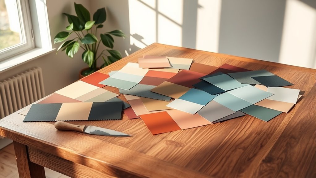

A timeless paint color palette combines neutral tones, earthy shades, and natural hues, giving you versatility and lasting appeal. Classic shades like soft grays and warm beiges create a calming atmosphere, while greens and blues promote emotional connections. These colors work seamlessly across different design styles, ensuring your space remains relevant over time. Plus, opting for sustainable paints enhances both your home and the environment. Explore how these principles intertwine for a truly enduring palette.
Key Takeaways
- Timeless palettes are dominated by neutral tones, providing versatility and compatibility with various design styles and home architectures.
- Earthy hues inspired by nature create a calming atmosphere and foster emotional connections, enhancing overall aesthetic quality.
- A balance of warm and cool tones adds depth and evokes emotional ties, suitable for both traditional and modern designs.
- Regular maintenance of painted surfaces enhances longevity, ensuring the palette remains appealing over time with less frequent updates.
- Eco-friendly paint options promote sustainability, improving indoor air quality and contributing to healthier living environments.
Characteristics of Timeless Colors

When you think about timeless colors, you’ll often notice certain characteristics that set them apart from fleeting trends. Neutral tones typically dominate, offering versatility that allows them to pair seamlessly with various design elements. Incorporating various materials like glass or wood in your design can enhance the overall aesthetic quality of timeless colors. Additionally, the use of textured fabrics can add warmth and comfort, further elevating the space. Key features of modern farmhouse decor often highlight the beauty of timeless colors through the use of natural materials and rustic charm. For example, using boho wall decor can introduce both texture and a vibrant color palette that complements timeless shades.
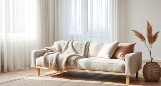
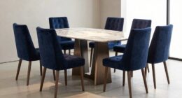
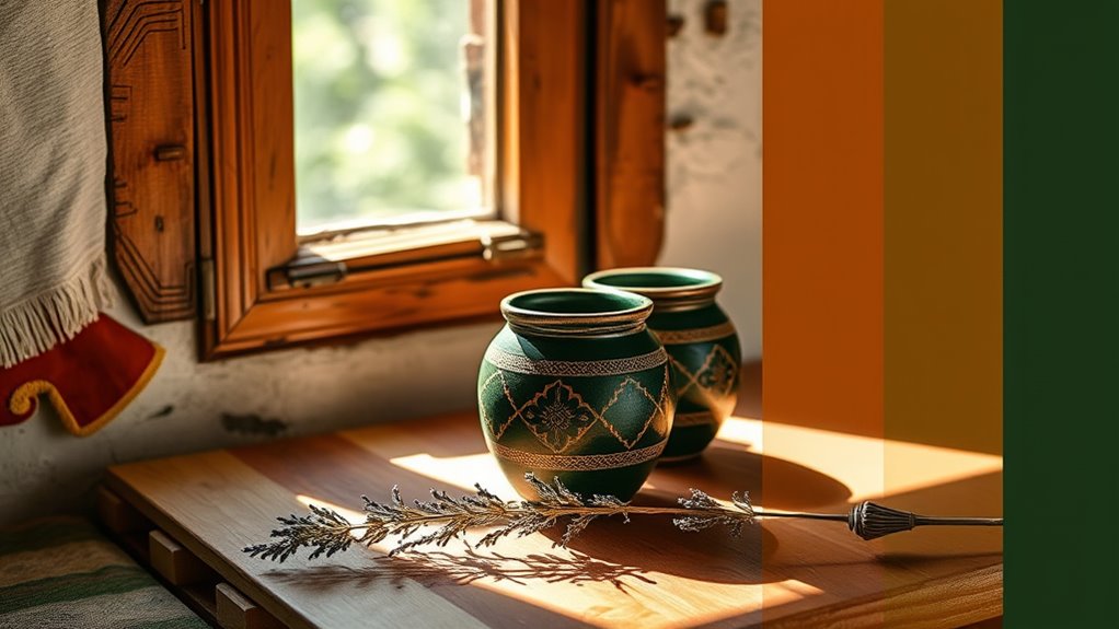
Elegant shades like navy blue evoke sophistication, while soft gray and creamy whites provide serene backdrops that never feel dated. Earthy tones inspired by nature consistently remain popular, adding warmth without the risk of becoming overly trendy. You’ll also find that these enduring shades, such as saturated blues and earthy pinks, possess a cultural significance that enhances their timeless appeal. Ultimately, these colors adapt well to evolving design trends, ensuring they maintain their charm across generations. Additionally, incorporating natural materials can further enhance the timeless quality of a color palette in home decor.
Design Principles for Timeless Palettes

Timeless color palettes not only embody lasting beauty but also adhere to key design principles that enhance their appeal.
Start by drawing inspiration from nature; calming blues and greens create a soothing atmosphere. Embrace simplicity by opting for clean lines and minimalism, which lend versatility. In a farmhouse kitchen, neutral tones can serve as a perfect backdrop to highlight vintage elements and rustic charm. Utilizing the best woods for farmhouse tables can further enhance the overall aesthetic of the space. Incorporating native ingredients in your design choices can also bring an organic touch reminiscent of traditional Brazilian cuisine. Additionally, integrating textiles like burlap and linen can enhance the warmth and comfort of the farmhouse aesthetic.
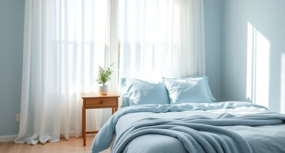
Drawing from nature, soothing blues and greens paired with minimalism create a versatile and calming atmosphere.
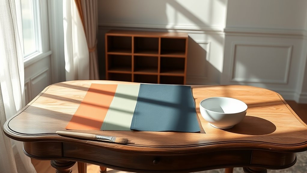
Use neutral tones like soft whites and muted grays as a timeless backdrop, allowing other elements to shine. Aim for adaptability; your palette should flow seamlessly across various spaces and styles.
Incorporate earthy hues and contrasting neutrals to add depth. Finally, balance warm and cool tones to evoke emotional connections, ensuring your palette remains elegant and sophisticated, transcending fleeting trends while maintaining a harmonious essence. Additionally, consider using color palettes that align with the overall theme of your space to create a cohesive design.
Selection of Timeless Paints
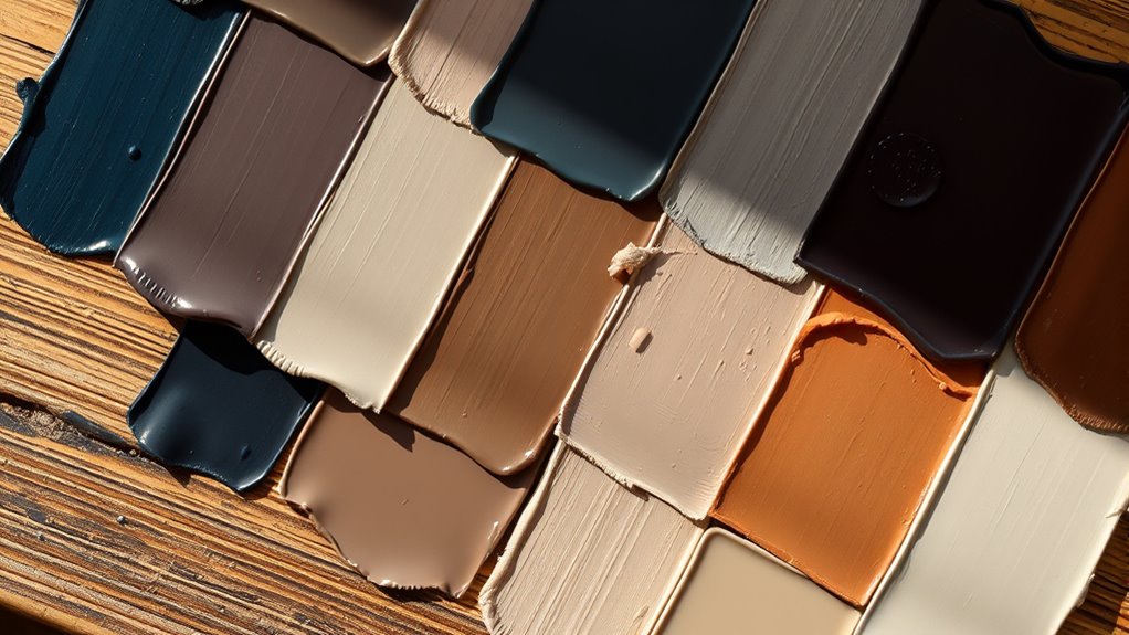
Choosing the right paint colors can greatly impact the overall aesthetic of your space. Timeless palettes often feature classic shades like pure white, soft gray, and warm beige, which have endured through decades. Incorporating natural hues, such as earth tones and greens, adds a sense of lasting appeal. Select colors with proven longevity to avoid fleeting trends. It’s essential that your palette harmonizes with your home’s architecture, ensuring it enhances rather than clashes with the structure. Multi-functional appliances can also influence the design aesthetic of your kitchen, showcasing how versatility can be a timeless quality. A focus on emotional well-being in design choices can create a more inviting atmosphere. Additionally, incorporating natural elements in your space can enhance the overall harmony of your design. Versatile colors should adapt to various surroundings, whether urban or rural. For instance, Sherwin Williams’ White Duck or Benjamin Moore’s Simply White work beautifully with different styles, allowing you to create a balanced and timeless look. Additionally, the rise of sustainable fashion practices emphasizes the importance of durability and longevity, which can similarly apply to selecting paint colors that stand the test of time. The market for skincare products demonstrates a similar trend, as consumers increasingly prefer products that offer lasting benefits and quality over fleeting trends.
Psychological Impact of Timeless Colors
Timeless colors, like pastels, evoke nostalgia, connecting you to simpler times and enhancing emotional ties in branding. Shades of blue and green can bring comfort and calm, creating a soothing atmosphere in any space. Conversely, vibrant colors like red stimulate energy and excitement. The use of natural elements in color palettes, such as greens that mimic plant life, can further enhance a sense of tranquility. Additionally, incorporating essential oils in your environment can amplify the calming effects of these colors through their aromatic properties. Understanding the impact of financial planning during transitions, such as divorce, can also influence how you create and perceive your space. During such transitions, it is crucial to recognize the importance of strategic planning to ensure emotional stability while redesigning your living space.
Culturally, colors carry different meanings, influencing how you perceive them. You might find that the intensity of a color affects the mood of a room, making it feel either cozy or expansive. Additionally, understanding how colors can align with vibrational energy can further enhance your emotional balance and overall well-being.
Ultimately, understanding the psychological impact of colors can enhance your environment and overall well-being, fostering creativity, concentration, and emotional balance.
Integration With Design Styles

While integrating timeless color palettes into your design can elevate a space, understanding how these hues interact with various styles is crucial. Timeless palettes, characterized by their versatility and neutrality, fit seamlessly into traditional, modern, and coastal designs. For traditional settings, navy blue and earth tones create elegance, while soft pastels add a whimsical touch. Additionally, incorporating innovative paint techniques can further enhance the aesthetic of these traditional spaces, as well as using scratching posts to maintain the integrity of furniture and decor.
In modern spaces, monochromatic neutrals and bold contrasts achieve a sleek look. Coastal designs thrive on light neutrals and sea-inspired hues, promoting a calming atmosphere. Additionally, incorporating natural elements like wood and stone can enhance the aesthetic while maintaining a timeless appeal.
Sustainable and Cultural Relevance
As you explore the intersection of sustainability and cultural relevance in paint choices, you’ll discover that eco-friendly options not only enhance a space but also reflect a commitment to the environment and community.
Choosing low or zero VOC paints promotes healthier indoor air quality while minimizing environmental impact. Colors inspired by nature evoke emotional connections, creating timeless palettes that resonate across cultures.
Utilizing GREENGUARD Gold Certified paints guarantees your selection meets high standards for sustainability. Incorporating earthy tones and historical hues fosters cultural continuity, appealing to diverse tastes. Moreover, just as with air purifier maintenance, maintaining a commitment to sustainability ensures long-lasting benefits for both the environment and your living space.
Frequently Asked Questions
How Do I Choose a Timeless Color for a Small Room?
Choosing a timeless color for your small room starts with soft neutrals like beige or light gray, which create an airy feel.
Consider reflective properties to enhance the space’s brightness. You might want to incorporate calming shades, such as muted blues or greens, for a serene atmosphere.
Using an accent wall can add interest without overwhelming the room.
Finally, assess natural lighting to guarantee your color choice harmonizes beautifully throughout the day.
What Finishes Work Best With Timeless Paint Colors?
When choosing finishes for timeless paint colors, consider your desired effect.
For neutrals, a matte or satin finish works well, providing a classic look without distracting sheen.
Bold colors thrive with flat or semi-gloss finishes to highlight their vibrancy.
In coastal settings, opt for soft chalk or flat satin finishes to evoke a breezy feel.
Finally, for classic interiors, an estate eggshell or satin enamel finish complements traditional styles beautifully.
Can Timeless Colors Be Used in Modern Homes?
Absolutely, you can use timeless colors in modern homes! They create a beautiful balance between contemporary design and classic appeal.
Pair soft neutrals like cream and beige with sleek furniture for a fresh look. You might consider adding navy blue or soft greens to add depth while maintaining a calming atmosphere.
How Often Should I Repaint With Timeless Colors?
You should plan to repaint every 5 to 15 years when using timeless colors, depending on factors like exposure and wear.
Timeless shades typically maintain their appeal longer, requiring less frequent updates. If you’re in an area with high humidity or sunlight, you might need to repaint sooner.
Regular maintenance and using high-quality paint will also help extend the life of your chosen colors, keeping your space looking fresh and inviting.
Are There Any Timeless Colors to Avoid for Outdoor Spaces?
When choosing colors for outdoor spaces, you should steer clear of pure black, as it absorbs heat and shows fading.
Bright white can attract dirt and requires constant upkeep.
Fluorescent colors tend to fade quickly in sunlight, while trendy brights can quickly become outdated.
Very dark colors might make your space uncomfortable during warmer months.
Instead, focus on warm neutrals and earthy tones for a timeless, inviting look that lasts.
Conclusion
In the end, choosing a timeless paint color palette is like weaving a tapestry of memories and emotions. Picture soft, muted hues that dance harmoniously together, creating a warm embrace in your space. By understanding the characteristics and principles behind these colors, you can craft an environment that whispers elegance and longevity. So, as you select your shades, imagine the stories they’ll tell, making your home a sanctuary that stands the test of time.