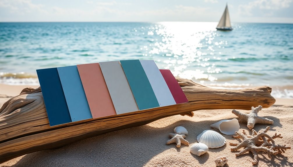
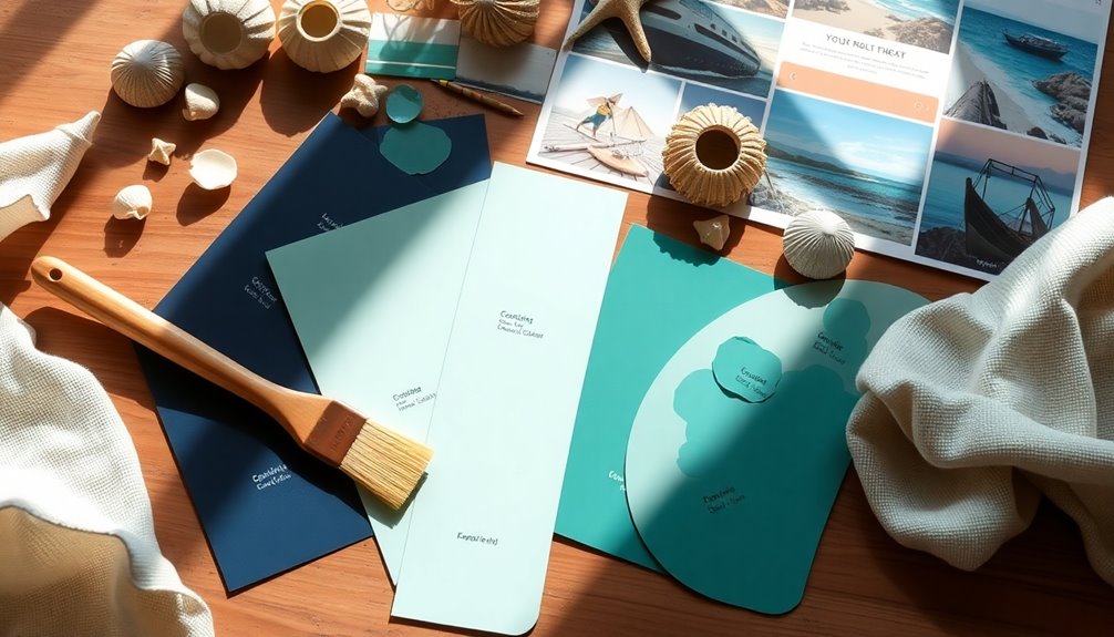
Selecting your perfect nautical color scheme starts with defining your inspiration. Think about elements like ocean hues and maritime motifs. Start with a neutral base using crisp whites or sandy beiges, and then select core blue shades that resonate with you. Incorporate accent colors like coral or seaweed green for vibrant pops, but use them sparingly. Layer various textures and patterns to add depth, and consider seasonal variations to keep it fresh. Personalizing your palette is key, so test and adjust your choices until they feel just right. Keep going, and you'll uncover even more tips for a stunning nautical look.
Key Takeaways
- Identify maritime elements and choose classic colors like navy, white, and sandy beige to establish a nautical foundation.
- Select a neutral base with crisp whites and soft grays to brighten the space and accommodate seasonal accents.
- Pinpoint core blue shades that resonate with your style, balancing light and dark blues for depth and visual interest.
- Incorporate vibrant accent colors, such as coral or seaweed green, while ensuring they complement your primary color scheme.
- Layer different textures and patterns, using natural materials and maritime accents, to create an inviting and cohesive nautical atmosphere.
Define Your Nautical Inspiration
To define your nautical inspiration, start by pinpointing the maritime elements that truly resonate with you. Think about the ocean, sailing, or coastal wildlife as you create your nautical theme.
Classic colors like navy blue, crisp white, and sandy beige evoke the tranquility of seaside environments, setting the tone for your color palette. Incorporate motifs such as anchors, stripes, or seashells to add visual interest and reinforce your nautical inspiration.
It's crucial to analyze your personal style and preferences, ensuring your chosen colors reflect both nautical elements and your unique taste. Use mood boards or color swatches to visualize how different shades and patterns work together, helping you achieve a cohesive look that aligns with your vision.
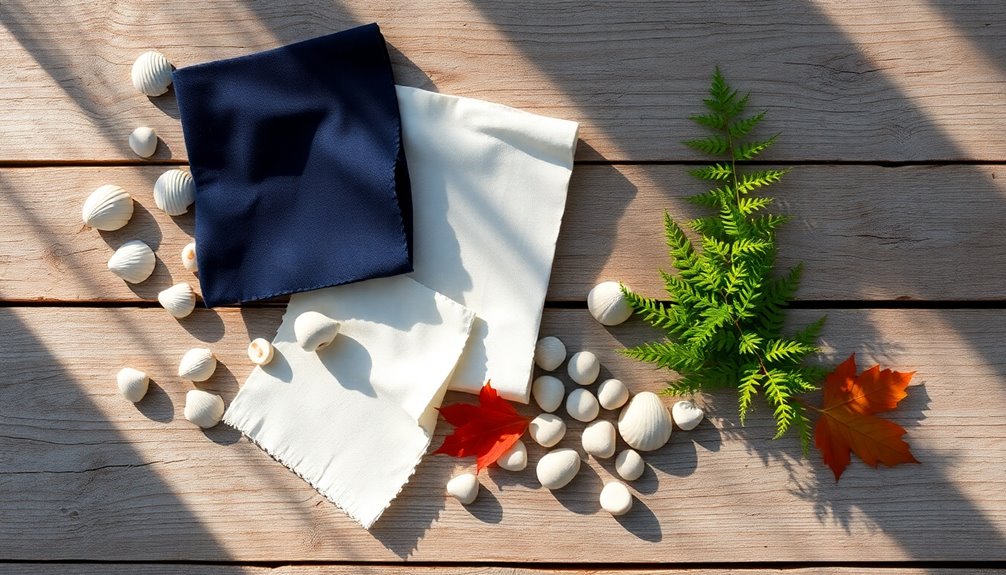
Choose a Neutral Base
Choosing a neutral base is essential for establishing a versatile backdrop that complements your nautical color palette. Start with crisp whites or sandy beige to reflect natural light, making your space feel larger and brighter. Soft gray tones, like Vintage Linen, can add subtle warmth and depth. This neutral foundation allows you to layer bolder nautical colors, such as shades of blue and seafoam green, without overwhelming the area. Plus, it seamlessly accommodates seasonal accents—brighter hues in summer or deeper tones in winter. Below is a quick reference for neutral base options:
| Neutral Base | Effect |
|---|---|
| Crisp Whites | Brightens and enlarges space |
| Sandy Beige | Warmth and versatility |
| Soft Grays | Adds depth and subtle warmth |
| Vintage Linen | Soft texture and warmth |
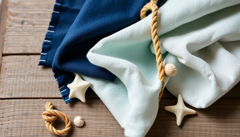
Select Your Core Blue Shades
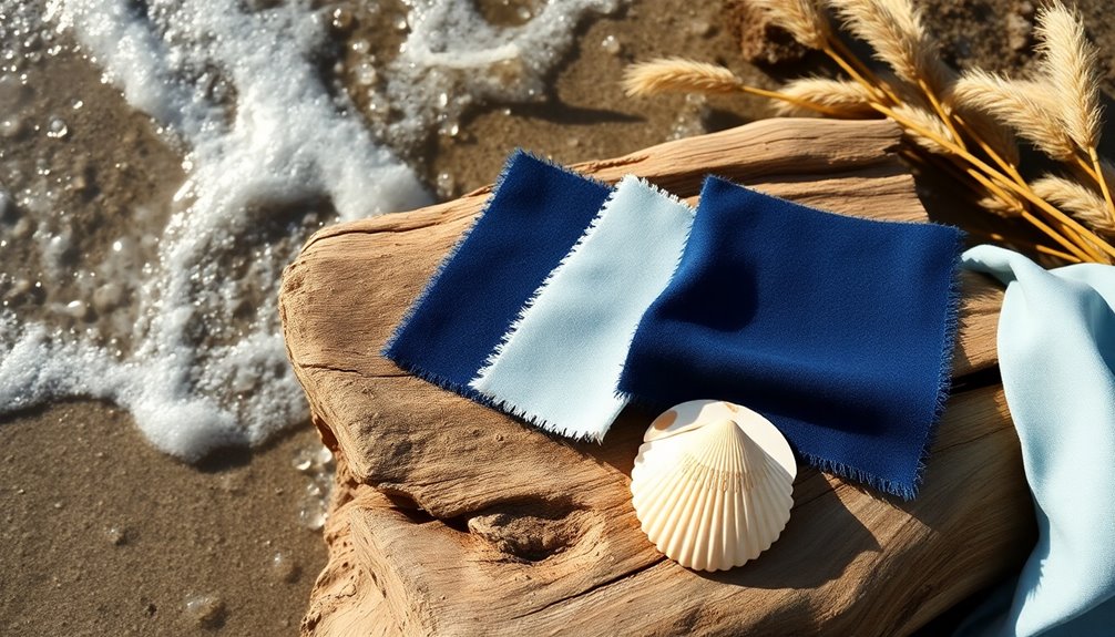
When you select your core blue shades, start by pinpointing the one that resonates most with you, as this will anchor your nautical color scheme. You can choose from deep navy for a bold statement or light sky blue for a softer touch.
Pay attention to your skin tone; cool undertones usually pair well with darker shades, while warm undertones favor lighter blues. Aim for a mix of light and dark blues to create depth, like combining rich navy with soft azure.
To enhance your blues, incorporate complementary neutrals such as crisp white or sandy beige.
Finally, test your selected shades in various lighting conditions to guarantee they evoke the desired nautical ambiance before finalizing your choices.
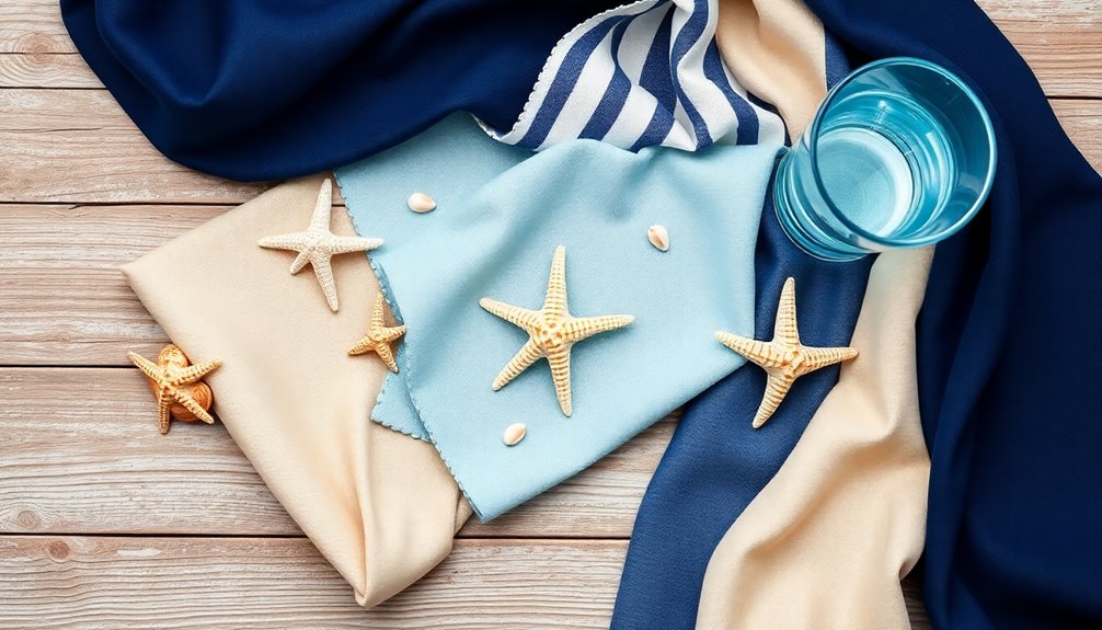
Incorporate Accent Colors
Once you've established your core blue shades, it's time to infuse your nautical color scheme with accent colors.
Think coral or seaweed green to create vibrant pops against your blue and white backdrop. Use these accent colors sparingly to enhance the overall aesthetic without overwhelming the space.
A few well-placed accessories, like throw pillows or rugs, can seamlessly integrate these hues. Make certain your accent colors complement your primary shades, maintaining a harmonious theme that reflects natural elements. Additionally, consider incorporating eco-friendly practices that align with your nautical theme, as they can enhance your overall home environment.
Warm colors can add a cozy feel, especially during winter months. By thoughtfully incorporating accent colors, you'll achieve a balanced nautical look that's both inviting and visually appealing.
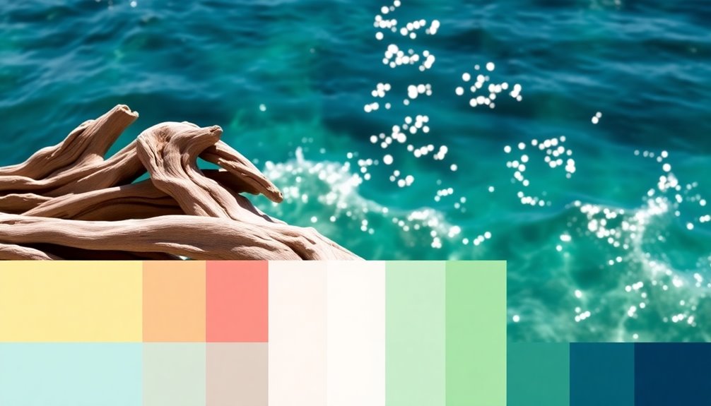
Consider Seasonal Variations
To create a truly dynamic nautical color scheme, consider how seasonal variations can enhance your decor.
In spring, opt for light pastels like soft pinks and pale blues to achieve an airy feel that reflects the blooming season.
As summer rolls in, embrace bold shades like vibrant turquoise and sunny yellow, perfect for capturing that lively coastal vibe.
When autumn arrives, earthy tones such as sandy beige and driftwood brown can evoke warmth, creating an inviting space.
In winter, deeper hues like dark blue and forest green, along with metallic accents, add a cozy, sophisticated touch.
Layer Different Textures
Layering different textures brings your nautical color scheme to life, adding depth and visual interest. Incorporate natural materials like linen, cotton, and jute to enhance the coastal vibe of your space.
Consider using textured fabrics for cushions and throws, creating an inviting atmosphere that encourages relaxation. Accent pieces made from driftwood and rope can reinforce your chosen color palettes while providing a maritime touch.
Mixing smooth ceramics with rough-hewn wooden decor evokes the diverse elements of the sea. Don't forget to balance glossy finishes, like painted furniture, with matte textures, such as unpolished wood.
This dynamic aesthetic not only enriches your design but also makes your nautical theme feel cohesive and well thought out.
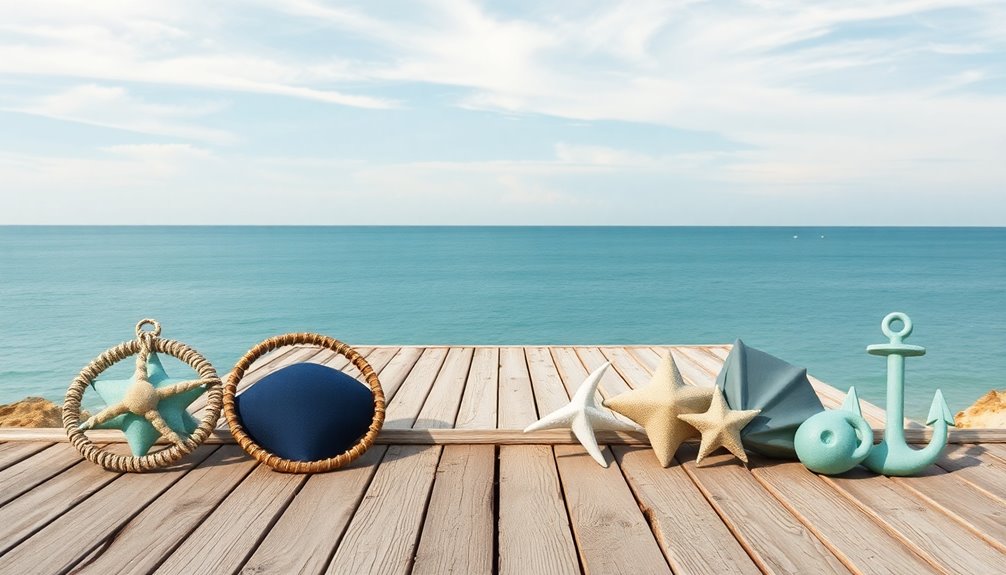
Use Nautical Patterns
Using nautical patterns can instantly transform your space, bringing a fresh coastal vibe that captures the essence of maritime life.
To achieve that perfect nautical look, consider incorporating these patterns into your home decor:
- Stripes: Bold horizontal lines evoke sailor uniforms and boat sails, enhancing a classic look.
- Anchor motifs: Symbolizing stability and hope, they add a touch of nautical charm.
- Waves and seashell patterns: These playful designs reflect the ocean's movement while complementing neutral tones like white or beige.
When selecting patterns, balance bold designs with subtle textures. Additionally, incorporating neutral color palettes can help create a relaxing environment that complements your nautical patterns.
This way, you can create a cohesive atmosphere without overwhelming your space, ensuring the colors evoke a relaxing maritime experience.
Personalize Your Palette
Incorporating nautical patterns sets the stage for a beautiful coastal aesthetic, but personalizing your color palette takes your decor to the next level.
Start by identifying your skin tone to select the right blues—cool undertones should embrace navy and cobalt while warm undertones can shine with turquoise and aqua.
To reflect coastal diversity, incorporate accent colors like coral and seafoam green. Use crisp whites and sandy beiges to balance these vibrant hues, adding warmth and versatility.
Don't forget to adapt your palette with the seasons, opting for brighter shades in summer and deeper tones in winter.
Create personalized combinations, like pairing navy blazers with sandy beiges or sky-blue shirts with coral accents, ensuring your style truly reflects you.
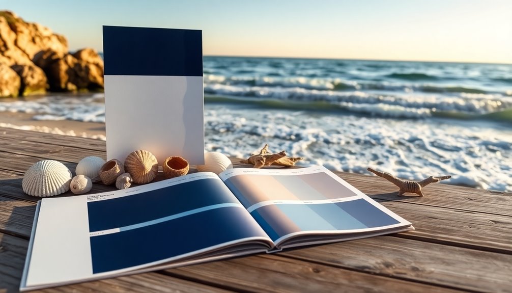
Test and Adjust Your Scheme
Before you settle on your nautical color scheme, it's important to test and adjust your selections to guarantee they resonate well in your space.
Start by applying your chosen colors on A4 non-marking stickers to visualize them under different lighting. Use sample paint pots to create patches on your walls, observing how the colors change throughout the day.
- Adjust your palette based on how well the colors harmonize with existing furniture.
- Consider the balance of bold and neutral tones for a cohesive ambiance.
- Don't hesitate to modify your choices to evoke the desired nautical feel.
This process guarantees your colors not only look great but also create the inviting atmosphere you're aiming for. Additionally, ensure that your selections support a healthier lifestyle by maintaining a clean and organized environment.
Frequently Asked Questions
How to Choose Your Perfect Color Palette?
Choosing your perfect color palette starts with identifying your favorite base color. Think about how it makes you feel and what vibe you want to create.
Next, incorporate complementary neutrals for balance. Then, add accent colors that bring warmth and vibrancy.
Don't forget to reflect on the natural light in your space, as colors can change throughout the day.
Test swatches to visualize your choices and ascertain they work harmoniously together.
What Should Be Considered When Choosing a Color Scheme?
When choosing a color scheme, you've gotta balance light and dark, creating a vibrant yet soothing atmosphere.
Consider your personal style; it should reflect who you are, not just trends.
Small spaces benefit from lighter hues, while larger rooms thrive on deeper shades.
Don't forget to factor in your existing decor—new colors should blend harmoniously.
Finally, use a color wheel to find complementary shades, ensuring your palette feels balanced and inviting.
What Is the 60 30 10 Color Rule?
The 60-30-10 color rule is a guideline that helps you create a balanced color scheme.
You'll use 60% of a dominant color, usually for larger areas like walls, 30% for a secondary color in furniture or decor, and 10% for accent colors in smaller items.
This method guarantees visual harmony in your space, preventing it from feeling overwhelming and helping you achieve a cohesive and inviting atmosphere.
How to Select a Color Scheme?
Selecting a color scheme isn't rocket science—unless you're trying to impress a color scientist.
Start by choosing a primary color that speaks to you. Balance it with neutrals like white or beige to avoid overwhelming your senses.
Don't forget to sprinkle in a bold accent—because who doesn't love a pop of color? Experiment with combinations and test them in different light.
Your walls should be inviting, not a circus tent gone rogue.
Conclusion
By following these nine steps, you'll create a stunning nautical color scheme that reflects your style. Did you know that 60% of homeowners believe color greatly affects their mood? Choosing the right palette can elevate your space and enhance your well-being. So, immerse yourself in the world of nautical colors, experiment with textures and patterns, and don't hesitate to personalize your choices. Your perfect coastal escape is just a few swatches away!