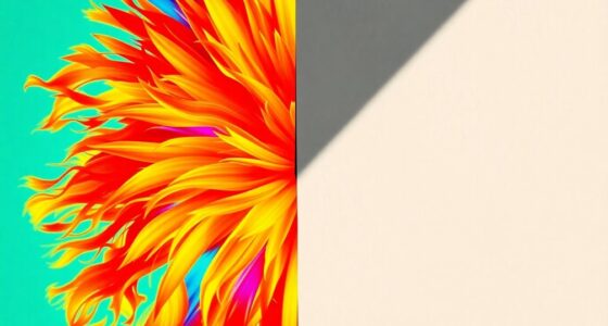

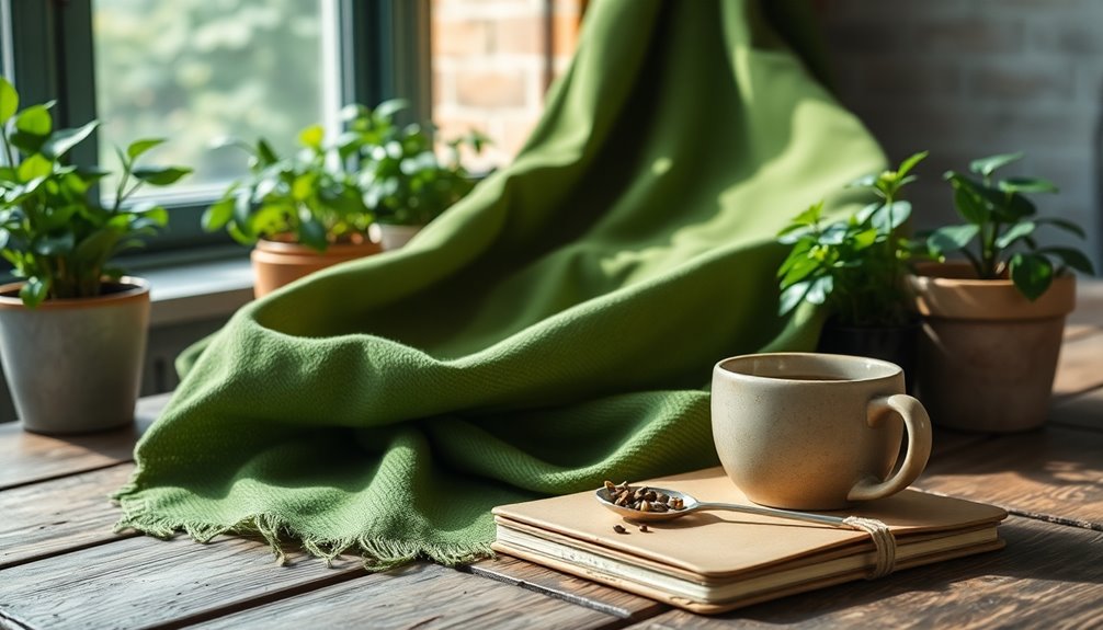
If you're wondering about the trendiest color of the year, look no further than Pantone's Mocha Mousse. This warm, rich brown brings elegance and comfort to any space. It's perfect for enhancing modern designs while promoting a sustainable aesthetic. Other notable contenders include Benjamin Moore's Cinnamon Slate and Glidden's Purple Basil, both offering unique styles and emotional resonance. These colors reflect a shift towards earthy and inviting tones that are eco-friendly too. So, if you want to see how to incorporate these trendy shades into your home, stick around for more insights!
Key Takeaways
- Pantone's Mocha Mousse is the first brown hue selected as Color of the Year, reflecting a trend towards grounding and natural aesthetics.
- Earthy tones like Cinnamon Slate and Purple Basil are gaining popularity, making bold statements in modern and cozy designs.
- Sustainable colors, such as Mapped Blue, emphasize eco-friendliness while appealing to contemporary design sensibilities.
- Vibrant colors paired with warm neutrals create a balanced, inviting atmosphere in various living spaces.
- Current trends prioritize emotional well-being and environmental consciousness, influencing the selection of colors in design.

PHI VILLA 9 Pieces Acacia Wood Outdoor Dining Set for 8, Expandable Teak Wooden Table & Chairs, Large Farmhouse Furniture Set for Patio, Deck, Backyard, Porch
Extendable Wood Dining Table - This outdoor dining table is crafted entirely from robust and highly abrasion-resistant acacia...
As an affiliate, we earn on qualifying purchases.
Overview of Color Trends
Color trends are constantly evolving, reflecting changes in society, culture, and the environment. This year, soothing and earthy tones take center stage, with colors like Future Dusk—a deep blue that brings calmness—and Transcendent Pink, a soft vintage hue symbolizing stability.
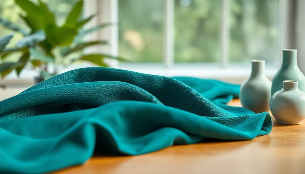
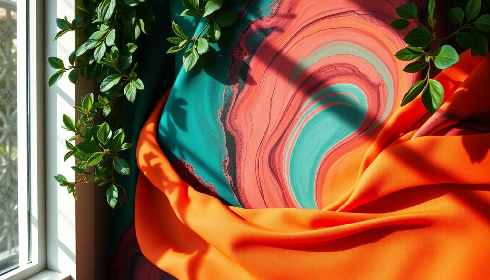
Aquatic Awe embraces vibrant turquoise, inviting you to connect with nature. Sunset Coral encourages a conscious enjoyment of life, while Ray Flower brightens the palette with its cheerful yellow, showcasing environmental awareness. These shades not only resonate emotionally, but they also promote inclusivity and diversity. By incorporating these colors, you can create spaces that evoke feelings of security, joy, and optimism, making them perfect for various designs and audiences. Additionally, the 2025 trends emphasize stronger connection to nature through the selection of earthy tones, reflecting a growing desire for environmental consciousness.

SERWALL 8-Piece Patio Dining Sets with 15FT Double Side Patio Umbrella, Outdoor HDPE Dining Furniture Set with Umbrella Hole Cut-Out Table and 6 Chairs, Blue(Umbreall Base not Included)
【8-Piece Dining Chair Set】This patio dining set contains 1 extended dining table and 6 ergonomic dining chairs and...
As an affiliate, we earn on qualifying purchases.
Pantone's Mocha Mousse

As you explore the latest trends in design, Pantone's Mocha Mousse emerges as a warm, rich brown that evokes a sense of comfort and sophistication.
This hue, with its chocolate and coffee undertones, offers a grounding elegance that feels both timeless and modern. You can use Mocha Mousse as a subtle backdrop in website design, making text and visuals pop without overwhelming the viewer. In addition, the use of eco-friendly materials in architecture aligns beautifully with the warm tones of Mocha Mousse, creating an inviting atmosphere.
It's perfect for call-to-action buttons, drawing attention in a gentle way. Pair it with neutral grays or soft blues for a harmonious look, ensuring user-friendly interfaces that reduce visual fatigue.
This versatile color not only enhances brand identity but also communicates warmth and authenticity, making it a prime choice for your next project. Additionally, its selection as the first brown hue for Color of the Year reflects a growing movement toward natural world alignment and sophistication.

Oasbira Outdoor Aluminum Patio Dining Table Set for 8 Person, Expandable Outdoor Table and 8 Chairs with Textilene Fabric & HDPS Armrest, All-Weather Patio Furniture Set for Yard, Deck, Gray
[Expandable Design] The tabletop of the outdoor dining table features an expandable function, allowing you to adjust the...
As an affiliate, we earn on qualifying purchases.
Benjamin Moore's Cinnamon Slate
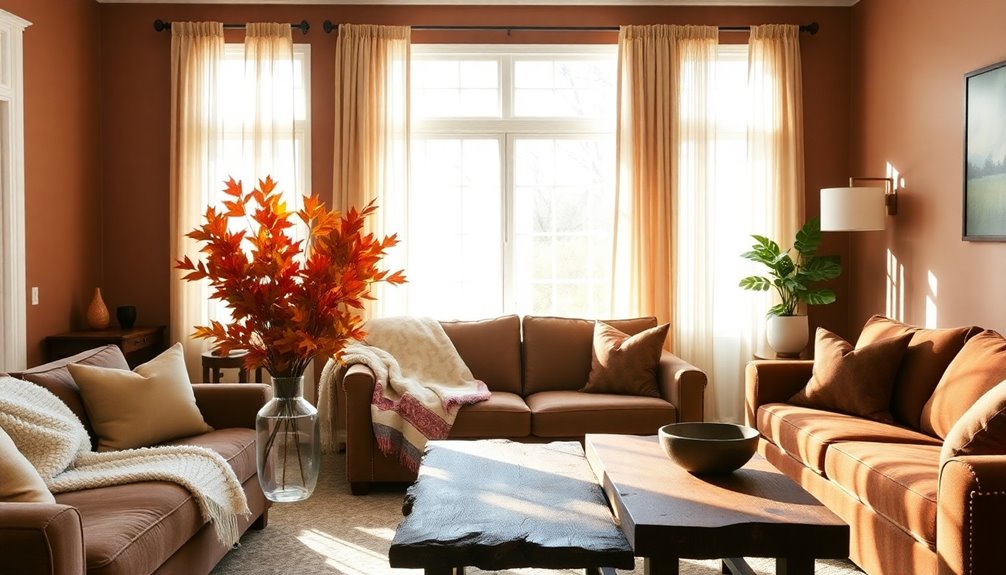
Building on the warmth and sophistication of Mocha Mousse, Benjamin Moore's Cinnamon Slate brings a velvety plum tone that enhances interiors with its rich, earthy presence.
This color features warm brown undertones, creating a depth that feels both sophisticated and neutral. You can use it for accent walls in your living room or as a main shade in kitchens and bedrooms. Its versatile nature makes it perfect for furniture, adding elegance wherever it's applied. Whether your style is traditional or modern, Cinnamon Slate complements a variety of settings.
As a signature hue in the Color Trends 2025 palette, it reflects current design trends while offering a soothing familiarity, making it an ideal choice for cozy, stylish spaces.
9 Pieces Patio Dining Set, 8 x Woven Rattan Chairs with Waterproof Cushion, 83" Rectangular Metal Dining Table with Umbrella Hole, Outdoor Table and Chairs Set for Backyard Lawn and Deck, Beige
PATIO DINING SET FOR 8:This patio dining set includes 8 x fixed chairs and 1 x 83" Rectangular...
As an affiliate, we earn on qualifying purchases.
Glidden's Purple Basil

When you're looking to make a bold statement in your home, Glidden's Purple Basil offers a deep jewel-toned purple that captures attention with its unique blend of warm and cool undertones. This dynamic color, featuring mauve undertones, is perfect for expressing your personality through interior design. Whether you choose to paint your walls, kitchen cabinets, or even exterior accents, Purple Basil adds vibrancy and energy to any space. It works beautifully across various styles, from Art Deco to modern and craftsman. Try color drenching for a dramatic effect, or create accent walls in bedrooms and kitchens. The choice of Purple Basil aligns with the growing trend toward bold color choices, moving away from safe neutrals to embrace vibrant hues. Additionally, incorporating high-end materials in your decor can further enhance the luxurious feel of your space. Available at popular retailers and online, it's a versatile choice that can elevate your home's aesthetic effortlessly.
Valspar's Encore
After exploring the striking qualities of Glidden's Purple Basil, it's time to turn your attention to Valspar's Encore, the 2025 Color of the Year.
This atmospheric blue hue offers a joyful respite, perfect for any project, whether indoors or out. Its deep tones blend the luxury of Old World design with a modern twist, creating a familiar yet unexpected backdrop. With its versatility, Encore is ideal for various applications such as walls, cabinets, and even outdoor spaces like decks. It's DIY-friendly, making it accessible for all skill levels. Incorporating color into your space can enhance your financial health by increasing the value of your home.
Pair it with complementary shades like Moroccan Resort or Blueberry Ice for a vibrant look.
You'll find Encore available exclusively at Lowe's, ensuring you can easily incorporate it into your home.
Dutch Boy's Mapped Blue

Dutch Boy's Mapped Blue is a standout choice for those looking to infuse their spaces with versatility and charm. This medium-tone blue features subtle yellow undertones, giving it a modern appeal. Its adaptability means it suits a variety of design styles, whether you want a calming accent or a neutral base. Reflecting current design trends, Mapped Blue aligns with the slow living ethos and emphasizes sustainability, making it perfect for Millennials and Gen Zs who value durability and timelessness. In addition, it has been selected as Dutch Boy® Paints' 2025 One-Coat Color of the Year, showcasing its trendsetting potential. Furthermore, just as heat pumps can reduce energy consumption significantly, Mapped Blue contributes to creating energy-efficient and stylish spaces.
Pair it with Elegant White or Warm Timber for an elegant aesthetic, or opt for Soft Antique White for a simpler look. With its one-coat hide technology, transforming your space is a breeze, ensuring professional results every time.
Influence on Design Industries

As design industries evolve, the influence of color trends becomes increasingly evident, shaping everything from fashion to interior decor.
In 2025, earthy tones, especially brown, are making a significant resurgence, with shades like truffle brown and rich chocolate becoming dominant neutrals. You'll notice muted earthy colors paired with natural materials that evoke calmness and warmth. This trend is highlighted by the emergence of brown as a contemporary alternative to black, providing warmth and grounding spaces. Additionally, the choice of colors can impact investment growth in certain markets, creating a ripple effect across various industries.
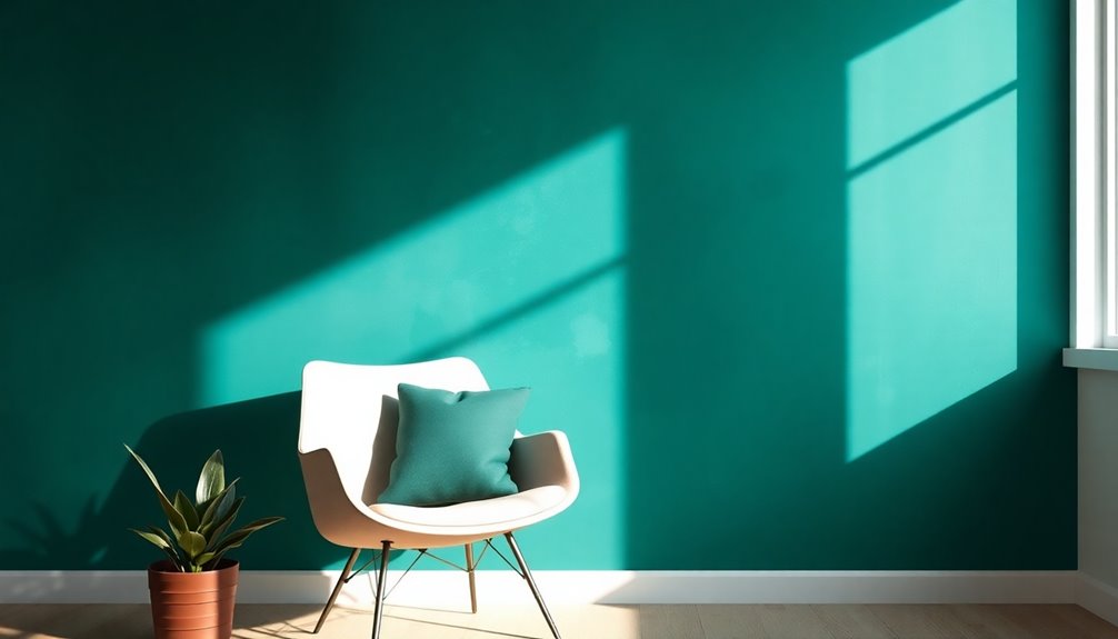
Deep blues and greens are also trending, creating serene environments with hues like Cosmic Cobalt and Quietude. Warm neutrals, including honeyed browns, are gaining popularity, inviting comfort into spaces.
Meanwhile, bold accents like ebony and black olive add depth and sophistication. Together, these colors reflect a desire for comfort, creativity, and a natural aesthetic in design.
Sustainable Color Choices
While many design enthusiasts are drawn to vibrant colors, a growing trend emphasizes sustainable color choices that promote both beauty and environmental responsibility.
Natural neutrals like warm beige and creamy white create calming spaces, while earthy tones reflect a connection to nature. The use of eco-friendly paints not only enhances the aesthetics of these colors but also contributes to improved indoor air quality. Incorporating butter as a source of vitamins can also inspire a warm and inviting atmosphere in your space.
Organic greens such as moss and sage bring the outdoors in, evoking balance and tranquility.
Earthy blues like sky blue and seafoam green inspire serenity, grounding your environment in natural beauty.
Opting for low VOC paints ensures a healthier indoor atmosphere, while sustainable options like recycled and plant-based paints reduce waste.
How to Incorporate These Colors

Incorporating the trendiest colors of the year into your space can elevate your design while aligning with sustainable choices.
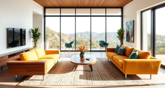
Start with Pantone Mocha Mousse in throw pillows or sofas for added comfort. Pair it with cool tones for a balanced palette. Modern farmhouse decor often emphasizes neutral tones, which can beautifully complement these trendy colors.
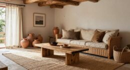
For a cozy atmosphere, color-drench your living room with Benjamin Moore Cinnamon Slate, or use it in smaller spaces for warmth. This color reflects the thoughtful indulgence that is a hallmark of 2025's color trends.
Purple Basil can add a dynamic touch to furniture or kitchen cabinetry, enhancing the overall aesthetic.
Valspar Encore serves as a grounding backdrop, while Dutch Boy Paints Mapped Blue offers durability and versatility. Incorporating natural materials in your decor will further enhance the cohesiveness of these color choices.
Use these colors in accessories, furniture, or even exterior elements to create a cohesive and vibrant aesthetic throughout your home.
Frequently Asked Questions
How Are Color Trends Determined Each Year?
Color trends are determined each year through a combination of research, analysis, and collaboration.
You'll find experts examining fashion, art, and environmental changes to spot recurring themes. They gather data on consumer behavior and preferences, then analyze it for cyclical patterns.
Collaboration with industry groups helps validate these findings, while market research provides insights into what colors resonate with you.
Ultimately, it's a mix of creativity and data-driven decisions.
Can I Mix These Colors With Existing Decor?
When it comes to mixing colors with your existing decor, don't throw caution to the wind!
You can absolutely blend shades like Benjamin Moore's Cinnamon Slate or Sherwin-Williams' Quietude with what you've got.
Consider using neutral tones to balance bold colors or add deep hues for richness.
Trust your instincts—you'll create a harmonious space that reflects your style.
Just remember, it's all about finding the right balance!
What Are the Historical Influences on Color Trends?
Historical influences on color trends are fascinating!
You'll find that natural dyes shaped early palettes, with colors derived from plants and minerals. The rise of synthetic dyes during the Industrial Revolution democratized vibrant shades, making them available to everyone.
Cultural significance also plays a role; for instance, red symbolizes luck in China, while white reflects purity in Western weddings.
Understanding these trends enriches your appreciation of modern color choices and their meanings.
How Do Cultural Factors Impact Color Choices?
Imagine walking into a room painted in vibrant red, feeling both energized and passionate.
Cultural factors shape your emotional response to colors like that. In China, red symbolizes prosperity, while in Japan, white represents mourning.
Your color choices reflect these associations—green may evoke paradise in Islamic cultures, while blue universally brings calm.
Recognizing these influences helps you appreciate the rich tapestry of meaning behind your favorite hues, transforming how you see the world.
Are There Color Trends Specific to Certain Regions?
Yes, there are definitely color trends specific to certain regions.
You'll notice that local cultures, traditions, and lifestyles heavily influence these trends. For instance, urban areas might embrace bold, vibrant colors, while rural settings often lean towards muted, earthy tones.
Additionally, factors like climate and historical architectural styles can shape color preferences.
Conclusion
As you step into a world painted with the warmth of Mocha Mousse and the richness of Cinnamon Slate, you're embracing a vibrant palette that invites creativity. Imagine your living room bathed in the calming hues of Purple Basil or the serene depths of Mapped Blue, instantly transforming your space. These colors don't just decorate; they breathe life into your surroundings. So grab that paintbrush and let these trendiest shades inspire a fresh, sustainable masterpiece in your home!