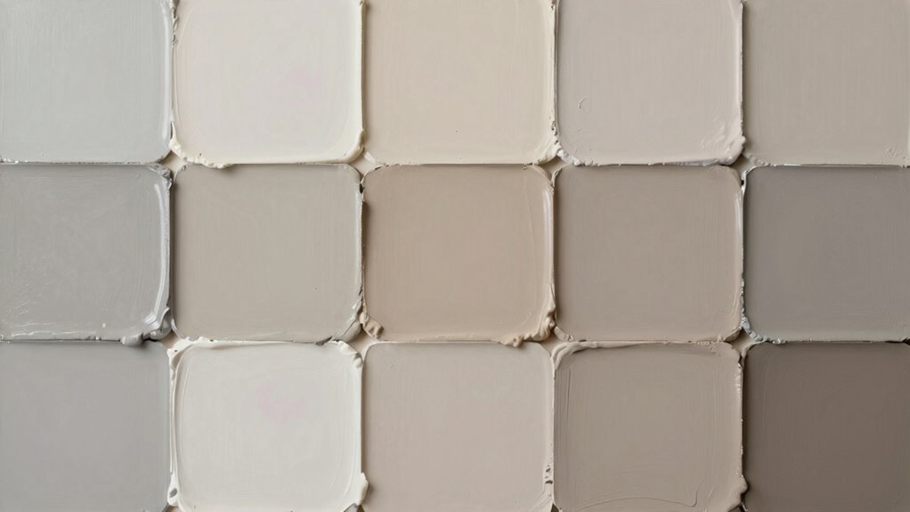
Greige, beige, and taupe are all neutral shades, but they each have distinct qualities. Beige is warm with yellow or red undertones, taupe blends gray and brown for a sophisticated look, and greige combines gray and beige for a cool, modern vibe. Recognizing their differences helps you choose the perfect hue for your space. If you want to understand how to tell them apart and find the best color for your style, keep exploring.
Key Takeaways
- Beige is warm with yellow or red undertones, originating from natural fibers; taupe blends gray and brown for a sophisticated look.
- Greige mixes gray and beige, offering a cool, neutral tone that combines warmth and modernity.
- Taupe has a balanced gray-brown mix, while beige is predominantly warm, and greige leans cooler with gray undertones.
- Lighting and undertones significantly affect how each color appears in different spaces.
- Understanding their origins and undertones helps you choose the right neutral shade for your style and décor.
What Are the Main Differences Between Greige, Beige, and Taupe?

While greige, beige, and taupe are all neutral colors often used in interior design, they each have distinct characteristics that set them apart. Their differences trace back to color mixing and historical origins. Beige comes from natural, unbleached fibers, historically used in textiles, giving it warm, sandy tones. Taupe blends gray and brown, with origins rooted in French fashion, where its name means “mole,” reflecting its earthy hue. Greige results from mixing gray and beige, combining the coolness of gray with the warmth of beige, and has gained popularity in modern design for its versatility. Understanding these roots helps you recognize subtle differences, guiding your choices in creating balanced, cohesive spaces. Additionally, color mixing techniques play a significant role in how these shades are created and perceived. These distinctions influence how each color interacts with lighting and other design elements in your home, and recognizing color harmony principles can further enhance your interior styling. Furthermore, exploring visual perception of color can help you select the perfect shade for your specific environment and mood.
How Can You Tell These Neutral Colors Apart in Your Home?

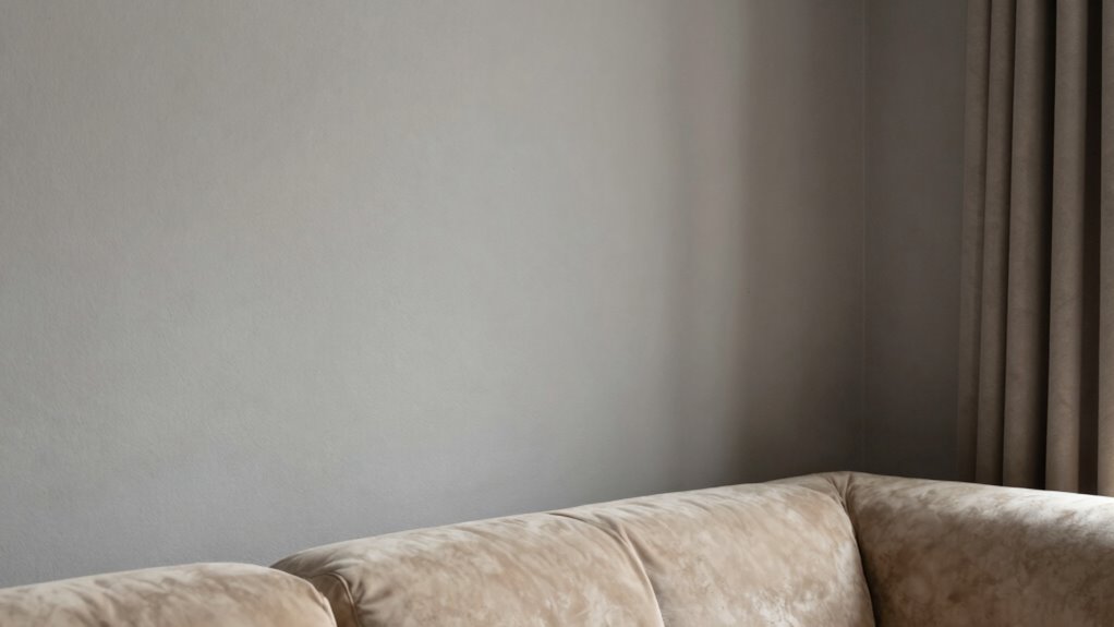
To distinguish greige, beige, and taupe in your home, start by observing their undertones and overall warmth. Greige often has cool gray undertones, beige leans warm with hints of yellow or red, while taupe combines gray and brown for a more muted, earthy look. Pay attention to how these colors influence the room’s mood through color psychology—greige feels modern and calming, beige exudes warmth and comfort, and taupe offers sophistication. Additionally, understanding the color undertones can make a significant difference in choosing the perfect shade for your decor. When selecting paint, consider the paint finish options available, as matte finishes can soften the color, while satin or semi-gloss add depth. Also, consider how natural and artificial lighting impacts these shades—testing small patches in different lighting conditions helps ensure your chosen color looks great in all settings. This can help you confidently select the right neutral for your space.
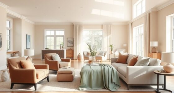
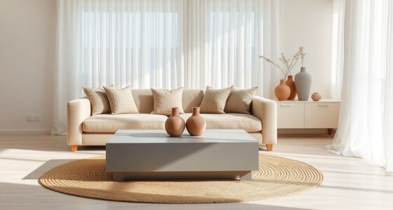
Best Neutral Paint Colors for Different Interior Styles
Choosing the right neutral paint color depends on your interior style, as each aesthetic calls for different shades that enhance its character. For modern or minimalist spaces, opt for cool-toned neutrals like soft greiges or light taupes that create a sleek, cohesive look. In traditional or classic interiors, warm beiges and creamy tones foster a cozy, inviting atmosphere. Decorating with neutrals requires thoughtful color palette coordination to ensure harmony between walls, furniture, and accents. For bohemian styles, embrace earthy taupes or warm neutrals that add depth without overwhelming the space. In coastal or airy interiors, light, airy beiges or soft greiges reflect natural light beautifully. Matching your neutral shades to your specific interior style helps establish a balanced, unified environment. Additionally, understanding color harmony and contrast can further enhance your overall design. When selecting neutrals, considering lighting conditions is also crucial, as natural and artificial light can significantly alter how colors appear in your space.
How to Pick the Perfect Neutral for Your Space
Selecting the perfect neutral paint color for your space involves considering both the room’s style and how the shade interacts with your lighting and furnishings. Your choice influences the mood through color psychology, so pick a hue that aligns with the atmosphere you want. Additionally, understanding historical color trends can help you choose a timeless shade that complements current design movements. Incorporating knowledge about color psychology can guide your selection toward creating a desired emotional environment in your space. To narrow your options, consider these factors:
Choosing the right neutral paint depends on lighting, furnishings, and mood you want to create.
- The room’s natural light levels, which can alter how a neutral appears.
- The undertones in your furnishings and décor.
- The emotional impact of certain colors based on color psychology.
- The longevity of the color trend for a more classic look.
- How the hue will work with your overall interior style for seamless integration.
Being aware of current interior design trends can also help ensure your neutral choice remains stylish over time. Furthermore, taking into account lighting conditions can significantly influence how the color ultimately looks in your space. For example, using AI tools can assist in visualizing how different shades will look in your specific lighting environment before making a final decision. Additionally, understanding how color undertones interact with your existing décor can make a significant difference in achieving harmony in your space.
Common Mistakes to Avoid When Choosing Neutral Paints

One common mistake is ignoring the importance of undertones, which can cause your neutral walls to clash with your furniture or decor. To avoid this, pay attention to undertone hints in your paint choices. Additionally, selecting the wrong paint sheen choices can affect the overall look; matte finishes hide imperfections, while satin adds subtle shine. Poor color palette coordination often results in a disjointed space, so test paint samples in natural light before committing. Consider how your neutral tone interacts with existing furniture, flooring, and accents. Don’t rush the decision—taking time to assess undertones, sheen options, and how everything harmonizes ensures your space feels cohesive and polished. Being mindful of these factors helps you sidestep common pitfalls and creates a balanced, inviting environment.
Frequently Asked Questions
Which Neutral Color Is Easiest to Match With Bold Accent Colors?
You’ll find beige to be the easiest neutral color for accent color pairing. Its warm, versatile tone acts as a perfect backdrop for bold accent colors, making combinations like vibrant reds or deep blues stand out beautifully. Beige’s simplicity allows you to experiment with different neutral color combinations while keeping the focus on your accent hues. When choosing a neutral for bold accents, beige offers effortless flexibility and timeless appeal.
How Do Lighting Conditions Affect the Appearance of Greige, Beige, and Taupe?
Lighting effects act as a painter’s brush, shaping your perception of color’s true essence. You’ll notice that in natural daylight, greige and taupe appear warm and vibrant, while in dim or artificial light, they fade into muted shadows. Beige’s subtlety shifts less dramatically, but all three colors respond to your lighting environment. To truly appreciate their nuance, observe how different lighting conditions influence your color perception throughout the day.
Are There Specific Room Types Best Suited for Each Neutral Shade?
You should choose neutral paint pairing based on your room’s purpose and lighting. For example, greige works well in living rooms for a modern feel, while beige is perfect for bedrooms to create a cozy atmosphere. Taupe adds sophistication to dining rooms. Use room design tips like adding accent colors or layered textures to enhance each neutral shade’s impact. Tailor your choices to your space for a balanced, inviting look.
Can Color Undertones Influence the Perceived Warmth or Coolness of These Neutrals?
Ironically, your favorite neutral’s undertone can totally fool you into thinking it’s warm or cool. Color undertone variations hugely influence perceived warmth differences, even within the same shade. So, if you’re aiming for a cozy vibe, pick neutrals with warm undertones, and for a crisp, modern look, go cool. Always check the undertone in your lighting—what looks warm in one space might feel cool in another.
What Are the Cost Differences Between High-Quality and Budget Neutral Paint Options?
High-quality paint options often cost more but offer better coverage, durability, and finish options, making your DIY painting tips more successful. Budget neutrals tend to be cheaper upfront but may require additional coats and touch-ups, increasing overall costs. When choosing paint, consider your preferred paint finish options—such as matte or satin—and weigh the long-term benefits of investing in quality versus saving money initially.
Conclusion
Understanding the subtle differences between greige, beige, and taupe helps you make confident choices for your home. Did you know that neutral paint colors account for over 60% of interior paint sales? By selecting the right shade, you create a versatile, timeless space that reflects your style. So, take your time, avoid common mistakes, and enjoy transforming your home into a welcoming oasis with the perfect neutral hue.