
To create duotone rooms with dramatic flair, you should choose bold, contrasting colors that evoke strong emotions and set the mood. Use color psychology to pick warm tones for energy or cool shades for relaxation, then balance these with textures, patterns, and layered lighting to heighten impact. Strategic color blocking and accent walls help define spaces without overwhelming. If you want to discover how to master these techniques and craft stunning, cohesive environments, keep exploring further.
Key Takeaways
- Use bold duotone color pairings, such as black and gold or deep reds and blues, for high-contrast, dramatic visual impact.
- Balance warm and cool tones strategically to evoke energy or serenity, enhancing the room’s emotional mood.
- Incorporate layered lighting—ambient, task, and accent—to emphasize contrasting colors and create depth.
- Add textured fabrics and bold patterns to complement the duotone scheme, increasing tactile interest and visual intrigue.
- Consider cultural or historical influences, like art deco or vintage palettes, to deepen emotional resonance and dramatic storytelling.
Understanding the Power of Duotone Color Schemes

Duotone color schemes have become a powerful tool in visual design because they can evoke strong emotions and create a cohesive aesthetic with just two colors. By leveraging color psychology, you can influence how people feel in a space, whether it’s calm, energizing, or sophisticated. The limited palette simplifies the environment, allowing you to focus on mood enhancement through carefully chosen hues. For example, pairing warm tones like reds and oranges can boost energy, while cool tones like blues and greens promote relaxation. This strategic use of color helps set a vibe without overwhelming the senses. When you understand the emotional impact of color, duotone schemes become an effective way to craft spaces that resonate deeply and evoke the desired response. Additionally, understanding how color schemes influence mood can help you select palettes that support overall organization and harmony within your space.
Choosing the Perfect Contrasting Colors for Your Space
Selecting the right contrasting colors can instantly transform your space and create visual interest. Consider bold pairings that make a statement or harmonious contrasts that bring balance. Whatever you choose, guarantee the colors work together to reflect your style and mood. Incorporating vintage decor can further enhance the dramatic effect by adding timeless charm to your duotone room.
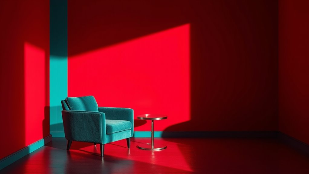
Bold Color Pairings
Choosing the right contrasting colors can instantly energize your space and create a striking visual impact. When selecting bold color pairings, consider color psychology to evoke specific moods — vibrant reds can boost energy, while calming blues promote relaxation. Historical influences also play a role; for example, art deco often pairs black with gold for luxury and drama. Think about how these contrasts can highlight architectural features or furniture, making them pop. Don’t shy away from unexpected combinations like deep purple and mustard yellow, which can add depth and personality. The key is balancing intensity with harmony, ensuring the colors complement each other while maintaining visual interest. Additionally, understanding color pairings and their effects can help you create a cohesive and dynamic space. Bold color pairings aren’t just about contrast—they’re about creating a compelling, memorable space.
Harmonious Contrast Choices
Finding the perfect contrasting colors for your space involves more than just picking shades that are different; it requires a thoughtful balance that enhances harmony. Start with the color wheel, which guides you in selecting complementary hues that naturally balance each other. Consider these key points:
- Use the color wheel to identify hues directly opposite each other for striking contrast.
- Pair bold, vibrant shades with softer, muted tones to avoid visual overload.
- Balance warm and cool colors to create a dynamic yet harmonious environment.
- Test combinations in different lighting to ensure contrast remains appealing throughout the day.
Techniques for Applying Duotone Effects in Different Rooms

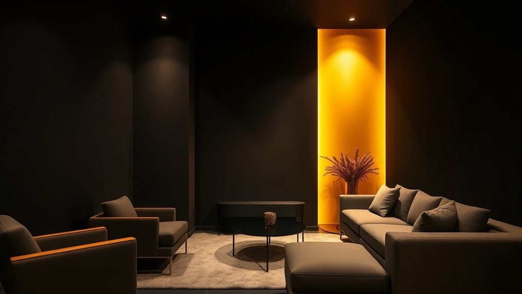
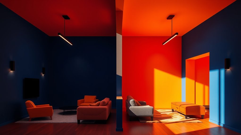
Applying duotone effects effectively depends on understanding how to tailor the technique to each room’s purpose and lighting. For living rooms or spaces with ample natural light, consider using color blocking to create bold, defined sections that emphasize certain areas or furniture. This method helps you control the visual flow and adds a modern touch. In smaller or darker rooms, accent walls painted with duotone shades can generate focal points without overwhelming the space. Use contrasting or complementary colors to make the wall stand out. Keep in mind that lighting can alter how colors appear, so test samples in different conditions. Whether you opt for subtle shifts or striking blocks, adjusting your approach based on room size, purpose, and light guarantees a cohesive, dramatic effect. Incorporating self watering plant pots can also add a touch of practicality and greenery, enhancing the overall ambiance with minimal maintenance.
Incorporating Textures and Patterns to Enhance Visual Impact
Adding textured fabrics and bold patterns can make your duotone room stand out. You can layer different materials to create depth and tactile interest, or choose striking patterns to draw the eye. These elements work together to amplify the visual impact of your space. Incorporating attention in creative practice can help you focus on the details that make textures and patterns truly stand out.
Layering Textured Fabrics
Layering textured fabrics can dramatically elevate the visual complexity of your duotone rooms, creating depth and interest through tactile contrast. By thoughtfully layering textiles, you add richness and dimension that catch the eye. Consider these approaches:
- Mix different textured fabrics like velvet, boucle, and linen to evoke tactile variety.
- Combine smooth and rough surfaces for a dynamic feel.
- Use textured fabrics on pillows, throws, and upholstery to build layers.
- Vary the scale of textures to enhance visual interest and prevent monotony.
- Incorporate textural contrast intentionally to highlight the depth and richness of your layered fabrics.
This layering technique invites touch and sight, making your space more engaging. Incorporate textured fabrics strategically to emphasize the duotone palette, heighten contrast, and craft a sophisticated, inviting environment.
Incorporating Bold Patterns
Incorporating bold patterns into your duotone rooms instantly amplifies visual impact and creates focal points that draw the eye. Use geometric shapes to introduce sharp, clean lines that add structure and modernity, or explore abstract motifs for a more dynamic, artistic feel. These patterns can be applied through wallpaper, textiles, or artwork, giving your space depth and personality. Combining contrasting patterns with solid duotone backgrounds enhances the dramatic flair. Be mindful of scale; large geometric patterns make a bold statement, while smaller motifs add subtle complexity. Balance is key—pair busy patterns with simpler elements to prevent visual overload. Incorporating Vetted – Halloween Product Reviews can help you select the most striking and popular patterns for your space. With intentional placement of these bold patterns, you’ll craft a space that captivates and leaves a lasting impression.
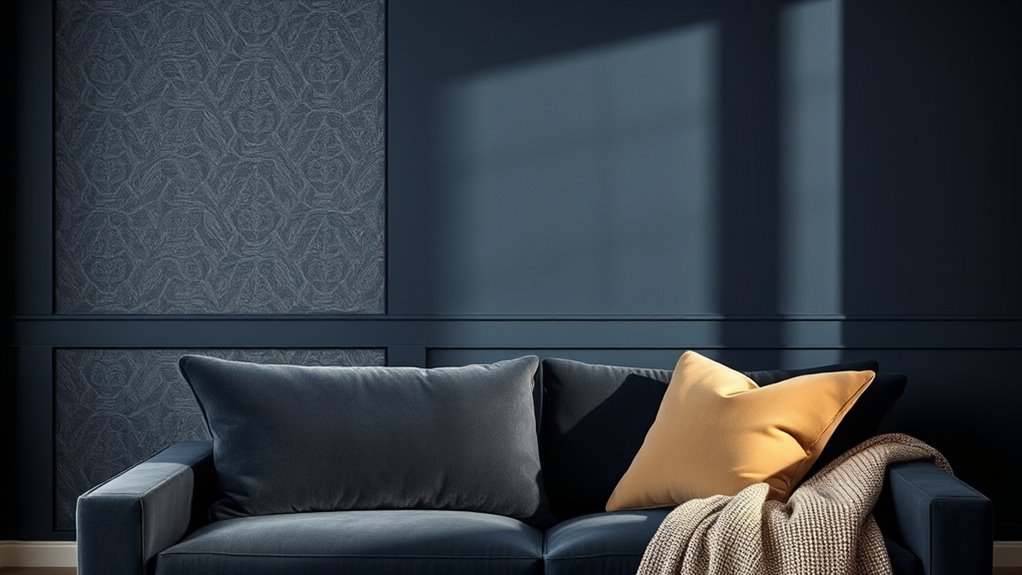
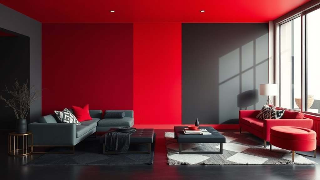
Balancing Bright and Dark Tones for Dramatic Effect
To create a striking duotone room, you need to carefully balance bright and dark tones, as this contrast defines the space’s mood and visual impact. Use color psychology to select hues that evoke desired emotions and support mood enhancement. Consider these key steps:
- Choose a dominant tone that sets the overall atmosphere, like a warm dark hue for intimacy or a cool dark for calm.
- Pair it with a bright accent color that energizes or highlights specific areas.
- Use contrast strategically to emphasize focal points without overwhelming the senses.
- Maintain harmony by balancing saturation levels to prevent discordance.
- Be mindful of relationship dynamics, as the emotional tone of your space can influence feelings of connection or distance.
This careful balance guarantees your room feels dynamic yet cohesive, creating a powerful visual statement that resonates emotionally.
Using Lighting to Amplify Your Duotone Design
Lighting plays a crucial role in enhancing your duotone design by emphasizing contrasts and setting the mood. Carefully chosen lighting fixtures can highlight the bold color blocks, making them pop and creating depth. Use color psychology to select lighting that reinforces your desired atmosphere—warm tones evoke coziness, while cool tones foster calmness. Adjustable fixtures allow you to tweak the intensity and direction, amplifying the dramatic effect of your duotone palette. Layering different types of lighting, such as ambient, task, and accent, helps balance the space while emphasizing key design elements. Understanding lighting techniques can help you craft a more dynamic and impactful environment. By thoughtfully integrating lighting into your room, you can transform a simple duotone scheme into a mesmerizing, mood-enhancing environment that truly stands out.
Inspiring Examples of Stunning Duotone Room Transformations

Have you ever seen a room transformed purely through a bold duotone palette? These stunning examples showcase how carefully chosen color combinations can evoke emotion and history. For instance:
- A vintage-inspired living room uses historical color palettes like muted teals and warm terracottas, reflecting a bygone era.
- An Asian-inspired space integrates cultural influences with deep reds and golds, creating a sense of tradition and richness.
- A modern office employs contrasting black and white duotones, emphasizing sleekness and minimalism.
- A bohemian bedroom combines earthy browns with vibrant turquoise, blending cultural textures and natural tones.
- The use of color schemes rooted in historical and cultural cues demonstrates how duotone design elements can deepen the visual impact and storytelling of a space.
These transformations demonstrate how duotone schemes can harness historical and cultural cues to craft visually mesmerizing, dramatic environments.
Tips for Maintaining a Cohesive and Bold Aesthetic
Building on those inspiring duotone transformations, maintaining a cohesive and bold aesthetic requires intentionality and strategic choices. Start by understanding color psychology to select hues that evoke the mood you want. Use contrasting yet complementary colors to create visual interest while keeping the palette consistent across walls, accents, and furniture. Furniture placement plays a vital role; arrange pieces to highlight your color scheme without cluttering the space. Balance bold colors with neutral or darker shades to prevent overwhelm, and make certain your furniture complements the duotone palette. Consistency is key—repeat color themes and patterns throughout the room. Regularly step back and assess the overall harmony, adjusting elements as needed to sustain a unified, dramatic look.
Frequently Asked Questions
How Can I Customize Duotone Schemes for Small Spaces?
To customize duotone schemes for small spaces, start by using color blocking to create visual interest and define areas. Consider adding an accent wall with bold duotone shades to make a dramatic impact without overwhelming the room. You can also experiment with contrasting colors or softer tones to enhance the space’s depth. Keep it simple and balanced, ensuring the palette complements your existing decor for a cohesive, stylish look.
What Are the Best Materials to Achieve Sharp Duotone Lines?
Think of your walls as a canvas waiting for bold strokes. To achieve sharp duotone lines, choose high-quality painter’s tape for clean edges. Opt for smooth, matte or semi-gloss paint to prevent bleeding and guarantee crisp color blocking. Using a fine-tipped brush or edge painter helps define precise lines. The right paint texture and tools turn your space into a striking masterpiece with clear, dramatic contrasts.
Can Duotone Designs Work With Minimalist or Cluttered Styles?
You can definitely make duotone designs work with both minimalist and cluttered styles. In minimalist spaces, simple color pairing and clean lines enhance the stark contrast, creating a bold statement. In cluttered environments, balancing pattern complexity with limited duotone colors prevents visual overload while adding a dramatic flair. Adjust the contrast and pattern size to maintain harmony, ensuring the duotone design complements your overall aesthetic rather than overwhelming it.
How Do Duotone Colors Affect Room Mood and Ambiance?
Imagine walking into a space where color psychology sparks your mood—duotone colors create a powerful visual impact that influences how you feel. They can evoke calm or excitement, depending on the hues chosen. With their bold contrast or subtle harmony, duotone palettes set the tone, shaping the room’s ambiance. You’ll find that strategic use of these colors enhances your environment, making it both engaging and emotionally resonant.
Are There Specific Maintenance Tips for Duotone Painted Walls?
When maintaining duotone painted walls, you should focus on proper wall preparation and paint selection. Clean the walls gently with a soft cloth to remove dust and avoid harsh chemicals that could damage the finish. Use high-quality, washable paint designed for durability and color retention. Touch up chips or scratches promptly with matching paint, and avoid abrasive cleaning tools to keep the vibrant contrast and dramatic flair intact.
Conclusion
Think of your space as a canvas, where duotone colors are your bold brushstrokes. When you blend contrasting tones thoughtfully—like a painter balancing light and shadow—you create a room that commands attention and tells a story. Just as a striking photograph captures a moment in time, your dramatic duotone design transforms your space into an unforgettable masterpiece. Embrace the contrast, and let your room’s personality shine through.