To color block your living room like a pro, start by selecting a balanced palette of bold and neutral shades, considering color psychology for the mood you want. Use painter’s tape carefully for sharp lines, applying thin coats of paint in defined sections. Mix geometric patterns and textures for visual interest while balancing vibrant hues with softer tones. Regularly update accessories and touch-ups to keep the space fresh—keep going to discover even more expert tips.
Key Takeaways
- Plan your color palette using complementary or analogous shades for harmony and visual interest.
- Use painter’s tape carefully to create sharp, clean lines and prevent paint bleeding during application.
- Balance bold color blocks with neutral tones to avoid overwhelming the space and maintain cohesion.
- Incorporate geometric patterns and textured accents to add depth and dynamic appeal to your design.
- Regularly refresh accessories and touch up paint to keep the space vibrant and aligned with your evolving style.
Understanding the Principles of Color Blocking
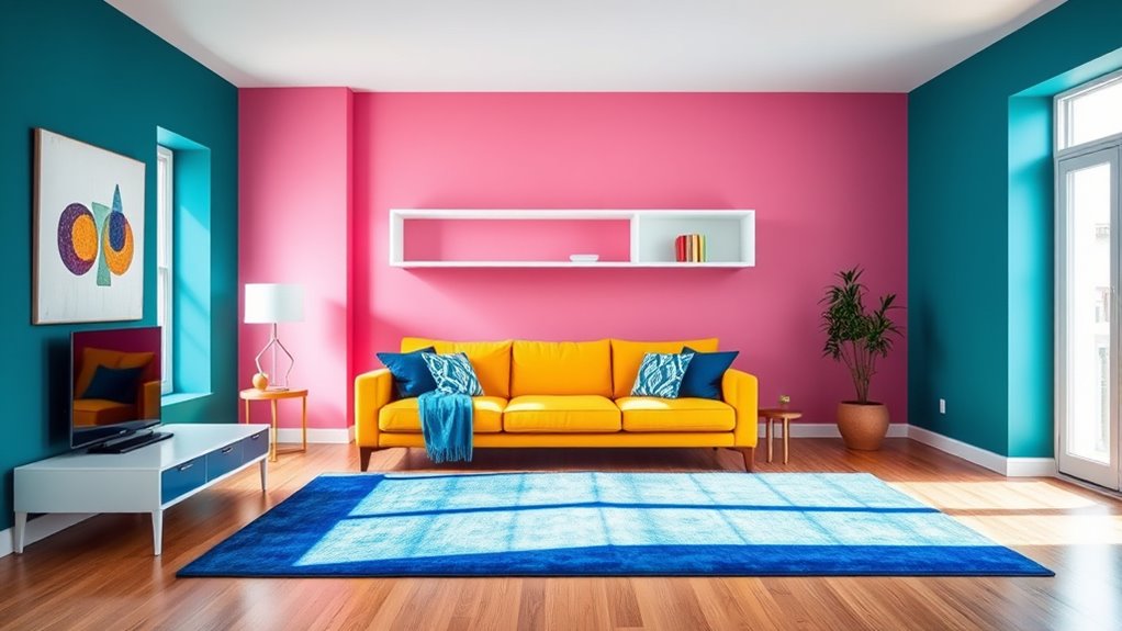
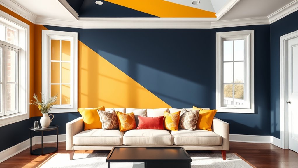
Color blocking involves pairing bold, solid colors in defined sections to create visual interest and balance in your living room. To succeed, you should understand the principles of color theory, which guides how colors interact and influence mood. Using complementary or analogous colors can strengthen visual harmony, making your space feel cohesive and dynamic. Color blocking isn’t just about choosing bright hues; it’s about thoughtfully placing them to emphasize certain areas or features. When you grasp how different colors work together, you can craft a balanced composition that feels lively yet harmonious. This understanding helps prevent chaotic or mismatched looks, allowing you to create a unified space where every section complements the others, enhancing the overall aesthetic of your living room. Additionally, considering current trends like color blocking in fashion and design can inspire more innovative and appealing combinations.
Choosing the Right Color Palette for Your Space
Selecting the perfect color palette is essential to creating a cohesive and inviting living room, as it sets the tone and influences the overall mood. Consider color psychology to choose shades that evoke the feelings you want, like calmness with blues or energy with reds. Cultural symbolism also plays a role; colors can carry different meanings across cultures, so pick hues that resonate with your personal or cultural context. Stick to a few dominant colors to maintain harmony, then add accent shades for contrast and interest. Test paint samples in your space to see how they look in different lighting. Additionally, understanding color trends can help you choose modern and timeless options that enhance your decor. Ultimately, your chosen palette should reflect your personality and style while fostering a welcoming atmosphere.
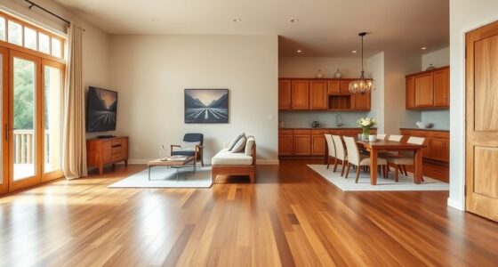
Deciding on the Best Wall and Furniture Combinations

Once you’ve established your ideal color palette, the next step is to choose wall finishes and furniture that enhance and complement your overall design. Explore wall paint ideas that incorporate bold or contrasting colors to highlight your color blocking concept. Consider neutral tones for larger surfaces to balance vibrant shades, or try accent walls to create focal points. When selecting furniture, focus on placement strategies that emphasize your color blocks—arranging pieces to frame or highlight specific areas. Opt for solid-colored furniture that complements wall colors, or introduce subtle patterns to add depth without clashing. Keep proportions in mind to avoid overwhelming the space. Additionally, understanding color psychology can help you select hues that evoke the desired mood in your living room. Thoughtful wall paint choices and strategic furniture placement will unify your color blocking and elevate your living room’s visual appeal.
Techniques for Creating Clean, Sharp Lines

Achieving crisp, clean lines in your color blocking project requires precise techniques and attention to detail. Start by taping off your edges with painter’s tape, pressing it down firmly to prevent bleeding. Use a level or straightedge to ensure tape placement is exact. When choosing paint, consider finish options; matte finishes hide imperfections, while gloss or semi-gloss offer sharper lines. Applying paint in thin, even coats minimizes drips and feathering. For extra precision, use a small brush to carefully cut in along the tape edges before rolling over the larger areas. Keep your tools clean and work slowly to maintain accuracy. Remember, understanding color psychology helps you select hues that create the desired mood, and sharp lines enhance the overall visual impact of your color block design. Additionally, incorporating crochet techniques can add textured accents to your space, creating a unique visual interest.
Incorporating Different Shapes and Patterns for Visual Interest

Adding different shapes and patterns to your color block design instantly boosts visual interest and depth. Incorporate geometric patterns like chevrons, hexagons, or stripes to create striking focal points. Mixing textures, such as smooth fabrics with rougher materials, enhances the tactile appeal and adds complexity to your space. Use bold shapes in artwork, cushions, or rugs to break up large color blocks and introduce variety. Combining different patterns strategically prevents the room from feeling monotonous while maintaining a cohesive look. Remember, contrast is key—pair sharp-edged geometric patterns with softer, organic shapes for balance. Incorporating variety in textures and materials further elevates the design and creates a more inviting environment. By thoughtfully integrating diverse shapes and patterns, you’ll create a dynamic, engaging living room that captures attention and invites exploration.
Balancing Bold Colors With Neutral Tones

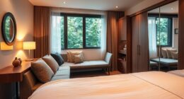
Balancing bold colors with neutral tones creates a harmonious and visually appealing living room. Color psychology shows that neutrals like beige, gray, or white provide a calming backdrop, allowing bold hues to stand out without overwhelming the space. Historically, design trends have favored this balance, blending vibrant accents with subdued bases for timeless appeal. When you incorporate neutral tones, you create a versatile foundation that highlights your chosen bold colors, making your room feel lively yet balanced. Use neutral shades on larger surfaces like walls or sofas, then add pops of bold color through accessories or accent walls. This approach guarantees your space remains inviting and dynamic, preventing bold colors from dominating while maintaining a sophisticated, cohesive look. Additionally, understanding the value of color blocking can elevate your interior design skills and create a more engaging environment.
Accessorizing Your Color-Blocked Living Room

When accessorizing your color-blocked living room, choosing the right complementary pieces can make a big difference. You want to pick accents that enhance your bold colors without overwhelming the space. Remember to balance the intensity of your accessories to keep the room harmonious and visually appealing. Incorporating bathroom accessories and enhancements such as stylish rugs, decorative plants, and sleek storage solutions can elevate your overall decor and add a touch of sophistication.
Choosing Complementary Accessories
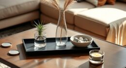
Choosing the right accessories can truly elevate your color-blocked living room by tying together the bold hues and creating visual harmony. To do this, select accent pillows that pick up on or complement your main colors, adding depth and interest. Mixing different textures or patterns on your pillows can also enhance the layered look. Decorative throws are another excellent choice; drape them over sofas or chairs to introduce softer shades or contrasting tones that enhance your color scheme. Keep accessories simple and purposeful—avoid cluttering the space. Focus on pieces that highlight your color choices and add personality without overpowering the bold blocks. Incorporating well-chosen decorative accents can further emphasize your color-blocking design and create a cohesive aesthetic. Thoughtful accessory selection transforms your room into a cohesive, stylish haven that showcases your color-blocking skills.
Balancing Color Intensity
Since bold colors can easily overwhelm a space, it’s essential to carefully balance their intensity with your accessories. To prevent visual overload, consider using monochrome schemes or softer shades like pastels to tone down vibrant hues. For example, if you have a neon orange wall, add:
- Pale blush or mint cushions to soften the look
- Cream or light gray rugs for grounding the space
- Simple metallic accents to add subtle shine
- Light-colored curtains or throws to balance the vividness
Additionally, incorporating low-carb and keto-friendly elements in your decor palette can help create a cohesive and balanced aesthetic. Balancing color intensity involves mixing high-energy neons with muted tones or opting for monochrome schemes that create harmony without overpowering. This approach ensures your living room remains lively yet visually comfortable.
Tips for Maintaining and Refreshing Your Color Scheme

Maintaining and revitalizing your color scheme keeps your living room feeling vibrant and intentional. Regularly update your wall art to reflect seasonal changes or your evolving style, which instantly refreshes the space. Consider swapping out or repositioning lighting fixtures to alter the room’s ambiance and highlight your color blocking. Clean your walls and fixtures to keep colors looking fresh and vibrant. Repainting a feature wall or touch-ups can restore brightness and prevent fading. Use accessories like throw pillows, rugs, or curtains in complementary or contrasting shades to add variety without overwhelming your scheme. Incorporating color psychology principles can also influence the mood of your living space and enhance your overall design. These simple updates help keep your living room lively and cohesive, ensuring your color blocking remains intentional and inspiring over time.
Frequently Asked Questions
How Can I Make Color Blocking Look More Subtle?
If you want color blocking to look more subtle, start by choosing shades with slight variation, creating a gentle contrast. Use tone balancing by pairing softer hues that complement each other seamlessly. Apply shade variation carefully, avoiding stark differences, and blend edges smoothly for a refined look. This approach keeps your space visually interesting without overwhelming, making your color blocking feel more sophisticated and understated.
What Are Common Mistakes to Avoid With Color Blocking?
Imagine a vibrant canvas where bold color contrast sparks excitement, but avoid common mistakes. You might clash furniture or choose shades that overwhelm the space. To keep it balanced, coordinate your furniture with the color blocks, ensuring harmony. Don’t overdo it with too many contrasting hues, which can make the room feel chaotic. Instead, aim for a cohesive look that highlights your style without overwhelming the senses.
Can Color Blocking Work in Small Living Rooms?
Yes, color blocking can work in small living rooms if you choose the right colors and placement. Use color psychology to select hues that make the space feel larger and inviting. Keep furniture placement strategic, like placing lighter shades on walls to open up the room and darker accents for depth. Avoid overcrowding, and opt for bold blocks sparingly to create a balanced, vibrant look without overwhelming the space.
How Do I Choose Durable Paint for Bold Colors?
Think of choosing durable paint as selecting a knight for your castle—strong and reliable. To guarantee color longevity, pick paints with a high-quality finish, like eggshell or satin, which resist wear and stains. Look for labels that specify durability and fade resistance. You’ll want a paint finish that keeps your bold colors vibrant over time, making your living room a stunning, lasting masterpiece.
What Lighting Options Enhance Color Blocking Effects?
You should consider lighting techniques like layered lighting with spotlights or wall washers to highlight bold color blocks. Opt for fixture styles that complement your design, such as sleek track lighting or modern sconces. These choices add emphasis and depth, making your color blocking stand out. Adjusting the brightness levels can also enhance the contrast, creating a dynamic and inviting space that truly showcases your creative wall art.
Conclusion
By mastering color blocking, you transform your living room into a canvas of bold expression. Think of it as painting your personality onto the walls—each hue a brushstroke of your style. With careful balance and creative flair, you’ll craft a space that’s both vibrant and harmonious. Remember, color blocking isn’t just decorating; it’s storytelling—an artful dance between shades that invites you to live boldly and beautifully every day.