
To choose a cohesive holiday decor palette, start by selecting a primary color scheme that reflects your style and mood, like traditional reds and greens or icy blues and silvers. Build around these main colors with complementary shades or neutrals to create visual flow across your space. Consistent use of colors in ornaments, tableware, and accents ties everything together, making your decor look intentional and polished. Keep exploring ways to refine your festive look for a harmonious holiday atmosphere.
Key Takeaways
- Select a primary color scheme that reflects your style and desired holiday mood.
- Limit your palette to a few complementary or neutral tones to maintain harmony.
- Build around main colors, adding accents with metallics or whites for sophistication.
- Ensure color consistency across ornaments, tableware, and decorations for visual flow.
- Use colors to reinforce your theme, enhancing the overall festive atmosphere.

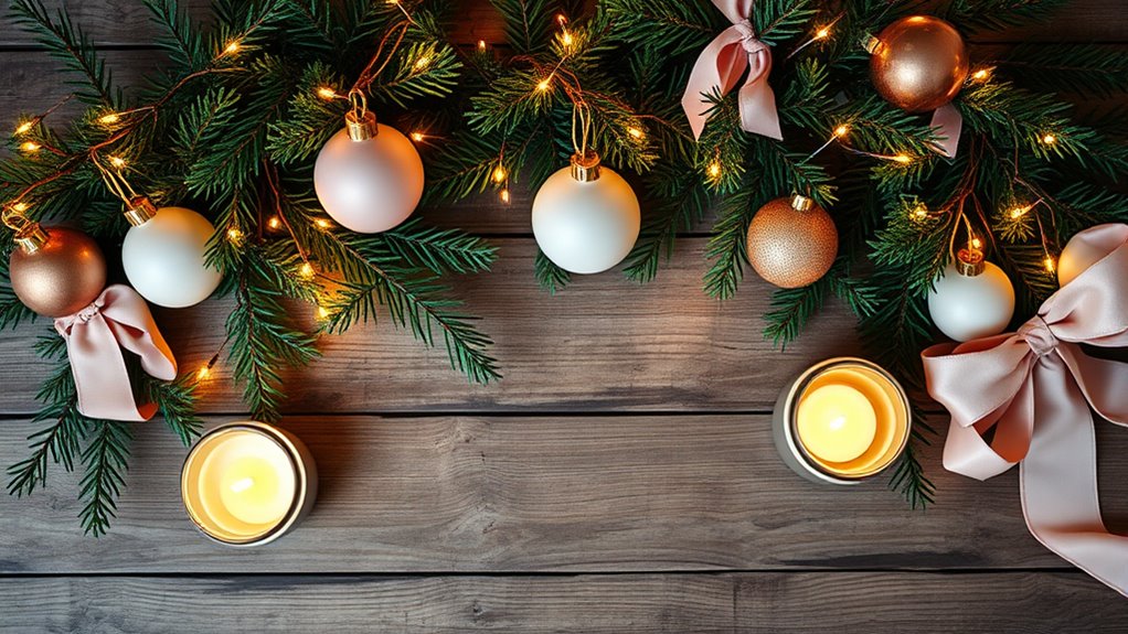
Creating a cohesive holiday decor palette transforms your space into a festive and inviting environment. When you focus on color coordination, you guarantee that every element—from ornaments to tableware—works harmoniously, making your decor look intentional and polished. The key is selecting a color scheme that resonates with your style and the mood you want to set. Whether you prefer traditional reds and greens, sleek golds and silvers, or cool winter blues, sticking to a limited palette helps unify your decorations. This consistency prevents the space from feeling cluttered or chaotic, allowing your standout pieces to truly shine.
A cohesive holiday palette makes your décor look polished and inviting.
Once you’ve chosen your primary colors, you can build around them with complementary shades or neutrals. For example, if you opt for a classic red and green scheme, adding touches of white or metallic accents can elevate the look without overwhelming it. When you incorporate themed decorations, aim for items that share your chosen palette. This might include ornaments, ribbons, or figurines that follow the same color story, reinforcing visual cohesion across the room. Themed decorations help tell a story or create a specific vibe, whether it’s cozy and rustic, modern and minimalist, or glamorous and luxurious. When your decorations align with your color scheme, the overall aesthetic becomes more intentional and sophisticated.
You’re encouraged to think about the flow of colors throughout your space. For instance, if you hang a red ornament on the tree, try to echo that shade in your table setting or mantel decor. This continuity draws the eye across different areas and creates a seamless look. Mixing too many contrasting colors can disrupt the harmony and divert attention from your carefully curated theme. Instead, stick with variations of your main colors, adding in small pops of accent shades sparingly to keep things lively without losing cohesion.
Furthermore, themed decorations don’t have to be overly literal. You can interpret a theme creatively, using color and style to evoke a particular mood or story. For example, a winter wonderland theme might feature icy blues, silvers, and whites, with snowflake-shaped ornaments and frosted accents. A rustic Christmas could incorporate deep reds, greens, and burlap textures. The consistency in color coordination across all your decorations enhances the thematic vibe and makes your holiday decor feel thoughtfully designed. Paying attention to color harmony ensures your decorations will look more refined, making your entire space more inviting and memorable for everyone who visits.
Frequently Asked Questions
How Do I Incorporate Personal Style Into a Holiday Palette?
You can incorporate your personal style into a holiday palette by choosing colors that reflect your favorite shades and vibe. Mix and match hues that resonate with your aesthetic, whether it’s cozy neutrals or bold jewel tones. Add personalized touches like ornaments or textures that showcase your taste. This way, your holiday decor feels authentic and uniquely yours, creating a warm, inviting space that truly reflects your style and color preferences.
Can I Mix Patterns With a Cohesive Color Scheme?
Yes, you can mix patterns with a cohesive color scheme, turning your decor into a visual symphony. Think of pattern mixing as a dance where different styles glide together seamlessly, guided by color coordination. Use hues from your palette to unify diverse patterns, ensuring they complement rather than clash. This approach adds personality and depth, making your holiday decor both lively and harmonious, like a well-orchestrated celebration.
What Are Some Budget-Friendly Ways to Update My Holiday Decor?
You can update your holiday decor on a budget by creating DIY decorations, like homemade garlands or painted ornaments, which add a personal touch without spending much. Thrift store finds are a fantastic resource for unique ornaments, vintage pieces, or seasonal accents that can be repurposed to match your cohesive color scheme. Combining these affordable options helps refresh your decor while keeping costs low and your style consistent.
How Do I Create a Focal Point Using My Color Palette?
To create a focal point with your color palette, use color blocking to draw attention to a specific area, like a mantel or centerpiece. Incorporate focal accents, such as a bold ornament or a themed garland, in contrasting or complementary hues. Keep surrounding decor more subdued to make these accents stand out. This approach guides the eye naturally and adds depth to your holiday decor.
Are There Seasonal Color Trends to Consider for Holiday Decor?
Did you know that 65% of holiday decorators plan their color schemes around seasonal color trends? You should consider these when choosing your holiday color palettes, as they can make your decor feel fresh and timely. Keep an eye on trending shades like deep reds, icy blues, or metallics, which are popular this season. Incorporating these trends helps your decor stay stylish and cohesive, creating a festive atmosphere.
Conclusion
By blending bold blues, bright reds, and shimmering silvers, you create a fascinating, cohesive holiday haven. Remember, a well-woven palette promotes perfection, producing a polished, picturesque space. Stay spontaneous with subtle shifts, and let your palette tell a powerful, personal story. With thoughtful, themed tones, you’ll transform your holiday decor into a harmonious haven that happily highlights your holiday heart and home. Happy decorating, and may your palette truly pop with personality!