
If you're looking to create a relaxed vibe with a boho color palette, earthy tones are your best bet. Think warm terracottas, gentle browns, and calming olive greens. These colors bring a cozy atmosphere and blend beautifully with natural elements, like wood and stone. Layering different textures enhances the look, making it inviting and unique. Don't forget to balance these hues with soft neutrals or bold jewel tones for added interest. Embracing this palette not only reduces stress but also captures that free-spirited essence of boho design. There's so much more to explore about capturing the perfect boho aesthetic!
Key Takeaways
- Earthy tones like terracotta, sage green, and browns create a cozy and relaxed atmosphere in boho design.
- Layering textures and patterns enhances depth, making earthy palettes feel inviting and warm.
- Incorporating natural elements, such as wood and stone, grounds the space and complements the color scheme.
- Seasonal color shifts can refresh the aesthetic, using lighter pastels in spring and deeper earthy tones in fall.
- Combining bold jewel tones with neutrals maintains harmony while adding visual interest to a bohemian setting.
Understanding Boho Style
Understanding Boho style invites you to embrace a free-spirited approach to design that celebrates individuality. This aesthetic thrives on eclectic expression, combining various influences to create unique spaces.
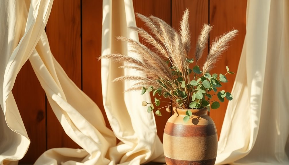
Earthy tones like browns and greens set the foundation for boho design, establishing a grounded and inviting atmosphere. You'll find that layering different textures and patterns adds depth and warmth, making each room feel personal and lived-in.
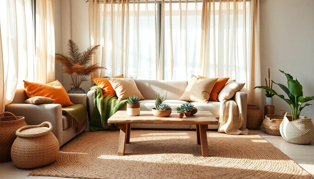
While boho color palettes often feature muted shades, don't shy away from incorporating bold jewel tones for contrast. These vibrant hues enhance visual interest and reflect a sense of adventure.
Creating Earthy Color Palettes
When creating earthy color palettes, you'll want to balance bold hues with neutral tones for a harmonious look.
Integrating natural elements and textures not only enhances visual interest but also reinforces the bohemian vibe.
Experiment with layering to find the right mix that feels both grounded and inviting.
Balancing Bold and Neutral
How can you create an enchanting earthy color palette that balances bold and neutral tones?
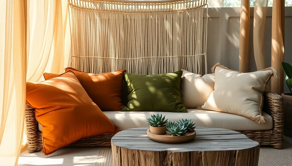
Start by incorporating jewel tones, like deep greens and rich blues, alongside soft, muted hues. This combination not only enhances the organic feel but also keeps your space visually engaging.
Use colors with neutral backgrounds to provide a calming base, allowing bold shades to pop without overwhelming the room.
Don't forget about textures; mixing materials like wood, linen, and clay adds depth to your earthy colors.
As seasons change, adjust your balance of bold and neutral tones to keep the palette fresh and relevant year-round.
This careful balance guarantees your design maintains visual interest while promoting a relaxed atmosphere. Additionally, consider using natural materials such as reclaimed wood and metal accents to further enrich your earthy palette.
Natural Elements Integration
Integrating natural elements into your design brings your earthy color palette to life, enhancing its warmth and tranquility.
To create a serene atmosphere, consider these four key elements:
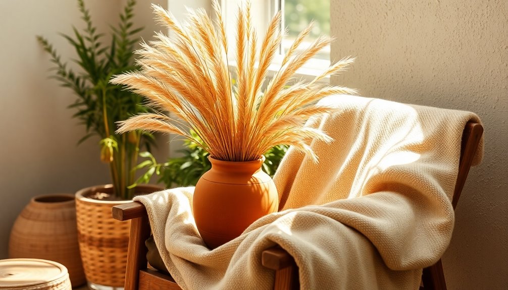
- Wood: Use wooden furniture or accents to introduce rich, natural tones.
- Stone: Incorporate stone elements, like a fireplace or decorative rocks, to ground the space.
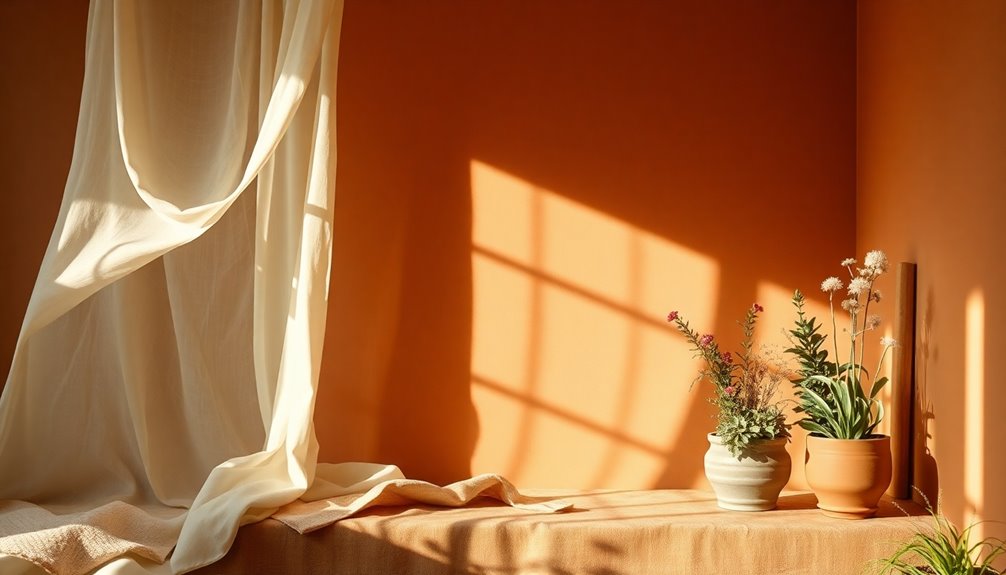
- Plants: Add greenery with potted plants or hanging vines for a fresh, organic touch.
- Patterns: Use fabrics with floral or tribal prints that reflect natural motifs, complementing your earthy colors.
Experimenting with color combinations like sage greens and terracotta can evoke a cozy vibe. Additionally, the use of natural elements in decor promotes tranquility and enhances the overall ambiance of your space.
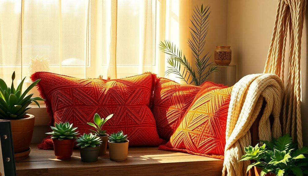
Textures for Visual Interest
To create an enchanting earthy color palette, incorporating a variety of textures adds depth and visual interest. Layer materials like wood, woven fabrics, and ceramics to achieve a harmonious blend. Pair soft linens with rough jute or velvet with distressed leather for a rich sensory experience. Patterns such as tribal prints and floral motifs can introduce dynamic elements while preserving the earthy boho aesthetic. Additionally, consider using unique, handcrafted decor items to reflect individuality in your design choices.
| Material | Texture Type | Visual Impact |
|---|---|---|
| Natural Wood | Smooth/Grainy | Warmth and earthiness |
| Woven Fabrics | Soft/Rough | Comfort and coziness |
| Ceramics | Glossy/Matt | Contrast and elegance |
| Plants | Organic/Varied | Liveliness and freshness |
Utilizing these textures enhances your design and reinforces the earthy vibe.
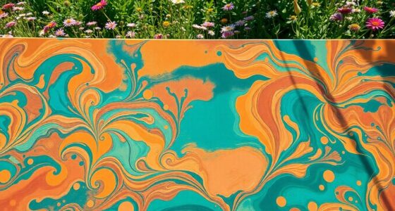
Popular Color Combinations
When you're exploring popular boho color combinations, you'll find that jewel tones with neutrals create a rich yet relaxed vibe.
Mixing earthy colors with pastels can bring a calming balance to your space, while combining warm and cool tones adds dynamic contrast.
Each of these combinations contributes to the inviting atmosphere that defines boho style.
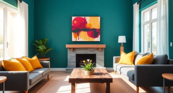
Jewel Tones With Neutrals
While jewel tones like emerald, sapphire, and ruby create a vibrant focal point, pairing them with neutral shades such as beige and cream enhances the overall aesthetic.
This combination strikes a perfect balance, allowing the jewel tones to energize the space while the neutrals evoke calmness. It's a popular choice in boho color palettes, reflecting individuality and a cozy atmosphere.
To effectively implement this color scheme, consider these tips:
- Choose a dominant jewel tone for key pieces.
- Use neutrals as a backdrop for walls and larger furniture.
- Incorporate natural textures like wood or woven fabrics.
- Accessorize with smaller decor items in complementary jewel tones.
This approach guarantees a warm and inviting environment that feels effortlessly stylish.
Earthy Colors and Pastels
Embracing earthy colors alongside soft pastels creates an enchanting balance in your space, inviting warmth and calmness.
Earth tone colors like terracotta and forest green pair beautifully with pastel colors such as blush pink and pale sage. This combination balances the visual weight of your boho living room, fostering a cozy and vibrant atmosphere.
Popular pairings, like muted greens with soft lilacs, evoke a serene vibe, perfect for peaceful environments. The contrast between bold earthy hues and gentle pastels adds depth, making your space feel layered without overwhelming the senses.
To enhance this organic aesthetic, incorporate natural textures like woven fabrics and wooden elements, further enriching your color palette and creating a stunning, relaxed vibe. Additionally, consider adding vintage fixtures to your decor, which can complement your earthy tones beautifully.
Warm and Cool Mixes
Mixing warm and cool colors in your boho space not only creates visual interest but also fosters a unique atmosphere.
By incorporating earthy tones with contrasting colors, you can achieve a dynamic balance that enhances your space's relaxed vibe. Here are some popular combinations to contemplate:
- Terracotta with sage green
- Warm mustard paired with cool teal
- Burnt sienna alongside dusty lilac
- Jewel tones like emerald mixed with warm neutrals
These warm and cool mixes allow for versatility, making them suitable for various areas, from living rooms to bedrooms.
Embracing these combinations can evoke a sense of adventure while maintaining an inviting and tranquil environment, perfect for your boho aesthetic. Additionally, considering the color palette can significantly impact the overall theme of your space.
Color Psychology Insights
Color psychology plays an essential role in how we experience and interact with our environments. By using earthy tones like browns, greens, and beiges, you can create a relaxed atmosphere that promotes comfort and stability.
These colors help establish a serene ambiance, making your space feel inviting. Incorporating warm colors, such as terracotta and mustard, adds a sense of coziness that enhances this inviting vibe.
Soft, muted shades further reduce stress and anxiety, contributing to a calm environment. Understanding these emotional responses allows you to design spaces that align with your mood and experiences. Embracing natural hues fosters a connection to nature, promoting feelings of peace and well-being in your home. Additionally, integrating aromatherapy techniques can further enhance your emotional well-being and create a more tranquil space.
Seasonal Design Considerations
As you consider your boho design, seasonal elements become a key aspect of creating inviting spaces that reflect the changing environment.
Embrace seasonal shifts by integrating these elements:
- Color Shifts: Use lighter pastels in spring and deeper earthy tones like ochre in fall.
- Textures: Opt for lightweight fabrics like linen and cotton during warmer months, and switch to knits and wools in winter.
- Seasonal Patterns: Incorporate floral designs in spring and cozy textures for winter to enhance your boho aesthetic.
- Color Psychology: Utilize warm colors to foster comfort in winter, while cool shades promote calm in summer. Additionally, consider using natural elements like plants to enhance the seasonal feel and connect indoor spaces with the outdoors.
Boho Aesthetics in Fashion
While embracing boho aesthetics in fashion, you'll discover a world where individuality flourishes through layered outfits and eclectic combinations.
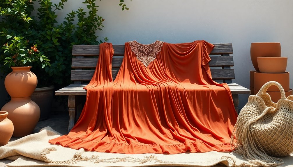
Boho fashion celebrates earthy tones like terracotta, olive green, and mustard yellow, creating a cozy vibe that connects you to nature. You'll often mix and match various textures, patterns, and colors for a free-spirited look that's all your own.
Accessories are essential; oversized hats, layered jewelry, and fringe bags enhance your unique style. Opt for fabrics like cotton, linen, and crochet to guarantee comfort and breathability while embodying that laid-back, artistic spirit.
Don't forget to incorporate vintage or handmade pieces, as they promote uniqueness and a connection to artisanal craftsmanship, allowing your individuality to truly shine. Additionally, exploring the impact of social media on fashion trends can further inspire your boho wardrobe choices.
Frequently Asked Questions
What Is the Most Calming Color Palette?
The most calming color palette often features soft, muted tones like light blues, gentle greens, and earthy neutrals.
These shades help reduce stress and create a peaceful atmosphere.
By combining these colors with natural materials, such as wood and textiles in neutral hues, you enhance the feeling of tranquility.
A balanced mix of cool and warm tones can evoke harmony, making it ideal for spaces where you want to relax and unwind.
What Colors Are Associated With Boho?
Ever wonder what colors make a space feel like a cozy escape? In boho design, earthy tones reign supreme.
You've got terracotta, mustard, soft pinks, and muted greens that create a grounded atmosphere. Jewel tones like emerald and sapphire add vibrant accents, while warm reds and browns enhance coziness.
Feel free to mix in pastels to balance bold hues, crafting a harmonious, visually enchanting environment that reflects your unique, laid-back style.
What Color Scheme Can Create a Warm Cozy Feeling?
To create a warm, cozy feeling, you'll want to focus on earthy tones like terracotta, muted browns, and soft greens.
These colors connect you to nature and evoke comfort. Consider layering in rich jewel tones such as ruby and emerald alongside warm neutrals for balance.
Incorporating varied textures like woven fabrics and rustic wood will further enhance the inviting atmosphere, making your space feel lived-in, warm, and welcoming.
What Are Warm Earthy Color Tones?
Warm earthy color tones are like a comforting hug from nature!
You've got shades like terracotta, ochre, burnt sienna, and warm beige that wrap you in a cozy embrace.
These colors, inspired by soil and rustic landscapes, create an inviting atmosphere that makes you feel grounded.
When you use them, you're not just decorating; you're invoking feelings of stability and relaxation that transform your space into a serene haven.
Conclusion
Incorporating a boho color palette into your space or wardrobe can truly transform your vibe. Did you know that 62% of people feel more relaxed in environments with earthy tones? Imagine stepping into a room painted in warm terracotta or soft sage, instantly calming your mind. By embracing these colors and their combinations, you not only enhance your aesthetic but also create a sanctuary that reflects your unique style and promotes tranquility in your everyday life.