
To choose the perfect paint color, first, understand your space’s purpose and natural light. Gather inspiration and samples, and test colors in various lighting to see how they change throughout the day. Consider the emotional impact colors can have on you, using the color wheel for guidance. Trust your instincts and take your time. There’s plenty more to learn about making confident color choices and avoiding common mistakes that could lead to regret.
Key Takeaways
- Assess the room’s purpose and natural light to select colors that enhance the desired atmosphere and mood.
- Gather a variety of paint samples and test them in different lighting to ensure they complement your space.
- Apply the 60-30-10 rule for balanced color distribution, ensuring dominant, secondary, and accent colors create harmony.
- Consider the emotional impact of colors and choose shades that promote relaxation or energy, aligning with your personal preferences.
- Trust your instincts while using the color wheel to find complementary shades, and remain flexible in your choices as perfection may be unattainable.
Understand Your Space and Its Requirements
How do you know which paint color is right for your space? Start by evaluating the room’s purpose. Brighter colors work well in morning spaces, while darker shades can enhance evening atmospheres.
Pay attention to natural light; south-facing rooms amplify warm tones, and north-facing ones highlight cooler shades. Additionally, consider how lighting design impacts the perception of your chosen color throughout different times of the day. Incorporating similar flooring materials can also create a seamless transition in color throughout the room. Choosing a paint color that complements farmhouse charm can elevate the rustic appeal of your kitchen.
Natural light plays a crucial role; south-facing rooms enhance warm hues, while north-facing ones bring out cooler tones.
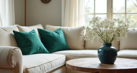
Consider existing finishes like flooring and cabinetry, as they influence your color choice and overall aesthetic. Assess how your selected paint colors interact with your furniture and decor to create harmony. You’ll want to make sure they complement each other without clashing.
Finally, apply the 60-30-10 rule for color distribution: use a dominant color for 60%, a secondary color for 30%, and an accent color for the last 10% to achieve balance. Additionally, incorporating natural elements like wood and stone can enhance the overall ambiance of your space and complement your chosen paint color.
Gather Inspiration and Color Samples
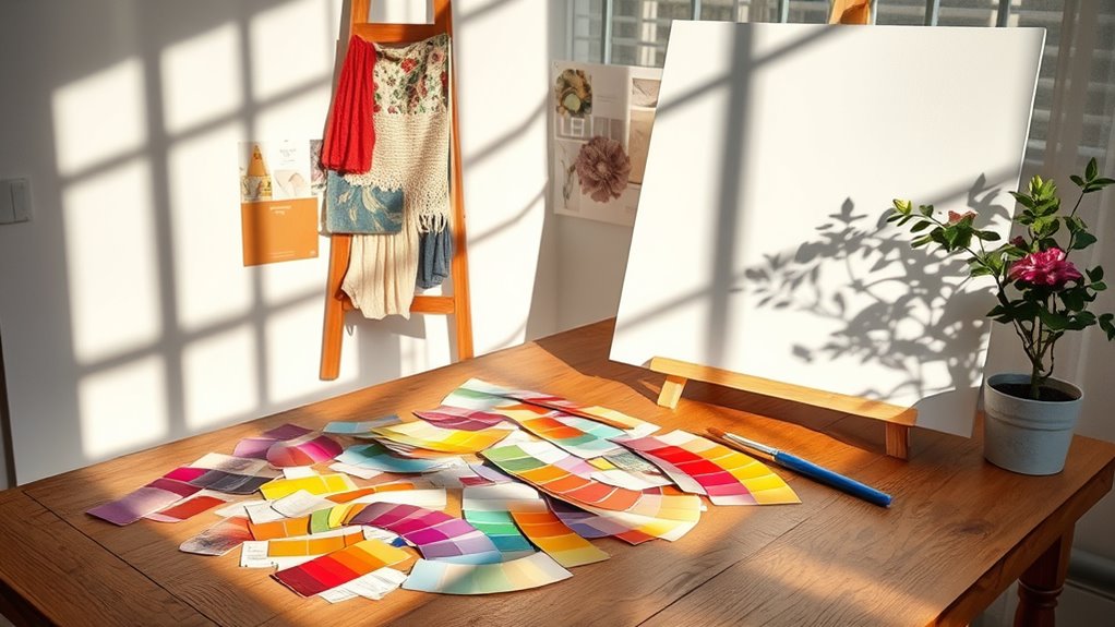
Start by paying attention to the colors around you in everyday life; you might find inspiration in nature, fabrics, or decor. Additionally, considering cat furniture in your space can help create an inviting environment that balances both aesthetics and functionality for pet owners. Next, head to local stores and collect 15-20 paint chip samples that catch your eye, ensuring you have a broad selection to compare. Additionally, consider how your chosen colors will interact with your space to promote mental clarity and a sense of calm. A well-thought-out color scheme can also enhance color accuracy in your home cinema setup, ensuring that visuals are vibrant and true to life. Incorporating elements that reflect environmental sustainability can further enhance the overall harmony of your space.
Observe Everyday Color Cues
Here are some tips to help you gather inspiration:
- Match paint chips with colors from inspiring spaces.
- Hold paint chips next to objects or fabrics you plan to keep.
- Consider how natural light affects color perception throughout the day.
- Explore online resources for popular color combinations.
- Incorporate warm color palettes to create a cozy atmosphere in your farmhouse bedroom. Additionally, you can draw inspiration from boho wall decor that often features vibrant colors and patterns for visual interest. Using color coordination can also enhance the overall aesthetic of your room by creating a harmonious environment. Furthermore, consider how certain colors may evoke feelings of mindfulness and harmony, similar to the tranquil atmosphere found in a traditional tea ceremony.
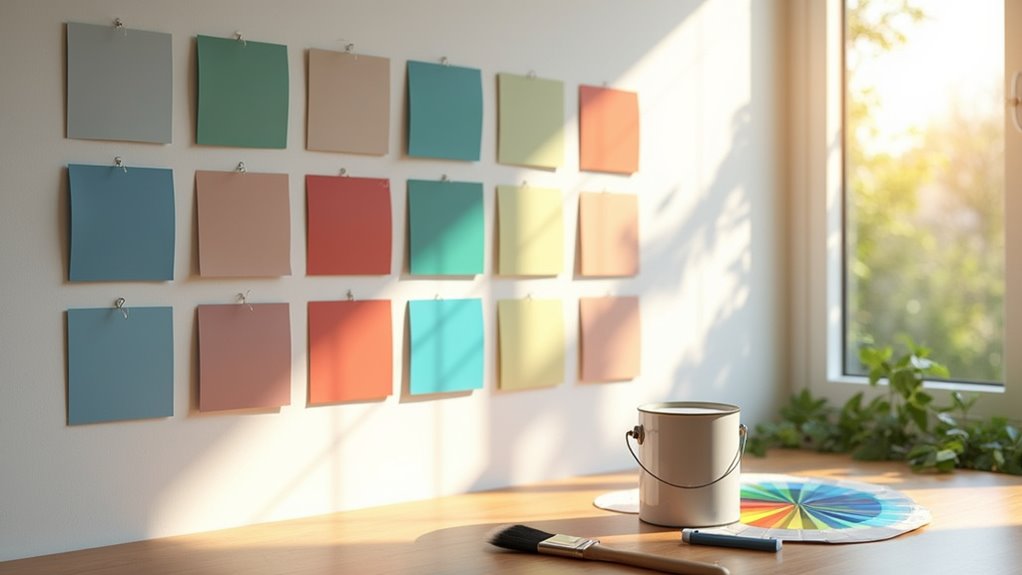
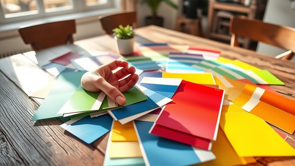
Collect Paint Chip Samples
Collecting paint chip samples is an essential step in finding the perfect color for your space. Aim for 15-20 variations to broaden your color choices.
Use larger paint color sheets from brands like Benjamin Moore or Sherwin Williams for better visibility. Hold these color swatches next to your existing paint color and under different lighting to accurately evaluate how they’ll look. Additionally, consider how toilet flushing can influence the overall atmosphere of your bathroom space, as it can affect the perceived cleanliness and maintenance of the area. Incorporating multi-functional furniture can further enhance the functionality of your space, complementing your chosen paint color. It’s also important to understand zoning laws in your area, especially if you are considering building a tiny home that may require specific color guidelines.
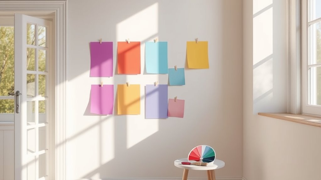
Avoid making hasty decisions in the paint store; instead, take samples home for a more thoughtful assessment. Create sample boards using foam board to test multiple coats and observe how light affects each shade over time. This approach helps guarantee you’re confident before finalizing your choice, leading to a space you truly love. Additionally, consider using energy-efficient lighting to see how your chosen colors interact with various light sources throughout the day.
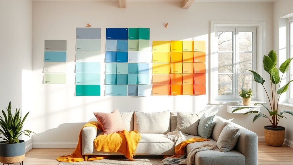
Evaluate Colors in Different Lighting Conditions
As you explore paint colors for your space, it’s crucial to evaluate how they look in different lighting conditions. Natural light shows the purest color, so test your paint samples at various times of the day.
Evaluating paint colors in various lighting conditions is essential for achieving the perfect look in your space.
Don’t forget about artificial light, as it can change how colors appear. Here are some tips to guide you:
- Use larger paint swatches (at least 2-foot squares) to observe colors better.
- Apply samples in the actual room to see how they interact with your decor. Additionally, consider how surface texture can affect the appearance of the paint color. Moreover, selecting the right specialized spray tips can enhance the application of your chosen color for a flawless finish. Exploring high-quality MP3 output can also help you enjoy music while painting.
- Check how colors shift throughout the day, especially morning versus evening light.
- Make your final decision based on a thorough review of color looks under both natural and artificial lighting conditions. Additionally, consider using airless paint sprayers to achieve a smooth, even finish that complements your chosen color.
Consider the Emotional Impact of Colors
When choosing paint colors, it’s important to contemplate how different shades can affect your emotions. Warm colors like red can energize a space, while cool tones like blue can create a sense of calm. Think about your personal connections to colors and how they can shape the atmosphere you want in your home. Additionally, certain colors can evoke feelings of health benefits that may enhance your overall well-being and comfort within the space. For example, incorporating colors that promote relaxation techniques can help create a serene environment conducive to stress relief.
Color Psychology Basics
Color psychology reveals how different hues can shape our emotions and perceptions. Understanding this can greatly enhance your living experience.
Here are some key aspects to reflect on:
- Warm colors (like red and orange) evoke energy and excitement.
- Cool colors (such as blue and green) promote calmness and tranquility.
- Color saturation affects mood; bright colors energize, while softer pastels soothe.
- Lighter colors can make spaces feel larger, whereas darker colors create intimacy.
Personal Emotional Responses
Emotion plays an essential role in how you perceive and choose paint colors for your home. Different colors evoke emotional responses that can transform your space.
Warm hues like reds and yellows energize and excite, while cool tones such as blues and greens create a calming atmosphere. Your personal connections to colors, maybe from childhood or cherished items, greatly influence your color choices.
Understanding the psychological effects of colors helps you select shades that enhance comfort or productivity, depending on the room. By recognizing and addressing these emotional responses during the color selection process, you can alleviate anxiety and create a home environment that genuinely resonates with you, fostering a sense of peace and satisfaction.
Use the Color Wheel for Guidance
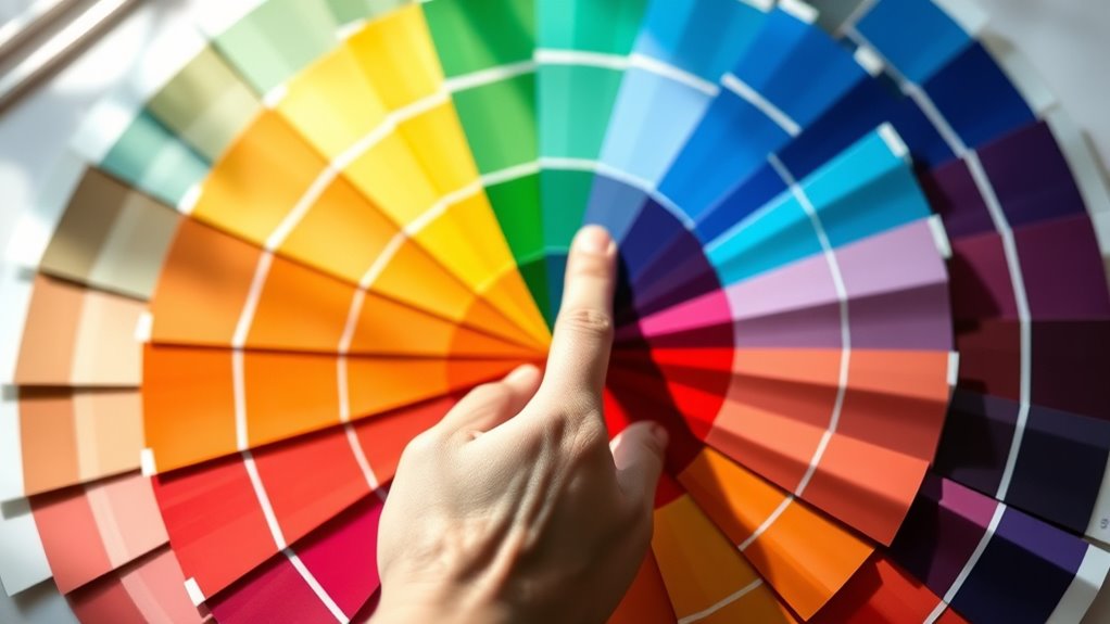
How can you transform a room’s atmosphere with the right paint colors? Using the color wheel is a fantastic way to guide your choices. It helps you understand relationships between colors, ensuring you achieve a harmonious look or striking contrasts.
Here are some tips for choosing paint colors effectively:
- Identify warm colors (red, orange, yellow) to energize a space.
- Use cool colors (blue, green, purple) to create a calming environment.
- Look for accent colors that complement your main choice for a balanced aesthetic.
- Explore analogous or complementary colors to enhance your design based on color theory.
With the color wheel, you’ll easily find shades that work together, making your room feel cohesive and inviting.
Test Colors on Sample Boards

After you’ve selected potential colors using the color wheel, it’s time to see how they truly look in your space. To accurately test colors, use foam sample boards instead of the existing wall colors for a more accurate representation.
Apply multiple coats, especially for deeper shades, to guarantee proper coverage and true color perception. Allow the sample boards to cure for a day, revealing the final appearance and color undertones.
Assess them in different lighting conditions throughout the day, as natural and artificial light can dramatically affect how the color looks. Also, consider how the tested colors coordinate with existing design elements, confirming furniture compatibility and enhancing your overall decor choices.
Trust Your Instincts and Take Your Time

When it comes to choosing the perfect paint color, trusting your instincts can greatly ease the decision-making process.
Remember, taking your time is essential for thoughtful decision-making. Here are a few tips to contemplate:
- Explore various color options that resonate with your personal preferences.
- Sample paint colors in your space, observing how they change with different times of day and lighting.
- Reflect on how the colors interact with existing furnishings to create a cohesive look.
- Engage in self-dialogue to clarify your thoughts and feelings about each shade.
Understanding that perfect paint colors may not always exist can relieve some pressure.
Focus on what feels right for your space, and you’ll be more satisfied with your choice. Trust your instincts, and enjoy the journey!
Frequently Asked Questions
What Color Paint Shows the Least Imperfections?
If you want a paint color that shows the least imperfections, go for lighter shades like soft whites or light grays.
These colors reflect light effectively, minimizing flaws on your walls. You should also consider flat or matte finishes, as they absorb light and hide blemishes better than glossy options.
Testing samples in your room’s lighting will help you see which color and finish work best to disguise imperfections while enhancing your space.
How Do You Match the Perfect Color in Paint?
When it comes to matching the perfect paint color, you’ve gotta strike while the iron’s hot.
Start by holding paint chips next to your existing materials, like fabrics and flooring, to see how they harmonize. Use a color reader to get an accurate match for your favorite hues.
Don’t forget to test samples on the wall in different lighting, and consider creating a mood board to visualize everything together.
What Color Is Replacing Gray?
Warm tones are replacing gray in interior design, creating a more inviting atmosphere.
You’ll find colors like beige, taupe, and soft earthy shades gaining popularity. Greige, a mix of gray and beige, is especially versatile, while soft whites provide a serene backdrop.
Natural hues, like greens and blues, bring the outdoors inside, enhancing tranquility.
As homeowners lean towards these warmer palettes, gray’s coolness is fading, making way for cozier options.
What Is the Rule for Wall Colors?
“Variety is the spice of life,” but when it comes to wall colors, sticking to a balanced approach is key.
The 60-30-10 rule is your best friend: use 60% dominant color for walls, 30% for secondary shades in furniture, and 10% for accents.
Aim for lighter, neutral tones to appeal to a wider audience and enhance your home’s value.
Conclusion
Choosing the perfect paint color can feel like traversing a labyrinth, but with the right approach, you’ll emerge victorious. By understanding your space, gathering inspiration, and testing colors in various lights, you can avoid common pitfalls. Remember, every hue has its story, influencing mood and atmosphere. Trust your instincts—after all, like Alice in Wonderland, you’re on a journey of self-discovery. Take your time, and you’ll find the shade that brings your vision to life.