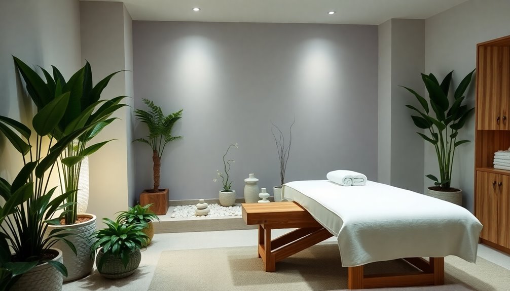
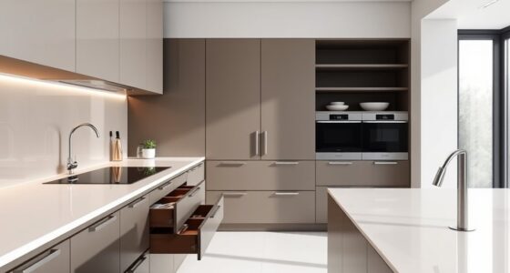
When you're picking colors for your spa design, think about how each shade influences relaxation. Soft blues and greens are perfect for calming spaces, while warm tones like coral can create intimacy. Earthy hues connect you to nature, promoting a grounded feel. Don't overlook pastels; they evoke serenity and comfort. You'll want to reflect on lighting too, as it can change how colors appear. A balanced palette not only enhances the client experience but also aligns with your brand identity. Ready to explore specific trends and seasonal ideas to make your spa even more inviting? You'll find plenty of inspiration ahead.
Key Takeaways
- Choose calming colors like soft blues and greens to promote relaxation and lower anxiety levels in spa environments.
- Incorporate warm shades such as coral and golden yellow to evoke comfort and intimacy, enhancing the overall client experience.
- Utilize earthy tones like browns and greens to create a connection to nature, fostering a grounded and soothing atmosphere.
- Implement soft pastels and neutrals to reinforce cleanliness and serenity, essential for a tranquil spa ambiance.
- Consider the impact of lighting on color perception, using layered lighting to enhance vibrancy and create the desired mood.
Importance of Color in Spa Design
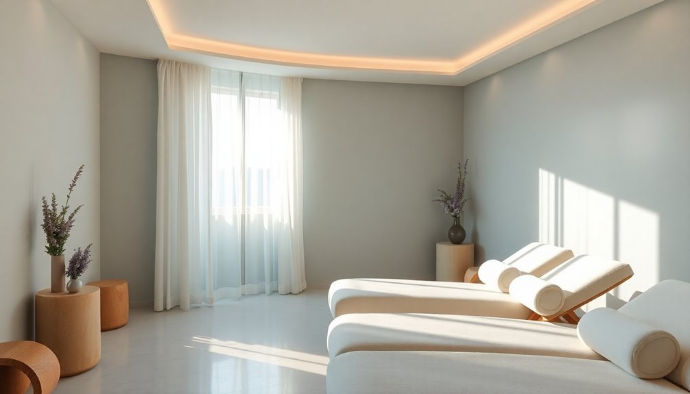
When you step into a spa, the colors surrounding you play an essential role in shaping your experience. Thoughtfully chosen color palettes can create a soothing ambiance that enhances relaxation.
Calming colors like soft blues and greens help lower blood pressure, promoting a therapeutic environment. Meanwhile, warm shades such as coral and golden yellow evoke feelings of comfort and intimacy, making treatments more enjoyable.
Neutral colors like beige and gray establish a clean backdrop, allowing accent colors to shine while fostering tranquility.
Understanding the psychological effects of these colors enables spa interior design to cater to client preferences, ensuring a relaxing atmosphere that invites you to unwind fully and rejuvenate your spirit.
Color Psychology and Relaxation
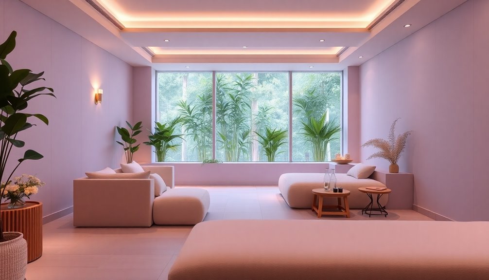
Color choices play a significant role in how you feel during your spa experience. Warm tones can create a cozy atmosphere, while cool shades help reduce anxiety and promote relaxation. Incorporating Law of Attraction principles can further enhance the calming environment by aligning your space with positive energy and intentions.
Impact of Color Choices
Choosing the right colors in spa design can profoundly impact your relaxation experience. Soft blues and greens promote tranquility and relaxation, while earthy tones create a grounding connection to nature. Gentle hues like lavender and beige evoke comfort, enhancing the soothing environment you seek. Research shows that blue tones can lower heart rates and reduce anxiety, making them perfect for therapy spaces. By incorporating pastels and neutral tones, you'll evoke serenity and cleanliness, reinforcing a calming atmosphere.
| Color Family | Effects on Relaxation | Ideal Uses |
|---|---|---|
| Soft Blues | Promotes tranquility | Treatment rooms |
| Soft Greens | Enhances relaxation | Waiting areas |
| Earthy Tones | Creates grounding effect | Common areas |
| Lavender | Increases comfort | Resting spaces |
| Neutral Tones | Evokes cleanliness | Reception areas |
Warm vs. Cool Tones
The interplay between warm and cool tones greatly influences the ambiance of a spa, shaping how clients feel during their visit.
Warm tones like reds, oranges, and yellows create an inviting atmosphere that stimulates energy and fosters comfort. In contrast, cool tones such as blues, greens, and purples promote serenity and peace, effectively lowering blood pressure and reducing anxiety for enhanced relaxation.
Understanding these color choices is vital, as warm colors evoke intimacy while cool colors enhance tranquility, directly impacting therapeutic outcomes.
For the best results, consider combining warm beige with coral for coziness or light teal with white for sophistication.
Ultimately, your color palette can greatly affect your clients' emotional responses and overall spa experience.
Popular Spa Color Trends

As spa enthusiasts seek tranquility and relaxation, popular color trends in 2023 reflect a desire for serene environments.
Soft pastels like light pinks and blues are creating a calming ambiance, making your spa feel like a serene sanctuary. Aqua shades are also gaining traction, enhancing relaxation while evoking the soothing essence of water.
Earthy tones, including taupe and beige, provide a grounded atmosphere that resonates with eco-friendly designs. Additionally, minimalistic designs are trending, incorporating subtle color combinations that promote tranquility without overwhelming the senses.
Seasonal adaptations guarantee your spa-like paint colors stay fresh, with lighter hues in spring and deeper tones in fall, keeping your space inviting year-round. Incorporating natural materials into your decor can also enhance the overall calming effect of your spa environment.
Embrace these trends to elevate your spa experience!
Earthy and Natural Tones
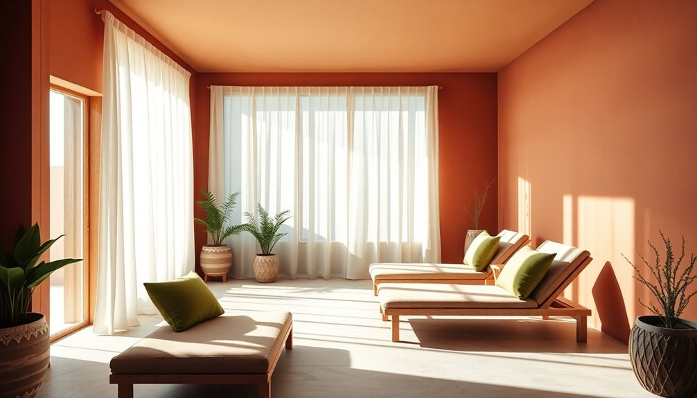
While exploring spa design, you'll find that earthy and natural tones, like greens and browns, effectively connect you to nature and foster a grounded atmosphere.
These earthy tones create a harmonious color palette that enhances the calming ambiance essential for relaxation. Incorporating soft beiges with bold greens can yield a warm, inviting atmosphere, encouraging comfort and tranquility.
Using natural materials alongside these tones further enhances the serene experience you're aiming for, reflecting eco-friendly values and a connection to the natural world.
The combination of earthy tones and natural elements not only elevates the overall aesthetic appeal of your spa but also promotes a peaceful environment where clients can unwind and rejuvenate. Furthermore, incorporating natural materials like wood and stone can deepen the connection to the surrounding landscape.
Pastel Color Combinations
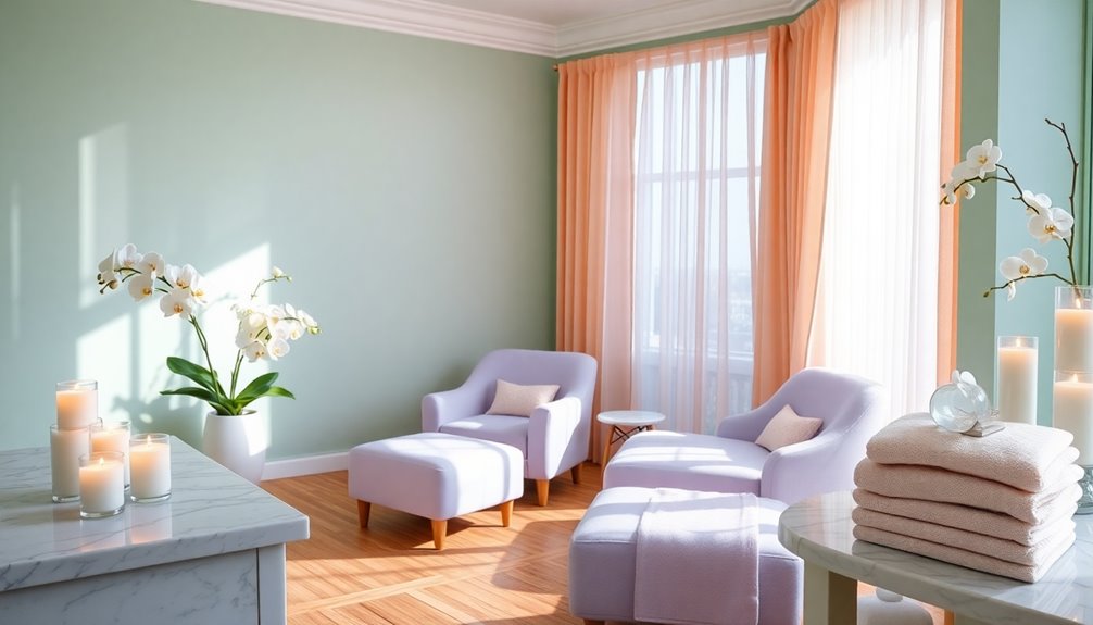
Earthy tones provide a solid foundation for spa design, but pastel color combinations can take your space to another level of serenity. Soft pastels like pale pinks, blues, and lavenders create a calming ambiance, enhancing the serene environment in treatment rooms and relaxation areas. These soothing colors are not only visually appealing but also trendy, attracting clients seeking a tranquil atmosphere. By incorporating unique pastel combinations, you can differentiate your spa brand, establishing a distinct identity that resonates with customers. Additionally, pastel hues align perfectly with minimalistic aesthetics, enhancing the overall calming ambiance of your space. Incorporating a financial planning strategy for your spa can help ensure you can maintain this serene environment effectively.
| Color 1 | Color 2 | Color 3 |
|---|---|---|
| Pale Pink | Soft Blue | Lavender |
| Mint Green | Peach | Light Yellow |
| Lilac | Soft Gray | Cream |
| Baby Blue | Blush | Sage Green |
Seasonal Adaptations for Spa Colors
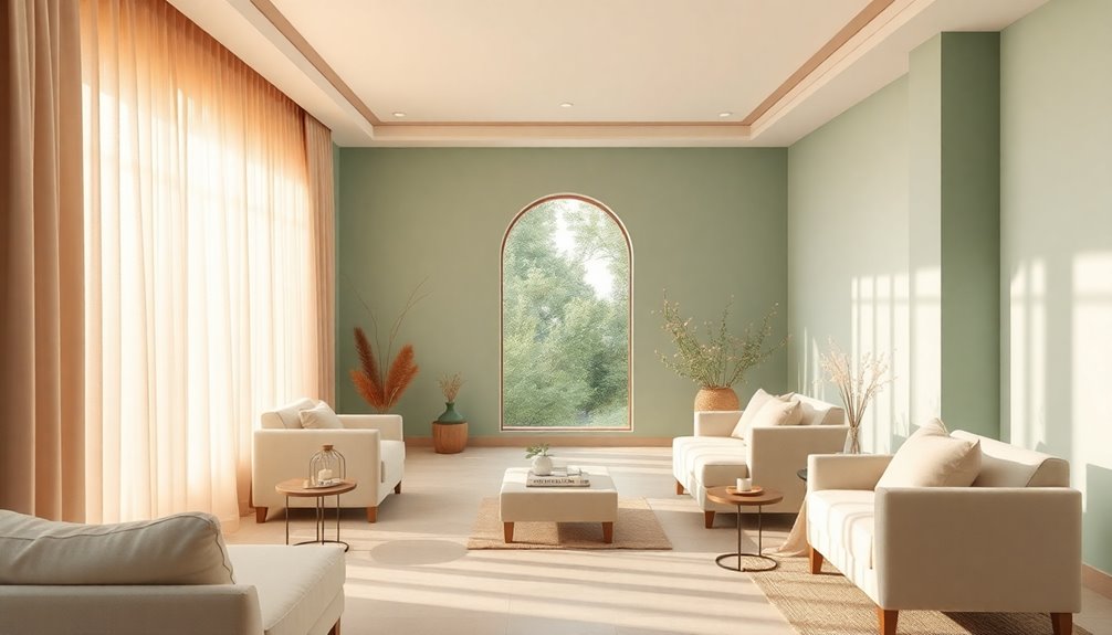
Incorporating seasonal adaptations in your spa's color palette not only keeps your design fresh but also draws in customers who crave a relevant and inviting atmosphere.
During spring, consider using soft pastels to create a serene and uplifting environment that enhances relaxation. These lighter colors resonate with the freshness of the season, inviting clients to unwind.
As autumn arrives, shift to earthy tones that reflect nature's richness, providing warmth and comfort. This change not only aligns with seasonal themes but also enriches the customer experience, making each visit feel unique and tailored.
Designing for Client Experience
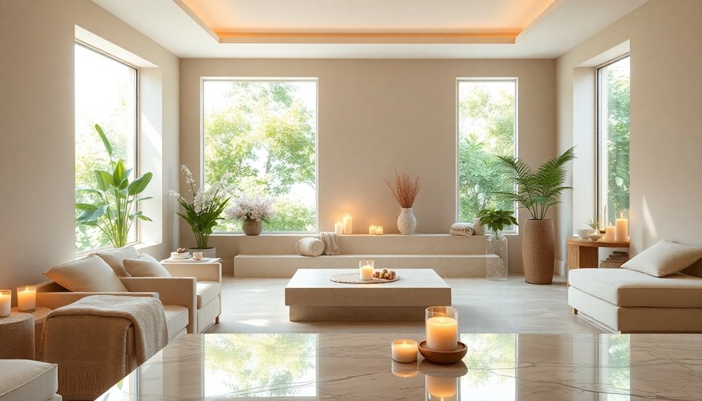
Adapting your spa's color palette not only enhances its seasonal appeal but also plays an essential role in designing an inviting client experience.
Choosing gentle hues like blue and lavender creates a calming ambiance that promotes relaxation. Incorporating earthy tones and soft pastels in your spa design helps lower anxiety levels, enhancing overall well-being.
Consistency in color schemes throughout treatment rooms and common areas reinforces your brand identity, making clients feel more engaged with the space.
Don't forget to gather client feedback on color preferences; this can help tailor your palette to meet their desires. Additionally, consider integrating natural materials into your design, as they create a warm and inviting atmosphere that complements your chosen color scheme.
Ultimately, a thoughtfully designed color scheme will lead to increased client satisfaction, encouraging repeat visits and fostering brand loyalty.
Frequently Asked Questions
What Is the Most Relaxing Color for a Spa?
When you're choosing a color for a spa, blue hues often stand out as the most relaxing option.
They're linked to tranquility and can help lower your heart rate.
Soft greens also work well, reminding you of nature and promoting calmness.
If you want to add a touch of peace, lavender is an excellent choice.
Earthy tones offer warmth and comfort, creating a welcoming atmosphere that invites relaxation and rejuvenation.
What Is the Best Color for Relaxation?
When you're looking for the best color for relaxation, consider soft hues like blue and green.
These colors promote tranquility and can lower your anxiety levels.
Pastels such as light pinks and lavender evoke feelings of calmness, making them perfect choices for creating a serene environment.
Warm neutrals like beige and taupe also provide a comforting backdrop, enhancing stability and warmth, which can greatly contribute to your overall sense of relaxation.
What Are the Best Colors for a Spa Business?
Did you know that colors can influence your mood by up to 80%?
For your spa business, consider soft pastels like light pinks and blues to create a calming atmosphere.
Earthy tones, such as greens and browns, connect clients to nature and promote grounding.
Gentle hues like lavender and beige evoke warmth and tranquility.
Cool colors, especially soft blues, help reduce anxiety, making your space inviting and ideal for relaxation.
Choose wisely!
What Is the Best Color to Paint a Room for Relaxation?
When you want to paint a room for relaxation, soft hues like pale blues and greens are your best bet.
These colors promote tranquility and can help lower anxiety. Lavender and beige also create inviting atmospheres, enhancing comfort.
Earthy tones, such as taupe and soft browns, connect you to nature, grounding the space.
Don't forget to test your chosen colors in different lighting to see how they truly affect the room's vibe.
Conclusion
Incorporating the right colors in your spa design can transform the atmosphere and enhance relaxation. For instance, a spa that chose soft greens and blues found that clients reported a 30% increase in overall satisfaction. By carefully selecting your color palette, you can create a serene environment that promotes tranquility and rejuvenation. So, whether you opt for earthy tones or calming pastels, remember that your color choices can greatly impact your clients' experience.
