
If your accent color feels too loud, start by softening its hue and lowering its saturation to reduce its visual impact. Incorporate neutral tones or cooler hues nearby to balance the space, and adjust brightness to match your lighting conditions. Testing different variations will help you find the perfect harmony. If you want to learn more about calming your accent color without losing its appeal, continue exploring effective strategies.
Key Takeaways
- Soften the hue’s shade or reduce saturation to decrease visual intensity and calm the accent color.
- Incorporate neutral tones or cooler hues nearby to balance and mute the bold accent.
- Adjust brightness levels to ensure the accent color blends harmoniously with ambient lighting.
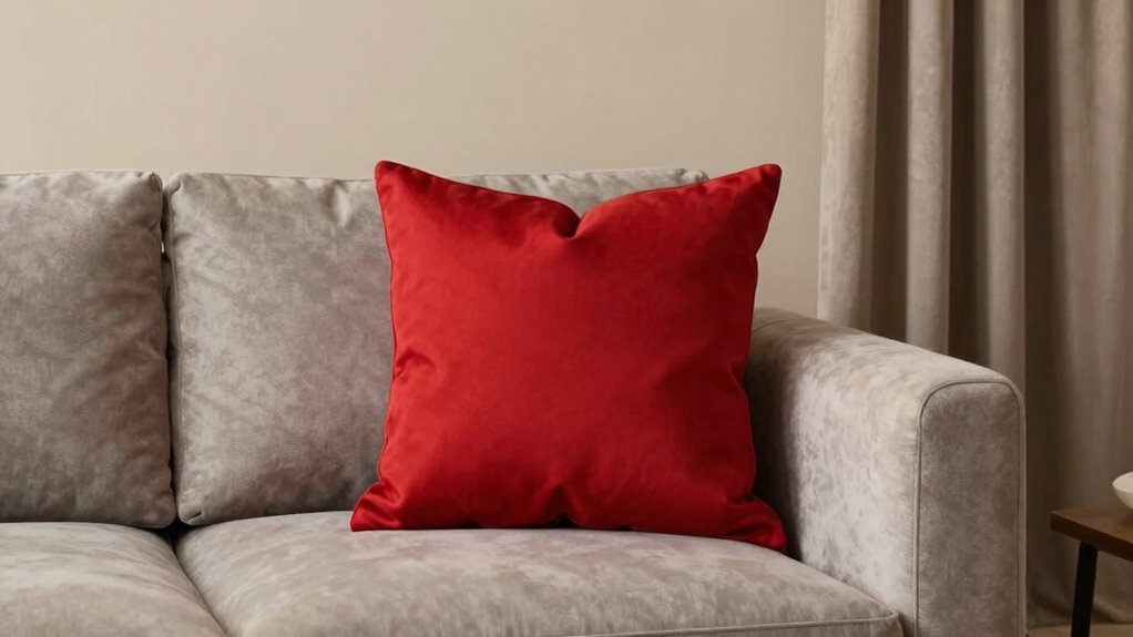
- Use smaller doses like pillows or artwork instead of large, bold applications of the accent color.
- Test and compare different variations in various lighting to find a subtle, balanced color harmony.
AMAATE 3 Pieces 3D Sandstone Wall Art, Black Metal Framed Boho Minimalist Abstract Relief Wall Decor, Silver Grey Olive Green Neutral Tone Wall Paintings for Living Room Bedroom Office, 24×26 Inches, Ready to Hang
1. 【Premium 3D Sandstone Relief & Durable Build】 Made of high-quality natural sandstone with a multi-layer 3D relief…
As an affiliate, we earn on qualifying purchases.
As an affiliate, we earn on qualifying purchases.
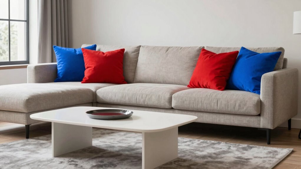
Is Your Accent Color Too Loud? Here’s How to Calmer It

If your accent color feels overwhelming or draws too much attention, it’s time to tone it down. Understanding color psychology helps you see how certain hues evoke specific emotions, influencing the room’s vibe. For example, bright reds or oranges can energize a space but may also feel overpowering if overused. Cultural associations also play a role; a color that’s lively and positive in one culture might carry different connotations elsewhere. To calm your accent color, consider softening its shade or reducing its prominence in the room. You can also balance it with neutral tones or cooler hues to create harmony. color psychology plays a crucial role in how your accent hue impacts the mood of your space. Additionally, incorporating Free Floating elements can help create a sense of openness and reduce visual clutter, making the accent color less dominant. Employing visual balance techniques can further help in achieving a cohesive look. By thoughtfully adjusting the intensity and placement of your accent color, you’ll achieve a more balanced, inviting atmosphere.

PHILIPS Hue Indoor 10 Ft Smart RGBWW LED Solo Lightstrip Base Kit, 1 Pack, Control with Hue App, LED Strip Lights Compatible with Alexa, Google Assistant and Apple HomeKit
WHAT’S IN THE BOX: Includes one 3-meter (10FT) PHILIPS Hue Solo lightstrip base kit with one plug to…
As an affiliate, we earn on qualifying purchases.
As an affiliate, we earn on qualifying purchases.
How to Tell If Your Accent Color Is Overpowering Your Palette

Determining if your accent color is overpowering your palette requires a keen eye for balance. First, assess whether the accent color draws too much attention, disrupting the overall color harmony. If it dominates the space or pulls focus away from other design elements, it’s a sign it’s too loud. Look at how the colors interact; if the accent clashes or feels jarring rather than complementary, your visual balance is off. A well-balanced palette creates harmony and smooth *segue*s between hues. Step back and view your space or design as a whole. If your eye keeps fixating on the accent color or it feels overwhelming compared to the rest of the palette, it’s time to tone it down. Achieving harmony involves ensuring your accent enhances rather than competes with your overall color scheme. Paying attention to color harmony principles can also help in understanding how subtle adjustments create a balanced, cohesive look or performance, especially as AI software engineer jobs evolve to include design considerations.

Nogrit Counseling Office Must Haves Throw Pillow Cover, Calming Corner, Mental Health Pillowcase Decor for Home Kids,Mental Health Counselor Gifts, Calming Corner Pillow Covers 18×18 Light Blue
It a perfect addition to our calming corner and a great reference to begin learning the different emotions.,classroom…
As an affiliate, we earn on qualifying purchases.
As an affiliate, we earn on qualifying purchases.
Easy Ways to Tone Down Your Accent Color Without Losing Its Impact
Sometimes, you can soften your accent color’s impact without losing its visual punch by adjusting its application. Using color psychology, consider how your chosen hue influences mood and perception; a slightly muted tone can create a calmer atmosphere while still catching the eye. Additionally, cultural associations play a role—certain colors may carry different meanings across cultures, so toning down intensity helps prevent misinterpretation or overwhelming viewers. Instead of applying the color boldly everywhere, try using it in smaller doses, like accent pillows or artwork, to keep its impact strong yet balanced. You can also experiment with semi-transparent overlays or overlays that blend the accent color with neutral shades, allowing the hue to stand out subtly without dominating the space. Color management techniques can further help you achieve a harmonious balance between vibrancy and subtlety. Incorporating color psychology principles can guide you in selecting and applying shades that evoke the desired mood without overpowering your overall design. Understanding visual hierarchy can help you prioritize how and where to use your accent color for maximum effect without overwhelming the space. Exploring field-of-view considerations in your color choices can also enhance overall harmony in your design, ensuring the accent remains effective across different viewing contexts.
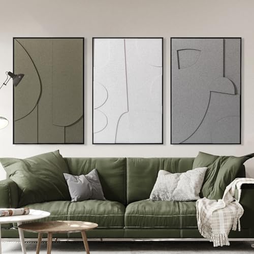
BICERE Abstract Gray Pastel Framed Canvas Wall Art Set,Neutral Watercolor Brush Stroke Wall Decor,Modern Minimalist Beige Illustration Artwork for Living Room,Bedroom,Dining Room -12"x16"x3
【Abstract Colorful Pastel Wall Art】These three abstract framed prints are all about gentle, muted tones—think calming beiges, soft…
As an affiliate, we earn on qualifying purchases.
As an affiliate, we earn on qualifying purchases.
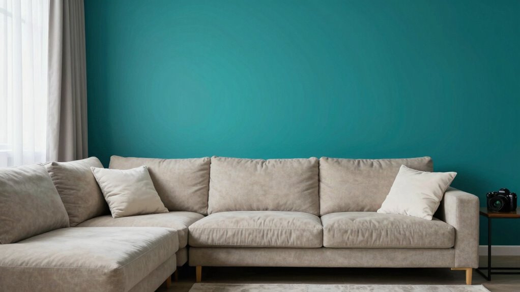
How to Use Neutral Colors to Mute Your Accent Hue
Neutral colors are an effective way to tone down your accent hue without sacrificing its visual appeal. They act as a calming backdrop, balancing bold or bright colors by softening their impact. Understanding color psychology helps you choose neutrals that complement your space’s mood—warm grays or beige evoke coziness, while cool tones like taupe bring serenity. Cultural influences also shape perceptions of color; for example, whites and creams may symbolize purity in some cultures, while in others, darker neutrals suggest sophistication. Using these shades strategically can mute a loud accent hue, making it more harmonious with your overall design. Additionally, smart lighting can be adjusted to enhance the calming effect of neutral tones and further tone down the vibrancy of your accent color. Incorporating color harmony principles can help you select neutrals that create a pleasing visual balance and prevent your accent from overpowering the space. Employing neutral color schemes effectively can also help in achieving a subtle, cohesive look that emphasizes harmony over contrast. Recognizing the impact of undertones in neutral shades ensures they work harmoniously with both the accent hue and the overall decor, enhancing the sense of unity in your space. By thoughtfully selecting neutral tones, you create a balanced environment that highlights your accent color without overwhelming the senses.
Adjusting Saturation and Brightness for Better Color Balance

To improve your color balance, start by fine-tuning the saturation to reduce any overpowering intensity. Adjust the brightness levels to create a more harmonious look, ensuring your accent color isn’t too harsh or faded. Balancing these adjustments with complementary colors will help your overall palette feel more cohesive and visually appealing.
Fine-Tune Color Saturation
Adjusting the saturation and brightness levels of your colors can make a significant difference in achieving a balanced and visually appealing palette. When you fine-tune saturation, you influence how vibrant or muted your colors appear, directly affecting their emotional impact through color psychology. For example, saturated reds evoke energy, while desaturated reds feel more subdued. Brightness adjustments also help align colors with cultural associations—softening a bold hue can make it feel more traditional or calming, depending on context. By carefully controlling these elements, you create a harmonious look that avoids overwhelming your audience. Focus on subtle tweaks to find the right balance, ensuring your accent color enhances your design without overpowering the overall aesthetic.
Adjust Brightness Levels
When you want your colors to work harmoniously, tweaking brightness levels is essential. Adjusting brightness helps balance your colors by considering factors like color temperature and lighting conditions. If your room has warm lighting, lowering brightness can prevent colors from appearing too washed out or overly yellow. Conversely, in cooler or dim environments, increasing brightness enhances clarity without making colors look dull. Additionally, understanding how indoor air quality affects lighting perception can help you make more informed adjustments, ensuring your accent color remains pleasing and balanced. Properly sizing and load‑planning your lighting setup can also influence how brightness adjustments impact color appearance. Being aware of color calibration techniques can further improve the accuracy of your color adjustments, leading to a more visually appealing space. Recognizing the impact of air quality on visual clarity can support more precise brightness tuning for optimal color harmony. Incorporating lighting control systems allows for dynamic adjustments that adapt to changing conditions, enhancing overall color harmony and comfort.
Balance With Complementary Colors
Balancing your accent color with its complementary hues can considerably improve the overall harmony of your palette. Use the color wheel to identify these complementary shades, which naturally create contrast without overpowering. Adjust the saturation and brightness of your accent color so it doesn’t compete with the surrounding hues. Lowering saturation can make the accent more subdued, helping it blend smoothly into the visual hierarchy. Similarly, tweaking brightness ensures your accent doesn’t dominate or fade into the background. Remember, a balanced palette guides the viewer’s eye effortlessly, emphasizing key elements without overwhelming. To prevent unintentional color clashes, consider how your choices align with color harmony principles, which are essential in creating a cohesive visual design. Incorporating professional architectural design standards can further refine your color balance and ensure your palette aligns with industry best practices. Additionally, paying attention to color contrast ratios helps maintain accessibility and visual clarity in your design. By carefully moderating the intensity of your accent color through its complementary tones, you create a cohesive, visually appealing design that feels harmonious and well-crafted.
Test and Refine Your Color Changes for the Best Look

Start by comparing different color variations to see which one feels most balanced. Adjust brightness levels as needed to fine-tune the overall look. Don’t hesitate to seek opinions from others to guarantee your color choices resonate well. To improve clarity, detect and correct passive voice in your writing to make your message more direct. Remember, visual hierarchy helps prioritize your accent color effectively. Additionally, using color theory principles can guide you in selecting shades that complement your overall palette.
Compare Color Variations
To find the best look for your accent color, you need to compare different variations side by side. This helps you evaluate how each option affects overall color contrast and palette harmony. Experiment with subtle shifts in hue or saturation to see what feels balanced and visually appealing. Don’t rely solely on your screen—step back and view your choices in different lighting conditions to spot what truly works.
- Test multiple shades within your chosen hue to find the right contrast without overpowering.
- Consider how each variation interacts with neighboring colors to maintain palette harmony.
- Use side-by-side comparisons to gauge emotional impact and ensure the accent isn’t too loud or subdued.
Adjust Brightness Levels
Once you’ve compared different color variations, it’s time to fine-tune their brightness levels. Adjusting brightness helps you achieve better color harmony and visual balance. If your accent color appears too vivid or overpowering, dial it down gradually until it complements the overall palette. Use your design software’s brightness controls to test subtle changes, ensuring the color remains noticeable but not disruptive. Keep checking how the adjusted hue interacts with surrounding elements, aiming for a cohesive look. Remember, the goal is to create harmony, so don’t be afraid to revisit earlier choices and refine until your accent color blends seamlessly. Proper brightness levels will enhance your design’s elegance, making your accent stand out just enough without overwhelming the viewer.
Seek Design Opinions
Have you tested your color adjustments with others to see how they perceive your design? Getting fresh eyes helps ensure your color harmony and visual hierarchy work well together. Others can spot if your accent color still feels too loud or if it blends smoothly with the overall palette. Share your design with colleagues, friends, or even online communities for honest feedback.
- Ask if the accent color draws attention without overpowering the main content
- Check if the visual hierarchy guides the viewer comfortably
- Confirm the overall color harmony feels balanced and pleasing
This feedback helps you refine your choices, making sure your accent color enhances rather than distracts. Adjust based on their input, then test again until you’re confident in your refined look.
Common Mistakes to Avoid When Subduing a Bold Accent Color

A common mistake when trying to subdue a bold accent color is overcorrecting with too many neutral or muted tones. This can disrupt the overall design harmony, making the space look dull rather than balanced. Instead of randomly layering muted shades, consult the color wheel to find subtle variations that complement your accent color without overpowering it. Using neighboring hues or analogous colors can help create a cohesive look while softening the boldness. Remember, the goal is to tone down the accent color without eliminating its personality. Overusing neutrals can also flatten the space, so aim for a balanced mix that maintains visual interest. Keep in mind that subtle adjustments often have a more sophisticated and harmonious effect than heavy-handed corrections.
Frequently Asked Questions
How Do I Choose the Right Neutral Tones to Complement My Accent Color?
To choose the right neutral tones, start with a neutral pairing that balances your accent color. Opt for softer shades like beige or taupe if your accent is bold, or go for darker neutrals like charcoal if your accent is subtle. Focus on tone selection that complements your overall style, ensuring the neutrals enhance rather than compete. Test samples in your space to see how they harmonize before making a final decision.
What Tools Can Help Me Measure Color Saturation and Brightness Accurately?
To measure color saturation and brightness accurately, use digital color tools like a colorimeter or spectrophotometer. These tools help with color calibration, ensuring your displays show true colors. You can also use software with built-in color measurement features, such as Adobe Photoshop or Lightroom, which offer precise controls for analyzing and adjusting color saturation and brightness. Regular calibration with these tools keeps your color choices consistent and accurate.
How Long Should I Wait Before Evaluating the Effectiveness of My Color Adjustments?
You should wait at least 24 hours before evaluating your color adjustments, giving yourself enough timing patience for your eyes to adapt. During this period, avoid making further changes and focus on a visual assessment under different lighting conditions. This approach guarantees you gain a clear perspective on how the adjustments work in real-life settings, helping you make more accurate decisions about whether to refine your accent color further.
Can Changing Lighting Conditions Affect How My Accent Color Appears?
Yes, changing lighting conditions can substantially impact your accent color’s appearance. Lighting impact influences how your color perceives brightness and hue, making it look different in various environments. You might notice your accent color appears more vibrant or subdued depending on the lighting. To guarantee consistent color perception, test your accent color under different lighting scenarios and consider using adjustable lighting to maintain the desired effect.
What Are Some Common Signs My Accent Color Is Distracting Rather Than Enhancing?
Like a loud whistle, an accent color can be distracting if it causes a color clash or visual distraction. If your accent color draws attention away from the main design or feels out of place, it’s a sign it’s too loud. You might notice eyes wandering or the color clashing with nearby elements. When this happens, tone it down or choose a more harmonious hue to keep your design balanced and engaging.
Conclusion
By tuning into your space and making small adjustments, you can tame a bold accent color without losing its impact. Trust your instincts and test different options—saturation, brightness, or neutral tones—to find the perfect balance. Remember, subtle tweaks often create the most harmonious results. So, take your time, experiment, and enjoy transforming your space into a more inviting, cohesive environment where your accent color complements rather than overwhelms.