
To make neutral color schemes exciting, incorporate rich textures, varied materials, and strategic lighting to add depth and visual interest. Use monochromatic shades of beige, taupe, or gray as a foundation, then add bold accent colors like navy or emerald for pops of personality. Balancing matte and shiny finishes, soft fabrics with rough textures, and natural materials creates a lively, sophisticated space that feels both timeless and fresh. Keep exploring to discover even more ways to elevate your neutral palette.
Key Takeaways
- Incorporate monochromatic palettes with varied shades and tints to add depth and visual interest.
- Use bold accent colors like navy, emerald, or mustard for focal points and personality.
- Mix textures and finishes, such as matte and shiny surfaces, to create tactile contrast.
- Layer different textiles and natural materials to introduce complexity and warmth.
- Employ strategic lighting to enhance neutral tones and keep the space lively and inviting.
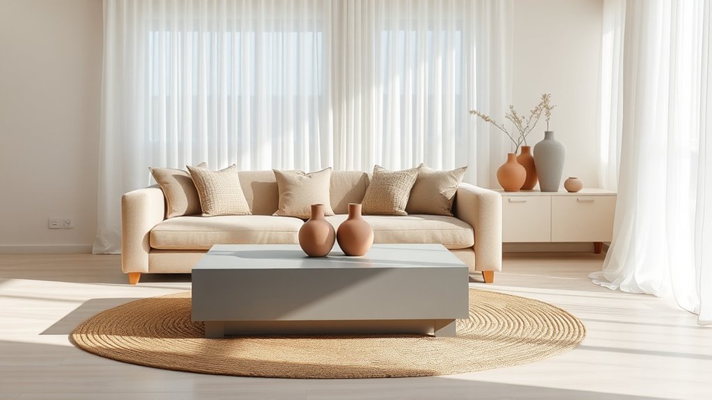
Have you ever wondered why neutral color schemes are so popular in interior design? The answer lies in their versatility and timeless appeal. When you choose neutral tones, you create a foundation that’s easy to build upon, allowing your space to feel calm, sophisticated, and welcoming. But a common concern is that neutral palettes can be boring or lack personality. The good news is, with the right approach, you can craft a neutral space that’s anything but dull. One effective way to do this is by working with monochromatic palettes. These involve sticking to different shades and tints of a single color, like soft beiges, warm taupes, or cool greys. Monochromatic schemes add depth and interest without overwhelming the senses. They create a seamless, cohesive look that feels both modern and elegant, making your space appear larger and more unified. Additionally, understanding the importance of contrast ratio can help you choose the right shades to create visual interest and depth within your neutral palette.
Neutral color schemes offer timeless elegance, creating calm, cohesive spaces with depth through monochromatic palettes and strategic accents.
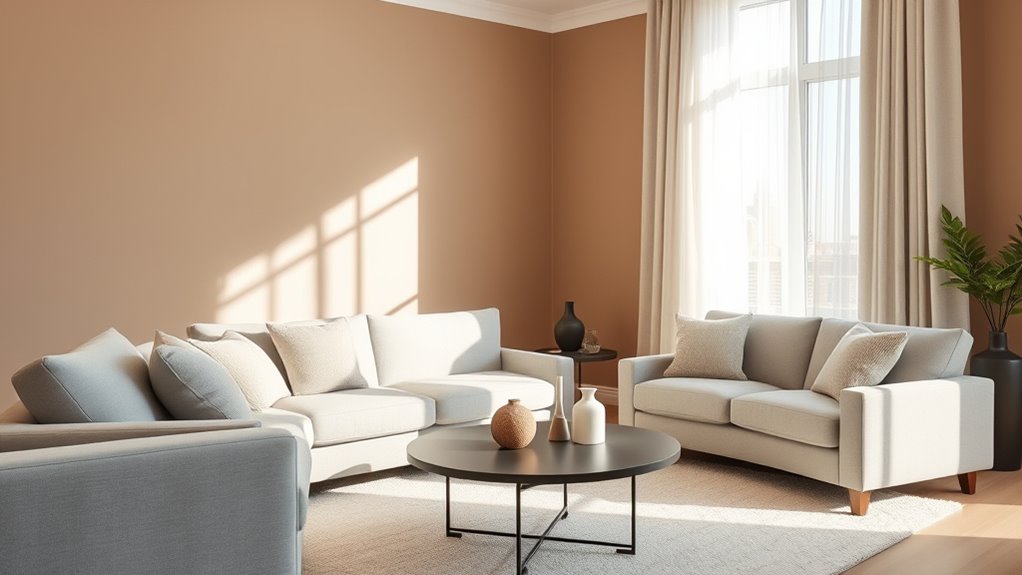
In addition to monochromatic palettes, accent color options play a vital role in elevating a neutral scheme. Think of accent colors as the jewelry of your room—they add that pop of personality and visual interest. You can incorporate these through accessories like throw pillows, artwork, rugs, or even a statement piece of furniture. For example, a neutral backdrop of taupe or grey can be beautifully complemented with deep navy, rich emerald, or vibrant mustard accents. These pops of color draw the eye, break up the monotony, and give your space a dynamic feel. The key is to choose accent colors that resonate with your personal style and to place them thoughtfully throughout the room for balance.
Another way to keep your neutral scheme from feeling flat is by playing with textures and materials. Combining matte finishes with shiny surfaces, mixing soft fabrics with rougher textures, or layering different textiles can add visual interest without introducing bold colors. Natural materials like wood, stone, or linen enhance the warmth and tactile appeal of your space. Lighting also makes a significant difference—strategic use of natural light and layered fixtures can highlight the subtle variations in your neutral palette, making your room feel lively and inviting.
Ultimately, neutral color schemes aren’t inherently boring. When you leverage monochromatic palettes, select compelling accent colors, and incorporate diverse textures, you craft a space that’s both timeless and engaging. It’s about creating a balanced environment where simplicity meets sophistication, allowing your personal style to shine through without overwhelming the senses. With these strategies, your neutral space will feel fresh, dynamic, and indispensable.

Soalmost Living Room 10x14 Area Rugs, Washable Low Pile Non-Slip Stain Resistant Extra Large Thin Rug, Vintage Soft Throw Carpet for Dining Room Bedroom Farmhouse Home Office Decor Beige
Effortless Machine Washable Design: Experience the beauty of a textured rug without the upkeep—our 3D visual effect is...
As an affiliate, we earn on qualifying purchases.
Frequently Asked Questions
How Can I Add Texture to Neutral Color Schemes Effectively?
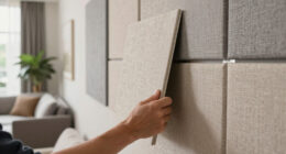
To add texture to neutral color schemes effectively, incorporate textural contrasts and layered fabrics. You can mix smooth surfaces like matte paint with rougher textures such as woven rugs or textured wall coverings. Use layered fabrics like plush throws, velvet cushions, or linen curtains to create visual interest and depth. These elements highlight the neutrals, making your space feel inviting and dynamic without overwhelming the calm palette.
What Are the Best Accent Colors to Complement Neutral Tones?
Choose complementary hues like deep blues, rich greens, or warm terracotta to elevate your neutral palette. These bold accents add depth, contrast, and personality, making your space feel lively and inviting. By mixing subtle shades with striking pops of color, you create balance, draw attention, and evoke emotion. Don’t be afraid to experiment with vibrant accessories or artwork — your neutral base is the perfect canvas for bold, beautiful accents.
How Do I Choose Neutral Shades for Different Lighting Conditions?
When choosing neutral shades, consider your lighting conditions to guarantee shade versatility. In natural light, opt for warmer neutrals like beige or soft taupe, which brighten spaces. For low-light rooms, cooler shades like greige or gray add depth without darkness. Test paint samples in different lighting to see how they change throughout the day. This approach helps you pick neutral tones that stay appealing under various lighting conditions.
Can Neutral Color Schemes Work in Small Spaces? How?
Yes, neutral color schemes work well in small spaces. They create small space illusions, making rooms feel larger and more open. To maximize this effect, use light shades like beige or soft gray and incorporate color coordination techniques, such as matching furniture and decor, to add visual interest without clutter. Reflective surfaces and strategic lighting further enhance the sense of spaciousness, ensuring your small room feels airy and inviting.
What Are Common Mistakes to Avoid With Neutral Palettes?
You should avoid monochromatic monotony by mixing textures and subtle shades, preventing your space from feeling dull. Don’t overuse beiges, as this can make your room look flat and uninspired. Instead, incorporate warm taupes or cool greys to add depth. Be mindful of balancing light and dark neutrals, and add small pops of color or varied materials to keep your neutral palette interesting without overwhelming the calm aesthetic.

10x14 Area Rugs for Living Room Rug Washable: Abstract Large Rug Indoor Modern Carpet Non Slip for Dining Room Bedroom Nursery Home Office Blue Grey
Soft & Durable: This 10x14 low-pile rug combines soft faux wool fibers with a 0.25-inch height for comfort....
As an affiliate, we earn on qualifying purchases.
Conclusion
With these neutral color schemes, your space will transform into a sanctuary so stunning, it’ll make even the most vibrant palettes seem dull in comparison. You’ll create a timeless, versatile look that’s never boring, just like a classic masterpiece that keeps enthralling everyone who sees it. Embrace these shades, and watch your home become a breathtaking haven that radiates effortless elegance and style—proof that neutral doesn’t have to mean dull!

Srugn Washable Rugs 10x14 Area Rugs for Living Room,Rugs for Bedroom,Large Carpets,Ultra Soft Faux Wool Retro Dining Room Rug,Non Slip&Non-Shedding Low Pile Vintage Print Rug for Home Office Decor
CUSHIONED AND SOFT: Washable rugs might already exist, but none are as luxurious to touch as ours. More...
As an affiliate, we earn on qualifying purchases.

Area Rugs 10x14 Living Room: Washable Rug Modern Abstract Large Rugs Soft Non Slip Neutral Rug Stain Resistant Indoor Carpet for Bedroom Kitchen Dining Room Home Office Rugs(Beige, 10'x14')
Modern Abstract Rug: Simple color with soft stripe design, our living room rug has a modern look with...
As an affiliate, we earn on qualifying purchases.